We are currently engaging in research utilising 23 years of historical constituent data for the S&P 500 sectors. But if our database isn’t accurate then our test results will be worthless. I started writing this post about the processes we went through to ensure that the historical data we used was clean and that our constituent list was accurate. But then I realised that no one cares how many multiple fail safe cross over checks were made or how difficult the process was. The only thing people care about (the only thing that matters) is being able to prove that the database is accurate.
So how do we prove that we are working with an accurate database?
Well the second half of our S&P 500 Sector constituent list (Sept 2001 – March 2013) came directory from our insider at State Street; the company that actually issues the Select Sector SPDR ETFs. With the data for this period coming straight from the horses mouth it is safe to say that the accuracy for this period can be relied upon. It also contains an abundance of information, enough to reconstruct the ETFs, including:
Company Name, Symbol, Exchange, Shares, Float, Float Shares, Multiplier, Adjusted Shares, Last Sale, Previous Close, Index Weight, Index Market Value, Market Value (Unadjusted Shares), Current Cap, Divisor, Previous Cap, Number of Components, Sum Of Adjusted Shares, Calculated Index, Published Index, # of Stocks, Sum of Adjusted Shares, Capitalization Using Unadjusted Shares, Estimated Weight of Index Components in the S&P 500…
The first half of our S&P 500 Sector constituent list however (Feb 1990 – Aug 2001) was compiled from several sources of varying reliability and only consists of dates and symbols. Plus most of the stocks had to be classified into their sectors manually.
The best way to prove the accuracy of our database then is to reconstruct the sector indices and compare the correlation coefficient for each of the two periods against the actual indices published by S&P. If our data is good then we should be able to closely reproduce the Equal Weighted S&P 500 Sector Indices.
In this post there is reference to several different indices. Here are a number of relevant links:
Index and ETF Link Matrix |
|||||
| Market Capitalization Weighted Index | Select Sector Index | Select Sector SPDR ETF | Equal Weight Index | Equal Weighted ETF | |
| S&P 500 | SPX/GSPC/INX | SPY | SPW / SPXEW | RSP | |
| Materials | S5MATR / SPXM | IXB | XLB | S15 | RTM |
| Energy | SPN / SPXE | IXE | XLE | S10 | RYE |
| Industrials | S5INDU / SPXI | IXI | XLI | S20 | RGI |
| Financials | SPF / SPXF | IXM | XLF | S40 | RYF |
| Cons Staples | S5CONS / SPXS | IXR | XLP | S30 | RHS |
| Technology | S5INFT / SPXT | IXT | XLK | S45 | RYT |
| Utilities | S5UTIL / SPXU | IXU | XLU | S55 | RYU |
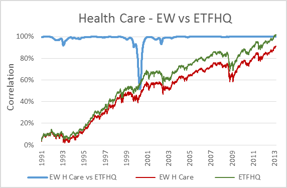
| Health Care | S5HLTH / SPXA | IXV | XLV | S35 | RHY |
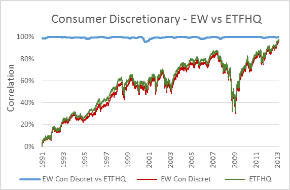
| Cons Discret | S5COND / SPXD | IXY | XLY | S25 | RCD |
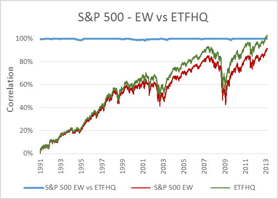
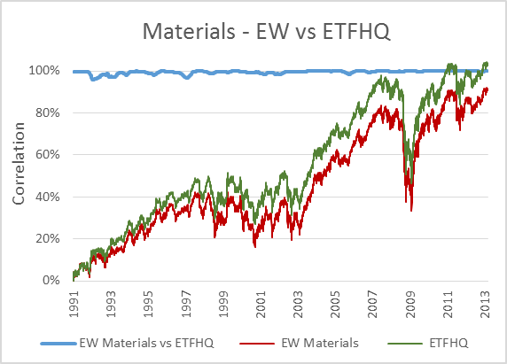
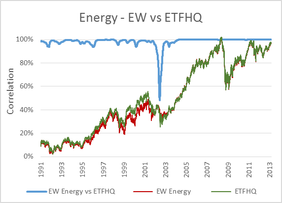
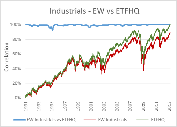
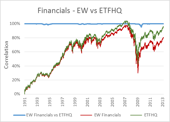
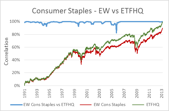
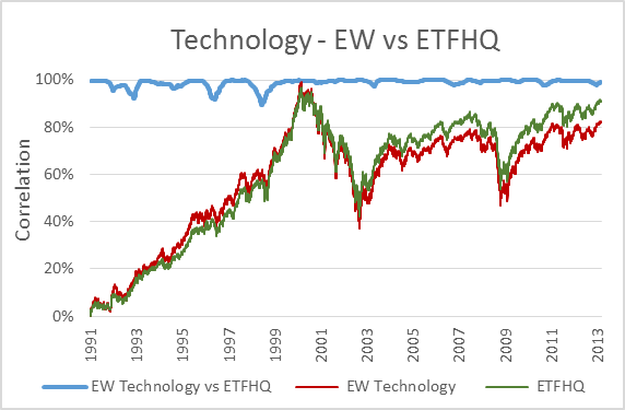
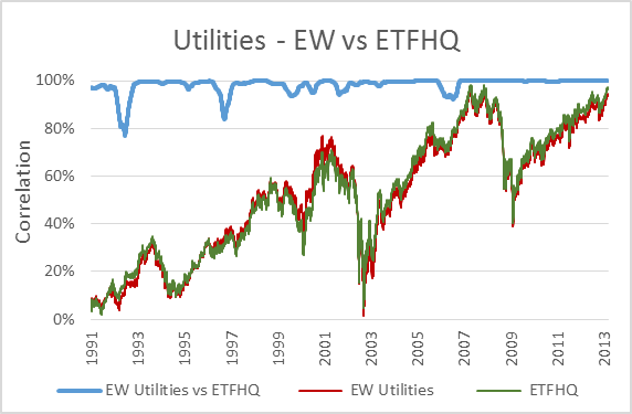
Now, to keep things simple the ETFHQ constructed indices will be equally weighted on a daily basis rather than quarterly. For this reason our results won’t be identical to that of the S&P, but this is not an issue. As long as the level of correlation Feb 1990 – Aug 2001 is not far below the level of correlation Sept 2001 – March 2013 then our hard work and patience has paid off:
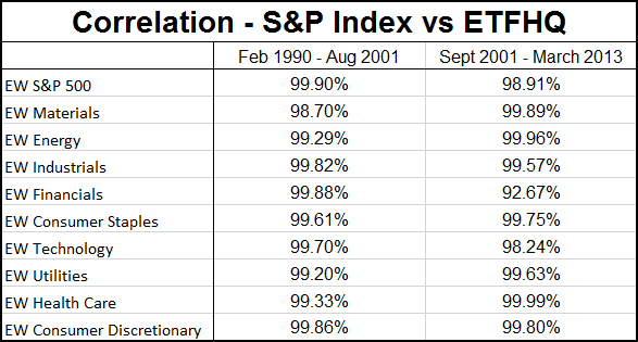
(Special thanks to Mr Anonymous for sending us some data that we needed for these tests). As you can see above, the results are even better than we could have hoped. In many cases the correlation for the first half of our data is greater than that for the second. How is this possible when we know that the data from Sept 2001 – March 2013 is from a reliable source? Because during this period the market has endured some extreme turmoil. Extreme stock behavior will result in greater index discrepancies when the component weightings are not identical.
So with this we have definitive proof that our data and constituent list is extremely accurate. Let the testing begin!
But before we do that, for those that are interested, below you will find charts that display each index; the S&P version vs the ETFHQ version including a rolling 252 day (one trading year) correlation coefficient.
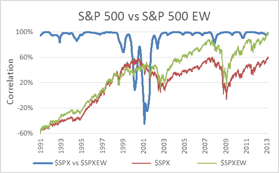
The chart above actually shows the correlation between the S&P 500 (official) and the S&P 500 Equal Weighted Index (official). I have included it to illustrate why we didn’t test our results against the standard market cap weighted indices.
Stocks in companies of different sizes can behave very differently at times and for that reason market cap and equally weighted indices perform very differently. In fact, in this case the two diverged to such an extent that the correlation dropped to -44.52%. That means that they moved in opposite directions for over a year despite tracking the exact same 500 stocks!