Stochastic Oscillator (SO) – Test Results

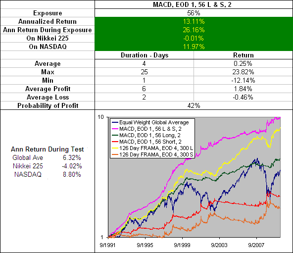
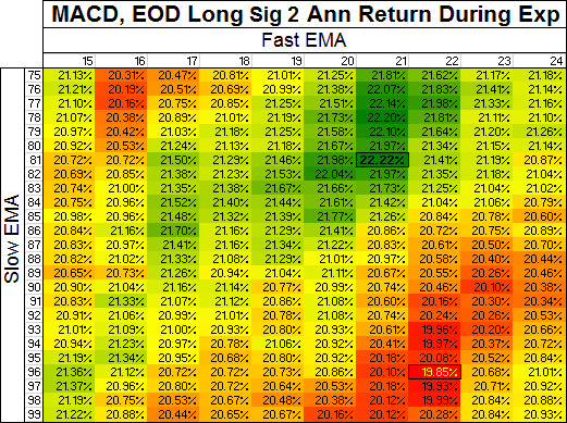
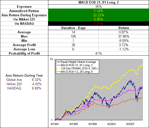
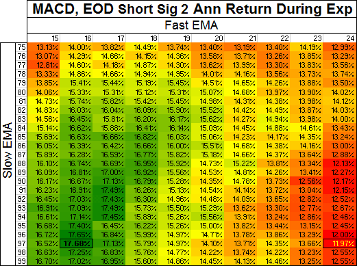
The Stochastic Oscillator (SO) is a widely used momentum indicator.  As part of the Technical Indicator Fight for Supremacy we have put it to the test through 16 different global markets~ (a total of 300 years data) to find out how well it works and what settings produce the best returns.

Download A FREE Spreadsheet With Data, Charts And Results

For all 1,248 Stochastic Oscillator Settings Tested

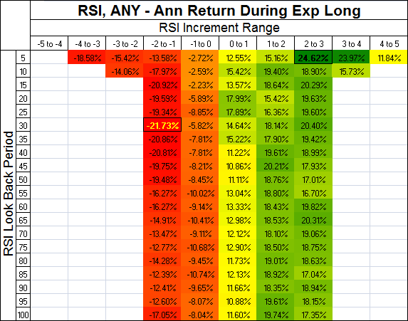
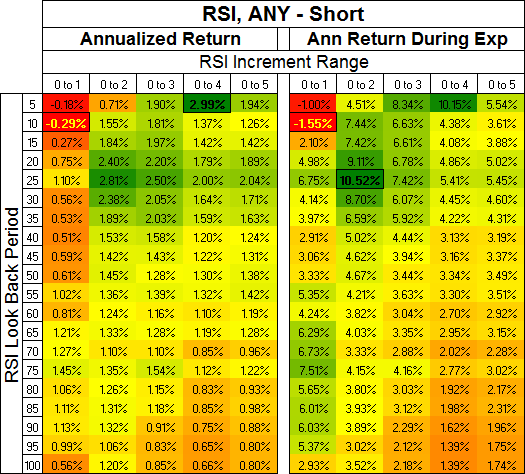
First of all lets establish how the market performs while the Stochastic Oscillator is in each 10th of its range:

Stochastic Oscillator Range 10

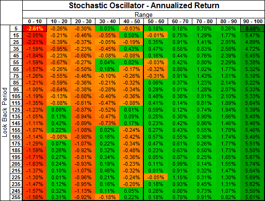
I have highlighted each of the negative results across a Red—>Orange gradient and positive results across a Light Green—>Dark Green gradient (depending on how great the loss or gain).  Clearly most of the market gains occurred while the Stochastic Oscillator was above 50 and the lion’s share when it was above 90.

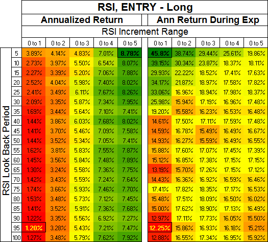
What this means is that when the market is in the top 50% of its range it has a tendency to go up and when it is in the top 90% of its range it has a strong tendency to go up.  It also tells us that we want to avoid being long when the market is in the bottom 50% of its range.  Over what period do we base this range?  Interestingly, the returns do not change much over the different look back periods although the benefit of a longer look back is less volatility from the signals.

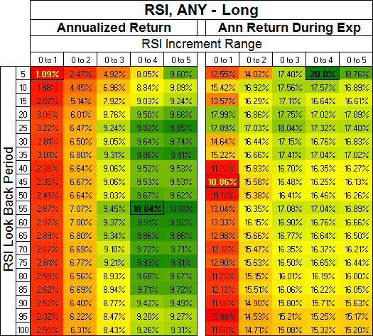
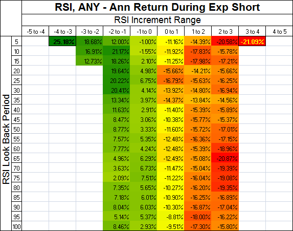
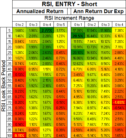
Lets now look at segments of 20-50% when the Stochastic Oscillator is above 50:

Stochastic Oscillator Range Above 50

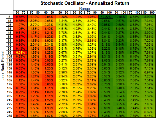
The table above is colour coded Red—>Yellow—>Green from Lowest—>Middle—>Highest return.  The message coming through loud and clear is that you need to be long when the market is making new highs if you want to make money.  Over a 255 day look back (about 1 year) the difference between going long in the 50-90 range vs the 50-100 range is the difference between making 2.68% or 8.38% a year!!

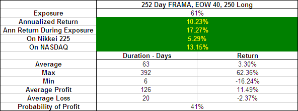
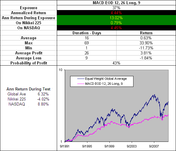
Lets have a look at the trade profile:

252 Day Stochastic Oscillator EOD, 50-100 Range, Long, Any

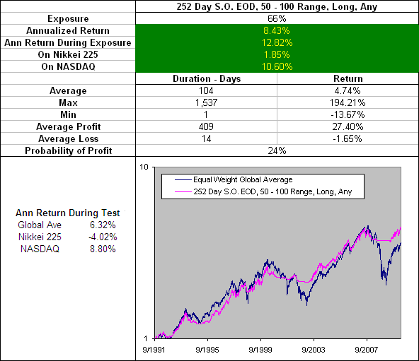
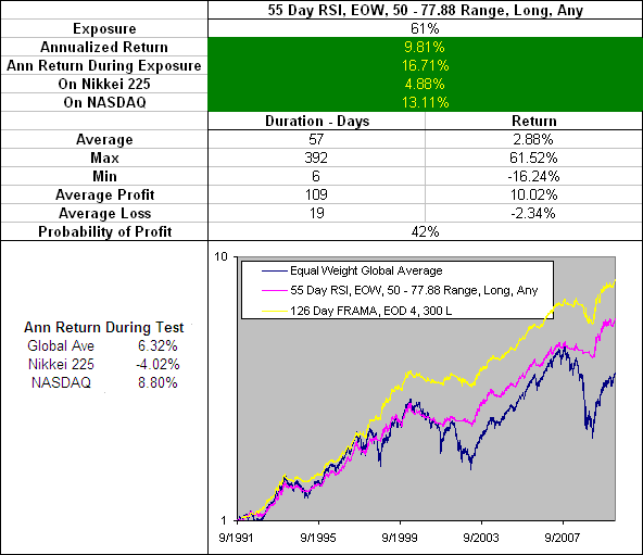
The results above show what would have happened if a long position was opened and held any time, any of the 16 test markets had a reading above 50 on their Stochastic Oscillator (meaning that the market was in the top half of its range).  We chose a period of 252 days, not because the returns were the best, but because this look back produced a longer average trade duration and 252 days is the average number of trading days in a year.

The returns are not as good as we have seen from other indicators such as the RSI or the Moving Average Crossover but they are still respectable.  Furthermore an average trade duration of 104 days is advantageous when looking for a long term indication of market direction.

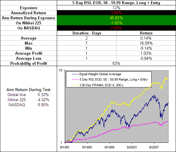
What about the %K signal line?  We did test this but the results were not worth taking the time to publish.  They are included in the results spreadsheet for free download if you wish to review them however.


Stochastic Oscillator Conclusion

The Stochastic Oscillator %K line is too volatile and is not worth considering in your trading as originally suggested by Dr. George Lane in the 50’s.  There are better options for short term trading such as the FRAMA.  In fact, there are also better options available for longer-term indications of market direction than the Stochastic Oscillator as presented in this article… So is it worth bothering with at all?

Well… YES and here is why:

The fact illustrated by these tests is that the majority of gains occur when the market is in the top 10% of its range and nearly all of the gains occur when the market is within the top half of its range.

There has been a lot or research published on momentum strategies and they typically involve buying the best performing assets out of a selection and then rotating funds periodically so as to constantly stay with the best.  Many people fear holding markets that are near their highs so by rotating constantly into the current market leaders these fears are be alleviated.

What our tests on the Stochastic Oscillator reveal however is that simply holding an index fund when it is in the top half of its range (over almost any look back period) will capture the majority of the gains while STILL avoiding those much feared ‘bubble burst’ like declines.  Contrary to popular belief; when a market bubble bursts it does not do so over night.  Penny stocks my grow exponentially and then plummet the next day.  On rare occasions large companies may even do so.  But major economies can not turn on a dime.

“In the event of nuclear war, disregard this message.” – Warren Buffett

Therefore the Stochastic Oscillator could be a useful addition to a momentum rotation type strategy.  Another idea worth considering is to change the rules for your trading system based to the Stochastic Oscillator reading.  For instance we know that most gains occur when the market is making new highs, therefore the rules for taking profits on a long position should be different when the Stochastic Oscillator  is above 90 than they are when it is between 50 and 60.

Both of these applications will be included in future tests.


More in this series:

We have conducted and continue to conduct extensive tests on a variety of technical indicators.  See how they perform and which reveal themselves as the best in the Technical Indicator Fight for Supremacy.


  • ~The data used for these tests is included in the results spreadsheet and more details about our methodology can be found here.
  • No interest was earned while in cash and no allowance has been made for transaction costs or slippage.  Trades were tested using End Of Day (EOD) signals on Daily data.

Stochastic Oscillator (SO)

The Stochastic Oscillator (SO) (pronounced sto kas’tik) is a momentum indicator that was developed in the 1950’s by a group of futures traders in Chicago.  Primarily attributed to Dr. George Lane (1921 – July 7, 2004) it is sometimes referred to as ‘Lane’s stochastics’.  The term stochastic refers to the location of the current price in percentage terms relative to it’s range over a specific period.

“Stochastics measures the momentum of price.  If you visualize a rocket going up in the air; before it can turn down, it must slow down.  Momentum always changes direction before price.” – Dr. George Lane

Interpreting the Stochastic Oscillator

Because of Lane’s belief that momentum changes direction before price, he looked for bullish and bearish divergences as a warning of pending reversals.

Another method is to only take positions when the Stochastic Oscillator is within a specific range.  e.g Only going long when the SO is above 80 (meaning a stock is with within the top 80% of its range over the specified period).

Active traders may choose to trade the SO directly from its signal line.  e.g go long when the %K line rises above the %D line.

Below is a Slow Stochastic Oscillator with the most commonly used settings of N(14), %K(3) and %D(3):

Stochastic Oscillator


How to Calculate the Stochastic Oscillator

%K = 100 * ( Average(CL,s) / Average(HL,s) )

%D = User selected moving average of %K.

Were:

s = User Selected smoothing period.

CL = Close – Low(n)

HL = High(n) – Low(n)

n = User selected look back period for measuring the price percentage range.

Notes:

An ‘s’ of 1 will produce a ‘Fast Stochastic’ while a setting of 3 is typicality used for a ‘Slow Stochastic’.  Interestingly the Williams %R is identical to the %K but mirrored at the 0% line.


Free Stochastic Oscillator Excel Download

We have built a free Excel Spreadsheet for you to download containing an SO that will automatically adjust to the settings you choose. You will find it at the following link under Technical Indicators.


Is the Stochastic Oscillator a good indicator?

As part of the Technical Indicator Fight for Supremacy we putting it to the test through 300 years of data across 16 different global markets – See the results.

Relative Strength Index (RSI) – Test Results

The RSI is a staple indicator of the technical analysis community but how good is it, really?  What are the best settings?  What does its trade profile look like?  Ask around and no one can tell you…  Does it not seem strange that so many traders can be using an indicator without solid data on its performance?  Well we are on a mission to change that.  We tested 3800 different RSI settings through 300 years of data across 16 different global markets~ to reveal the facts.

Download A FREE Spreadsheet With Data, Charts

And Results For all 3,800 RSIs Tested

.

RSI – Test Results:

.

RSI Conclusion

.

Our Testing Strategy Explained

noʊtɑ bɛnɛ (Note Well) we use an EMA when calculating the RSI instead of a WS-MA.  This is not just to be difficult, please read more about the RSI for an explanation.  The formula to convert the EMA Look Back period to the identical equivalent WS-MA used by your charting programs when calculating the RSI is (Period + 1)/2.  Below is a table with all the Look Back Periods we tested and how they convert to the original RSI:

RSI Period Conversions

Now there are many different ways that signals can be taken from the RSI but to start with we wanted to see how the market behaved when the RSI was in different ‘zones’.  We also wanted to find out which RSI Look Back period is the most desirable.  But this presents a problem because changing the Look Back period alters the range of an RSI.

For instance during our tests across 16 different markets and 300 years of data the range for the RSI(5) was 89.96 – 10.04 while for the RSI(100) it was 70.77 – 29.23.  Clearly a direct level comparison between two RSIs of different look back periods is not suitable.

To overcome this challenge we identified the range for each RSI across all different look back periods tested. Then divided each range by 10 and advanced from the mid line (50) in 1/10th increments specific for each different RSI.  The normalisations were numbered based on how many 1/10th of their range they were from 50 (with the exception of the final increment at each end which was extended to 100 or 0 respectively).

Here is a table of the normalisations used which will hopefully clarify:

RSI Normalisations

For instance, lets say we wanted to see how the market performed within a 0 – 3 Normalised RSI range on a RSI(15) vs. an RSI(55).  Using the table above as a guide we would test the RSI(15) from 50 – 78.30 and the RSI(55) from 50 – 70.91; in doing so we should be comparing apples with apples.

Next it was necessary to exclude some data because it was taken from a sample too small to be conclusive.  Lets say you were to buy every time that an RSI(35) was in the -4 to -5 RSI range, in our tests your annualized return during exposure was 248377165801.21%… sounds great right?  Yes and no; the average trade did return 1.16% per day… but the average trade duration was only 1 day and you would have only been exposed to the market 3 days a year.  Statistics like this are invalid so we excluded anything that didn’t result in market exposure of at least 6%.

We tested all combinations of increment ranges:

Range of 1 = -5 to -4, -4 to -3 … 3 to 4, 4 to 5

Range of 2 = -5 to -3, -4 to -2 … 2 to 4, 3 to 5

Range of 3 = -5 to -2, -4 to -1 … 1 to 4, 2 to 5

Range of 4 = -5 to -1, -4 to -0 … 1 to 4, 2 to 5

Range of 5 = -5 to 0, -4 to 1 … -1 to 4, 0 to 5

The key findings are published below, to see all the results download the full results spreadsheet.

Return to Top

.

RSI: ANY, Range = 1

First, to see how the market behaved in each increment; a long position was taken ANY time the test market was in the corresponding RSI range:

RSI, ANY, Increment Range 1, Annualized Return During Exposure, Long

Above 0 (50 on the RSI) and the returns are positive, below zero and the returns were negative, you don’t often see such a clear edge over the market as that (see the results when going Short).  The blank cells, (if you were wondering) are where data was excluded because the market exposure < 6%.

Return to Top

.

RSI: ANY > 0, Range = 1, 2, 3, 4, 5

So we now know that RSI > 50 = Good and RSI < 50 = Bad.  Lets now look at how far above 50 (the 0 increment) we can go and capture the best profits.  A Long position was open ANY time the test market was in the corresponding RSI range:

RSI ANY - Long, Increment Range 1, 2, 3, 4, 5 > 0

From the above table we can see that the most gains on the Long side occur when the RSI is between the 0 and 4 increment (see results going short).  The Look Back period makes surprisingly little difference although around 55 days we see the most gains captured over all:

55 Day RSI EOW, 50 - 77.88 Range, Long Any

Above are the results from an RSI(55) with a open Long position any time that the RSI was in in the 50 – 77.88 range (0 – 4 increment).  The positions were only opened and closed at the End Of the Week (EOW) because switching from EOD to EOW almost doubled the average trade duration and the probability of profit (see the results EOD).  While the trade profile is quite good, the MA Crossover or FRAMA are still both more desirable.

Note – our RSI(55) using an EMA is equivalent to an RSI(28) in your charting programs which use Wilder’s Smoothing.

Return to Top

.

RSI, ENTRY > 0, Range = 1, 2, 3, 4, 5

What if we only opened a Long position when the RSI was rising?  In these tests a position was only initiated when the RSI went from being below 50 (the 0 increment) to above 50.  It was then held as long as the RSI remained in the corresponding range:

RSI ENTRY - Long, Increment Range 1, 2, 3, 4, 5 > 0

By introducing entry criteria to the RSI trades the market exposure decreased and with it the returns in most areas (see results going short).  One area that does stands out however; the Annualized Return During Exposure when the RSI(5) moves through the 0 – 1 increment.  Lets take a look at the trade profile:

5-day-rsi-eod-0-1-l-entry

Above are the results from an RSI(5) with a position opened Long only when the RSI raised above 50.  The position was then held until the RSI moved above 55.99 or back below 50 (the 0 – 1 increment).  The resulting trade profile doesn’t suit my style but I will entertain the idea because it may suit yours…

You don’t have to look far in the quant blogosphere to find examples of systems based on holding a position for only one day following an fed announcement when the VIX is above a certain level etc.  Anyway, be this a practical system or not, it does have a rather smooth looking equity curve and a high probability of profit. Just for fun, lets look at what happens if we add 4X leverage and only go Long when the 13 / 48 MA Crossover is confirming the RSI signal:

13 EMA > 48 EMA + 5 Day RSI, EOD, 50 - 60 Range, Long + Entry, 4X

You must admit, once you crank up the leverage and remove the bear markets by confirming the signals with the 13 / 48 MA Crossover; this is an impressive looking equity curve.  The best part is that you are only exposed to the market 7% of the time!  Realistic in the real market?  Questionable…

Perhaps with the use of futures this could be a workable strategy.  It was profitable on 15/16 global indices we tested and showed a 54% probability of profit through 3837 trades (a nice large sample).  What do you think?

Return to Top

.

RSI Conclusion

Never before have I seen such a dichotomy of profitable and unprofitable trades when an indicator is above or below a level as is the case with the RSI being above or below 50.  This proves that momentum is a strong and valuable predictor of market direction and the theory behind the RSI is sound.  For this reason it would be worth testing your system with entry signals confirmed by the RSI(55) being on the appropriate side of 50.  (Remember to use the conversion table; our RSI(55) will be an RSI(28) in your charting program.)

While the RSI clearly provides valuable information, unfortunately we are yet to identify a method of use that presents a more desirable trade profile than the simple effectiveness of the MA Crossover or the FRAMA.

We also tried using an EMA signal line on the RSI but the results where not worth writing about (download all the results in a spreadsheet to see for yourself.)  However I feel that there will be other worthwhile ways to test the RSI.  Perhaps it could be used as a breadth indicator where the number of higher highs from the RSI is compared to the number of higher highs from the stocks within an ETF?

How would you like to see the RSI tested?  Ideas?


More in this series:

We have conducted and continue to conduct extensive tests on a variety of technical indicators.  See how they perform and which reveal themselves as the best in the Technical Indicator Fight for Supremacy.

Return to Top


  • ~The data used for these tests is included in the results spreadsheet and more details about our methodology can be found here.
  • No interest was earned while in cash and no allowance has been made for transaction costs or slippage.  Trades were tested using End Of Day (EOD) signals on Daily data except where otherwise noted.

Relative Strength Index (RSI)

The Relative Strength Index (RSI) is a very popular Momentum Oscillator and was created by J. Welles Wilder, Jr. who first presented it in his landmark book New Concepts in Technical Trading Systems (June 1978).

The RSI moves within a range from 0 to 100 and typically has an upper extreme zone above 70 and a lower extreme zone below 30. When in the upper extreme zone a stock is considered overbought and when in the lower extreme zone a stock is considered oversold. At such extremes the RSI suggests that a recent stock movement is likely to slow or reverse. Welles recommended a 14 period RSI but increasing the RSI period will decrease its volatility (and vice versa) as seen in the example below where three different RSI periods are overlaid:

RSI Example

The Relative Strength Index measures declines relative to advances over a specified period. This is done by averaging out the amount that a stock advanced on the days that it moved higher and the amount that stock declined on the days it moved lower. A modified ratio of these two averages is then charted creating a visual Relative Strength Index of bulls and bears.

Wells used his own smoothing method in the RSI known as Wilder’s Smoothing (WS-MA). Despite having a unique calculation method, WS-MA is actually identical to an EMA with a period of (2 * RSI Period) – 1. So an RSI(14) actually has an EMA period of 27 = (14 * 2) -1. Why care? Because it helps to maintain constancy between methods and measures when comparing indicators as we are in the Technical Indicator Fight for Supremacy.

For instance if we were to compare the Relative Momentum Index (RMI) to the RSI it would be helpful to compare them over equivalent look back periods so any patterns become evident. For this reason we use the EMA instead of the WS-MA in the Relative Strength Index.


How to Calculate the RSI

RSI = 100 – (100 / 1 + RS)

RS = EMA of Gains / EMA of Declines

EMA = EMA(1) + α * (Current change – EMA(1))

Where:

α = 2 / (N + 1)

N = (2 * RSI Period) – 1

RSI Period = User selected value but typically 14

Note:

Declines are expressed as their absolute value (all as positive).

Each EMA can be seeded with a SMA of the relevant Gains or Losses.


Free RSI Excel Download

To make life easy we have built a free Excel Spreadsheet for you to download containing an RSI that will automatically adjust to the look back period you set. You will find it at the following link under Technical Indicators.


How to use the RSI

Overbought/Oversold: Wilder suggested the upper and lower extremes of 70 and 30 as an indication of turning points. He said that when the RSI rises above 30 this is a bullish sign, with the opposite indication when the RSI falls below 70. Some traders, after identifying the long term trend of a stock will use extreme readings from the RSI as an entry point.

Divergences: Confirmation of the strength of a medium term bullish trend can be gained by looking for higher highs from the stock confirmed by higher highs from the RSI. In a similar fashion; a stock that is declining and making lower lows while the RSI is making higher lows may become a buying opportunity.

Centreline Crossover: The centreline on an RSI is 50, above this level we know that the average gain has been larger than the average decline over the look back period.  Many traders look to see the RSI above or below 50 as confirmation before opening a long or short position.


Is the RSI a good indicator?

That is a great question, at a guess I would say yes but rather than guess we tested it through 300 years of data across 16 different global markets – See the Results.

MACD – Test Results

The MACD is one of the most widely used technical indicators in the world and is included in every charting program worth owning.  Unfortunately however, reliable data on its performance is almost non-existent.  Are the standard settings of 26, 12, and 9 the best?  To reveal the answer we tested 2000 different combinations through 300 years of data across 16 different global markets~. Stand by for the results below…


Download A FREE Spreadsheet With Data, Charts

And Results For all 2,000 MACDs Tested

.

MACD – Test Results:

.

MACD Conclusion

.

Our Testing Strategy Explained

Because there are so many different possible settings for a MACD we started by testing a broad range with the hope this would reveal the areas to focus on more closely.  To cast our testing range wide but strategically, we progressed in a liner fashion through the Fast Moving Averages (FC) and set the Slow Moving Averages (SC) as of multiple of the FC:

Fast Moving Averages (FC) = 10, 20, 30, 40, 50
Slow Moving Averages (SC) = 2 * FC, 3 * FC, 4 * FC, 5 * FC, 6 * FC

So each of the five FC settings were tested against five SC settings based on a multiple of the FC. e.g  A SC of 50 would be tested against a FC of 100, 150, 200, 250, 300 as these are equal to 50 multiplied by 2, 3, 4, 5 and 6.

Each of these were tested against 10 different Signal Line settings:

Signal Line (SL) = 2, 4, 6, 8, 10, 12, 14, 16, 18, 20

Trading Rules:

An entry signal to go Long for each MACD tested was generated when the MACD Line was above zero AND above the Signal Line.  The position was closed when the MACD Line moved below zero OR below the Signal Line (vice versa when going short)^.

If what you have read so far does not make much sense, please read more about the MACD before continuing 🙂

.

MACD Test Sets – Broad

MACD, EOD Long - Annualized Return During Exposure

Above you can see the annualized return during the time each MACD was exposed Long to the market.  Clearly the Signal Line setting is far more influential than the ‘Fast’ and ‘Slow’ Moving Averages (MACD Line).  To my surprise having the Signal Line as fast as just 2 days produced the the best results and even more surprising is that the trades produced are not prohibitively short (8 – 27 days on average from the table above, see spreadsheet for full stats).

Return to Top

.

MACD Test Sets – Short Term Trading

MACD EOD, Long - Annualized Return During Exposure

After refining the tests down several times we uncovered some interesting findings.  Firstly the most efficient returns came from a MACD with a ‘Fast’ Moving Average of 1, which isn’t actually a MACD at all (a Moving Average with a period of 1 is equal to the price itself).  So the best results come from measuring the Convergence and Divergence between an MA and the price, with the addition of a Signal Line.  What is really exciting however is this also works exceptionally well on the Short side of the market:

MACD EOD, Short - Annualized Return During Exposure

For me, when assessing a trading system, I am more interested in the return during exposure than the return overall.  A system may have you exposed to the market for 30%, 70% or 99% of the time but the more time you are exposed to the market the more time your money is at risk.  While my money is at risk, if it is not working hard, if I am not getting a high return, then I would rather sit in cash!

The Short side of the market is often not worth trading because decent returns during exposure are difficult to get from a mechanical system.  What we see with the MACD however are returns during exposure then exceed even the best that the FRAMA could produce when Long….  Sooooo, what is the catch?  Lets have a closer look:

MACD EOD 1, 56 Long and Short, Sig 2

The pink line on the chart above is the performance, taking signals both Long and Short from a MACD with a ‘Fast’ MA of 1 (price), a ‘Slow’ MA of 56 and a Signal Line of 2.  I have included the results from the best FRAMA for comparison.

The impressiveness of this MACD can’t be doubted; consider the fact that it achieves these returns while only being exposed to the market 56% of the time and delivers a 42% probability of profit for each trade.  But can you see the problems?  With an average return of just 0.25% and an average trade duration of 4 days, a MACD with these settings is limited in its practical applications.

Firstly you would need near frictionless trading, such as that offered by some index mutual funds (e.g. Rydex, ProFunds, or Direxion)

Secondly you would need to gain exposure to several diverse equity index funds.  Part of the reason for the success of this strategy is the fact that it spreads the risk across 16 different global markets, some of which performed better than others in our tests.  In the real world frictionless trading is not accessible to such a variety of indices.

Thirdly between 2003 and 2007 while the Global Average was experiencing a very strong bull market the MACD underperformed quite significantly.

Return to Top

.

MACD Test Sets – Practical Trades: Long

MACD EOD, Long - Annualized Return During Exposure

The table above is the result of a search for some more practical MACD settings.  As you can see the best returns localise around the the 21/81 mark area:

MACD EOD 21, 81 Long, 2

Above we are looking at the performance of a MACD going Long with a ‘Fast’ Moving Average of 21, a ‘Slow’ Moving Average of 81 and a signal line of 2 compared to the best FRAMA (also notice the poor performance from the standard MACD of 12, 26, 9 – See Full Stats).

Now when comparing the 21, 81, 2 MACD to the FRAMA it must be taken into consideration that the MACD is only exposed to the market 35% of the time while the FRAMA is exposed 57% of the time.  So a side by side, total return comparison is not really fair.  What is good to see however is the consistency and stability from the MACD during market declines.  What I don’t like though is the familiar under-performance during the strong bull market between 2003 and 2007.

Return to Top

.

MACD Test Sets – Practical Trades Short

MACD EOD, Short - Annualized Return During Exposure
The Short side of the market behaves differently to the Long so it is not surprising to see that a more reactive MACD performs better, and the top returns were found around 16/97:

MACD EOD 16, 97 Short, 2

Above we are looking at the performance of a MACD going Short with a ‘Fast’ Moving Average of 16, a ‘Slow’ Moving Average of 97 and a signal line of 2 compared to the best FRAMA (also included is the standard MACD of 12, 26, 9 – See Full Stats).

The 16, 97, 2 MACD is quite exceptional, managing to match the returns from the FRAMA with 2/3 the market exposure and a higher probability of profit.  These results are very exciting.  It would appear as though the MACD’s true strength is in its ability to go Short.

Return to Top

.

MACD Conclusion

I have been a big fan of the MACD for a long time and had high expectations for these test results.  But reality has been harsh on the MACD and in many ways the Emperor has no clothes.

In an attempt to limit the length of this article we only published results from trades off the Signal Line when the MACD line was above zero (when Long) or below zero (when short).  Please note however that trying the trade the MACD when it is on the wrong side of zero will lead to an unhappy bank account, an unhappy wife and an unhappy life.

As a tool for long term trading the MACD fails and can’t compete with its less evolved relative the Moving Average Crossover.

As a tool for short term trading (4 days on average) the MACD is very powerful in theory but with such a small average return the practical applications are limited.

As a tool for medium term trading the MACD should not be your first choice on the Long side of the market BUT on the Short side the MACD is simply outstanding!  Using a ‘Fast’ Moving Average of 16, a ‘Slow’ Moving Average of 97 and a signal line of 2 you have a powerful indicator for taming the bear.


More in this series:

We have conducted and continue to conduct extensive tests on a variety of technical indicators. See how they perform and which reveal themselves as the best in the Technical Indicator Fight for Supremacy.


Return to Top

  • ~The data used for these tests is included in the results spreadsheet and more details about our methodology can be found here.
  • ^ No interest was earned while in cash and no allowance has been made for transaction costs or slippage.  Trades were tested using End Of Day (EOD) signals on Daily data.  All Moving Averages (MA) in these tests were Exponential (EMA).

Golden Cross – Which is the best?

The Golden Cross typically referrers to the crossing of the 50 and 200 Day Simple Moving Averages. When the shorter term average moves above the longer term average this is seen by many as the beginning of a sustained bullish period and vise versa. It is not wise however to risk your money in the market on the assumption that such a theory is true.

One has to ask, which is better, a SMA Golden Cross or an EMA Golden Cross? Are the settings of 50 & 200 really the best? What is the profile of the trades that this strategy generates as far as duration, probability of profit, draw downs etc.  In order to answer these questions we applied some brute mathematical force and tested 1750 different combinations through 300 years of data across 16 different global markets~. We have done the hard work and you get the benefits for free… aren’t you lucky.

Michael Stokes over at MarketSci has also written a great series on Trading The Golden Cross.


Download A FREE Spreadsheet With Data, Charts

And Results For all 1750 Moving Average Crossovers Tested

.

Golden Cross, Moving Average Crossover – Test Results:

.

Golden Cross Conclusion

.

Our Testing Strategy Explained

There are endless combinations of moving averages that we could test in search of the best. To cast our testing range wide but intelligently we have used progressions of a ratio; slow/fast MA:

Fast Moving Averages (FC) = 5, 10, 15, 20, 25, 30, 35, 40, 45, 50
Slow Moving Averages (SC) = 1.2 * FC, 1.4 * FC, 1.6 * FC, …….. 5.6 * FC, 5.8 * FC, 6 * FC

So each of the ten FC settings were tested against twenty five SC settings based on a multiple of the FC. e.g The traditional Golden Cross with a SC of 50 and a FC of 200 has a multiple of 4 (because 50 * 4 = 200). The tests against a FC of 50 had a multiple as low as 1.2… (50 * 1.2 = 60) and as high as 6… (50 * 6 = 300).

Hopefully by using this tactic we can identify the multiples or ratios that deserve more targeted testing.

.

Simple vs Exponential Moving Average Crossover

In our original MA test; Moving Averages – Simple vs. Exponential we revealed that the Exponential Moving Average (EMA) was superior to the Simple Moving Average (SMA). If the same proves to be true with the ‘Golden Moving Average Crossover’ then this will further validate the EMA as being of higher-caliber than the SMA.

Simple vs Exponential MA Crossover Returns


The chart above fades between the results from the EMA and the SMA crossover tests. As you can see the EMA outperforms the SMA by well over a percentage point on average. This unequivocally confirms that the EMA is superior to the SMA. Further more it should be noted that every single EMA combination tested (and most SMAs) outperformed the buy and hold annualized return of 6.32%^ during the test period (before allowing for transaction costs and slippage). But “technical analysis doesn’t work” they say.

.

Below are the all the individual Annualized returns from the EMA chart above:

EMA Crossover, EOD Long, Annualized Return During Exposure

The best returns came from an fast EMA of 10 days with a slow EMA of 50 (ratio of 5 because 10 * 5 = 50). Based on these results we will run more refined tests on fast moving averages in the range of 8 – 17 and slow moving averages 20 – 56.

Return to Top

.

Daily vs Weekly Moving Average Golden Cross

What about Weekly data you ask? We didn’t test with Weekly data but we did test using End Of Week (EOW) signals on Daily data (previous tests on the EMA revealed that the two produce almost identical results). When we used EOW signals the returns dropped by 0.5% on average while the trade duration increased by just 10 days and the probability of profit increased by only 2%. In other words; you are better to use daily data and EOD signals on a Moving Average Crossover Strategy.

Return to Top

.

Golden Cross – Refined Test Sets

After getting a better idea of the ‘sweet’ spot from our first round of testing, we refined our range and instead of continuing with ratios of fast and slow EMA crossovers, we progressed in a liner fashion. So what is the “True Golden Cross” that proved the best returns during our tests?

EMA Crossover, EOD Long, Annualized Return

There is a zone of dark green on the grid above but the very best from our tests, the True Golden Cross has a slow EMA of 48.5 and a fast EMA of 13. Reality is very different from the 50/200 SMA Golden Cross that someone made up once upon a time and that is why we must test everything.

Return to Top

.

The True Golden Cross

EMA Crossover, 13 / 48.5 EOD, Long

The profile of the trades produced by the true Golden Cross have many very desirable features; a significant average trade duration (94 days), a high probability of profit (45%) and solid returns across the board (even on the difficult, bear savaged Nikkei 225).  While it does not produce returns any where near as good as the best FRAMA, it certainly out performs the traditional Golden Cross of 50 / 200.  Plus with the long trade duration, it may be more desirable than the slower FRAMA for use as a long term indicator as one part of a complete trading system:

252 Day FRAMA, EOW 40, 250 Long

Return to Top

.

Golden Cross Conclusion

Moving average crossovers have proven themselves to be a powerful and effective form of technical analysis, however the so called “Golden Cross” of the 50 and 200 day SMA is far from the best.  Our testing revealed that the EMA produces better results than the SMA and the best settings are that of a 13 / 48.5 EMA Crossover.  The long duration of the trades produced, ability to sidestep bear markets and the high probability of profit make it worth testing as a major component in a complete trading system.

The moving average crossover is a component of the popular Moving Average Convergence Divergence (MACD), see the completed test results here.

Return to Top


More in this series:

We have conducted and continue to conduct extensive tests on a variety of technical indicators. See how they perform and which reveal themselves as the best in the Technical Indicator Fight for Supremacy.


Return to Top

  • ~ An entry signal to go long for each crossover tested was generated when the faster moving average of each pair closed above the slower moving average (the opposite closed the position or triggered a signal to go short. No interest was earned while in cash and no allowance has been made for transaction costs or slippage. Trades were tested using End Of Day (EOD) and End Of Week (EOW) signals for Daily data. Eg. Daily data with an EOW signal means that only the signals at the end of each week were taken.
  • ^ This was the average annualized return of the 16 markets during the testing period. The data used for these tests is included in the results spreadsheet and more details about our methodology can be found here.

Moving Average Convergence Divergence (MACD)

MACD stands for Moving Average Convergence Divergence and was first developed by Gerald Appel in the late 1970s.  It is an Absolute Price Oscillator (APO) and can be used in an attempt to identify changes in market direction, strength and momentum.

It calculates the convergence and divergence between a ‘fast’ and a ‘slow’ Exponential Moving Average (EMA) known as the MACD Line.  A signal EMA is then plotted over the MACD Line to show buy/sell opportunities.  Appel specified the MA lengths as the following percentages:

Slow EMA        =     7.5%    (25.67 period EMA)
Fast EMA        =    15%      (12.33 period EMA)
Signal EMA     =    20%       (9 period EMA)

Usually however these are rounded to EMAs of 26, 12 and 9 respectively.  Many charting packages will also plot the difference between the Signal Line and MACD Line as a Histogram.

One of the biggest challenges when dealing with financial data is noise or erratic movements that cause false signals.  By smoothing data out you can reduce the number of false signals.  But this comes at a cost, and causes an increase in the lag of your signals.  The genius of the MACD is that it begins by smoothing data (thus causing lag) and then speeds up the signals from the smoothed data.  This combination helps to reduce false signals while minimising the lag.

By comparing EMAs of different lengths the MACD can help to identify subtle changes in the trend and momentum of a security.  It is a great visual representation of the acceleration or rate of change in a trend.


MACD Example


How to Calculate a MACD

MACD Formula:

MACD Line = EMA,12 – EMA,26
Signal Line = EMA[MACD,9]
MACD Histogram = MACD – Signal Line
Histogram Trigger = EMA[MACD Histo,5]

Obviously you can change the parameters to any value of your choice.


MACD Excel File

We have put together an Excel Spreadsheet that will automatically adjust to the MACD settings you desire.  Find it at the following link near the bottom of the page under Downloads – Technical Indicators: Moving Average Convergence Divergence (MACD)


Test Results

Is the MACD an effective indicator?  We are putting it into the ring for the Technical Indicator Fight for Supremacy.  It will be tested through 300 years of data across 16 global markets to discover which settings produce the best results and how it performs compared to other indicators:

  1. Moving Average Crossovers – Completed – Golden Cross – Which is the best?
  2. Moving Average Convergence Divergence (MACD) – CompletedResults
  3. ZeroLag MACD (ZL-MACD)
  4. MACD Z Score (MAC-Z)


CompletedResults

Log-Normal Adaptive Moving Average (LAMA)

The Log-Normal Moving Average (LAMA) is the name I have given to an Adaptive Moving Average that uses the adaptive process developed by John F Ehlers for use in his FRAMA.  Stock prices are said to be Log-Normal so Ehlers used EXP to relate his Volatility Index (The Fractal Dimension) to Alpha.  The LAMA is designed so that any VI can easily be incorporated as long as it shifts between a range of 1 – 0 where high readings indicate high volatility.

How to Calculate an Log-Normal Moving Average

Seed it with the Close price then after that the LAMA is calculated according to the following formula:

LAMA = LAMA(1) + New α * (Close – LAMA(1))

Where:

New α = 2 / (New N + 1)

New N = ((SC – FC) * ((N – 1) / (SC – 1))) + FC

SC = Your choice of a Slow moving average > FC

FC = Your choice of a Fast moving average < SC

N = (2 – α) / α

α = EXP(W * (1 – VI))

W = LN(2 / (SC + 1))


***If the above formula does not make a lot of sense to you and you would like a more in depth explanation then please read this article on the Fractal Adaptive Moving average.


Log-Normal Adaptive Moving Average Excel File

I have put together an Excel Spreadsheet containing the Log-Normal Adaptive Moving Average and made it available for FREE download.  It contains a ‘basic’ version that shows all the working for the formula and a ‘fancy’ one that will automatically adjust to the length as well as the Volatility Index you specify.  Find it at the following link near the bottom of the page under Downloads – Technical Indicators: Log-Normal Adaptive Moving Average (LAMA)


How EXP affects Alpha and the Smoothing Period:

Ehlers used EXP to relate the Volatility Index (VI) to Alpha (α) so lets have a look at what affect this has:

LNMA - EXP Affect on Alpha and SmoothingLNMA - EXP Affect on Alpha and Smoothing.

In the top chart you can see Alpha taken directly from the the Fractal Dimension and also taken after it has been modified by applying EXP.  In the bottom chart you can see the smoothing period that results from each version of Alpha.  Clearly by applying EXP, Alpha is reduced creating an significantly faster Smoothing Period.

The use of EXP results in not just a slower LAMA overall but one that exponentially slows as alpha decreases.  This affect is similar to that of raising Alpha to a power as seen in the Adaptive Moving Average (AMA).  In fact, it turns out that the LAMA is identical to the AMA if you were to raise it to the power of about 988,869,997.798!!!!!!  That is not a typo.  The LAMA and therefore the FRAMA is identical to the AMA raised the power of almost 100 million….

In discovering this there is little point in running the tests on this indicator because previous tests on the AMA already reveal it will not be able to out perform.  Oh well, that saves some work!  That is why we take the time to look closer at these things and try not to make too many uneducated assumptions.


More in this series:

We have conducted and continue to conduct extensive tests on a variety of technical indicators.  See how they perform and which reveal themselves as the best in the Technical Indicator Fight for Supremacy.


Adaptive Moving Average (AMA) aka Kaufman Adaptive Moving Average (KAMA)

The Adaptive Moving Average (AMA) aka Kaufman Adaptive Moving Average (KAMA) was created by Perry Kaufman and first presented in his book Smarter Trading (1995).  This moving average offered a significant advantage over previous attempts at ‘intelligent’ averages because it allowed the user greater control.

The Variable Moving Average – VMA (1992) for instance offered no upper or lower limit to its smoothing period.  The AMA on the other hand allowed the user to define the range across which they desired the smoothing to be spread.

It follows the same theory as the VMA in that depending on the market environment there will be different amounts of noise and therefore a different moving average speed will be required to achieve the most profitable results.  In a strongly trending market for instance, the noise levels are low and a faster moving average should produce the best results.  Conversely in a crab or sideways market the noise levels are very high and a slower average is likely to be better suited.

.

How to Calculate an Adaptive Moving Average

.

It starts with the Close price.

AMA(1) = Close

After that AMA is calculated according to the following formula:

AMA = AMA(1) + α * (Close – AMA(1))

You will notice that this is the same as the formula for an Exponential Moving Average (EMA):

EMA = EMA(1) + α * (Close – EMA(1))

But Alpha in an EMA is α = 2 / (N + 1) so it remains constant while for an AMA the Alpha is adaptive:

α = [(VI * (FC – SC)) + SC] ²

Where:

VI = Users choice of a measure of volatility or trend strength, Kaufman suggested his Efficiency Ratio (ER).

SC = 2 / (SN + 1)

SN = Your choice of a Slow moving average > FN

FC = 2 / (FN + 1)

FN = Your choice of a Slow moving average < SN

Here is an example of a 3 period AMA with a 3 period Efficiency Ratio (ER) as the VI:

.

Adaptive Moving Average Formula.

How Squaring Alpha affects the AMA Smoothing Range

.

Kaufman suggest that his AMA have a FC of 2 and a SC of 30 which would lead one to assume that the adaptive smoothing would be in the 2 – 30 range but you would be wrong because the alpha is squared.  For example, lets set the VI to zero so we can reveal the slowest possible average:

.

AMA Alpha Calculations.

Now to reveal the EMA smoothing period ‘N’ from alpha:

N (EMA) = (2 – α) / α
N (EMA) = (2 – 0.0042) / 0.0042
N (EMA) = 480

So in reality an AMA with a SN of 30 where alpha is raised to the power of 2 can actually move as slowly as a 480 day EMA.  Now to me that is not very user friendly; entering a parameter of 30 that results in a smoothing period of 480.  So I use the following formula for SC and FC instead:

SC = α(1)^(1/P)

Where:

α(1) = 2 / (SN+1)

P = Power that alpha is raised to (usually 2)

SN = Your choice of a Slow moving average > FN

Now SN will be the actual resulting slowest moving average even if you change the power that alpha is raised to.  I also use the same process for FN and FC.  Lets look again at Alpha with the VI set to zero, the FN at 2 and the SN at 480:

.

AMA New Alpha Calculations.

Now when we reveal the EMA smoothing period ‘N’ from alpha it should equal our user defined 480:

N (EMA) = (2 – α) / α
N (EMA) = (2 – 0.0042) / 0.0042
N (EMA) = 480

.

A closer look at the affect of Squaring Alpha

.

Understanding the affect of squaring alpha is very important as the chart below illustrates:

.

AMA Exponent Affect on Smoothing

.

As you can see above, an input smoothing period of 300 with alpha squared results in an actual smoothing period of over 45,300 which is totally useless.  However this is a setting that one could easily use without a proper understanding of how the AMA works.  In our testing we will be trying the AMA with alpha raised to powers other that 2 so some other examples have also been plotted on the chart above.

Below we look at the affect on alpha and the smoothing resulting from an AMA with the Efficiency Ratio taken directly into alpha (^1) or being squared (^2):

.

AMA - Alpha and Smoothing with and without Squaring

.

We used our modified AMA formula for the above charts so that the actual FN and SN were identically matched despite modifications to alpha.  As you can see, squaring alpha results in not just a slower AMA overall but one that is much faster to slow down when the alpha decreases.  Kaufman obviously wanted the AMA to very rapidly slow when the data lacked a trend.  This affect is similar to that of increasing the constant ‘N’ in the Variable Moving Average.

.

Is the AMA a Good Indicator?

.

As part of the ‘Technical Indicator Fight for Supremacy‘ we will be putting the AMA against several different types of moving averages and will test several different Volatility Indexes as components including:

We will also be testing the assumption that squaring alpha was a good idea and will try raising it to several different powers.

Can you think of any other worthwhile tests?  Please let us know in the comments section at the bottom.

.

Adaptive Moving Average Excel File

.

I have put together an Excel Spreadsheet containing the Adaptive Moving Average and made it available for FREE download.  It contains a ‘basic’ version that shows all the working and a ‘fancy’ one that will automatically adjust to the length as well as the Volatility Index you specify.  Find it at the following link near the bottom of the page under Downloads – Technical Indicators: Adaptive Moving Average (AMA)

.

Adaptive Moving Average Example, VI = 50 Day Efficiency Ratio

.

Kaufman Adaptive Moving Average vs EMA - Example

Fractal Dimension Variable Moving Average (D-VMA) – Test Results

The Variable Moving Average (VMA) dynamically adjusts its own smoothing period to the changing market conditions based on a Volatility Index (VI).  While any VI can be used, in this article we will look at how the VMA performs using the Fractal Dimension (D).  This measure was originally used by John F Ehlers as a component in his Fractal Adaptive Moving Average (FRAMA) which has so far set the standard in our moving average tests.

We did have to make one slight modification to the Fractal Dimension however.  The Volatility index in a VMA needs to shift through a 0 – 1 range where higher readings indicate a stronger trend.  The Fractal Dimension shifts through a 1 – 2 range where lower readings indicate a stronger trend.  Therefore we shall use = ABS(D – 2).

The D-VMA requires two user selected inputs: A Fractal Dimension Period and a VMA period.  We tested trades going Long and Short, using Daily data, taking End Of Day (EOD) and End Of Week (EOW) signals~ analyzing all combinations of:

D = 10, 20, 40, 80, 126, 252

VMA = 5, 10, 15, 20, 25, 30, 35, 40, 45, 50

The D lengths were selected due to the fact that they correspond with the approximate number of trading days in standard calendar periods: 10 days = 2 weeks, 20 days = 1 month, 40 days = 2 months, 80 days = ⅓ year, 126 days = ½ year and there are 252 trading days in an average year.

The VMA periods were selected after preliminary tests showed that when combined with the different ER lengths they resulted in median smoothing periods between 12 and 133 days; a range that should capture the best results based on what we know from previous research into moving averages.

A total of 240 different averages were tested and each one was run through 300 years of data across 16 different global indexes (details here).

Download A FREE Spreadsheet With Raw Data For

All 240 D-VMA Long and Short Test Results

.

D Variable Moving Average EOD vs EOW Returns:

.Fractal Dimension Variable Moving Average - Average Annualized Return, Long

.

It must be noted that every single D-VMA using EOD or EOW signals managed to outperform the average buy and hold annualized return of 6.32%^ during the test period (before allowing for transaction costs and slippage).  This is very impressive when you consider that most fund managers fail to out perform a simple buy and hold approach.

Clearly the D periods of 126 and 252 produced the best results using both EOD and EOW signals.  This echoes previous results on other ‘intelligent’ moving averages.  The 126 Day D-VMA with a constant of 10 stands out as the best performer with EOD signals while the 252 Day D-VMA with a constant of 30 was the best when taking EOW signals.

Because the returns hold up so well when using EOW signals lets take a closer look at the how the probability of profit and trade duration compares for EOD and EOW signals with a D of 126 and 252:

.

Fractal Dimension VMA - Probability of Profit and Average Trade Duration, Long.

Clearly there is a large jump in the probability of profit and the average trade duration when using EOW signals; both are highly desirable characteristics especially if they can be achieved without sacrificing too much return.

.

Best EOD Efficiency Ratio Variable Moving Average

.

126 Day D-VMA EOD, 10 Long.

I have included on the above chart the performance of the 126 Day FRAMA, EOD 4, 300 Long becuase so far this has been the best performing Moving Average.  The 126 Day D-VMA, EOD 10, Long produced almost identical results to the best that the FRAMA could produce and there is really very little between the two.

.

126 Day D-VMA, EOD 10 – Smoothing Period Distribution

.

126 Day D-VMA, EOD 10 - Smoothing Period Distribution.

The smoothing distribution for the two averages has a similar shape but the D-VMA starts from 10 and the FRAMA starts from 4.

.

126 Day D-VMA, 1 – Alpha Comparison

.

To get an idea of the readings that created these results we charted a section of the alpha for the 126 Day D-VMA, 1 and compared it to the best performing FRAMA to see if there were any similarities that would reveal what makes a good volatility index:

.

126 Day D-VMA, 10 - Alpha Comparison.

It is not surprising that the shapes of the alpha readings are almost identical because they are both based on the same Fractal Dimension reading.  The only real difference is that the FRAMA tends to move to extremes more readily.

.

Best EOW Efficiency Ratio Variable Moving Average

.

252 Day D-VMA EOW, 30 Long.

I have included on the above chart the performance of the 252 Day FRAMA, EOW 40, 250 Long becuase so far this has been the best performing ‘slower’ Moving Average.  The 252 Day D-VMA, EOW 30, produced almost the exact same results but did under perform ever so slightly.

.

252 Day D-VMA, EOW 30 – Smoothing Period Distribution

.

252 Day D-VMA, 30 - Smoothing Period Distribution.

The smoothing distribution for the 252 Day D-VMA, 30 is more spread than that of the FRAMA but is still very similar.

.

252 Day D-VMA, 30 – Alpha Comparison

.

252 Day D-VMA, 10 - Alpha Comparison.

Not surprisingly you can see the close similarity between the alpha readings for the D-VMA and the FRAMA thus the similar performance.

.

Conclusion

.

The fact that the D-VMA produces almost the exact same results to the FRAMA shows that the volatility index is more important than the method for translating those readings into an ‘intelligent’ moving average.  However because the FRAMA offers more control and fractionally better returns it remains the best moving average we have found so far.

Want to use the Fractal Dimension Variable Moving Average?   Get a free Excel spreadsheet at the flowing link under Downloads – Technical Indicators: Variable Moving Average (VMA).  It will automatically adjust to one of many different VIs that you can select including the Fractal Dimension used in this article.

.

For more in this series see – Technical Indicator Fight for Supremacy

.

  • ~ An entry signal to go long (or exit signal to cover a short) for each average tested was generated with a close above that average and an exit signal (or entry signal to go short) was generated on each close below that moving average. No interest was earned while in cash and no allowance has been made for transaction costs or slippage. Trades were tested using End Of Day (EOD) and End Of Week (EOW) signals on Daily data. Eg. Daily data with an EOW signal would require the Week to finish above a Daily Moving Average to open a long or close a short while Daily data with EOD signals would require the Daily price to close above a Daily Moving Average to open a long or close a short and vice versa.
  • ^ This was the average annualized return of the 16 markets during the testing period. The data used for these tests is included in the results spreadsheet and more details about our methodology can be found here.

252 Day ER-AMA, 9 – Alpha Comparison