ETF HQ Report – Did We Get It Wrong?

June 13, 2010 – 11:20 pm ET

Performance Update – The original readers of this newsletter will remember the Global ETF rotation model that we developed about 6 years ago.  Well that model has now been independently verified by Timertrac for just over two years.  During that period the S&P 500 is down -19.84% while our model is up 114.07% (in our own account we are up 187.93% due to the use of some leverage).

These results have NOT been achieved through day trading, picking penny stocks or complicated options positions.  They have been achieved with just 19 trades over the last two years on ETFs that are so diversified they track entire countries.  I challenge you to find proof of similar performance especially with such diversification and low frequency of trading.

Global ETF Rotation

We are considering making this model available through autotrade or subscription at some point to a limited number of people.  See the last two years of verified results – HERE.

.

To The Markets – It was a very interesting week, nearly all the occurrences we were looking for to indicate a continuation of the bearish trend happened on Monday.  The only confirmation that didn’t come was a secondary breakdown of OBV by IYT and I was surprised to see the market finish so strongly for the week.  So, did we get our levels wrong or is this just another bear market rally?  Lets take a closer look:

.

ETF % Change Comparison

.ETF % Change Comparison

I would give far more weight to the advances over the last few days if they were being lead by SMH and QQQQ, instead the comparatively economically stable SPY and DIA out performed.  To complicate matters however, IYT (Dow Transportation Index ETF) was the top performer advancing a healthy 3.75%.  It is strange for the transports to do so well if the market really is sick.  The coming week will be telling.

.

What the % Comparison Table Tells Us:

By comparing the performance of the economically sensitive (SMH, QQQQ, IWM, IYT) and the comparatively stable ETFs (SPY and DIA) we can get an indication of the true market direction. The more sensitive areas of the market tend to be the first to initiate a trend change. For example if DIA and SPY sell off heavily while SMH and IWM (Russell 2000 small cap ETF) sell of mildly or continue moving to new highs then this would be very positive and vice versa.

The ‘Average Rank %’ is calculated by subtracting the % change for each ETF from the maximum % change and dividing it by the range for each period. 1-((MAX(% change all ETFs)-ETFs % Change)/(MAX(% change all ETFs)-MIN(% change all ETFs))) The readings for each period are then averaged. This reading is provided because if one ETF was significantly under/out performing the others then a plain high or low rank would not accurately reflect this.

.

1

.

A Look at the Charts

.

SPY

At this point resistance is proving to be stronger that support indicating that another violent downward leg is on the way.

.

QQQQ

QQQQ under performed the broad market over the last week, briefly failed a test of support and volume flows have deteriorated.  This is not a good sign.

.SMH

SMH had a comparatively lack luster week but volume flows have improved.  Resistance at $28 is likely to hold.

.

IWM

IWM suffered a secondary break down by OBV and a brief loss of support.  Further declines are likely but a close above $67.50 would be a major victory for the bulls!

.IYT

IYT offers the strongest bullish argument at the moment.  Volume flows never suffered the secondary breakdown we needed to confirm a continuation of the bearish trend and instead have turned bullish.  It is likely that resistance will hold strong but a close above $80 would be a major victory for the bulls.

.

1

.

OM3 Weekly Indicator

.

OM3 Indicator

The OM3 indicator has produced its first bull alerts in 7 weeks.  It would be far more bullish however if they came from the more economically sensitive ETFs rather than from DIA and SPY.

.

How to read the OM3 indicator

The OM3 indicator as with most of our models primarily reads price action and volume. The strong/weak buy/sell signals are self-explanatory. ‘No Signal’ means that the component readings are in conflict and cancel each other out.

The alerts let you know if the cycle is speeding up or slowing down, so when you get at ‘Strong Buy, Bear Alert’ for instance it simply means that the criteria for a strong buy is in place but this weeks cycle reading is weaker (or more bearish) than last weeks reading (the same is true in reverse).

The number of weeks that a signal has been repeated is displayed. Historically a ‘Strong Buy’ signal has lasted for an average of 6 weeks and a maximum of 42 weeks, while a ‘Strong Sell’ has lasted for an average of 4 weeks and a maximum of 16.

This is an indicator not a mechanical trading model. It is useful to assist in analyzing the market but for the best results should be combined with commonsense and support/resistance levels etc.

.

1

.

TransDow & NasDow

.TransDow and NasDow

The Transports remain dominant over the Dow after 105 days and have advanced 4.48% during that time easily outperforming the Dow that has declined -1.11% over the same period.  For the NasDow there is currently no clearly dominant index.

.

What the TransDow Readings tell us:

The TransDow measures dominance between the DJ Transportation Index (DJTI) and the Dow Jones Industrial Average (DJIA). In a strong market the more economically sensitive Transportation Index should be dominant over the DJIA.

Historically the DJTI has been dominant over the Dow 45% of the time. The annualized rate of return from the DJTI during this period was 18.47% with the biggest loss for one trade sitting at -13.27%. The annualized return from the DJIA during the periods it was dominant over the DJTI was just 4.06% and the biggest loss for one trade was -16.13%. A 4% stop-loss is applied to all trades adjusting positions only at the end of the week.

What the NasDow Readings tell us:

The NasDow measures dominance between the NASDAQ and the DJIA. Using the same theory behind the Trans Dow; in a strong market the more economically sensitive NASDAQ should be dominant over the DJIA.

Historically the NASDAQ has been dominant over the DJIA 44% of the time. Taking only the trades when the NASDAQ is above its 40 week moving average the annualized rate of return was 25.47% with the biggest loss for one trade sitting at –8.59%. The annualized rate on the DJIA during the periods it was dominant over the NASDAQ is just 8.88% and the biggest loss for one trade was –12.28%. A 8% stop-loss is applied to all trades adjusting positions only at the end of the week.

.

1

.

LTMF 80 & Liquid Q

.

LTMF 80 and Liquid Q

Both LTMF 80 and Liquid Q remain in cash.

.

Historical Stats:

.

LTMF 80 & Liquid Q Stats

.

How The LTMF 80 Works

LTMF stands for Long Term Market Forecaster. It reads volume flows relative to price action and looks for out performance of volume measured on a percentage basis over the prior 12 months. During a sustained rally the readings will reach high levels (near 100%) making it imposable for the volume reading to always outperform price so any reading above 80% will maintain the buy signal. This system has outperformed the market over the last 10 years but performance has been damaged by some nasty losses. It only produces buy signals and only for QQQQ.

How Liquid Q Works

Liquid Q completely ignores price action and instead measures the relative flow of money between a selection of economically sensitive and comparatively stable ares of the market. It looks for times when the smart money is confident and and can be seen by through volume investing heavily is more risky areas due to an expectation of expansion. This system has outperformed the market over the last 10 years and remained in cash through most of the major declines. It only produces buy signals and only for QQQQ. We will provide more performance details on the web site for these systems soon.

.

1

.

Summary

.

To confirm a continuation of the bearish trend we were looking for:

  • SPY close below 105.89 (Feb Low) – Achieved
  • QQQQ close below 200 Day SMA and OBV secondary breakdown – Achieved
  • SMH close below 200 Day SMA, OBV secondary breakdown and RSI turning bearish – Achieved
  • IWM close below $62.50 and OBV secondary breakdown – Achieved
  • IYT close below 200 Day SMA and OBV secondary breakdown – Not Achieved

Most support levels were broken even if only briefly while in contrast; when the market last came up against resistance it couldn’t break through.  This is the behavior of a bear market and is further confirmed by deteriorating volume flows from QQQQ and IWM.  However if we see resistance levels being broken then the situation will need to be reassessed.  If SMH closes above $28, IWM above $67.50 and IYT above $80 then I will be taking profits on my short positions.

.

Any disputes, questions, queries, comments or theories are most welcome in the comments section below.

.

Derry

And the Team @ ETF HQ

“Equipping you to win on Wall St so that you can reach your financial goals.”

.

P.S Like ETFHQ on Facebook – HERE

.

1

.

The Devils Dictionary – T

Tangible Common Equity – Unknown origin; Definition unknown; Purpose unknown; How it’s calculated, unknown; What federal regulators think it means, unknown.  Usages: “Macbeth,” Shakespeare, W., Act II, Scene (i): “Is this TCE which I see before me… I have thee not, and yet I see thee still.”

Too Big To Fail – Banks, insurance companies, car companies, presidential approval ratings, Fed chairmen seeking second terms, other people who think they should be Fed chairman, the reputations of people who’d be responsible for letting things fail.  Antonym: Too Boring To Save.

Toxic Assets – 1. A collection of bad loans and other botched financial bets that caused big losses for banks, prompted a credit crunch and sank the economy (Sept. 2008 to May 2009).  2. Long-term investments that will pay handsomely when the housing market recovers (June 2009 onward).

ETF HQ Report – Range Bound Until Confirmation

June 07, 2010 – 12:35 am ET

New Blog Posts – Have you ever wondered if any of the common technical indicators can actually beat a buy and hold approach to the market?  Well we are staging a Technical Indicator – Fight for Supremacy.  The first round if testing is now complete; we look at Moving Averages – Simple Vs. Exponential.  Find out which one is superior once and for all.

To the market – Last week was looking quite good until Friday when there were significant declines that erased the prior gains.  We laid down several resistance levels that needed to be broken in order to indicate a return to the bull market noting: “The more likely outcome however is that resistance will hold and we will see further consolidation before a continuation of the bear market.”  So far the market continues to track this more probable outcome.

——————–

Lets get the conversation started on Facebook
also access special downloads.

——————–

.

ETF % Change Comparison

.ETF % Change Comparison

It is now 50 days since SMH peaked and all of the influential ETFs are down over 10% from their highs this year.  The small caps and the transports were the hardest hit over the last week while SMH and QQQQ held together comparatively well.  It is good to see technology stocks showing strength but theses declines are hardly anything to be positive about.

.

What the % Comparison Table Tells Us:

By comparing the performance of the economically sensitive (SMH, QQQQ, IWM, IYT) and the comparatively stable ETFs (SPY and DIA) we can get an indication of the true market direction. The more sensitive areas of the market tend to be the first to initiate a trend change. For example if DIA and SPY sell off heavily while SMH and IWM (Russell 2000 small cap ETF) sell of mildly or continue moving to new highs then this would be very positive and vice versa.

The ‘Average Rank %’ is calculated by subtracting the % change for each ETF from the maximum % change and dividing it by the range for each period. 1-((MAX(% change all ETFs)-ETFs % Change)/(MAX(% change all ETFs)-MIN(% change all ETFs))) The readings for each period are then averaged. This reading is provided because if one ETF was significantly under/out performing the others then a plain high or low rank would not accurately reflect this.

.

1

.

A Look at the Charts

.

SPY

A close by SPY below the Feb low will cause some major technical damage.

.

QQQQ

A loss of the 200 Day SMA support by QQQQ and a secondary breakdown from OBV would be very bearish.

.SMH

If SMH closes below its 200 day SMA, has a secondary breakdown by OBV and the RSI turns bearish, this will provide good confirmation of a continuation in the bearish trend.

.

IWM

IWM has very important support at $62.50.  If this level is lost and OBV suffers a secondary breakdown we are likely to see some real declines.

.IYT

If IYT closes below its 200 day SMA and OBV suffers a secondary breakdown then we start moving into serious bear market territory.

.

1

.

OM3 Weekly Indicator

.

OM3 Indicator

For 6 weeks now the OM3 indicator has been warning of bearish action ahead.  It remains firmly bearish.

.

How to read the OM3 indicator

The OM3 indicator as with most of our models primarily reads price action and volume. The strong/weak buy/sell signals are self-explanatory. ‘No Signal’ means that the component readings are in conflict and cancel each other out.

The alerts let you know if the cycle is speeding up or slowing down, so when you get at ‘Strong Buy, Bear Alert’ for instance it simply means that the criteria for a strong buy is in place but this weeks cycle reading is weaker (or more bearish) than last weeks reading (the same is true in reverse).

The number of weeks that a signal has been repeated is displayed. Historically a ‘Strong Buy’ signal has lasted for an average of 6 weeks and a maximum of 42 weeks, while a ‘Strong Sell’ has lasted for an average of 4 weeks and a maximum of 16.

This is an indicator not a mechanical trading model. It is useful to assist in analyzing the market but for the best results should be combined with commonsense and support/resistance levels etc.

.

1

.

TransDow & NasDow

.TransDow and NasDow

After a rocky 14 days the Dow has gained dominance over the NASDAQ and the NasDow has closed out its position on the NASDAQ for a small -0.44% loss.  The Transports however remain dominant over the Dow after 98 days but nearly all the profits are now gone from the TransDow trade.

Over the last 98 days the Transports are up 0.55% while the Dow is down 3.81%, also the NASDAQ has declined -0.44% over the last 14 days while the Dow is down -2.56%.  This shows that the models are working correctly by identifying the better performing index and thus winning by not losing.

.

What the TransDow Readings tell us:

The TransDow measures dominance between the DJ Transportation Index (DJTI) and the Dow Jones Industrial Average (DJIA). In a strong market the more economically sensitive Transportation Index should be dominant over the DJIA.

Historically the DJTI has been dominant over the Dow 45% of the time. The annualized rate of return from the DJTI during this period was 18.47% with the biggest loss for one trade sitting at -13.27%. The annualized return from the DJIA during the periods it was dominant over the DJTI was just 4.06% and the biggest loss for one trade was -16.13%. A 4% stop-loss is applied to all trades adjusting positions only at the end of the week.

What the NasDow Readings tell us:

The NasDow measures dominance between the NASDAQ and the DJIA. Using the same theory behind the Trans Dow; in a strong market the more economically sensitive NASDAQ should be dominant over the DJIA.

Historically the NASDAQ has been dominant over the DJIA 44% of the time. Taking only the trades when the NASDAQ is above its 40 week moving average the annualized rate of return was 25.47% with the biggest loss for one trade sitting at –8.59%. The annualized rate on the DJIA during the periods it was dominant over the NASDAQ is just 8.88% and the biggest loss for one trade was –12.28%. A 8% stop-loss is applied to all trades adjusting positions only at the end of the week.

.

1

.

LTMF 80 & Liquid Q

.

LTMF 80 & Liquid Q

Liquid Q has closed out its position in QQQQ for a small loss of -0.70% after 28 days in a wild market.

.

Historical Stats:

.

LTMF 80 & Liquid Q Stats

.

How The LTMF 80 Works

LTMF stands for Long Term Market Forecaster. It reads volume flows relative to price action and looks for out performance of volume measured on a percentage basis over the prior 12 months. During a sustained rally the readings will reach high levels (near 100%) making it imposable for the volume reading to always outperform price so any reading above 80% will maintain the buy signal. This system has outperformed the market over the last 10 years but performance has been damaged by some nasty losses. It only produces buy signals and only for QQQQ.

How Liquid Q Works

Liquid Q completely ignores price action and instead measures the relative flow of money between a selection of economically sensitive and comparatively stable ares of the market. It looks for times when the smart money is confident and and can be seen by through volume investing heavily is more risky areas due to an expectation of expansion. This system has outperformed the market over the last 10 years and remained in cash through most of the major declines. It only produces buy signals and only for QQQQ. We will provide more performance details on the web site for these systems soon.

.

1

.

Summary

.

The resistance levels listed last week have all held strong so the bearish trend remains intact and now some of the bullish arguments have gone: The Dow is again dominant over the NASDAQ and Liquid Q is back in cash.  That said we are yet to see secondary breakdowns from OBV or a loss of support.  I will be looking for the following to confirm a continuation of the bearish trend:

  • SPY close below 105.89 (Feb Low)
  • QQQQ close below 200 Day SMA and OBV secondary breakdown
  • SMH close below 200 Day SMA, OBV secondary breakdown and RSI turning bearish
  • IWM close below $62.50 and OBV secondary breakdown
  • IYT close below 200 Day SMA and OBV secondary breakdown

It would not be surprising to see all of these occur by Mondays close but until they do we are likely to be range bound in a bear market.

.

Any disputes, questions, queries, comments or theories are most welcome in the comments section below.

.

Derry

And the Team @ ETF HQ

“Equipping you to win on Wall St so that you can reach your financial goals.”

.

P.S Like ETFHQ on Facebook – HERE

.

1

.

The Devils Dictionary – S

Sales – The art of separating a customer from his money.

Secured Creditors – In modern American capitalism, the parties last in line for repayment after a company’s failure.  The others in line include the government, unions, sundry suppliers, friends of the union, friends of the government, unsecured creditors and people vaguely familiar with the matter.

SIV – Special Investment Vehicle designed to circumvent GAAP off-balance sheet consolidation by moving risky assets on the balance sheets of financial institutions who don’t have enough capital to support their reckless activities to off-balance sheet entities owned by no one of any significance.  SIV’s pronunciation as an acronym is self defining.

Standard & Poor – Your life in a nutshell.

Stock Analyst – Idiot who just downgraded your stock.

Stock Split – When your ex-wife and her lawyer split your assets equally between themselves.

Subprime – An ingenious method of granting credit to the poor, thereby narrowing the wealth gap between the classes.  Dick Fuld (Final Chairman and CEO of Lehman Brothers) lost $650 million after Lehman’s subprime bets went sour.

Moving Averages – Simple vs. Exponential

In this round of testing we put the Simple (SMA), Exponential (EMA) and Double Exponential (D-EMA) Moving Averages through their paces to identify which is the best and what characteristics can be expected as the length of each average is adjusted.

We tested Long and Short trades using Daily and Weekly data, taking End Of Day (EOD) and End Of Week (EOW) signals with Moving Average lengths varying from from 5 – 300 days or 60 weeks.~ These tests were carried out over a total of 300 years of data across 16 different global indexes (details here).

.

Simple vs. Exponential – Test Results:

.

.

Simple vs. Exponential Conclusion

.

Download A FREE Spreadsheet With All 948 Long and Short Test Results

.

Moving Average - Long and Short Annualized Return

Above you can see how the annualized return changes with the length of each Daily, EOD Moving Average for the Long and the Short side of the market.  The relative performance of each MA is similar when going Long and Short but the returns on the Short side were much lower.

Both the SMA and EMAs spiked in return at 25 days and then returns steadily declined as the length of the averages increased, although the SMA did see some improved performance between 190 and 250 days.  The D-EMA on the other hand is much faster and returns steadily improved as the Moving Average length increased from 20 through to 300 Days.  (See Tests on the Triple Exponential Moving Average and D-EMA over longer periods – HERE.)

I was surprised to see that every single Daily, EOD Moving Average on the Long side outperformed the buy and hold annualized return of 6.32%^ during the test period (before allowing for transaction costs and slippage).  On the Short side however, not a single average was able to beat the market during the test period.  5 – 75 Days appears to be the most effective zone, with the EMA proving to be superior to the SMA and D-EMA by annualized return.

Return to Top

.

Moving Average - Long and Short Annualized Return During Exposure

Above you can see the performance of each average during only the times that it actually had an open position.  For the SMA and EMA the annualized return during exposure decreases as the length of the moving average is increased while the D-EMA exhibits the opposite behavior right up to the longest period we tested of 300 days.  The 5 – 75 Day zone and the EMA also produce the best results by annualized return during exposure.

Return to Top

.

Moving Average - Trade Duration Long and Short

As would be expected, with an increase in the length of a moving average comes an increase in the duration of the trades that are generated.  For all three classes of Moving Average tested, the duration of trades on the Short side was far less than those on the Long side.   This is likely to be a function of two things – 1.  The fact that the global markets gained an average of 6.32%^ annually during the test period, 2.  Bull markets tend to be personified by slow and steady gains and bear markets tend to be faster and more violent.

From the above chart you also get an idea of just how much faster a D-EMA is.  Notice how on the Long side, the average duration for a 300 Day, EOD D-EMA is similar to that of a 110 Day, EOD EMA or a 85 Day, EOD SMA.

Return to Top

.

Moving Average - Long and Short Time In The Market

Exposure to the market increases on the Long side and decreases on the Short side as the length of a moving average is increased.  However the amount of exposure provided by the D-EMA levels off with each average above 140 Days long.

Return to Top

.

Moving Average - Long and Short Biggest Loss

There is no clear correlation between size of the largest single losing trade and the length of a moving average.  However the D-EMA consistently suffers larger loses than the SMA and EMA on the Long side but after 90 Days tends to suffer smaller loses on the Short side.

Return to Top

.

Across the board, the probability of profit decreases as the length of an average increases but the D-EMA clearly identifies profitable trades more consistently than the SMA or EMA on both the Long and the Short side of the market.

Return to Top

.

Daily vs Weekly Data – EOD vs EOW Signals

.

Due to the superior performance of the EMA in the previous tests, lets take a closer look at how it behaves with Daily and Weekly data, taking EOD and EOW signals to see which combination is the most effective:

Exponential MA - Annualized Return Long

As you can see, there is a big difference between using EOD and EOW signals on the shorter averages but the results from Daily and Weekly data are very similar (Note – Each Daily average is compared to its Weekly equivalent eg. A 10 Day Average is compared to a 2 Week Average).  Once the length of each average rises above 45 days the results for each data and signal combination become quite similar and above 100 days in length there is no tangible difference in return.  The results are also similar on the Short side – EMA Annualized Return Short

.

Exponential MA - Probability of Profit and Trade Duration Long

By using EOW signals instead of EOD signals little is lost in the way of return but a large amount of noise is eliminated from the data.  As a result, using EOW signals there is a jump in the probability of profit for each trade of almost 50% and the average trade duration is doubled!  This clearly shows that taking EOW signals produces far more useful trades on averages above 45 days long.  The results are similar on the Short side – EMA Probability of Profit and Trade Duration Short.  The only real drawback of using EOW signals comes with a small jump in the size of the biggest loses incurred.

Return to Top

.

Simple vs Exponential – Conclusion

.

As a general rule we can conclude that the Exponential Moving Average is superior to both the Simple Moving Average and the Double Exponential Moving Average.  It should be noted however that the D-EMA has some beneficial characteristics such as a higher probability of profit and greater returns during market exposure on the long side of the market.

It can also be said that there is very little difference between using Daily or Weekly data but using End Of Day signals will produce better results on shorter averages while End Of Week signals are just as effective on longer averages with the added benefit of a 50% jump in the probability of profit and double the trade duration.

Return to Top

.

Best Moving Average – Long

.

Rather than simply selecting the average with the greatest returns, in search of the very best we looked for:

  • Annualized Return > 9%
  • Average Trade Duration > 29 Days
  • Annualized Return During Exposure > 15%
  • Annualized Return on Nikkei 225 > 3%
  • Annualized Return on NASDAQ > 12.5%

.
Download A FREE Spreadsheet With All 948 Long and Short Test Results
.

9/474 Averages made the final cut (see spreadsheet) and any of them would make an effective trading tool but we selected the 75 Day Exponential Moving Average with End of Week Signals as the ultimate winner because it also produced good returns on the short side of the market:
.

Exponential MA - 75 Day, EOW Long
The 75 Day EMA, EOW Long has you exposed to the market 62% of the time and produces an average trade of 74 days in duration with a comparatively high 41% probability of profit.  It also performed well on both the NASDAQ and ‘bear ravaged’ Nikkei 225. On the Short side it performed respectably as well; managing to endure the bullish periods by suffering only limited loses and making good returns when the market fell.

It will always be difficult for an indicator as basic as a Moving Average to successfully identify trades on the Short side during a period where the average market advanced 6.32%^ annually.  However combined, the attributes of this particular Moving Average make it well suited for use in conjunction with other indicators as part of a complete trading system.

.

See how the 75 Day EMA EOW Performed on Each MarketSee the results for the 75 Day EMA, EOW
Long and Short on each of the 16 markets tested.

Return to Top

.

Best Moving Average – Short

.

The Short side of the market is very different to the long; cycles are faster and more volatile so the moving average most suited to a bear market is not necessarily the same as that most suited to a bull market.  Of the 474 averages we tested on the Short side, in search of the very best we looked for:

  • Annualized Return > 0.5%
  • Average Trade Duration > 10 Days
  • Annualized Return During Exposure > 1.8%
  • Annualized Return on Nikkei 225 > 1.5%
  • Annualized Return on NASDAQ > 0.5%
  • Probability of Profit > 25%

6/474 Averages made the final cut (see spreadsheet) and any of them would make an effective trading tool but we selected the 25 Day Exponential Moving Average with End of Day Signals as the ultimate winner for Short trades because it produced the best returns out of the finalists:

.

25 Day EMA EOD - Short

The 25 Day EMA, EOD Short has you exposed to the market 40% of the time and produces an average trade of 12 days in duration with a comparatively high 25% probability of profit.  By going with a much faster average on the Short side of the market, bearish profits are improved but this comes at the expense of more active trading.  In the real market the more frequently you trade the greater your transaction costs, slippage and time required to execute the signals.

It is worth noting that this average performed O.K on the Nikkei 225 but didn’t produce outstanding results despite the Nikkei suffering a prolonged bear market during the test period.  Surprisingly, the much longer 75 Day EMA, EOW Short (and several other averages above 45 days long) performed better than the 25 Day EMA, EOD Short on the Nikkei 225.  This would suggest that a faster average has a better chance of making money on the Short side during a bull market but a slower average will produce better returns through a prolonged bear market.  (Stats for bullish trades – 25 Day EMA, EOD Long)

.


See how the 25 Day EMA EOD Performed on Each MarketSee the results for the 25 Day EMA, EOD
Long and Short on each of the 16 markets tested.

.

More in this series:

We have conducted and continue to conduct extensive tests on a variety of technical indicators.  See how they perform and which reveal themselves as the best in the Technical Indicator Fight for Supremacy.


Return to Top


  • ~ An entry signal to go long (or exit signal to cover a short) for each average tested was generated with a close above that average and an exit signal (or entry signal to go short) was generated on each close below that moving average.  No interest was earned while in cash and no allowance has been made for transaction costs or slippage.   Trades were tested using End Of Day (EOD) and End Of Week (EOW) signals for both Daily and Weekly data. Eg. Daily data with an EOW signal would require the Week to finish above a Daily Moving Average to open a long or close a short while Weekly data with EOD signals would require the Daily price to close above a Weekly Moving Average to open a long or close a short and vice versa.
  • ^ This was the average annualized return of the 16 markets during the testing period.  The data used for these tests is included in the results spreadsheet and more details about our methodology can be found here.
  • * The ‘best averages’ highlighted on this table were selected by picking the top performers after averaging the returns of all four tests on each Moving Average length; Daily EOD, Daily EOW, Weekly EOD and Weekly EOW. Eg. The results for a 100 Day and the equivalent 20 Week Moving Average using both EOD and EOW signals have been averaged.
50 Day EMA, EOW Short

ETF HQ Report – The Support Is Strong In This One

May 30, 2010 – 11:15 pm ET

The support levels identified last week held effectively and we have since seen some healthy consolidation.  Our forecasts have been a little too accurate for some time now and Mother Market never plays that nice, I expect her to throw a spanner in the works soon.  A big thanks to those who have been spreading the word about this newsletter, please keep it up!

I hope our American readers are enjoying their long Memorial Day weekend!  Lest we forget those that have fallen in battle so that we may enjoy freedom.

.

ETF % Change Comparison

.

ETF % Change Comparison.

This is very encouraging to see; DIA and SPY, the most economically stable of the influential ETFs are lagging behind significantly.  This shows that the money that has come back to the market over the last week has had enough confidence to invest in more risky areas like Transportation (IYT) and Semiconductors (SMH).  Such behavior gives added significance to the bullish argument.

.

What the % Comparison Table Tells Us:

By comparing the performance of the economically sensitive (SMH, QQQQ, IWM, IYT) and the comparatively stable ETFs (SPY and DIA) we can get an indication of the true market direction. The more sensitive areas of the market tend to be the first to initiate a trend change. For example if DIA and SPY sell off heavily while SMH and IWM (Russell 2000 small cap ETF) sell of mildly or continue moving to new highs then this would be very positive and vice versa.

The ‘Average Rank %’ is calculated by subtracting the % change for each ETF from the maximum % change and dividing it by the range for each period. 1-((MAX(% change all ETFs)-ETFs % Change)/(MAX(% change all ETFs)-MIN(% change all ETFs))) The readings for each period are then averaged. This reading is provided because if one ETF was significantly under/out performing the others then a plain high or low rank would not accurately reflect this.

.

1

.

A Look at the Charts

.

SPY

Last week we said “this is just the kind of place that consolidation could occur” and so far that is exactly what we are seeing.

.

QQQQ

QQQQ’s RSI is yet to turn bullish and it will be interesting to see if OBV suffers a secondary break down first.

.SMH

SMH has some solid resistance around $28 and it is unlikely that we will see a close above this level before some further consolidation.

.

IWM

IWM like SMH has some solid resistance just over head.

.IYT

IYT also has strong resistance over head at $80.  Further consolidation is likely before this level can be broken.

.

1

.

OM3 Weekly Indicator

.

OM3 Indicator

The OM3 indicator has been getting steadily more bearish for 5 weeks now.

.

How to read the OM3 indicator

The OM3 indicator as with most of our models primarily reads price action and volume. The strong/weak buy/sell signals are self-explanatory. ‘No Signal’ means that the component readings are in conflict and cancel each other out.

The alerts let you know if the cycle is speeding up or slowing down, so when you get at ‘Strong Buy, Bear Alert’ for instance it simply means that the criteria for a strong buy is in place but this weeks cycle reading is weaker (or more bearish) than last weeks reading (the same is true in reverse).

The number of weeks that a signal has been repeated is displayed. Historically a ‘Strong Buy’ signal has lasted for an average of 6 weeks and a maximum of 42 weeks, while a ‘Strong Sell’ has lasted for an average of 4 weeks and a maximum of 16.

This is an indicator not a mechanical trading model. It is useful to assist in analyzing the market but for the best results should be combined with commonsense and support/resistance levels etc.

.

1

.

TransDow & NasDow

.TransDow & NasDow

Both the Transports and the NASDAQ remain dominant over the Dow.  Historically these conditions have represented periods of low risk.

.

What the TransDow Readings tell us:

The TransDow measures dominance between the DJ Transportation Index (DJTI) and the Dow Jones Industrial Average (DJIA). In a strong market the more economically sensitive Transportation Index should be dominant over the DJIA.

Historically the DJTI has been dominant over the Dow 45% of the time. The annualized rate of return from the DJTI during this period was 18.47% with the biggest loss for one trade sitting at -13.27%. The annualized return from the DJIA during the periods it was dominant over the DJTI was just 4.06% and the biggest loss for one trade was -16.13%. A 4% stop-loss is applied to all trades adjusting positions only at the end of the week.

What the NasDow Readings tell us:

The NasDow measures dominance between the NASDAQ and the DJIA. Using the same theory behind the Trans Dow; in a strong market the more economically sensitive NASDAQ should be dominant over the DJIA.

Historically the NASDAQ has been dominant over the DJIA 44% of the time. Taking only the trades when the NASDAQ is above its 40 week moving average the annualized rate of return was 25.47% with the biggest loss for one trade sitting at –8.59%. The annualized rate on the DJIA during the periods it was dominant over the NASDAQ is just 8.88% and the biggest loss for one trade was –12.28%. A 8% stop-loss is applied to all trades adjusting positions only at the end of the week.

.

1

.

LTMF 80 & Liquid Q

.

LTMF 80 remains in cash while Liquid Q continues to have an open position in QQQQ that is now showing a small profit.

.

Historical Stats:

.

LTMF 80 & Liquid Q Stats

.

How The LTMF 80 Works

LTMF stands for Long Term Market Forecaster. It reads volume flows relative to price action and looks for out performance of volume measured on a percentage basis over the prior 12 months. During a sustained rally the readings will reach high levels (near 100%) making it imposable for the volume reading to always outperform price so any reading above 80% will maintain the buy signal. This system has outperformed the market over the last 10 years but performance has been damaged by some nasty losses. It only produces buy signals and only for QQQQ.

How Liquid Q Works

Liquid Q completely ignores price action and instead measures the relative flow of money between a selection of economically sensitive and comparatively stable ares of the market. It looks for times when the smart money is confident and and can be seen by through volume investing heavily is more risky areas due to an expectation of expansion. This system has outperformed the market over the last 10 years and remained in cash through most of the major declines. It only produces buy signals and only for QQQQ. We will provide more performance details on the web site for these systems soon.

.

1

.

Summary

.

There were several good reasons to believe that the support identified last week would hold and so far it has.  Now things get a little more complicated.

.

For the bullish argument:

  • NASDAQ is dominant over the Dow
  • Transportation Index is dominant over the Dow
  • Liquid Q has an open position in QQQQ
  • Support has held
  • SPY, SMH, IWM and IYT all have bullish RSIs
  • SPY and DIA are under performing relative to the more economically sensitive ETFs.

.

For the Bearish Argument

  • Volume flows are negative across the board
  • QQQQ still has a bearish RSI
  • SPY – 200 day SMA resistance
  • SMH – $28 resistance
  • IWM – $67.50 resistance
  • IYT – $80 resistance

.

If we see a close above ALL of the resistance levels and OBV does not suffer any secondary breakdowns (see charts) then we will be back in bull market territory.  The more likely outcome however is that resistance will hold and we will see further consolidation before a continuation of the bear market.

.

Any disputes, questions, queries, comments or theories are most welcome in the comments section below.

.

Derry

And the Team @ ETF HQ

“Equipping you to win on Wall St so that you can reach your financial goals.”

.

P.S Like ETFHQ on Facebook – HERE

P.P.S This is a fascinating video about what motivates us.  I highly recommended you take the time to watch it:

.

1

.

The Devils Dictionary – R

Rating Agency – By analogy best understood in terms of the kosher or Jewish dietary tradition i.e. what would you think of the slaughterhouse rabbi who is willing to bless pork sausages?  One of three unscrupulous, unregulated, unchallengeable yet universally well-regarded companies (STANDARD & POOR, MOODY and FITCH) specializing in credit analysis whose only asset is its reputation.  The rating agency is compensated usually by investment bankers (an archaic term) for rendering advice on how to structure inscrutably complex securities from pools of loans and other securities that no one understands and is then compensated again for assigning its highly-coveted and necessary rating (typically ranging from AAA to CCC ) as to the likelihood of “timely repayment of principal and interest”.  Investors, like religious zealots, rely on these ratings with no further independent due diligence undertaken since that would otherwise make redundant the supposed purpose of a rating.  A highly liquid over-the-counter option is currently trading at a substantial premium as to the likelihood of one or more of the rating agencies to win a Nobel Prize in Physics for having actually exceeded the speed of light as a scientific phenomenon for the time elapsed in the downgrading of AAA rated securities into total worthless claims by investors relying on these ratings.  (see also: Sausage Making)

Restraint – An undesirable spending habit rarely observed in public; an offense punishable by a targeted taxation regime.

Risk – A binary analytical framework for the simpleminded; can be either off or on.  A characteristic of investment that was largely forgotten in the mid-noughties

Risk Management – The conviction that young men and women with PhDs in mathematics can write formulas so that they are financially fail-safe.  It was believed until late 2007 that risk could be so well managed that it would be possible to lend billions of dollars to deadbeats, would-be bankrupts, near paupers, irresponsible speculators, uninformed immigrants, drunks and people seeking funds for a South American vacation and still make a profit.  The process by which banks make giant bets with other people’s money before persuading someone else to take the fall. Currently known as “federal supervision”.

Technical Indicator – Fight for Supremacy

Which Technical Indicators are Best?
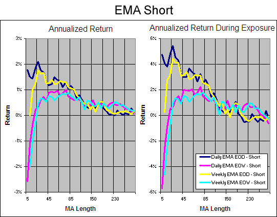
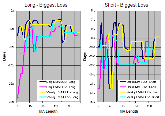
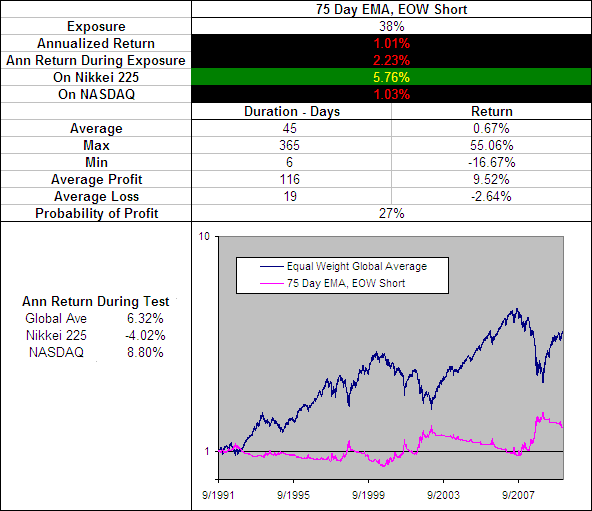
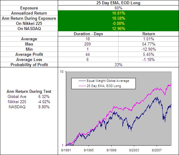
There are a vast number of technical indicators out there but which ones are best?  Are any of them suitable for use in a mechanical trading model?  Do any of them actually provide value over a buy and hold approach?  In my experience most of the publicly available technical indicators are of little, if any value.  All of our best performing models are build on completely new ideas that deviate from conventional approaches to technical analysis almost entirely.

But questions remain: what length of moving average provides the best signals?  Is it better to use a simple or exponential moving average?  Quality answers to these questions are few and far between and often the process people use to establish such answers are majorly flawed.

.

Common Flaws in Testing Technical Indicators and Systems

.

  • Curve Fitting – Only Testing On One Stock or Index (usually the S&P 500) Even if a test period covers many years of data to only test one index will produce results that fit that curve.  Also the US market has been one of the top performers over the last 100 years but will it be a top performer over the next 100?  Japan has experienced a bear market over the last 20 years so vicious that it has seen the the Nikkei 225 down over 80% from its peak.  To get an accurate idea of the effectiveness of an indicator it must be tested on several unrelated securities across the full spectrum of performance possibilities..
  • Testing A Range Of Individual Securities There are several misleading factors that come from testing a range of individual securities, the most troublesome one being the survivor-ship bias.  If I was to test a random selection of stocks then one necessary criteria would be to select from a group of stocks that had been around long enough to provide adequate data for testing.  But by selecting from stocks with enough data I would only be selecting randomly from stocks that had survived over that period and would be ignoring those that failed or had been de-listed.  This is not how things work in the real world and would produce artificially inflated results..Another challenge with testing idividual securities is choosing the sellection criteria for which stocks to include.  At which point should a cut off be made based on price, volume, market cap etc?  Some stocks are going to have an excess or lack of volatility and there may be a large amount of noise in the data.  This will make it difficult for even the best technical indicators to produce profitable signals and to limit losses.

.

A Less Flawed Method

.

There is no perfect way to test an indicator or system using historical data because past performance is no guarantee of future results.  However the markets are driven by human emotion and crowd psychology.  I believe that this behavior follows repeated patters and that effective historical testing can identify these patterns.  In this way we can look to the past for an indication of the likely future.

In an attempt to be more effective at identifying patterns that are likely to repeat as opposed to coincidental repetition of behavior from the past, we will test across several global indexes that have many years of accurate data available.  This way there is no survivor-ship bias and each indicator can be tested through varying market types.  Here is a list of the 16 global indexes that will be used for the testing process along with the data range for each:

.

Technical Indicator Test Periods

.

That is a total 109,539 days or 300 years* of data covering extended bull, bear and crab markets.  I am confident that due to the size of this data sample identifying the best parameters for each indicator through brute force of testing them all will not result in curve fitting and the statistics obtained will provide an accurate platform for a bare knuckle, Technical Indicator – Fight for Supremacy.^

.

Human psychology molds the value system that drives a competitive market economy.  And that process is inextricably linked to human nature, which appears essentially immutable and, thus, anchors the future to the past. – Former Fed Chief Alan Greenspan

.

Technical Indicators On The Fight Card (So far) – more

.

Moving Averages – info

.


  • Simple Vs Exponential Moving Averages, CompletedResults
  1. Simple Moving Average (SMA)
  2. Exponential Moving Average (EMA)
  3. Double Exponential Moving Average (D-EMA)

.

  • Double Vs Triple Exponential Moving Average, CompletedResults
  1. Double Exponential Moving Average (D-EMA)
  2. Triple Exponential Moving Average (T-EMA)

.

  • Reduced Lag Moving Averages
  1. Zero Lag EMA (ZL-EMA)
  2. Almost Zero Lag EMA (AZL-EMA)
  3. Zero Lag Error Correcting EMA (EC-EMA)
  4. Hull Moving Average (H-MA)
  5. Modified Moving Average (M-MA)
  6. 3rd Generation Moving Average (3G-MA)

.

  • Weighted Moving Averages, CompletedResults
  1. Weighted Moving Average (W-MA)
  2. Triangular Exponential Moving Average (TriW-MA)
  3. Sine Weighted Moving Average (SW-MA)

.

  • Mixed Moving Averages, CompletedResults
  1. Time Series Forecast or Moving Linear Regression (TSF)
  2. Linear Regression Indicator (LRI)
  3. Wilder’s Smoothing AKA Smoothed MA (WS-MA)
  4. Triangular Simple MA (TriS-MA)

.

Intelligent Moving Averages

.

These require a volatility index or ratio of some kind and we will be testing the following as components:

  1. Standard Deviation Ratio (SDR)
  2. Efficiency Ratio (ER)
  3. Relative Volatility Index (RVI)
  4. Vertical Horizontal Filter (VHF)
  5. Fractal Dimension (D)
  6. Z Score (ZS)
  7. Chaikin’s Volatility (CV) >
  8. Dreiss Choppiness Index (CI) >

> We currently lack High and Low Prices for some test markets.

.


  1. Standard Deviation RatioCompletedResults (SDR-VMA)
  2. Efficiency RatioCompletedResults (ER-VMA)
  3. Relative Volatility IndexCompletedResults (RVI-VMA)
  4. Vertical Horizontal FilterCompletedResults (VHF-VMA)
  5. Fractal Dimension CompletedResults (D-VMA) 
  1. Efficiency RatioCompletedResults (ER-AMA)
  2. Fractal DimensionCompletedResults (D-AMA)
  3. Standard Deviation RatioCompletedResults (SDR-AMA)
  4. Relative Volatility IndexCompletedResults (RVI-AMA)
  5. Vertical Horizontal FilterCompletedResults (VHF-AMA) 
  1. Fractal Adaptive Moving Average (FRAMA) CompletedResults
  2. Standard Deviation Ratio
  3. Efficiency Ratio
  4. Relative Volatility Index
  5. Vertical Horizontal Filter

.

  • Other Intelligent Moving Averages
  1. McGinley Dynamic Indicator
  2. MESA Adaptive Moving Average and Following Average FAMA (MAMA)

.

MACD

  1. Moving Average Crossovers – Completed – Golden Cross – Which is the best?
  2. Moving Average Convergence Divergence (MACD) – CompletedResults
  3. ZeroLag MACD (ZL-MACD)
  4. MACD Z Score (MAC-Z)

.

‘Index’ Indicators

  1. Relative Strength Index (RSI) – CompletedResults
  2. Relative Momentum Index (RMI)
  3. Dynamic Momentum Index (DMI)
  4. Relative Volatility Index (RVI)

.

Oscillators

  1. Stochastic Oscillator (SO)CompletedResults
  2. Stochastic Momentum Index (SMI)
  3. Projection Oscillator (PRO)
  4. Ultimate Oscillator (UO)
  5. Rolling EV Ratio (R-EVR)

.

Mixed Indicators

  1. Parabolic SAR (PSAR)
  2. Aroon (AN)
  3. Directional Movement (DM)
  4. Smoothing the Bollinger %b (SB%b)
  5. Vertical Horizontal Filter (VHF)

.

It is going to take a while to work through all of this and compile the data so we will update it regularly with the latest results.  Are there any indicators that you think we should add to the list or trading systems that you want tested? To be suitable for testing they must be able to produce clear entry and exit signals and not require volume data (we don’t yet have access to enough historical volume).  If you have any of the formulas that we are missing or wish to add an indicator to the fight card then the formula would be preferred in excel format.

And now… for the 1000s in attendance and the millions watching around the world, Ladies and Gentlemen, LLLLLET’S GET READY TO RUMBLE!

.


  • * Unless otherwise stated 104 weeks of data for each index has been ‘left in’ as lead time for indicators that require a lot of data to get their first signal such as a 50 week double exponential moving average.  On some occasions this lead time may not be enough and this could negatively affect the results for an indicator with a massive lead in time because the additional down time (the early 90s) was typically a bullish period globally.
  • ^ All testing has and will be performed mechanically and every effort is made to ensure accuracy but there is the possibility that some errors have over looked.  Please do your own research and remember that the information provided here is for entertainment purposes only.
Log Normal Moving Average

ETF HQ Report – Bears Assert Their Authority

May 24, 2010 – 08:40 am ET

The bears asserted their authority over the last week and the market closed down at levels south of those seen before the big European bailout.  Apparently a trillion dollars will buy you a good time but not a long time these days.  All of the targets set last week have already been reached or exceeded… so please spread the word about this newsletter if you enjoy receiving it (thanks).

I came across an article by Irish journalist Brendan O’Connor’s who made some brilliant observations in the Sunday Independent about the backwards nature of the bailouts and how they are rewarding those who have been the most irresponsible:

“…there is plenty of money in the world, and yet everybody is up to their neck in debt… maybe it’s time to start again.

Maybe it’s time for not just us to default, but for everyone to default.  They (whoever ‘they’ are) will get over it soon enough and they’ll give us more money to buy stuff from them.

It would be a delinquent thing to do, yes.  But if we’ve learn’t anything from all this, and we haven’t really, it’s that being good gets you nowhere.”

.

ETF % Change Comparison

.

ETF % Change Comparison.

For the week ending 16th May; IWM was the top performer and SMH lagged behind but over the last week those roles have reversed.  However the total decline from their peaks is similar across the board apart from DIA that has not been hit quite as hard.

.

What the % Comparison Table Tells Us:

By comparing the performance of the economically sensitive (SMH, QQQQ, IWM, IYT) and the comparatively stable ETFs (SPY and DIA) we can get an indication of the true market direction. The more sensitive areas of the market tend to be the first to initiate a trend change. For example if DIA and SPY sell off heavily while SMH and IWM (Russell 2000 small cap ETF) sell of mildly or continue moving to new highs then this would be very positive and vice versa.

The ‘Average Rank %’ is calculated by subtracting the % change for each ETF from the maximum % change and dividing it by the range for each period. 1-((MAX(% change all ETFs)-ETFs % Change)/(MAX(% change all ETFs)-MIN(% change all ETFs))) The readings for each period are then averaged. This reading is provided because if one ETF was significantly under/out performing the others then a plain high or low rank would not accurately reflect this.

.

1

.

A Look at the Charts

.

SPY

SPY has found support after some sharp declines; this is just the kind of place that consolidation could occur but the bears are still in control.

.

QQQQ

If there is going to be a catalyst for QQQQ it will come from SMH and IWM because they have found much more substantial support.

.SMH

I like the fact that SMH has done a better job of holding onto it’s 200 day SMA than QQQQ and SPY.  Keep an eye on that RSI for a good exit signal on short term bearish trades.

.

IWM

If IWM carries on straight through $62.50 then the markets problems have just begun, this appears unlikely however.

.IYT

If the transports RSI turns bullish along with SMH’s then new lows would be highly unlikely over the next week.

.

1

.

OM3 Weekly Indicator

.

A deteriorating outlook from the OM3 Indicator.

.

How to read the OM3 indicator

The OM3 indicator as with most of our models primarily reads price action and volume. The strong/weak buy/sell signals are self-explanatory. ‘No Signal’ means that the component readings are in conflict and cancel each other out.

The alerts let you know if the cycle is speeding up or slowing down, so when you get at ‘Strong Buy, Bear Alert’ for instance it simply means that the criteria for a strong buy is in place but this weeks cycle reading is weaker (or more bearish) than last weeks reading (the same is true in reverse).

The number of weeks that a signal has been repeated is displayed. Historically a ‘Strong Buy’ signal has lasted for an average of 6 weeks and a maximum of 42 weeks, while a ‘Strong Sell’ has lasted for an average of 4 weeks and a maximum of 16.

This is an indicator not a mechanical trading model. It is useful to assist in analyzing the market but for the best results should be combined with commonsense and support/resistance levels etc.

.

1

.

TransDow & NasDow

.TransDow and NasDow

Most of the profits from the DJT trade have gone now but DJT remains dominant over the Dow.  Surprisingly the NASDAQ has just regained dominance over the Dow which is positive and indicates that the risk level in the market has lowered.

.

What the TransDow Readings tell us:

The TransDow measures dominance between the DJ Transportation Index (DJTI) and the Dow Jones Industrial Average (DJIA). In a strong market the more economically sensitive Transportation Index should be dominant over the DJIA.

Historically the DJTI has been dominant over the Dow 45% of the time. The annualized rate of return from the DJTI during this period was 18.47% with the biggest loss for one trade sitting at -13.27%. The annualized return from the DJIA during the periods it was dominant over the DJTI was just 4.06% and the biggest loss for one trade was -16.13%. A 4% stop-loss is applied to all trades adjusting positions only at the end of the week.

What the NasDow Readings tell us:

The NasDow measures dominance between the NASDAQ and the DJIA. Using the same theory behind the Trans Dow; in a strong market the more economically sensitive NASDAQ should be dominant over the DJIA.

Historically the NASDAQ has been dominant over the DJIA 44% of the time. Taking only the trades when the NASDAQ is above its 40 week moving average the annualized rate of return was 25.47% with the biggest loss for one trade sitting at –8.59%. The annualized rate on the DJIA during the periods it was dominant over the NASDAQ is just 8.88% and the biggest loss for one trade was –12.28%. A 8% stop-loss is applied to all trades adjusting positions only at the end of the week.

.

1

.

LTMF 80 & Liquid Q

.

LTMF 80 and Liquid Q

LTMF 80 has finally moved to cash after giving back most of the profits from a trade that lasted 245 days.  Liquid Q on the other hand still has an open position in QQQQ but is very close to closing out.

.

Historical Stats:

.

LTMF 80 & Liquid Q Stats

.

How The LTMF 80 Works

LTMF stands for Long Term Market Forecaster. It reads volume flows relative to price action and looks for out performance of volume measured on a percentage basis over the prior 12 months. During a sustained rally the readings will reach high levels (near 100%) making it imposable for the volume reading to always outperform price so any reading above 80% will maintain the buy signal. This system has outperformed the market over the last 10 years but performance has been damaged by some nasty losses. It only produces buy signals and only for QQQQ.

How Liquid Q Works

Liquid Q completely ignores price action and instead measures the relative flow of money between a selection of economically sensitive and comparatively stable ares of the market. It looks for times when the smart money is confident and and can be seen by through volume investing heavily is more risky areas due to an expectation of expansion. This system has outperformed the market over the last 10 years and remained in cash through most of the major declines. It only produces buy signals and only for QQQQ. We will provide more performance details on the web site for these systems soon.

.

1

.

Summary

.

Much of the market is down 10% or more over the last 28 days and now some major support levels have been found.  There are a few good reasons to believe that these levels will hold over the short term such as:

  • SMH only declining 1.82% over the last week.
  • Strong buying interest on Friday at support levels.
  • Partially oversold conditions.
  • The NASDAQ regaining dominance over the Dow.

If the market declines continue through support levels before any consolidation can occur then the market is more unhealthy than even the most bearish have predicted.  A more probable outcome is to see some buying interest over the short term before another downward leg.

.

Any disputes, questions, queries, comments or theories are most welcome in the comments section below.

.

Derry

And the Team @ ETF HQ

“Equipping you to win on Wall St so that you can reach your financial goals.”

.

P.S Like ETFHQ on Facebook – HERE

.

1

.

The Devils Dictionary – P

P/E Ratio – The percentage of investors wetting their pants as the market keeps crashing.

Profit – An archaic word no longer in use.

Q

Quantitative Easing – A regulatory approach based on the point in Western movies when the sheriff, having fired all available bullets, in an act of final desperation throws his gun at the bad guys.  See also Inflation, Hyper.

ETF HQ Report – The Bears Are In Control

May 17, 2010 – 07:15 am ET

It is amazing what you can buy with a Trillion dollars and the market was up violently on Monday but nothing has really improved from a technical perspective in fact, it has deteriorated.

.

ETF % Change Comparison

.

ETF % Change Comparison

IWM had an amazingly good week and advanced over 6% while SMH was the worst performer advancing a comparatively small 1.7%.  Of the 6 influential ETFs, SMH has been the worst performer by every measure including being the first to peak 29 days ago.  This is concerning because the semiconductors tend to show the markets true direction.

.

What the % Comparison Table Tells Us:

By comparing the performance of the economically sensitive (SMH, QQQQ, IWM, IYT) and the comparatively stable ETFs (SPY and DIA) we can get an indication of the true market direction. The more sensitive areas of the market tend to be the first to initiate a trend change. For example if DIA and SPY sell off heavily while SMH and IWM (Russell 2000 small cap ETF) sell of mildly or continue moving to new highs then this would be very positive and vice versa.

The ‘Average Rank %’ is calculated by subtracting the % change for each ETF from the maximum % change and dividing it by the range for each period. 1-((MAX(% change all ETFs)-ETFs % Change)/(MAX(% change all ETFs)-MIN(% change all ETFs))) The readings for each period are then averaged. This reading is provided because if one ETF was significantly under/out performing the others then a plain high or low rank would not accurately reflect this.

.

1

.

A Look at the Charts

.

SPY

SPY has finally broken the bullish volume trend that has existed since March 2009 indicating that we have returned to a bear market.

.

QQQQ

QQQQ ended the week lower than it opened on Monday showing that the enthusiasm for the latest round of easy money is fading.

.SMH

SMH is not offering any encouraging signs.

.

IWM

It is good to see the small caps holding together so well as they are highly economically sensitive but for now best case scenario is likely to be consolidation.

.

IYT

The Transports also closed the week below Mondays open.  They have performed so well over the last few months which is unusual behavior if we are experiencing a major market reversal.  The maintenance of support at $77.50 will be important if the bulls are to stage a comeback.

.

1

.

OM3 Weekly Indicator

.

OM3 Indicator

Not really decisive signals from the OM3 Indicator but far from healthy.

.

How to read the OM3 indicator

The OM3 indicator as with most of our models primarily reads price action and volume. The strong/weak buy/sell signals are self-explanatory. ‘No Signal’ means that the component readings are in conflict and cancel each other out.

The alerts let you know if the cycle is speeding up or slowing down, so when you get at ‘Strong Buy, Bear Alert’ for instance it simply means that the criteria for a strong buy is in place but this weeks cycle reading is weaker (or more bearish) than last weeks reading (the same is true in reverse).

The number of weeks that a signal has been repeated is displayed. Historically a ‘Strong Buy’ signal has lasted for an average of 6 weeks and a maximum of 42 weeks, while a ‘Strong Sell’ has lasted for an average of 4 weeks and a maximum of 16.

This is an indicator not a mechanical trading model. It is useful to assist in analyzing the market but for the best results should be combined with commonsense and support/resistance levels etc.

.

1

.

TransDow & NasDow

.TransDow and NasDow

The Transports remain dominant over the Dow and have outperformed the Dow 8.54% to 2.86% over the last 77 days.  On a negative note the Dow is once again dominant over the NASDAQ, this raises the risk level in the market.

.

What the TransDow Readings tell us:

The TransDow measures dominance between the DJ Transportation Index (DJTI) and the Dow Jones Industrial Average (DJIA). In a strong market the more economically sensitive Transportation Index should be dominant over the DJIA.

Historically the DJTI has been dominant over the Dow 45% of the time. The annualized rate of return from the DJTI during this period was 18.47% with the biggest loss for one trade sitting at -13.27%. The annualized return from the DJIA during the periods it was dominant over the DJTI was just 4.06% and the biggest loss for one trade was -16.13%. A 4% stop-loss is applied to all trades adjusting positions only at the end of the week.

What the NasDow Readings tell us:

The NasDow measures dominance between the NASDAQ and the DJIA. Using the same theory behind the Trans Dow; in a strong market the more economically sensitive NASDAQ should be dominant over the DJIA.

Historically the NASDAQ has been dominant over the DJIA 44% of the time. Taking only the trades when the NASDAQ is above its 40 week moving average the annualized rate of return was 25.47% with the biggest loss for one trade sitting at –8.59%. The annualized rate on the DJIA during the periods it was dominant over the NASDAQ is just 8.88% and the biggest loss for one trade was –12.28%. A 8% stop-loss is applied to all trades adjusting positions only at the end of the week.

.

1

.

LTMF 80 & Liquid Q

.

LTMF 80 and Liquid Q

This is positive, both the LTMF 80 and Liquid Q still have open positions in QQQQ.  LTMF 80 however is not far off issuing a sell signal.

.

Historical Stats:

.

LTMF 80 & Liquid Q Stats

.

How The LTMF 80 Works

LTMF stands for Long Term Market Forecaster. It reads volume flows relative to price action and looks for out performance of volume measured on a percentage basis over the prior 12 months. During a sustained rally the readings will reach high levels (near 100%) making it imposable for the volume reading to always outperform price so any reading above 80% will maintain the buy signal. This system has outperformed the market over the last 10 years but performance has been damaged by some nasty losses. It only produces buy signals and only for QQQQ.

How Liquid Q Works

Liquid Q completely ignores price action and instead measures the relative flow of money between a selection of economically sensitive and comparatively stable ares of the market. It looks for times when the smart money is confident and and can be seen by through volume investing heavily is more risky areas due to an expectation of expansion. This system has outperformed the market over the last 10 years and remained in cash through most of the major declines. It only produces buy signals and only for QQQQ. We will provide more performance details on the web site for these systems soon.

.

1

.

Summary

.

I am at a stretch to find positive things to say about the current market.  There is the fact that the small caps have been holding together comparatively well and the fact that LTMF 80 and Liquid Q still have open trades.  Otherwise, volume flows are bearish across the board, the market is no longer oversold and no one has another Trillion dollar bailout surprise up their sleeve.  The bears are in control and there is nothing apparent that the bulls can do to stop them for now.

.

Any disputes, questions, queries, comments or theories are most welcome in the comments section below.

.

Derry

And the Team @ ETF HQ

“Equipping you to win on Wall St so that you can reach your financial goals.”

.

P.S Like ETFHQ on Facebook – HERE

.

1

.

The Devils Dictionary – N

NINJA Loan – No Income No Job No Assets.  A type of loan whose source of repayment is a miracle but when pooled creates a new security of which 80% is somehow rated AAA due to the theory of diversification.  Merton and Miller describe diversification as the only free lunch in the capital markets.  This has now been refined as a necessary condition since without free lunch every one on Wall Street will starve to death.

O

OIBITDA – Operating Income Before Interest Taxes Depreciation and Amortization.  The primary valuation measure used by Bernie Madoff’s accountants.  Currently being reformulated as OYBITDA.

Option – A financial instrument that offers multiple ways of losing money.  If being long vega doesn’t kill you, the decay will.

“This 2nd wind can create some impressive gains but usually on light volume and when it ends it tends to end in tears… When risk levels are perceived to be low the market is more easily spooked and this tends to lead to sharper and more severe reversals.” – April 12, 2010

ETF HQ Report – When she was good she was very very good…

May 10, 2010 – 07:35 am ET

…And when she was bad she was horrid!  The warning signs of a market tantrum have around for some time now and were clear enough for us to cash up all bullish positions as mentioned in our last newsletter – Cashed Up With A Few Shorts.

April 12, we cautioned “This 2nd wind can create some impressive gains but usually on light volume and when it ends it tends to end in tears… When risk levels are perceived to be low the market is more easily spooked and this tends to lead to sharper and more severe reversals.”

If the last week has been anything it has been a sharp and severe reversal.  If this kind of analysis has been of use to you then please spread the word about this newsletter.  We also identified the beginning of the last bullish leg and shared the analysis we used to do so with you for free.  So please get on twitter, the chat rooms, newsgroups, Facebook, email etc and help us grow.  Thanks.  We are certainly not always right but simply look to work with the probabilities.

.

ETF % Change Comparison

.

ETF % Change Comparison

When you stop and look at the numbers they are quite scary.  Don Beasley said that “Market Timing is winning by not losing” and we were certainly able to avoid some significant losses over the last week and lock in some tasty gains.  The more economically sensitive SMH, QQQQ, IWM and IYT are the furthest from their highs indicating that these declines are likely to be more than just profit taking.

.

What the % Comparison Table Tells Us:

By comparing the performance of the economically sensitive (SMH, QQQQ, IWM, IYT) and the comparatively stable ETFs (SPY and DIA) we can get an indication of the true market direction. The more sensitive areas of the market tend to be the first to initiate a trend change. For example if DIA and SPY sell off heavily while SMH and IWM (Russell 2000 small cap ETF) sell of mildly or continue moving to new highs then this would be very positive and vice versa.

The ‘Average Rank %’ is calculated by subtracting the % change for each ETF from the maximum % change and dividing it by the range for each period. 1-((MAX(% change all ETFs)-ETFs % Change)/(MAX(% change all ETFs)-MIN(% change all ETFs))) The readings for each period are then averaged. This reading is provided because if one ETF was significantly under/out performing the others then a plain high or low rank would not accurately reflect this.

.

1

.

A Look at the Charts

.

SPY

The ‘healthy targets’ set last week have all been smashed in an ‘unhealthy way’ and further volatility is likely.

.

QQQQ

QQQQ has broken its long term bullish trend which indicates a bearish trend change.

.

Another bearish volume trend from SMH confirming the trend change.

.

IWM

The small caps volume flows have also turned bearish.

.

IYT

That’s four out of five with bearish volume pointing towards a return to the bear market.

.

1

.

OM3 Weekly Indicator

.

OM3 Weekly Indicator

The OM3 indicator is not strongly bearish with a number of ‘Weak Sells’.

.

How to read the OM3 indicator

The OM3 indicator as with most of our models primarily reads price action and volume. The strong/weak buy/sell signals are self-explanatory. ‘No Signal’ means that the component readings are in conflict and cancel each other out.

The alerts let you know if the cycle is speeding up or slowing down, so when you get at ‘Strong Buy, Bear Alert’ for instance it simply means that the criteria for a strong buy is in place but this weeks cycle reading is weaker (or more bearish) than last weeks reading (the same is true in reverse).

The number of weeks that a signal has been repeated is displayed. Historically a ‘Strong Buy’ signal has lasted for an average of 6 weeks and a maximum of 42 weeks, while a ‘Strong Sell’ has lasted for an average of 4 weeks and a maximum of 16.

This is an indicator not a mechanical trading model. It is useful to assist in analyzing the market but for the best results should be combined with commonsense and support/resistance levels etc.

.

1

.

TransDow & NasDow

.

TransDow & NasDow

Now this is interesting… On Friday the NASDAQ become dominant over the Dow which is a very bullish sign and the Transports remain dominant over the Dow which is also very positive.  Most of the worst market declines are seen when the Dow is dominant.

.

What the TransDow Readings tell us:

The TransDow measures dominance between the DJ Transportation Index (DJTI) and the Dow Jones Industrial Average (DJIA). In a strong market the more economically sensitive Transportation Index should be dominant over the DJIA.

Historically the DJTI has been dominant over the Dow 45% of the time. The annualized rate of return from the DJTI during this period was 18.47% with the biggest loss for one trade sitting at -13.27%. The annualized return from the DJIA during the periods it was dominant over the DJTI was just 4.06% and the biggest loss for one trade was -16.13%. A 4% stop-loss is applied to all trades adjusting positions only at the end of the week.

What the NasDow Readings tell us:

The NasDow measures dominance between the NASDAQ and the DJIA. Using the same theory behind the Trans Dow; in a strong market the more economically sensitive NASDAQ should be dominant over the DJIA.

Historically the NASDAQ has been dominant over the DJIA 44% of the time. Taking only the trades when the NASDAQ is above its 40 week moving average the annualized rate of return was 25.47% with the biggest loss for one trade sitting at –8.59%. The annualized rate on the DJIA during the periods it was dominant over the NASDAQ is just 8.88% and the biggest loss for one trade was –12.28%. A 8% stop-loss is applied to all trades adjusting positions only at the end of the week.

.

1

.

LTMF 80 & Liquid Q

.

Another surprising but positive sign; Liquid Q triggered a new bullish position in QQQQ on Friday.  The signal for LTMF 80 is also still active but on the verge of being closed.  With the market being oversold this could turn out to be a good trade but I see it as too risky.

.

Historical Stats:

.

LTMF 80 & Liquid Q Stats

.

How The LTMF 80 Works

LTMF stands for Long Term Market Forecaster. It reads volume flows relative to price action and looks for out performance of volume measured on a percentage basis over the prior 12 months. During a sustained rally the readings will reach high levels (near 100%) making it imposable for the volume reading to always outperform price so any reading above 80% will maintain the buy signal. This system has outperformed the market over the last 10 years but performance has been damaged by some nasty losses. It only produces buy signals and only for QQQQ.

How Liquid Q Works

Liquid Q completely ignores price action and instead measures the relative flow of money between a selection of economically sensitive and comparatively stable ares of the market. It looks for times when the smart money is confident and and can be seen by through volume investing heavily is more risky areas due to an expectation of expansion. This system has outperformed the market over the last 10 years and remained in cash through most of the major declines. It only produces buy signals and only for QQQQ. We will provide more performance details on the web site for these systems soon.

.

1

.

Summary

.

Based on my discretionary technical analysis the market has completed a confirmed bearish trend change due to bearish volume flows from QQQQ, SMH, IWM and IYT along with the loss of several support levels.  However in such a volatile market after such harsh declines the possibility of an oversold bounce is good.  In fact looking at the market futures now I see they are well up on news about new bailouts organized for European nations burdened by heavy debt.

I am a big advocate of taking the easy trades and passing on the difficult others.  You don’t have to make many good trades each year as long as you don’t make too many bad ones.  This market is changing so quickly, you need to be very nimble not to get burnt.

If you are still in the market then sit on your hands for now.  There are fresh buy signals from the NasDow and Liquid Q and the market has found several support levels.  As long as the market maintains these levels then there is still hope for the bulls:

  • SPY $110
  • QQQQ $45
  • SMH $27
  • IWM $65
  • IYT 100day SMA.

Should there be a close below these levels then there is little/no hope for the bull market.

If you are already out of the market then wait until things are more clear before going long or short.  Much of the easy money has probably already gone from the short side and when volume flows are bearish it is a very risky time to go long.

.

Any disputes, questions, queries, comments or theories are most welcome in the comments section below.

.

Derry

And the Team @ ETF HQ

“Equipping you to win on Wall St so that you can reach your financial goals.”

.

P.S Like ETFHQ on Facebook – HERE

.

1

.

The Devils Dictionary – M.

.

Mark To Model – The use of a mathematical model to value complex securities, such as CDOs.  “The combination of precise formulas with highly imprecise assumptions can be used to establish practically any value one wishes” – Ben Graham.  Particularly useful to investors who wish to delay the recognition of a loss.

Market Correction – The day after you buy stocks.

Moody – State of mind after a just-issued security gets downgraded fro AAA to CCC

“This 2nd wind can create some impressive gains but usually on light volume and when it ends it tends to end in tears… When risk levels are perceived to be low the market is more easily spooked and this tends to lead to sharper and more severe reversals.” – April 12, 2010

ETF HQ Report – Cashed Up With A Few Shorts

May 03, 2010 – 02:10 am ET

Last week I warned that “the risk over the short term should not be ignored despite the recent exceptional performance” and the last few days have been a clear indication as to why.  For several weeks now the risk/reward ratio has been slipping away from the bulls and is now not far from tipping into the bears favor.

.

ETF % Change Comparison

.

ETF % Change Comparison

SMH was the big loser for the week which is concerning because of the influence it has over the NASDAQ, while IYT made a new high on just Thursday.  From a longer term perspective is is good to see the Small caps (IWM) and the Transports (IYT) with the top performance ranks because they are both highly economically sensitive.

.

What the % Comparison Table Tells Us:

By comparing the performance of the economically sensitive (SMH, QQQQ, IWM, IYT) and the comparatively stable ETFs (SPY and DIA) we can get an indication of the true market direction. The more sensitive areas of the market tend to be the first to initiate a trend change. For example if DIA and SPY sell off heavily while SMH and IWM (Russell 2000 small cap ETF) sell of mildly or continue moving to new highs then this would be very positive and vice versa.

The ‘Average Rank %’ is calculated by subtracting the % change for each ETF from the maximum % change and dividing it by the range for each period. 1-((MAX(% change all ETFs)-ETFs % Change)/(MAX(% change all ETFs)-MIN(% change all ETFs))) The readings for each period are then averaged. This reading is provided because if one ETF was significantly under/out performing the others then a plain high or low rank would not accurately reflect this.

.

1

.

A Look at the Charts

.

SPY

Over the short term SPY is likely to encounter profit taking but it can suffer from some considerable weakness before breaking its long term bullish volume trend.  QQQQ will give a better indication of the true direction of the market moving forward.

.

QQQQ

If QQQQ breaks its long term volume trend then it will be very difficult for the bull market to continue.  The next two weeks will be crucial as an indication of the bulls strength.

.

SMH

I will be keeping a close eye on SMH’s volume trend for confirmation of direction moving forward but for now it remains bullish.

.

IWM

If we see profit taking from here then it is inevitable that IWM will break its bullish volume trend.  If this break is confirmed by SMH also doing the same then you would be wise to become very defensive with your positions.

.

IYT
It is difficult to have a negative view of the market over the longer term when the transports are performing so well and on such healthy volume.  Hopefully this is an indication that any profit taking will not evolve into a trend change.

.

1

.

OM3 Weekly Indicator

.

OM3 Indicator
The OM3 indicator has issued its first ‘Bear Alert’ in 11 weeks which is not surprising after a week of declines on a overbought market.

.

How to read the OM3 indicator

The OM3 indicator as with most of our models primarily reads price action and volume. The strong/weak buy/sell signals are self-explanatory. ‘No Signal’ means that the component readings are in conflict and cancel each other out.

The alerts let you know if the cycle is speeding up or slowing down, so when you get at ‘Strong Buy, Bear Alert’ for instance it simply means that the criteria for a strong buy is in place but this weeks cycle reading is weaker (or more bearish) than last weeks reading (the same is true in reverse).

The number of weeks that a signal has been repeated is displayed. Historically a ‘Strong Buy’ signal has lasted for an average of 6 weeks and a maximum of 42 weeks, while a ‘Strong Sell’ has lasted for an average of 4 weeks and a maximum of 16.

This is an indicator not a mechanical trading model. It is useful to assist in analyzing the market but for the best results should be combined with commonsense and support/resistance levels etc.

.

1

.

TransDow & NasDow

.
TransDow & NasDow
No change here, the Transports remain dominant over the Dow and the Dow remains dominant over the NASDAQ.

.

What the TransDow Readings tell us:

The TransDow measures dominance between the DJ Transportation Index (DJTI) and the Dow Jones Industrial Average (DJIA). In a strong market the more economically sensitive Transportation Index should be dominant over the DJIA.

Historically the DJTI has been dominant over the Dow 45% of the time. The annualized rate of return from the DJTI during this period was 18.47% with the biggest loss for one trade sitting at -13.27%. The annualized return from the DJIA during the periods it was dominant over the DJTI was just 4.06% and the biggest loss for one trade was -16.13%. A 4% stop-loss is applied to all trades adjusting positions only at the end of the week.

What the NasDow Readings tell us:

The NasDow measures dominance between the NASDAQ and the DJIA. Using the same theory behind the Trans Dow; in a strong market the more economically sensitive NASDAQ should be dominant over the DJIA.

Historically the NASDAQ has been dominant over the DJIA 44% of the time. Taking only the trades when the NASDAQ is above its 40 week moving average the annualized rate of return was 25.47% with the biggest loss for one trade sitting at –8.59%. The annualized rate on the DJIA during the periods it was dominant over the NASDAQ is just 8.88% and the biggest loss for one trade was –12.28%. A 8% stop-loss is applied to all trades adjusting positions only at the end of the week.

.

1

.

LTMF 80 & Liquid Q

.

LTMF 80 & Liquid Q

The LTMF 80 still has an active trade on QQQQ while Liquid Q remains in cash.

.

Historical Stats:

.

LTMF 80 & Liquid Q Stats

.

How The LTMF 80 Works

LTMF stands for Long Term Market Forecaster. It reads volume flows relative to price action and looks for out performance of volume measured on a percentage basis over the prior 12 months. During a sustained rally the readings will reach high levels (near 100%) making it imposable for the volume reading to always outperform price so any reading above 80% will maintain the buy signal. This system has outperformed the market over the last 10 years but performance has been damaged by some nasty losses. It only produces buy signals and only for QQQQ.

How Liquid Q Works

Liquid Q completely ignores price action and instead measures the relative flow of money between a selection of economically sensitive and comparatively stable ares of the market. It looks for times when the smart money is confident and and can be seen by through volume investing heavily is more risky areas due to an expectation of expansion. This system has outperformed the market over the last 10 years and remained in cash through most of the major declines. It only produces buy signals and only for QQQQ. We will provide more performance details on the web site for these systems soon.

.

1

.

Summary

.

If IWM, SMH and QQQQ break their bullish volume trends then we are likely to see some significant profit taking.  In such case, depending on your investing time frame you would be wise to at least become very defensive with your positions.  The declines so far have not been enough to warrant bearish positions on the broad market but they have been enough to encourage me to cash up all my bullish positions and take a few select bearish trades.

It is always a good idea to keep an eye on market action and have a defined plan of attack for each possible scenario but over the next few weeks I urge you to be particularly attentive.

.

Any disputes, questions, queries, comments or theories are most welcome in the comments section below.

.

Derry

And the Team @ ETF HQ

“Equipping you to win on Wall St so that you can reach your financial goals.”

.

P.S We have been doing a lot of research recently on the performance of common technical indicators across a 16 global global markets going back to 1989.  Over the years I have found most of the popular indicators of little use and want to reveal which ones (if any) actually add value over a buy and hold approach.  I will be publishing the results so let me know if there is something you would like us to test.

P.P.S Like ETFHQ on Facebook – HERE

.

1

.

The Devils Dictionary – L.

.

Leverage – The act of turning your problem into our problem.  In theory, any gains from leverage are offset by a commensurate increase in risk.  In practice, this theory is ignored.

Liquidity – A vogue term which provides an aura of financial sophistication to its user, as in, “an excess of liquidity drove the market higher, today” or “a lack of liquidity drove the market lower, today.”

Loser’s Game – The recognition that investors, in aggregate, are engaged in a zero-sum game – one person’s gains are equal to another’s losses, less the cost of transactions.  Those who make fewest mistakes and have the lowest management expenses end up winning the loser’s game.  The irrefutable consequence of this finding is that institutional funds should be largely invested in low-cost index funds.  It is a tribute to the marketing power of the Wall Street that this isn’t the case.

Lucky Fool – A person who owes his success to luck rather than skill, but is unaware of the fact.  As it takes several decades of performance data for statisticians to distinguish luck from skill in the investment game, the number of lucky fools on Wall Street must always remain indeterminate.

ETF HQ Report – Underestimated

April 26, 2010 – 08:45 am ET

Well I was simply wrong about the markets ability to see new highs so soon and that is all there is to it.  I underestimated the strength of the rally and was very surprised to see things moving higher with such vigor over the last week.  Short term weakness has been a likely outcome for a while now but the market has refused to see anything of the sort.  This is very frustrating for those still sitting on the sidelines and pleasantly surprising for those of us reaping the benefits.

.

ETF % Change Comparison

.

ETF % Change Comparison

As you can see all of the influential ETFs except SMH are sitting at new peaks.  SMH was the worst performer over the last week but the best over the last two weeks.  It is nice to see IWM, IYT, SMH and QQQQ with the highest performance ranks as this shows the more economically sensitive areas of the market are leading it higher.

.

What the % Comparison Table Tells Us:

By comparing the performance of the economically sensitive (SMH, QQQQ, IWM, IYT) and the comparatively stable ETFs (SPY and DIA) we can get an indication of the true market direction. The more sensitive areas of the market tend to be the first to initiate a trend change. For example if DIA and SPY sell off heavily while SMH and IWM (Russell 2000 small cap ETF) sell of mildly or continue moving to new highs then this would be very positive and vice versa.

The ‘Average Rank %’ is calculated by subtracting the % change for each ETF from the maximum % change and dividing it by the range for each period. 1-((MAX(% change all ETFs)-ETFs % Change)/(MAX(% change all ETFs)-MIN(% change all ETFs))) The readings for each period are then averaged. This reading is provided because if one ETF was significantly under/out performing the others then a plain high or low rank would not accurately reflect this.

.

1

.

A Look at the Charts

.

SPY

The RSI remains bearish on SPY but all other indications are strong particularly over the longer term.

.

QQQQ

You have to go back to the 90s before you find rallies that look like this one.  Volume flows are strong but new short term bullish trades are just too risky.

.

SMH

I will be keeping a close eye on SMHs ability to maintain its volume trend and bullish RSI but for now all signs are positive.

.

IWM

This rally just takes your breath away, it is easy to make money when the market is behaving like this.  As with SMH I will be keeping a close eye on IWMs volume trend and RSI.  The fun will be over eventually.

.

IYT
IYT continues to confirm the strength of the bull market and has very strong volume flows.

.

1

.

OM3 Weekly Indicator

.

OM3 Indicator
All indications remain bullish here but these buy signals have been active for two months now which makes them statistically old.

.

How to read the OM3 indicator

The OM3 indicator as with most of our models primarily reads price action and volume. The strong/weak buy/sell signals are self-explanatory. ‘No Signal’ means that the component readings are in conflict and cancel each other out.

The alerts let you know if the cycle is speeding up or slowing down, so when you get at ‘Strong Buy, Bear Alert’ for instance it simply means that the criteria for a strong buy is in place but this weeks cycle reading is weaker (or more bearish) than last weeks reading (the same is true in reverse).

The number of weeks that a signal has been repeated is displayed. Historically a ‘Strong Buy’ signal has lasted for an average of 6 weeks and a maximum of 42 weeks, while a ‘Strong Sell’ has lasted for an average of 4 weeks and a maximum of 16.

This is an indicator not a mechanical trading model. It is useful to assist in analyzing the market but for the best results should be combined with commonsense and support/resistance levels etc.

.

1

.

TransDow & NasDow

.
TransDow and NasDow
The Transports remain dominant over the Dow and have doubled the Dow’s returns during the last 56 days.  The Dow is dominant over the NASDAQ and has about matched the performance of the NASDAQ over the last 42 days.

.

What the TransDow Readings tell us:

The TransDow measures dominance between the DJ Transportation Index (DJTI) and the Dow Jones Industrial Average (DJIA). In a strong market the more economically sensitive Transportation Index should be dominant over the DJIA.

Historically the DJTI has been dominant over the Dow 45% of the time. The annualized rate of return from the DJTI during this period was 18.47% with the biggest loss for one trade sitting at -13.27%. The annualized return from the DJIA during the periods it was dominant over the DJTI was just 4.06% and the biggest loss for one trade was -16.13%. A 4% stop-loss is applied to all trades adjusting positions only at the end of the week.

What the NasDow Readings tell us:

The NasDow measures dominance between the NASDAQ and the DJIA. Using the same theory behind the Trans Dow; in a strong market the more economically sensitive NASDAQ should be dominant over the DJIA.

Historically the NASDAQ has been dominant over the DJIA 44% of the time. Taking only the trades when the NASDAQ is above its 40 week moving average the annualized rate of return was 25.47% with the biggest loss for one trade sitting at –8.59%. The annualized rate on the DJIA during the periods it was dominant over the NASDAQ is just 8.88% and the biggest loss for one trade was –12.28%. A 8% stop-loss is applied to all trades adjusting positions only at the end of the week.

.

1

.

LTMF 80 & Liquid Q

.

LTMF 80’s trade on QQQQ remains open and is showing a return of almost 20% while Liquid Q remains in cash.

.

Historical Stats:

.

LTMF 80 & Liquid Q Stats

.

How The LTMF 80 Works

LTMF stands for Long Term Market Forecaster. It reads volume flows relative to price action and looks for out performance of volume measured on a percentage basis over the prior 12 months. During a sustained rally the readings will reach high levels (near 100%) making it imposable for the volume reading to always outperform price so any reading above 80% will maintain the buy signal. This system has outperformed the market over the last 10 years but performance has been damaged by some nasty losses. It only produces buy signals and only for QQQQ.

How Liquid Q Works

Liquid Q completely ignores price action and instead measures the relative flow of money between a selection of economically sensitive and comparatively stable ares of the market. It looks for times when the smart money is confident and and can be seen by through volume investing heavily is more risky areas due to an expectation of expansion. This system has outperformed the market over the last 10 years and remained in cash through most of the major declines. It only produces buy signals and only for QQQQ. We will provide more performance details on the web site for these systems soon.

.

1

.

Summary

.

The longer this rally defies gravity the more impatient, emotional people are going to jump on board and ultimately this will lead to a sharper and more painful pull back.  There are currently no bearish indications long term but the risk over the short term should not be ignored despite the recent exceptional performance.  Be decisive and only take action when you have probability on your side.

.

Any disputes, questions, queries, comments or theories are most welcome in the comments section below.

.

Derry

And the Team @ ETF HQ

“Equipping you to win on Wall St so that you can reach your financial goals.”

.

P.S Thanks to those who shared their thoughts on the Goldman Sachs ‘fraud’.  Bill Fleckenstein wrote an exceptional article called Goldman-deal gamblers knew the score.  He makes some great points including:

  • “Among professionals, the fact that somebody else has a different opinion usually isn’t enough to change one’s viewpoint.”
  • “Let’s say the housing market hadn’t melted down… can you imagine the SEC today suing Goldman Sachs because it hadn’t disclosed to Paulson that the buyers had picked some of the securities?”
  • “If the SEC really wants to get at the culprits of this deal, it ought to go after the ratings agencies, as should Congress.”
  • “The SEC also ought to consider pursuing the Financial Accounting Standards Board for helping denigrate accounting standards to the point that so much smoke and mirrors could pass for legitimacy.”

Rating Agency Data Aided Wall Street in Deals – Another article worth reading that explains how rubbish investments achieved such high ratings.  It turns out that banks were given the ‘secret formulas’ by the rating agencies so they could start with the answer and work backwards, reverse-engineering their investments for a top rating.

P.S.S Like ETFHQ on Facebook – HERE

.

1

.

The Devils Dictionary – I.

.

Initial Public Offering – An exit route for alternative investment managers who expect the jig is up.

Insider Trading – Just good research.

Institutional Investor – Investor who’s now locked up in a nuthouse.

Investment Bankers – Financiers who find clever and original ways to put their own interests before those of their clients.

Investment Banks – Wall Street firms that find clever and original ways to bring the financial system to the brink.