S&P 500 Sectors – Volume, Correlation and Beta

It has been said that stocks held by the major ETFs have become more correlated over time as the popularity and volume of these ETFs has increased.  As you know each ETF physically holds a basket of stocks in the weighting if the index or asset group that they are designed to emulate.  If enough trading of the ETF occurs then in theory the tail could wag the dog and move the underlying assets that are supposed to be being tracked.

Volume, (with regard to financial securities) refers to the number of trades that have taken place.  This is a useful useful measure but it isn’t relative.  If two stocks both have a daily volume of 100,000 but one is trading at $4 and the other at $400, then a volume comparison does not make sense.  A more useful measure is Trading Volume Value (TVV) which is simply the price times the volume.

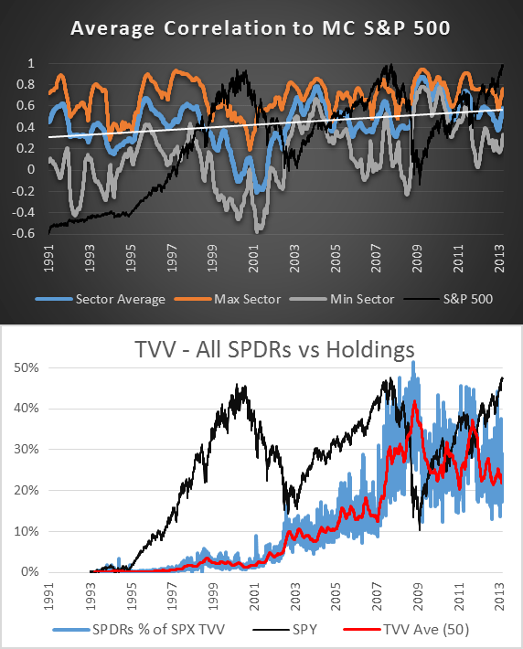
SPY is now the worlds most heavily traded ETF but on day 1, January 29th, 1993 its TVV was just $44.1 million; a tiny fraction of the 7.3 trillion for all of the S&P 500 stocks combined.  Fast forward to November 20th, 2008 and the TVV for SPY and the other SPDR sector ETFs was over 50% of the TVV for the entire S&P 500.  We are talking about $70 trillion dollars flowing through the SPDRs in one day!!  If the tail is 52% of the dog then who is waging who?  Here is a chart:

spx-correlation-tvv

To measure the change in correlation for the constituents of the S&P 500 over time, I first took the average 252 day (one trading year) correlation relative to the S&P 500 for each individual stock split by sector (creating 9 sector averages).  Then on the chart ‘Average Correlation To MC S&P 500′ I plotted the average of each sector along with the reading for the sector with the highest and the lowest average correlation.  Below that on the chart ‘TVV – All SPDRs vs Holdings’ you can see the sum of the TVV for SPY and the 9 sector ETFs as a percentage of the TVV for all the S&P 500 stocks.

When the market was falling violently during the first few months of 2009 the average correlation was over 80% and there was very little difference between the most and least correlated sector.  In other words; everything was going down creating a ‘nowhere to hide’ scenario (this pattern is was slightly more pronounced within the sectors themselves).

At the time TVV was at record levels, averaging around 25% but a similar ‘nowhere to hide’ situation was also seen during the bull markets of 2003 and 2004 while TVV at that time was only around 10%.  So we have examples of very high correlation during bull and bear markets, through varying levels of ETF TVV.  So volume on these ETFs certainly has an impact but it is not the only factor.  (see TVV for each sector individually)

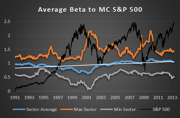
What about beta?  Are the S&P 500 stocks becoming more or less volatile in relation to the SPX?
spx-beta

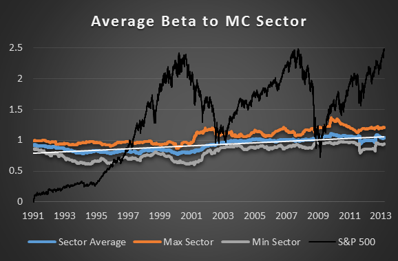
Clearly there has been an upward drift in beta from the S&P 500 constituents over the last 20 years but at all times there has remained a healthy spread between high and low beta sectors.  Within each sector however that spread is much smaller:

spx-sector-beta


Conclusion

Trading Volume Value (TVV) has increased dramatically on the SPDRs since SPY was first introduced back in 1993.  This increase can be seen having an impact on the correlation of the S&P 500 constituents but is clearly not the only factor that causes correlation to fluctuate.  I would speculate that automated trading algorithms and qualitative easing by the Fed are also major factors (among others).

During some periods correlation will be to such level that it will be almost impossible for stock pickers or sector selectors to escape the trend of the broad market.  At such times a specific directional bias will be mandatory as a delta neutral strategy would be an exercise in futility.

Over the last 10 years the average correlation to the S&P 500 has been 56% and for each stock to its sector, 63%.  For this reason you would be unwise to ignore the trend of the broad market and utterly foolish to trade a stock against the trend of its sector.  Yes, the trend is your friend and that friendship is developing.

Stock beta has also shown to be drifting higher over time and while the beta spread does fluctuate it has remained fairly wide for the last 20 years.  This means that at any time risk can be adjusted by taking positions in sectors with higher or lower betas.  Take note however; the beta spread within a sector is much more slight and consistent.

More in this series:

This is part of a research series on the S&P 500 and its Sectors utilizing historical constituent data.  Here is proof that our database is accurate.


S&P Sector Constituent Database – Garbage In, Garbage Out

We are currently engaging in research utilising 23 years of historical constituent data for the S&P 500 sectors.  But if our database isn’t accurate then our test results will be worthless.  I started writing this post about the processes we went through to ensure that the historical data we used was clean and that our constituent list was accurate.  But then I realised that no one cares how many multiple fail safe cross over checks were made or how difficult the process was.  The only thing people care about (the only thing that matters) is being able to prove that the database is accurate.

So how do we prove that we are working with an accurate database?

Well the second half of our S&P 500 Sector constituent list (Sept 2001 – March 2013) came directory from our insider at State Street; the company that actually issues the Select Sector SPDR ETFs.  With the data for this period coming straight from the horses mouth it is safe to say that the accuracy for this period can be relied upon.  It also contains an abundance of information, enough to reconstruct the ETFs, including:

Company Name, Symbol, Exchange, Shares, Float, Float Shares, Multiplier, Adjusted Shares, Last Sale, Previous Close, Index Weight, Index Market Value, Market Value (Unadjusted Shares), Current Cap, Divisor, Previous Cap, Number of Components, Sum Of Adjusted Shares, Calculated Index, Published Index, # of Stocks, Sum of Adjusted Shares, Capitalization Using Unadjusted Shares, Estimated Weight of Index Components in the S&P 500…

The first half of our S&P 500 Sector constituent list however (Feb 1990 – Aug 2001) was compiled from several sources of varying reliability and only consists of dates and symbols.  Plus most of the stocks had to be classified into their sectors manually.

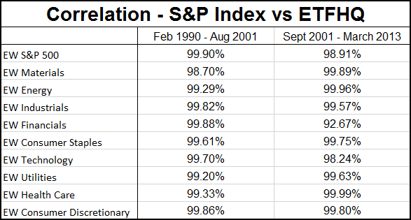
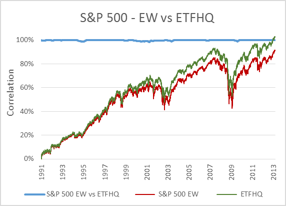
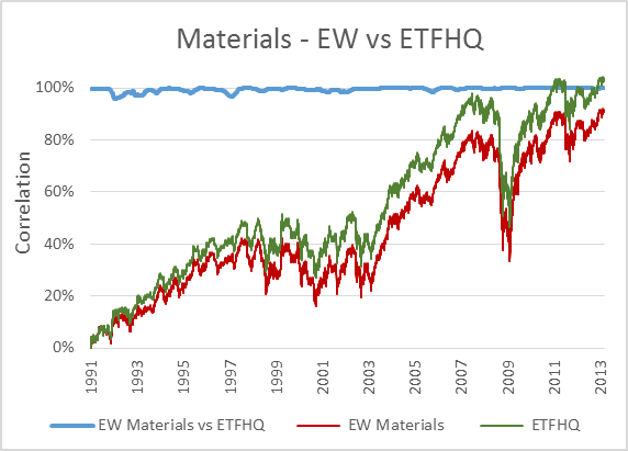
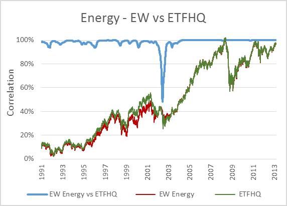
The best way to prove the accuracy of our database then is to reconstruct the sector indices and compare the correlation coefficient for each of the two periods against the actual indices published by S&P.  If our data is good then we should be able to closely reproduce the Equal Weighted S&P 500 Sector Indices.

In this post there is reference to several different indices.  Here are a number of relevant links:

Index and ETF Link Matrix

Market Capitalization Weighted Index Select Sector Index Select Sector SPDR ETF Equal Weight Index Equal Weighted ETF
S&P 500 SPX/GSPC/INX SPY SPW / SPXEW RSP
Materials S5MATR / SPXM IXB XLB S15 RTM
Energy SPN / SPXE IXE XLE S10 RYE
Industrials S5INDU / SPXI IXI XLI S20 RGI
Financials SPF / SPXF IXM XLF S40 RYF
Cons Staples S5CONS / SPXS IXR XLP S30 RHS
Technology S5INFT / SPXT IXT XLK S45 RYT
Utilities S5UTIL / SPXU IXU XLU S55 RYU
Health Care S5HLTH / SPXA IXV XLV S35 RHY
Cons Discret S5COND / SPXD IXY XLY S25 RCD


Now, to keep things simple the ETFHQ constructed indices will be equally weighted on a daily basis rather than quarterly.  For this reason our results won’t be identical to that of the S&P, but this is not an issue.  As long as the level of correlation Feb 1990 – Aug 2001 is not far below the level of correlation Sept 2001 – March 2013 then our hard work and patience has paid off:

Correlation - S&P EW Index vs ETFHQ

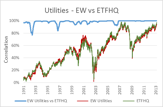
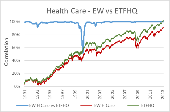
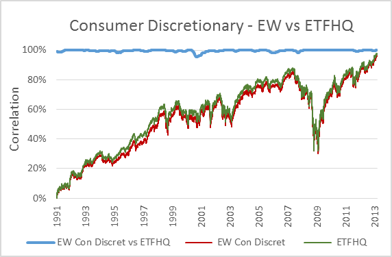
(Special thanks to Mr Anonymous for sending us some data that we needed for these tests).  As you can see above, the results are even better than we could have hoped.  In many cases the correlation for the first half of our data is greater than that for the second.  How is this possible when we know that the data from Sept 2001 – March 2013 is from a reliable source?  Because during this period the market has endured some extreme turmoil.  Extreme stock behavior will result in greater index discrepancies when the component weightings are not identical.

So with this we have definitive proof that our data and constituent list is extremely accurate.  Let the testing begin!

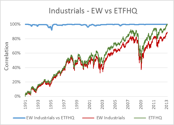
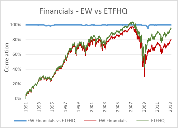
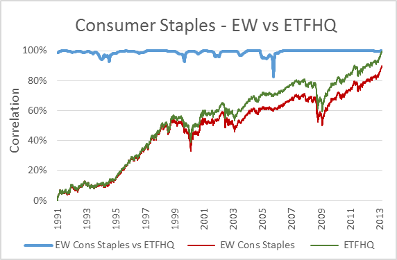
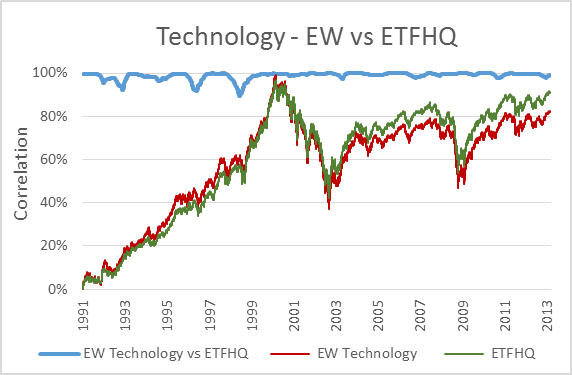
But before we do that, for those that are interested, below you will find charts that display each index; the S&P version vs the ETFHQ version including a rolling 252 day (one trading year) correlation coefficient.

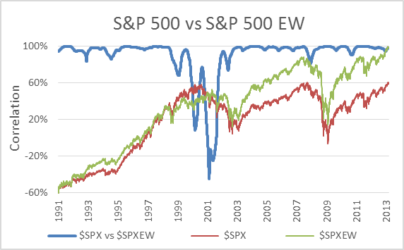
spx-vs-spxew

The chart above actually shows the correlation between the S&P 500 (official) and the S&P 500 Equal Weighted Index (official).  I have included it to illustrate why we didn’t test our results against the standard market cap weighted indices.

Stocks in companies of different sizes can behave very differently at times and for that reason market cap and equally weighted indices perform very differently.  In fact, in this case the two diverged to such an extent that the correlation dropped to -44.52%.  That means that they moved in opposite directions for over a year despite tracking the exact same 500 stocks!

spx-ew-v-etfhq

materials-ew-v-etfhq

energy-ew-v-etfhq

industrials-ew-v-etfhq

financials-ew-v-etfhq

consumer-staples-ew-v-etfhq

technology-ew-v-etfhq

utilities-ew-v-etfhq

health-care-ew-v-etfhq

consumer-discretionary-ew-v-etfhq

S&P 500 Sectors – Historical Holdings Data

S&P 500 Sector ETFs“Diversification is protection against ignorance.  It makes little sense if you know what you are doing.”
– Warren Buffett

Well when it comes to selecting individual companies on the basis of value, I certainly don’t know what I am doing and you know what?  I don’t care to learn.

That is the #1 draw card of ETFs; they provide diversification that protects me from my ignorance.  Furthermore by tracking the average of the stocks in an ETF, the noise found in the data of each individual holding is largely canceled out leaving numbers that are easier to decipher through technical analysis.

BUT, the data from an ETF is NOT the data from the underlying assets.  Yes, an ETFs price changes reflect the net asset value (NAV) of its holdings, but nothing more.  Quality breadth data is difficult to come by and historical breadth data going back more than 5-10 years is almost non-existent.  Access to such data is only a dream for most trading system engineers.

We contacted ‘S&P Dow Jones’ looking for such information and discovered that historical constituent data for the S&P 500 would cost $1,800 USD a year… 20 years would cost $36,000 and to include each of the 9 S&P sectors they would do us a deal; just $120,000.00 bucks…  We do have a budget for data, but…

So as luck would have it I managed to make friends with Mr XXXX from State Street who was kind enough to give me monthly S&P sector constituent data back to 2001.  But a lot has changed over the last 12 years.  Many of the S&P 500 holdings have been de-listed, changed names, ticker codes, have merged, been acquired, broken up etc.  Hunting down the last trading name, ticker code and clean data for these stocks is not a task for the faint of heart (or short of patience).

I could write a book about the difficulty of this task but instead will give you one example:

The old ‘General Motors’ (GM) stock was de-listed in March 2011 following bankruptcy.  What was remaining of the old GM at that time was trading under the name ‘Motors Liquidation Company’ (MTLQQ).  You will not find this name or ticker code in any historical holdings data for the S&P 500 or the S&P Consumer Discretionary Index because GM was removed from these indices in June 2009, before the name change.  However in November 2010 the new ‘General Motors’ was re-listed under the same name and symbol and in June 2013 returned to the S&P 500.  Very confusing!  Hundreds of similar yet different scenarios have faced the constituents of the S&P 500 over the last 23 years so you can imagine how difficult it was reconciling this database.

Anyway, with that hard work done we received some help from Frank Hassler over at Engineering Returns who provided us with fairly clean S&P 500 holdings data back to 1990.  Then the hard work began again and after multiple crossover checks it was a matter of researching several hundred stocks individually (many of which had been de-listed for over 15 years) and classifying them into the corresponding sectors.  Several sources were used for this process including:

http://www.moodys.com
http://en.wikipedia.org
http://www.bloomberg.com
http://www.fundinguniverse.com/company-histories/
http://www.nytimes.com
http://www.nndb.com

We logged about 270 hours on the project and now have a very exciting, quality database to work with (proof the data is good).  Realistically, most people wouldn’t know how to use this database even if they wanted to but I am happy to provide you with a copy at no cost on request.  All I ask is three things or your request will be ignored; 1 Let me know what ideas you want to test, 2 I must agree that these ideas are worth testing, 3 I kindly ask that you share your findings 🙂

Over the coming months we will be publishing a variety of tests using this data including:

  • Correlation, Beta and Volume – Does the tail now wag the dog?  Has there been an increase in the correlation of stocks since the proliferation of ETFs?
  • Momentum – Emulating the results seen in published papers on momentum and looking for new findings.
  • Volume – How can an index’s internal volume best be utilised in a trading system?
  • Breadth Data – What is effective?
  • Identifying The Best – A rising tide lifts all boats but how can one identify the best/worst performers within an asset group?

What kinds of tests would you like to see us perform?  Please leave your suggestions below:

Buy and Hold is not Dead – It was NEVER Alive

After the crash of 2008, many peoples faith in the Buy and Hold approach to financial freedom is on shaky ground.  For a long time the Buy and Hold strategy has been pushed strongly by financial planners and the mutual fund industry.

To sell ‘Buy and Hold’ as the way to go, compelling statistics are produced about how historically stocks have outperformed other asset classes.  How despite a few ‘bumps’ along the way “over the long term you can’t lose”.
.

Buy and Hold

.

But never take anything that you have been told as fact until you have done your own research (especially when it involves your finances).  As you are about to see, the reality is that Buy and Hold is not dead, it was never even alive and was simply dreamed up as a marketing ploy by those who would stand to profit from your believing in it.  Perhaps a better description would be Buy and Pray.
.

What is the Average Stock Market Return?

.
When people talk about returns available for the Buy and Hold investor they generally quote the historical performance of the US market, specifically the Dow Jones Industrial Average.  Several ‘Experts’ have told me that the average stock market return you can expect is 8 – 15% per year.  To quote from ‘Money Secrets of the Rich’ by John Burley printed 1999:
.

…compounded returns averaging more than 14%+ over the last 45 years…[1]

.
This is such a half truth it is a lie!  To mislead people into believing that by simply using a Buy and Hold strategy they will achieve returns of this nature is irresponsible!

Over time Buy and Hold returns on a broad index like the S&P 500 will match the average earnings yield and GDP growth.  Robert D. Arnott and Peter L. Bernstein found that the real stock returns over the past 192 years averaged 6.1% derived from three components; an earnings yield of 5%, per capita GDP growth of 1.7%, less 0.6% shrinkage of dividends relative to real per capital GDP growth.[2]

From 1929 to 2008 I calculate the average stock market return on the Dow Jones Industrial Average at just 4.28% without allowing for inflation.  That is far short of the 8-15% that most Buy and Hold investors promote as the investment returns that can be expected.  The scary thing is that people are basing retirement projections on such forecasts; for the 380 companies in the S&P 500 with defined-benefit plans, projected returns average 9%.[3]
.

The U.S Was a Top Performer

.
Another misleading factor is that during the 20th century the US had the worlds 4th best performing stock market after inflation.[4] This history of stellar growth in the US is something that we take for granted but it is unlikely to continue.  With no intention of being anti American I am simply stating a fact based on historical trends that it will be very difficult for the US market to be one of the top global performers during the 21st century.

Time brings many changes, 2000 years ago China and India combined accounted for 59% of the worlds GDP.  By 1950 Western Europe and the US had taken command with 53.5%.[5] That hold has since slipped and over the last 55 years China and India have grown their share of the words GDP from 8.75% to 22.07% (1950-2005), while the US and Western Europe now account for 38.24%.[6]

The next 50 years are likely to bring change at a faster pace than at any other time in history and it will put to test the US’s commitment to the global trade system.  The rising forces of China and India will cause disruptions to workforces, industries, companies, and markets in ways that we can only begin to imagine.  In the 19th century, Europe had to go through a similar test when it realized that a new giant was emerging; the US.  World leading corporate strategist Kenichi Ohmae said:
.

It is up to America to manage its own expectation of China and India as either a threat or opportunity.

.
As long as calamity doesn’t strike, most economists predict that China and India have the ability to keep growing at an annual rate of 7-8% for decades because they have younger populations, higher savings rates, and so much catching up to do.[7] At current projections China is likely to take the No. 1 position from the US and become the world’s largest economy before 2020.[8] By then, China and India could account for half of global GDP.  If this takeover does occur then a Buy and Hold strategy on the US market is going to produce disappointing results.

Warren Buffett put the reality of the situation brilliantly in his 2007 letter to Berkshire Hathaway Inc. shareholders:
.

During the 20th Century, the Dow advanced … 5.3% when compounded annually … Think now about this century.  For investors to merely match that 5.3% market-value gain, the Dow … would need to close at about 2,000,000 on December 31, 2099 … While anything is possible, does anyone really believe this is the most likely outcome? … People who expect to earn 10% annually from equities during this century … are implicitly forecasting a level of about 24,000,000 on the Dow by 2100.  If your adviser talks to you about double digit returns from equities, explain this math to him … Many helpers are apparently direct descendants of the queen in Alice in Wonderland, who said: “Why, sometimes I’ve believed as many as six impossible things before breakfast.”[9]

.

“Buy and Hold and you can’t lose long term” …But how long is long term?

.
Buy and hold advocates constantly remind us that if we hold a diversified portfolio for the long term then we can’t lose.  Well, just how long is the long term?

One investment advisor told me that if you Buy and Hold for 20 years or more then your risk in the stock market is reduced to zero.  Some say less… This from Mutual of America’s website:
.

There has been no 10-year period in the previous 50 years that has resulted in a downtick in the S&P 500.[10]

.
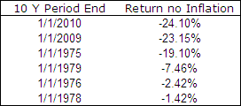
As Benjamin Disraeli said “There are three kinds of lies: lies, damned lies, and statistics.”  Mutual of America had revenue of 1.77 billion[11] in 2008 and they boast of “strong portfolio management teams and significant research capabilities”.[12] Yet despite their well funded research they can’t do simple maths.  Before allowing for inflation there has actually been 6 (and counting) ten year periods over the last 50 years that have resulted in a downtick for the S&P 500 and the Buy and Hold investor:

.
Buy and Hold Lie
.

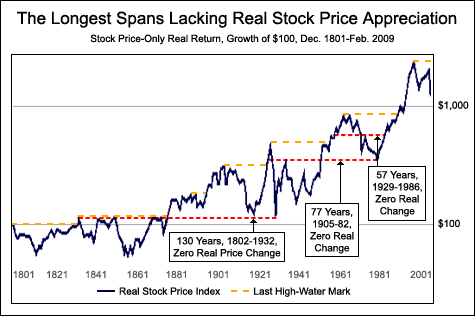
So what is the longest period with no growth for the Buy and Hold investor?

.
Would you be shocked to hear that the US has had three periods longer than 57 years where the stock market has experienced no real growth including one period of 130 years?  Robert Arnott in a stunning article called ‘Bonds: Why Bother?‘, revealed that the market drop from 1929-1932 was so severe that in real terms stocks fell below 1802 levels.  This erased 130 years of market gains:[13]
.
Buy and Hold After Inflation

.
Why do mutual fund promoters overlook this kind of research and mislead people into thinking that a Buy and Hold strategy is the best way to go?  Because they make huge fees out of managing your money and the last thing they want is for you to withdraw your funds in a bear market.  At the end of the third quarter 2009, equity mutual funds held $8.53 trillion dollars under management.[14] That makes promoting the Buy and Hold myth worth HUGE dollars.
.

Summary

.
Here is a prime example of how in the financial markets more than any other industry, one must be very aware of who is producing the statistics that are being used to influence your thinking.  (I am a trader so remember, I have a bias in the way that I present this information as well.)

Unfortunately the fact is that Buy and Hold as a strategy just does not stand up to scrutiny.  Having said that, Buy and Hold as a strategy is certainly better than not investing at all.  We may even get lucky and see the market embark on another 20 year period of above average growth like we saw from 1980 to 2000 when the S&P 500 advanced over 1200%.

But… you should never rely on luck when it comes to your financial future.  The reality is that over the long term the return from the stock market must match the growth of the economy, whatever that ends up being.  In the interim stocks undergo a constant battle between what they are truly worth based on the fundamentals and what the irrational, emotional, ‘Greater Fool’ is willing to pay.

If you are to ensure long term success with your finances regardless of what happens in the economy you must have an edge over the market.

.

Incidentally, if you don’t know what your edge is, you don’t have one. – Jack Schwager

.

So you have seen my research… Do you still believe in Buy and Hold? Share your thoughts in the comments section below.
.

  1. ^ Money Secrets of the Rich by John Burley, 1999
  2. ^ What Risk Premium is Normal? by Robert D. Arnott and Peter L. Bernstein. Financial Analysts Journal, March/April 2002, Vol. 58, No. 2, Page 74, Paragraph 3
  3. ^ The Pension Crisis Revealed, 2003 by Frank Fabozzi and Ryan Ronald. Journal of Investing Volume 12, No. 3
  4. ^ Triumph of the Optimists: 101 Years of Global Investment Returns, 2002 by Elroy Dimson, Paul Marsh, Mike Staunton. Page 52, Table 4-1
  5. ^ Contours of the World Economy 1-2030 AD Essays in Macro-Economic History, 2007 by Angus Maddison. Page 261, Table 8b
  6. ^ Statistics on World Population, GDP and Per Capita GDP, 1-2006 AD, March 2009, Horizontal File
  7. ^ Why the world must watch out for India, China by Pete Engardio. Businessweek September 12, 2005
  8. ^ China’s Economic Performance: How Fast Has GDP Grown; How Big is it Compared With The USA? February 22, 2007 by Angus Maddison and Harry X. Wu. Page 1, Paragraph 1
  9. ^ To the Shareholders of Berkshire Hathaway Inc. February 2008 by Warren E. Buffett. Fanciful Figures – How Public Companies Juice Earnings, Page 19, Paragraphs 3-8
  10. ^ Mutual of America, Capital Management Report, Stocks, S&P 500, Paragraph 3 (Screen Shot)
  11. ^ Mutual of America 2008 Annual Report, Financial and Corporate Information, Consolidated Statutory Statements of Operation and Surplus, Page 51
  12. ^ Mutual of America 2008 Annual Report, Discipline, Page 19
  13. ^ Bonds: Why Bother? May / June 2009 by Robert Arnott, Rethinking Fixed Income. Page 2 Paragraph 7
  14. ^ Worldwide Mutual Fund Assets and Flows, Third Quarter 2009, Worldwide Assets of Equity, Bond, Money Market, and Balanced/Mixed Funds.  Billions of U.S. dollars, end of quarter.