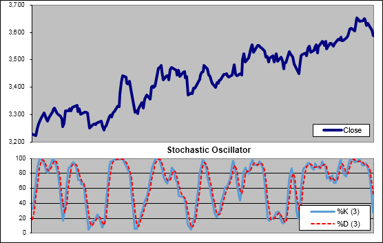
The Stochastic Oscillator (SO) (pronounced sto kas’tik) is a momentum indicator that was developed in the 1950’s by a group of futures traders in Chicago. Primarily attributed to Dr. George Lane (1921 – July 7, 2004) it is sometimes referred to as ‘Lane’s stochastics’. The term stochastic refers to the location of the current price in percentage terms relative to it’s range over a specific period.
“Stochastics measures the momentum of price. If you visualize a rocket going up in the air; before it can turn down, it must slow down. Momentum always changes direction before price.” – Dr. George Lane
Interpreting the Stochastic Oscillator
Because of Lane’s belief that momentum changes direction before price, he looked for bullish and bearish divergences as a warning of pending reversals.
Another method is to only take positions when the Stochastic Oscillator is within a specific range. e.g Only going long when the SO is above 80 (meaning a stock is with within the top 80% of its range over the specified period).
Active traders may choose to trade the SO directly from its signal line. e.g go long when the %K line rises above the %D line.
Below is a Slow Stochastic Oscillator with the most commonly used settings of N(14), %K(3) and %D(3):
How to Calculate the Stochastic Oscillator
%K = 100 * ( Average(CL,s) / Average(HL,s) )
%D = User selected moving average of %K.
Were:
s = User Selected smoothing period.
CL = Close – Low(n)
HL = High(n) – Low(n)
n = User selected look back period for measuring the price percentage range.
Notes:
An ‘s’ of 1 will produce a ‘Fast Stochastic’ while a setting of 3 is typicality used for a ‘Slow Stochastic’. Interestingly the Williams %R is identical to the %K but mirrored at the 0% line.
Free Stochastic Oscillator Excel Download
We have built a free Excel Spreadsheet for you to download containing an SO that will automatically adjust to the settings you choose. You will find it at the following link under Technical Indicators.
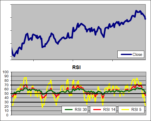
The RSI moves within a range from 0 to 100 and typically has an upper extreme zone above 70 and a lower extreme zone below 30. When in the upper extreme zone a stock is considered overbought and when in the lower extreme zone a stock is considered oversold. At such extremes the RSI suggests that a recent stock movement is likely to slow or reverse. Welles recommended a 14 period RSI but increasing the RSI period will decrease its volatility (and vice versa) as seen in the example below where three different RSI periods are overlaid:
The Relative Strength Index measures declines relative to advances over a specified period. This is done by averaging out the amount that a stock advanced on the days that it moved higher and the amount that stock declined on the days it moved lower. A modified ratio of these two averages is then charted creating a visual Relative Strength Index of bulls and bears.
Wells used his own smoothing method in the RSI known as Wilder’s Smoothing (WS-MA). Despite having a unique calculation method, WS-MA is actually identical to an EMA with a period of (2 * RSI Period) – 1. So an RSI(14) actually has an EMA period of 27 = (14 * 2) -1. Why care? Because it helps to maintain constancy between methods and measures when comparing indicators as we are in the Technical Indicator Fight for Supremacy.
For instance if we were to compare the Relative Momentum Index (RMI) to the RSI it would be helpful to compare them over equivalent look back periods so any patterns become evident. For this reason we use the EMA instead of the WS-MA in the Relative Strength Index.
How to Calculate the RSI
RSI = 100 – (100 / 1 + RS)
RS = EMA of Gains / EMA of Declines
EMA = EMA(1) + α * (Current change – EMA(1))
Where:
α = 2 / (N + 1)
N = (2 * RSI Period) – 1
RSI Period = User selected value but typically 14
Note:
Declines are expressed as their absolute value (all as positive).
Each EMA can be seeded with a SMA of the relevant Gains or Losses.
Free RSI Excel Download
To make life easy we have built a free Excel Spreadsheet for you to download containing an RSI that will automatically adjust to the look back period you set. You will find it at the following link under Technical Indicators.
How to use the RSI
Overbought/Oversold:Wilder suggested the upper and lower extremes of 70 and 30 as an indication of turning points. He said that when the RSI rises above 30 this is a bullish sign, with the opposite indication when the RSI falls below 70. Some traders, after identifying the long term trend of a stock will use extreme readings from the RSI as an entry point.
Divergences: Confirmation of the strength of a medium term bullish trend can be gained by looking for higher highs from the stock confirmed by higher highs from the RSI. In a similar fashion; a stock that is declining and making lower lows while the RSI is making higher lows may become a buying opportunity.
Centreline Crossover: The centreline on an RSI is 50, above this level we know that the average gain has been larger than the average decline over the look back period. Many traders look to see the RSI above or below 50 as confirmation before opening a long or short position.
Is the RSI a good indicator?
That is a great question, at a guess I would say yes but rather than guess we tested it through 300 years of data across 16 different global markets – See the Results.
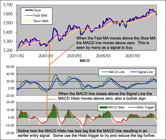
MACD stands for Moving Average Convergence Divergence and was first developed by Gerald Appel in the late 1970s. It is an Absolute Price Oscillator (APO) and can be used in an attempt to identify changes in market direction, strength and momentum.
It calculates the convergence and divergence between a ‘fast’ and a ‘slow’ Exponential Moving Average (EMA) known as the MACD Line. A signal EMA is then plotted over the MACD Line to show buy/sell opportunities. Appel specified the MA lengths as the following percentages:
Slow EMA = 7.5% (25.67 period EMA)
Fast EMA = 15% (12.33 period EMA)
Signal EMA = 20% (9 period EMA)
Usually however these are rounded to EMAs of 26, 12 and 9 respectively. Many charting packages will also plot the difference between the Signal Line and MACD Line as a Histogram.
One of the biggest challenges when dealing with financial data is noise or erratic movements that cause false signals. By smoothing data out you can reduce the number of false signals. But this comes at a cost, and causes an increase in the lag of your signals. The genius of the MACD is that it begins by smoothing data (thus causing lag) and then speeds up the signals from the smoothed data. This combination helps to reduce false signals while minimising the lag.
By comparing EMAs of different lengths the MACD can help to identify subtle changes in the trend and momentum of a security. It is a great visual representation of the acceleration or rate of change in a trend.
How to Calculate a MACD
MACD Formula:
MACD Line = EMA,12 – EMA,26
Signal Line = EMA[MACD,9]
MACD Histogram = MACD – Signal Line
Histogram Trigger = EMA[MACD Histo,5]
Obviously you can change the parameters to any value of your choice.
MACD Excel File
We have put together an Excel Spreadsheet that will automatically adjust to the MACD settings you desire. Find it at the following link near the bottom of the page under Downloads – Technical Indicators: Moving Average Convergence Divergence (MACD)
Test Results
Is the MACD an effective indicator? We are putting it into the ring for the Technical Indicator Fight for Supremacy. It will be tested through 300 years of data across 16 global markets to discover which settings produce the best results and how it performs compared to other indicators:
The Log-Normal Moving Average (LAMA) is the name I have given to an Adaptive Moving Average that uses the adaptive process developed by John F Ehlers for use in his FRAMA. Stock prices are said to be Log-Normal so Ehlers used EXP to relate his Volatility Index (The Fractal Dimension) to Alpha. The LAMA is designed so that any VI can easily be incorporated as long as it shifts between a range of 1 – 0 where high readings indicate high volatility.
How to Calculate an Log-Normal Moving Average
Seed it with the Close price then after that the LAMA is calculated according to the following formula:
LAMA = LAMA(1) + New α * (Close – LAMA(1))
Where:
New α = 2 / (New N + 1)
New N = ((SC – FC) * ((N – 1) / (SC – 1))) + FC
SC = Your choice of a Slow moving average > FC
FC = Your choice of a Fast moving average < SC
N = (2 – α) / α
α = EXP(W * (1 – VI))
W = LN(2 / (SC + 1))
***If the above formula does not make a lot of sense to you and you would like a more in depth explanation then please read this article on the Fractal Adaptive Moving average.
Log-Normal Adaptive Moving Average Excel File
I have put together an Excel Spreadsheet containing the Log-Normal Adaptive Moving Average and made it available for FREE download. It contains a ‘basic’ version that shows all the working for the formula and a ‘fancy’ one that will automatically adjust to the length as well as the Volatility Index you specify. Find it at the following link near the bottom of the page under Downloads – Technical Indicators: Log-Normal Adaptive Moving Average (LAMA)
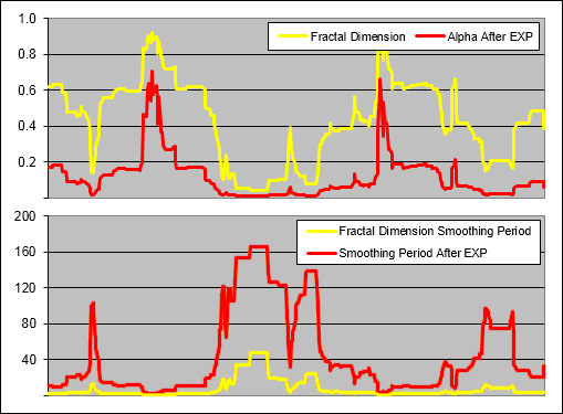
How EXP affects Alpha and the Smoothing Period:
Ehlers used EXP to relate the Volatility Index (VI) to Alpha (α) so lets have a look at what affect this has:
.
In the top chart you can see Alpha taken directly from the the Fractal Dimension and also taken after it has been modified by applying EXP. In the bottom chart you can see the smoothing period that results from each version of Alpha. Clearly by applying EXP, Alpha is reduced creating an significantly faster Smoothing Period.
The use of EXP results in not just a slower LAMA overall but one that exponentially slows as alpha decreases. This affect is similar to that of raising Alpha to a power as seen in the Adaptive Moving Average (AMA). In fact, it turns out that the LAMA is identical to the AMA if you were to raise it to the power of about 988,869,997.798!!!!!! That is not a typo. The LAMA and therefore the FRAMA is identical to the AMA raised the power of almost 100 million….
In discovering this there is little point in running the tests on this indicator because previous tests on the AMA already reveal it will not be able to out perform. Oh well, that saves some work! That is why we take the time to look closer at these things and try not to make too many uneducated assumptions.
More in this series:
We have conducted and continue to conduct extensive tests on a variety of technical indicators. See how they perform and which reveal themselves as the best in the Technical Indicator Fight for Supremacy.
The Adaptive Moving Average (AMA) aka Kaufman Adaptive Moving Average (KAMA) was created by Perry Kaufman and first presented in his book Smarter Trading (1995). This moving average offered a significant advantage over previous attempts at ‘intelligent’ averages because it allowed the user greater control.
The Variable Moving Average – VMA (1992) for instance offered no upper or lower limit to its smoothing period. The AMA on the other hand allowed the user to define the range across which they desired the smoothing to be spread.
It follows the same theory as the VMA in that depending on the market environment there will be different amounts of noise and therefore a different moving average speed will be required to achieve the most profitable results. In a strongly trending market for instance, the noise levels are low and a faster moving average should produce the best results. Conversely in a crab or sideways market the noise levels are very high and a slower average is likely to be better suited.
.
How to Calculate an Adaptive Moving Average
.
It starts with the Close price.
AMA(1) = Close
After that AMA is calculated according to the following formula:
AMA = AMA(1) + α * (Close – AMA(1))
You will notice that this is the same as the formula for an Exponential Moving Average (EMA):
EMA = EMA(1) + α * (Close – EMA(1))
But Alpha in an EMA is α = 2 / (N + 1) so it remains constant while for an AMA the Alpha is adaptive:
α = [(VI * (FC – SC)) + SC] ²
Where:
VI = Users choice of a measure of volatility or trend strength, Kaufman suggested his Efficiency Ratio (ER).
SC = 2 / (SN + 1)
SN = Your choice of a Slow moving average > FN
FC = 2 / (FN + 1)
FN = Your choice of a Slow moving average < SN
Here is an example of a 3 period AMA with a 3 period Efficiency Ratio (ER) as the VI:
.
.
How Squaring Alpha affects the AMA Smoothing Range
.
Kaufman suggest that his AMA have a FC of 2 and a SC of 30 which would lead one to assume that the adaptive smoothing would be in the 2 – 30 range but you would be wrong because the alpha is squared. For example, lets set the VI to zero so we can reveal the slowest possible average:
.
.
Now to reveal the EMA smoothing period ‘N’ from alpha:
N (EMA) = (2 – α) / α
N (EMA) = (2 – 0.0042) / 0.0042
N (EMA) = 480
So in reality an AMA with a SN of 30 where alpha is raised to the power of 2 can actually move as slowly as a 480 day EMA. Now to me that is not very user friendly; entering a parameter of 30 that results in a smoothing period of 480. So I use the following formula for SC and FC instead:
SC = α(1)^(1/P)
Where:
α(1) = 2 / (SN+1)
P = Power that alpha is raised to (usually 2)
SN = Your choice of a Slow moving average > FN
Now SN will be the actual resulting slowest moving average even if you change the power that alpha is raised to. I also use the same process for FN and FC. Lets look again at Alpha with the VI set to zero, the FN at 2 and the SN at 480:
.
.
Now when we reveal the EMA smoothing period ‘N’ from alpha it should equal our user defined 480:
N (EMA) = (2 – α) / α
N (EMA) = (2 – 0.0042) / 0.0042
N (EMA) = 480
.
A closer look at the affect of Squaring Alpha
.
Understanding the affect of squaring alpha is very important as the chart below illustrates:
.
.
As you can see above, an input smoothing period of 300 with alpha squared results in an actual smoothing period of over 45,300 which is totally useless. However this is a setting that one could easily use without a proper understanding of how the AMA works. In our testing we will be trying the AMA with alpha raised to powers other that 2 so some other examples have also been plotted on the chart above.
Below we look at the affect on alpha and the smoothing resulting from an AMA with the Efficiency Ratio taken directly into alpha (^1) or being squared (^2):
.
.
We used our modified AMA formula for the above charts so that the actual FN and SN were identically matched despite modifications to alpha. As you can see, squaring alpha results in not just a slower AMA overall but one that is much faster to slow down when the alpha decreases. Kaufman obviously wanted the AMA to very rapidly slow when the data lacked a trend. This affect is similar to that of increasing the constant ‘N’ in the Variable Moving Average.
.
Is the AMA a Good Indicator?
.
As part of the ‘Technical Indicator Fight for Supremacy‘ we will be putting the AMA against several different types of moving averages and will test several different Volatility Indexes as components including:
Chaikin’s Volatility (CV) * We currently lack High and Low Prices for some test markets.
We will also be testing the assumption that squaring alpha was a good idea and will try raising it to several different powers.
Can you think of any other worthwhile tests? Please let us know in the comments section at the bottom.
.
Adaptive Moving Average Excel File
.
I have put together an Excel Spreadsheet containing the Adaptive Moving Average and made it available for FREE download. It contains a ‘basic’ version that shows all the working and a ‘fancy’ one that will automatically adjust to the length as well as the Volatility Index you specify. Find it at the following link near the bottom of the page under Downloads – Technical Indicators: Adaptive Moving Average (AMA)
.
Adaptive Moving Average Example, VI = 50 Day Efficiency Ratio
The Variable Moving Average (VMA) aka Volatility Index Dynamic Average (VIDYA) was developed by Tushar S. Chande and first presented in the March 1992 edition of Technical Analysis of Stocks & Commodities – Adapting Moving Averages To Market Volatility
Chande’s theory was that the performance of an exponential moving average could be improved by using a Volatility Index (VI) to adjust the smoothing period as market conditions change. The idea being that when prices are congested an average should slow down to avoid whipsaws but when prices are trending strongly an average should speed up to capture the major price moves.
He was not the first person to think along these lines; George R. Arrington, Ph.D introduced a variable Simple Moving Average based on Standard Deviation in the June 1991 edition of Technical Analysis of Stocks & Commodities – Building a Variable-Length Moving Average (VLMA). The YIDYA however represented a massive step forward from the VLMA because it allowed a much larger spread of smoothing periods.
.
How To Calculate a Variable Moving Average
.
VMA = (α * VI * Close) + ((1 – ( α * VI )) * VMA[1])
Where:
α = 2 / (N + 1)
VI = Users choice of a measure of volatility or trend strength.
N = User selected constant smoothing period.
Here is an example of a 3 period VMA with a 3 period Efficiency Ratio (ER) as the VI:
.
.
How the VIDYA Smoothing is changed by the Volatility Index
.
The Variable Moving Average is unique in that it has no upper or lower limit to its smoothing period:
.
.
The VMA smoothing period can go infinitely high until the Volatility Index equals zero at which point the resulting average will stop moving and be equal to the previous VMA. When the Volatility Index equals 1 the smoothing period will be equal to the user selected constant ‘N’; notice how when the Y axis = N, the X axis = 1.
However if the Volatility Index being used can rise above 1 (such as the Standard Deviation Ratio) then the smoothing period can drop below the user selected constant. When the VI = (N/2) + 0.5 then the smoothing period will be 1, which is equal to the price itself. Therefore the VI that is used must not rise above (N/2) + 0.5 and if it does upon occasion then this cap must be written into the formula.
.
A Look at the Actual Alpha
.
Because the VMA is as the name suggests, variable, the ‘Actual Alpha’ is not static but is influenced by the VI. By changing the constant ‘N’ however the interpretation of the VI changes greatly:
.
.
Above you can see an example of the ‘Actual Alpha’ and the resulting smoothing period for a VMA with an ‘N’ of 1 and an ‘N’ of 5. We know that when the VI = 1 (indicating that the stock is trending perfectly) the smoothing period = ‘N’. So the fastest possible smoothing periods in these examples would be 1 and 5 respectively; not a big difference. But it is surprising to see what a huge impact changing ‘N’ just a few points has overall. In fact as ‘N’ increases the resulting VMA moves exponentially slower. This affect is rather like the squaring used by Kaufman in his Adaptive Moving Average.
.
What Volatility Index to use?
.
Chande originally used the Standard Deviation Ratio as his VI and this is the one typically used when people talk about a VIDYA. But later on, in the October 1995 article from Technical Analysis of Stocks & Commodities – ‘Identifying Powerful Breakouts Early‘ he suggested the use of his own Chande Momentum Oscillator (CMO).
Because the CMO ranges between 100 and -100, to use it in this application we must take the absolute value divided by 100. The result is identical to the Efficiency Ratio (ER) and is the VI used most often when people refer to a VMA. Any measure of volatility or trend strength can be used however as long as it fits between a zero to (N/2) + 0.5 range where higher readings indicate a stronger trend.
.
Volatility Indexes Used for Testing
.
As part of the ‘Technical Indicator Fight for Supremacy‘ we have tested/will test the following indicators as the Volatility Index in a Variable Moving Average:
Chaikin’s Volatility (CV) * We currently lack High and Low Prices for some test markets.
Are there any others that you think are worth testing? Please let us know in the comments section at the bottom.
.
Variable Moving Average Excel File
.
I have put together an Excel Spreadsheet containing the Variable Moving Average and made it available for FREE download. It contains a ‘basic’ version that shows all the working and a ‘fancy’ one that will automatically adjust to the length as well as the Volatility Index you specify. Find it at the following link near the bottom of the page under Downloads – Technical Indicators: Variable Moving Average (VMA)
.
10 Day Variable Moving Average Example, VI = 50 Day Efficiency Ratio
The Relative Volatility Index was created by Donald Dorsey and first presented in the June 1993 issue of Technical Analysis of Stocks and Commodities – The Relative Volatility Index. He noticed that most technical analysts look for confirmation from several indicators before initiating a trade in order to reduce the occurrence of false signals. This is a logical approach however many indicators are simply variations on the same calculation. Dorsey described this as “not unlike taking two wind direction readings rather than reading the wind direction and barometric pressure to predict tomorrow’s weather”.
Because most indicators measure price change, Dorsey developed the RVI as a confirming indicator that measures the direction of volatility. It is almost identical to the Relative Strength Index (RSI) but uses the standard deviation of high and low prices.
“There is no reason to expect the RVI to perform any better or worse than the RSI as an indicator in its own right. The RVI’s advantage is as a confirming indicator because it provides a level of diversification missing in the RSI.”
S = User selected period for the Standard Deviation of the close (Dorsey suggested 10).
N = User selected smoothing period (Dorsey suggested 14)
(Instead of using Wilder’s Smoothing we use an EMA with a period of (N*2)-1 which produces the same result but is faster to calculate.)
Here is an example of a RVI with an “S” and “N” of 3:
Relative Volatility Index Excel File
I have put together an Excel Spreadsheet containing the Relative Volatility Index and made it available for FREE download. It contains a ‘basic’ version displaying the example above and a ‘fancy’ one that will automatically adjust to the length you specify. Find it at the following link near the bottom of the page under Downloads – Technical Indicators: Relative Volatility Index (RVI)
Relative Volatility Index Example
How to use the Relative Volatility Index
The Relative Volatility Index measures the direction and magnitude of volatility. High readings indicate the market is moving up strongly, low readings indicate a strong bearish move and readings round 50 indicate a lack of direction. In this way the RVI can be used to measure the strength or lack of a trend. However like the RSI, extreme readings often warn of a reversal.
Here are the buy and sell rules that Dorsey developed for the RVI. Keep in mind that he intended this as a confirming indicator not a stand alone system:
Buy only if RVI > 50
Sell short only if RVI < 50
If you miss the first RVI buy signal buy when RVI > 60
If you miss the first RVI Sell signal sell when RVI < 40
Close a long position when the RVI falls below 40
Close a short position when the RVI rises above 60
In the September 1995 issue of Technical Analysis of Stocks and Commodities, Dorsey wrote a follow up article – Refining the Relative Volatility Index. Here he presented the idea of using the average of two RVIs; one of high prices and one of low prices and then smoothing the result with a 20 day Linear Regression Indicator. He called the new version “Inertia”.
“A trend is simply the outward result of inertia. Once a market starts to move, it takes significantly more energy for it to change direction than for it to continue along the same path.”
In Physics Inertia is described as the amount of resistance that an object requires for a change in velocity. To get a reading of Inertia requires a measure of mass and direction. In the stock market there are many different ways (each of varying effectiveness) to measure direction but what about mass?
Because volatility reveals the markets propensity to make various sized movements regardless of direction, Dorsey saw it as a possible measure for mass. If his theory is correct then the RVI should be a particularly useful trend indicator.
His modified version of the Relative Volatility Index or “Inertia” can be used as a long term trend indicator where readings above 50 indicate positive Inertia and readings below 50 indicate negative Inertia or a bearish trend.
Test Results
As part of the ‘Technical Indicator Fight for Supremacy‘ We have tested/will test the Relative Volatility Index as a component in several technical indicators:
The Fractal Dimension “D” is a measure of how completely a Fractal appears to fill space as one zooms down to finer and finer scales. So what is a fractal? It is a rough or fragmented shape that can be split into parts, each of which is at least similar to a reduced size copy of the original. The following video illustrates the beauty of fractals in 3D and is well worth watching in full screen:
.
AMAZING – 3D Evolving Fractal Landscape
.
.
Below is an example of a fractal called the Koch Curve:
.
Notice how no matter what scale you view the Koch Curve in it looks very similar? This characteristic is called self similarity and defines a fractal shape. Can you see anything strange about the chart below?
.
.
Without being told would you have known that the left half of the chart above was 5 years of monthly bars and the right half was 15 days on 30 minute bars? Probably not, because price movements look similar no matter what time frame we are viewing them in, this is self similarity and why the financial markets are considered fractals.
The Wiener process is also a fractal and looks very much like stock price movements. It is a continuous time stochastic process that charts Brownian Motion and is used in the mathematical theory of finance as well as the Black-Scholes option pricing model. It is clearly self similar and the average features of the function do not change while zooming in. Image by Cyp:
.
Wiener Process
.
Usually we think of things in whole, rather than partial dimensions and at first I found this a foreign concept, but try thinking of it this way: A shape like a stock chart is too big to be one dimensional but too thin to be two dimensional, so its Fractal Dimension results in a reading between 1 and 2.
It is easy to understand the number of dimensions in a line, square or cube. A line has 1 dimension – length, a square has 2 – length and width and a cube has 3 – length, width and depth. However if we use this very simplistic thought process to try and reveal the Dimension of a fractal like the Sierpinski triangle then we run into problems.
Sierpinski Triangle
It is clear that we need a more intelligent approach for identifying the dimension of self similar shapes so lets look at it in another way: If we break a line segment into 4 self similar parts of the same length, a magnification factor of 4 is needed to reveal the original shape. If we break a line segment into 7 self similar parts, a magnification factor of 7 will yield the original shape… 20 parts, magnification of 20 etc. Therefore we can break a line segment into “N” self similar parts and a magnification factor of “N” will reveal the original shape.
If we break a square into four self similar sub squares then a magnification factor of 2 is needed to reveal the original shape. 9 self similar parts will require a magnification factor of 3 and 25 self similar parts will require a magnification factor of 5. As a result we can conclude that a square can be broken into N^2 self similar copies and to reveal the original shape a magnification factor of “N” must be used. A cube can be broken into N^3 self similar pieces and once again the original shape is found using a magnification factor of “N”.
So a more accurate way of thinking about the Dimension of a object is to say that “D” is the exponent of the number of self similar pieces with a magnification factor of “N” which a shape can be broken into.
Using this thought process, lets look again at the dimension of the Sierpinski triangle. How do we find the exponent in this case? Now we are going to need logarithms (log).
What is Log?
Log reveals the power that a number needs to be raised to in order to produce a given result. Unless otherwise stated the base number is 10, therefore:
Log(1000) = 3
Because
10^3 = 10 * 10 * 10
10^3 = 1000
Returning to our previous conclusions – we know that for a square we have N^2 self-similar pieces, each with a magnification factor of N etc… So:
The Sierpinski triangle is made up of 3 self similar pieces that require a magnification factor of 2 to reveal the original shape. Therefore:
D = log (number of self similar pieces) / log (magnification factor)
= log 3 / log 2
= 1.58
The Sierpinski triangle also contains 27 self similar pieces that require a magnification factor of 8 to reveal the original shape so:
D = log (number of self similar pieces) / log (magnification factor)
= log 27 / log 8
= 1.58
In addition to this we know that the Sierpinski triangle breaks into 3^N self similar parts requiring a magnification factor of 2^N to reveal the original shape. Therefore:
D = log (number of self similar pieces) / log (magnification factor)
= log 3^N / log 2^N
= N * log 3 / N * log 2
= 1.58
So the Fractal Dimension is really a measure of how complicated a self similar shape is. A line is smaller and more basic than that a square, while the Sierpinski triangle sits somewhere between the two. However all three have the same number of self similar parts; they can all be divided to infinity.
****The beauty of the Fractal Dimension lies in its ability to somehow capture the notion of how large a set is.
.
Finding The Fractal Dimension of a Stock
.
John F Ehlers created a method for identifying the “D” for stocks by averaging the measured Fractal Dimension over different scales. He used this method as a component of his Fractal Adaptive Moving Average (FRAMA) and presented it again as a standalone indicator in the June 2010 edition of Technical Analysis of Stocks and Commodities – Fractal Dimension As A Market Mode Sensor.
The standard method of discovering the “D” of a shape is to cover it with a number of small objects that are various sizes and compare how many of each fit across the surface. Covering a price curve with a series of small boxes however is far too cumbersome. But because price samples are uniformly spaced (each bar is 1 day, 1 week, 10 min etc) Ehlers decided that the average slope of the curve could be used as an estimation of the box count.
This is far less complicated than it sounds as the slope is found by simply taking the highest price over a period minus the lowest price during that period and dividing the result by the number of periods. We will call this measure “HL”. We need to find the “HL” measure (slope) over the first half, second half and full length of “N” to help us find “D”.
D = (Log(HL1 + HL2) – Log(HL)) / Log(2)
Note: Log(2) = Log(N / (½N))
HL1 = (Max(High,½N..N) – Min(Low,½N..N)) / ½N
HL2 = (Max(High,½N) – Min(Low,½N)) / ½N
HL = (Max(High,N) – Min(Low,N)) / N
N = Periods
If D < 1 then D = 1
If D > 2 then D = 2
.
Finding The Fractal Dimension, Examples
.
Lets have a look at some theoretical stock prices and the resulting Fractal Dimension:
.
.
Above are three price curves, now lets calculate the “D” for each where “N” = 100.
D = (Log(HL1 + HL2) – Log(HL)) / Log(2)
So:
.
For ‘Curve A’ the full range is repeated in both halves of the chart so it exists fully in two Dimensions and D = 2. For ‘Curve B’ only half of the range is repeated in each half of the chart so it exists in between one and two Dimensions or specifically D = 1.58. The range for ‘Curve C’ is not repeated at all between the two halves of the chart so it exists in only one Dimension; D = 1.
.
Fractal Dimension Excel File
.
I have put together an Excel Spreadsheet that calculates the Fractal Dimension and made it available for FREE download. It contains a ‘basic’ version displaying the working and a ‘fancy’ one that will automatically adjust to the length you specify. Find it at the following link near the bottom of the page under Downloads – Technical Indicators: Fractal Dimension (D)
.
Fractal Dimension Example
.
.
Uses for the Fractal Dimension
.
The lower the Fractal Dimension the closer a stock chart is to a straight line and therefore the stronger the trend. High readings on the other hand reveal a complex fractal; the shape of a range bound market. These two different market types require very different strategies in order to maximize profits and minimize losses.
Ehlers uses this measure in the FRAMA to dynamically adjust the alpha of an exponential moving average so that it reacts quickly in a trending market and slowly when prices are congested. Accurately being able to identify the strength of a trend has endless uses and therefore is worthy of much research.
Fractal Dimension Variable Moving Average (D-VMA) – Completed See Results
Fractal Dimension Adaptive Moving Average (D-AMA) – CompletedSee Results
Fractal Dimension Weighted Moving Average (D-WMA)
We will also test “D” as a filter taking trades only when it indicates a strong trend.
.
Further Information on Fractals
.
Woodshedder wrote thought provoking article On Fractals and Market Crashes. Here is an interesting open source platform called Fragmentarium that allows to create Fractals yourself like this:
The Vertical Horizontal Filter (VHF) was first presented by Adam White in an article published in the August, 1991 issue of Futures Magazine – Tuning into trendiness with VHF indicator. Trend following indicators work best in a trending market while in a range bound market, mean reversion strategies tend to excel. The Vertical Horizontal Filter is designed to determine if prices are in a trending or congestion phase so that the most appropriate trading strategy can be applied.
The Vertical Horizontal Filter can be interpreted in several different ways:
Values can be used to indicate the strength of the trend; higher values equal a stronger trend.
The VHF direction can be used to identify if a trending or congestion phase is developing.
It can also be used as a contrarian indicator where extreme readings foretell of an impending change in the market phase.
.
How To Calculate the Vertical Horizontal Filter:
.
VHF = Numerator / Denominator
Where:
Denominator = n ∑ (ABS(Close – Close[1]))
Numerator = ABS (Max Close[n] – Min Close[n])
n = Number of Periods
Here is an example of a 3 period VHF:
.
.
Vertical Horizontal Filter Excel File
.
I have put together an Excel Spreadsheet containing the Vertical Horizontal Filter and made it available for FREE download. It contains a ‘basic’ version displaying the example above and a ‘fancy’ one that will automatically adjust to the length you specify. Find it at the following link near the bottom of the page under Downloads – Technical Indicators: Vertical Horizontal Filter (VHF)
.
Vertical Horizontal Filter Example
.
.
Test Results
.
As part of the ‘Technical Indicator Fight for Supremacy‘ We have tested/will test the Vertical Horizontal Filter as a component in several technical indicators:
Calculating it is as simple as taking the ratio of a Standard Deviation (SD) over one period to that of a longer period where both have the same starting point. One quirk of the SDR is that because the short term SD can become greater than the longer term SD, the ratio has no upper limit but does tend to remain below 1 most of the time (see the example chart below). The higher the ratio, the more spread the recent data is from the mean in relation to the past which should indicate a stronger trend.
It is very helpful to know the strength or lack of a trend as different approaches will be more profitable depending on the market type. But is the Standard Deviation Ratio an effective way to reveal the strength of a trend? To find out we are entering it in the Technical Indicator Fight for Supremacy. We will be testing the SDR as a component in the VIDYA, an Adaptive Moving Average and an Indicator Weighted Moving Average.
.
50 / 100 Standard Deviation Ratio Example
.
.
Standard Deviation Ratio Excel File
.
I have put together an Excel Spreadsheet containing the Standard Deviation Ratio and made it available for FREE download. While the SDR may be very easy to calculate this spreadsheet will automatically adjust to the parameters you specify. Find it at the following link near the bottom of the page under Downloads – Technical Indicators: Standard Deviation Ratio (SDR)


 Notice how no matter what scale you view the Koch Curve in it looks very similar? This characteristic is called self similarity and defines a fractal shape. Can you see anything strange about the chart below?


