August 09, 2010 – 07:20 am EDT
We have been waiting and waiting for this market to prove that it has the power to break through resistance and rally despite the many fundamental winds blowing in its face. Unfortunately however the market has failed to do so and time has probably run out. Things don’t look good and sadly it won’t take much to slip back into the bear market.
****Thanks to all those who referred people to this newsletter over the last week. The more readers we have the more services we can provide you.
.
ETF % Change Comparison
.

The hope was that the small caps (IWM) would finally step up and lead the market higher. Instead they were the worst performers over the last week and have outperformed only SMH over the last four weeks. This is not an encouraging sign at all.
Learn more – ETF % Change Comparison
.
![]()
.
A Look at the Charts
.
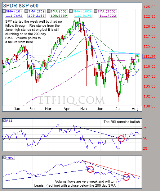
Volume flows suggest resistance will not be broken and that the trend change has failed.
.
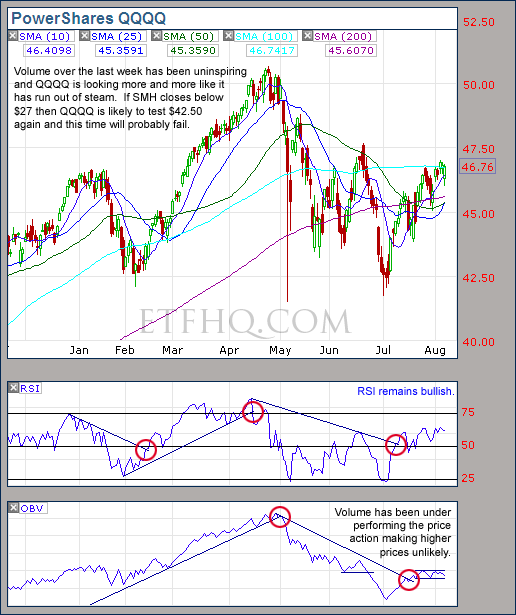
There looks to be an easy ride from $45 to $42.50 if SMH closes below $27.
.
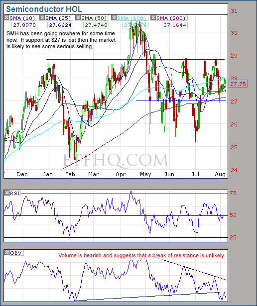
The action on SMH has been much ado about nothing but volume suggests weakness. Lookout below $27!
.
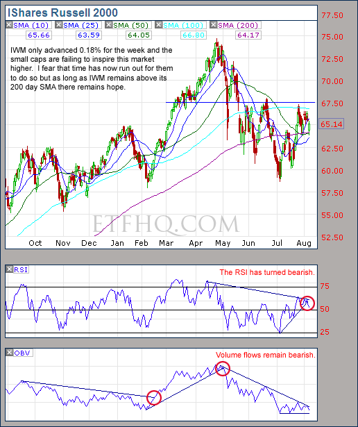
No trend change from volume to confirm the bull market but as long as IWM stays above its 200 day SMA there is hope.
.
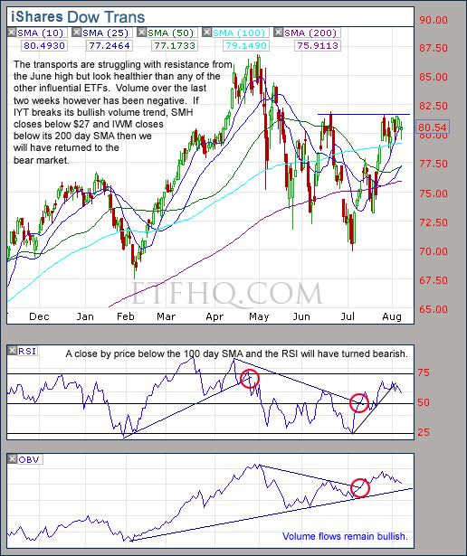
It won’t take much selling to break IYTs volume trend but for now it remains bullish.
.
![]()
.
OM3 Weekly Indicator
.

The Bull Alerts over the last five weeks have brought with them some nice gains but the recent Buy signals are mostly Weak.
Learn more – The OM3 Indicator
.
![]()
TransDow & NasDow
.

The Transportation Index remains dominant over the Dow which is positive and this trade is showing a small profit. On a more negative note the Dow remains dominant over the NASDAQ. Historically most of the big bullish moves have occurred when the NASDAQ has been dominant.
.
What the TransDow Readings tell us:
The TransDow measures dominance between the DJ Transportation Index (DJTI) and the Dow Jones Industrial Average (DJIA). In a strong market the more economically sensitive Transportation Index should be dominant over the DJIA.
Historically the DJTI has been dominant over the Dow 45% of the time. The annualized rate of return from the DJTI during this period was 18.47% with the biggest loss for one trade sitting at -13.27%. The annualized return from the DJIA during the periods it was dominant over the DJTI was just 4.06% and the biggest loss for one trade was -16.13%. A 4% stop-loss is applied to all trades adjusting positions only at the end of the week.
What the NasDow Readings tell us:
The NasDow measures dominance between the NASDAQ and the DJIA. Using the same theory behind the Trans Dow; in a strong market the more economically sensitive NASDAQ should be dominant over the DJIA.
Historically the NASDAQ has been dominant over the DJIA 44% of the time. Taking only the trades when the NASDAQ is above its 40 week moving average the annualized rate of return was 25.47% with the biggest loss for one trade sitting at –8.59%. The annualized rate on the DJIA during the periods it was dominant over the NASDAQ is just 8.88% and the biggest loss for one trade was –12.28%. A 8% stop-loss is applied to all trades adjusting positions only at the end of the week.
.
![]()
.
LTMF 80 & Liquid Q
.

Both LTMF 80 and Liquid Q remain in cash.
.
Historical Stats:
.

.
How The LTMF 80 Works
LTMF stands for Long Term Market Forecaster. It reads volume flows relative to price action and looks for out performance of volume measured on a percentage basis over the prior 12 months. During a sustained rally the readings will reach high levels (near 100%) making it imposable for the volume reading to always outperform price so any reading above 80% will maintain the buy signal. This system has outperformed the market over the last 10 years but performance has been damaged by some nasty losses. It only produces buy signals and only for QQQQ.
How Liquid Q Works
Liquid Q completely ignores price action and instead measures the relative flow of money between a selection of economically sensitive and comparatively stable ares of the market. It looks for times when the smart money is confident and and can be seen by through volume investing heavily is more risky areas due to an expectation of expansion. This system has outperformed the market over the last 10 years and remained in cash through most of the major declines. It only produces buy signals and only for QQQQ. We will provide more performance details on the web site for these systems soon.
.
![]()
.
Summary
The biggest loss over the last week is the time that has passed. Volume has been negative or uninspiring from most areas despite some advances in price. The possibility for further advances does still remain as long as SMH holds above $27 and the 200 Day SMAs hold strong but the likely hood of a good rally has diminished almost entirely. If however support fails, SMH closes below $27 and volume from IYT turns negative then we will have returned to the bear market.
.
Any disputes, questions, queries, comments or theories are most welcome in the comments section below.
.
Derry
And the Team @ ETF HQ
“Equipping you to win on Wall St so that you can reach your financial goals.”
.
P.S Like ETFHQ on Facebook – HERE
.
![]()
.
Quote of the Day:
The stock market is a no-called-strike game. You don’t have to swing at everything, you can wait for your pitch. The problem when you’re a money manager is that your fans keep yelling, ‘Swing, you bum!’ – Warren Buffett
The comment on the OBV for SPY is “…will turn bearish (red line) with a close below the 200 day SMA”. To me, the red line is already bearish – downward slope and lower highs. Also, which 200 day SMA are you referring to? I don’t think you link 200 day SMA with OBV before, right? Please enlighten. Thanks.
What I mean is that the old bullish trend will be replaced by the new bearish trend (red) if SPY closes below its 200 day SMA. I don't usually link OBV a moving average but in this case have done so it get confirmation.
Trend lines are subjective so getting confirmation from a loss of support helps to avoid false signals. This is similar to the way that we have been waiting for OBV on IWM to confirm the trend change that SPY, QQQQ etc already indicated had occurred.
Volatile crab markets make identifying the direction over the medium term all the more difficult and multiple forms of confirmation very important. Thanks for your question, have a great week.
Derry
OBV in IWM in the weekly chart is much more bullish than the daily chart.
Please comment about this.
I don't have any statistical evidence to back this up, perhaps I should put it on the long list of things that we need to test. However, when shifting to the weekly time frame by my observation using OBV to measure volume flows merges too much data and does not provide accurate readings.
When it comes to volume, the more data the better. Eventually we plan to expand our info-structure to provide analysis of volume tick by tick on all the components of a fund. So daily volume data will not simply be the sum total of volume for an ETF on that day but a combination of volume from the up tick and down ticks throughout that day for every stock in the basket. But making this happen is easier said than done!
Thanks for your question Joe
Derry
Thanks, Derry, there must be something amiss about that OBV in weekly vs. daily charts, since they disagree. What about the accumulation/distribution line, shown at stockcharts.com? When price and a/d diverge, it's a signal. Now, a/d is holding up well during the IWM price decline, indicating a bullish move is coming soon. I've read the glossary info about it there.
Hi Joe,
There is nothing amiss. OBV is a very simple indicator. It is just the running total of volume where it is added to the total on an up period and subtracted from the total on a down period. When you switch to weekly time frame the entire volume for the week is added or subtracted from the total based on the direction that week.
For example: over previous week 30 July – 6 Aug, IWM advanced 0.18% so all the volume for that period is added to the running total of the weekly OBV. But the volume on the down days exceeded the volume on volume on the up days despite IWM advancing slightly for the week. So the daily OBV moved lower over over the same period that the weekly OBV moved higher. This is what I mean by saying that too mush data is merged with the weekly OBV.
A/D Line = (# of Advancing Stocks – # of Declining Stocks) + Previous Period's A/D Line Value. It is a breadth indicator that typically takes its readings from the stocks on the NYSE or the NASDAQ, so it is not as relevant to compare it to IWM which tracks the Russell 2000.
The reason we look to the Russell 2000 (among others) is becuase provides insight into an economically sensitive segment of the market. But I hope you are right and that a bullish move is on the way. Only time will tell.
Cheers
Derry
At stockcharts.com, the accum/dist line is calculated differently than you describe below, and is specific to each chart, so a/d for IWM chart reflects IWM only.
The signal only comes when there is divergence to price, and takes weeks to develop.
You may want to read about it in their glossary:
http://stockcharts.com/school/doku.php?id=chart…
OK now we are on the same page. The AD Line is different from the Accumulation/Distribution Line:
http://stockcharts.com/school/doku.php?id=chart…
In my tests several years ago OBV produced superior results to the Accumulation/Distribution Line. We will need to conduct the research into this subject more thoroughly however as I can't find the old stats and the tests were not performed as scientifically as we would today.
The ability of the S&P to close higher than it opened despite declining on Friday and Today (Tuesday) has been impressive and the Accumulation/Distribution Line rewards this. IWM did however fail to close above its open today. But only time will tell and with SMH still above $27 and IWM still above its 200 day SMA etc there is still hope.
Cheers
Derry