Wilder’s Smoothing AKA Smoothed MA (WS-MA)

Wilder’s Smoothing AKA Smoothed Moving Average is to duke it out in the ‘Technical Indicator – Fight for Supremacy‘ so here is some info about how it is calculated along with an Excel Spreadsheet for your interest:

Wilder’s Smoothing (WS-MA) was developed buy J. Welles Wilder, Jr. and first presented in his landmark book New Concepts in Technical Trading Systems (June 1978).  He used it as a component in several of his other indicators including the RSI which is one of the most popular technical indicators of all time.

Despite being very different in how they are calculated, Wilder’s Smoothing and the EMA are actually the same indicator.  To reveal the equivalent EMA simply multiply the period by two and subtract one, test it for yourself; a 50 period WS-MA is equivalent to a 99 period EMA.  You can also reveal the EMA smoothing period from any two data sets using the following formula:

N = (2-( (MA-MA[1]) / (Close-MA[1]) ) ) / ( (MA-MA[1]) / (Close-MA[1]) )

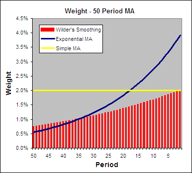
Below you can see how the weighting is applied to a 50 period WS-MA, EMA and SMA:

.

Wilder's Smoothing vs SMA vs EMA Weighting.

How To Calculate Wilder’s Smoothing:

.

It starts as a Simple Moving Average (SMA):

WSMA1 = Simple MA = SUM(CLOSE, N)/N

After that it is calculated according to the following formula:

WSMA(i) = (SUM1-WSMA1+CLOSE(i))/N

Where:

WSMA1 = Wilder’s Smoothing for the first period.

WSMA(i) = Wilder’s Smoothing of the current period (except for the first one).

CLOSE(i) = The current closing price.

N = The smoothing period.

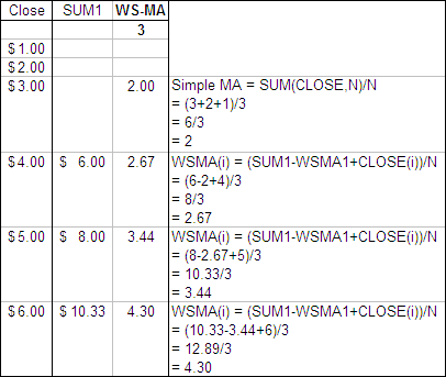
Here is an example of a 3 period Wilder’s Smoothing AKA Smoothed Moving Average:

.

Who to Calculate Wilder's Smoothing.

Wilder’s Smoothing Excel File

.

I have put together an Excel Spreadsheet containing Wilder’s Smoothing and made it available for FREE download.  It contains a ‘basic’ version displaying the example above and a ‘fancy’ one that will automatically adjust to the length you specify.  Find it at the following link near the bottom of the page under Downloads – Technical Indicators: Wilder’s Smoothing (WS-MA).

.

Smoothed Moving Average and a Simple Moving Average

.

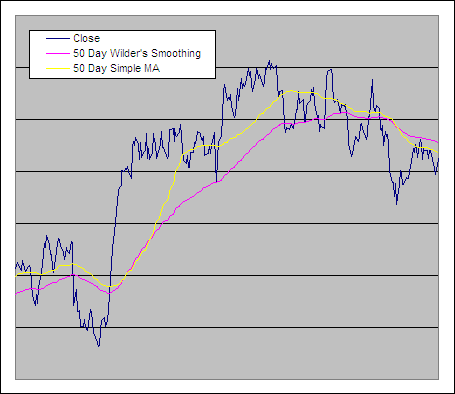
Wilder's Smoothing vs Simple Moving Average

.

Test Results

.

We tested Wilder’s Smoothing through 300 years of data across 16 global markets to reveal if it is an effective trading tool – see the results.

.

.

Wilder’s Smoothing was developed buy J. Welles Wilder, Jr. and he used it as a component in several of his other indicators including the RSI which is one of the most popular technical indicators of all time.

ETF HQ Report – The Bears Mean Business

August 16, 2010 – 09:30 am EDT

Last week we warned that things didn’t look good, that volume flows suggested resistance would not be broken, that the trend change had failed and that the likely hood of a good rally had diminished almost entirely.  Sadly this all turned out to be true and now some major technical damage has been done.

****Was this kind of advance warning of value to you?  If it was then please return the favor by inviting others to subscribe.  The more readers we have the more services we can provide for you.  Please send people to http://etfhq.com to subscribe – Thanks in advance for your support!

.

ETF % Change Comparison

.

ETF % Change Comparison

Here you start to get an indication to the extent of the damage.  SMH lead the declines with a 7.29% drop, followed by IWM down 6.25%.  Notice how the more stable SPY and DIA have held together much better by nearly every measure.  With the more economically sensitive ETFs leading the market lower we can see that the bears mean business.

Note – I have removed the ranking section due to the confusion it was causing.

Learn moreETF % Change Comparison

.

1

.

A Look at the Charts

.

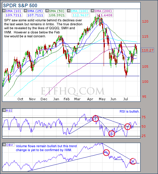
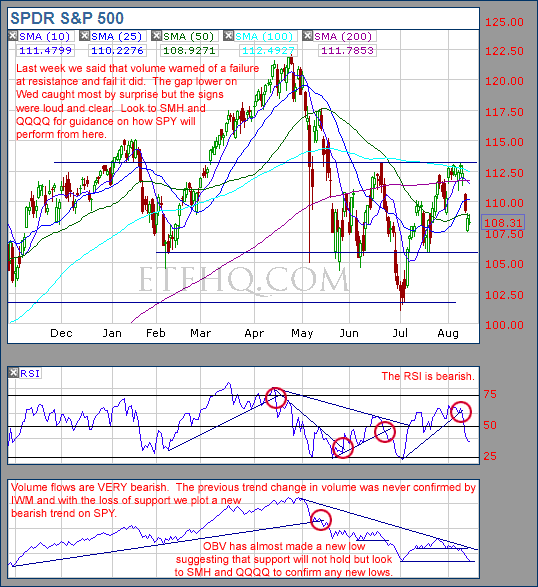
SPY

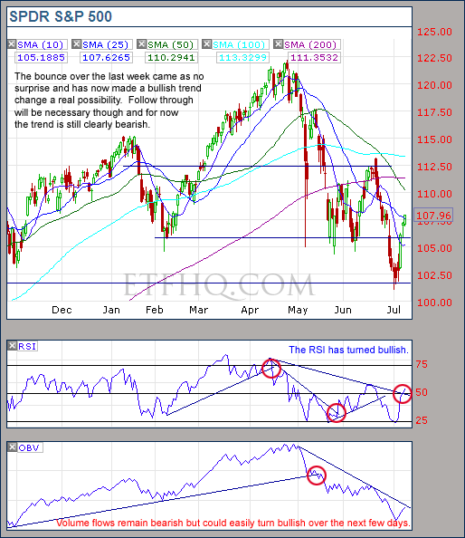
We warned of failure at resistance and fail it did.  Now new lows look likely but SMH and QQQQ will lead the way as usual.

.

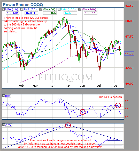
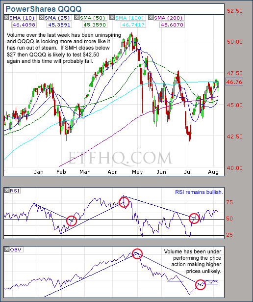
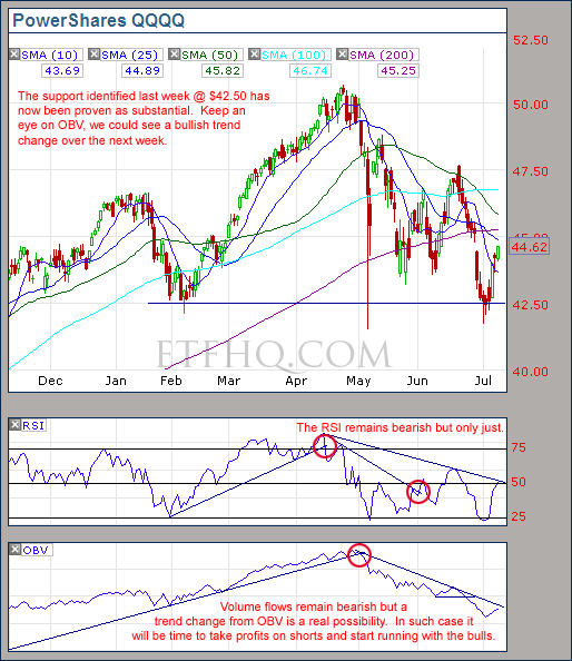
Volume on QQQQ is not nearly as bad as SPY which is positive.  A test of the 200 day SMA resistance is a real possibility.

.

SMH

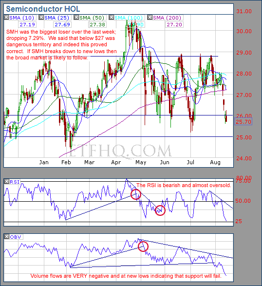
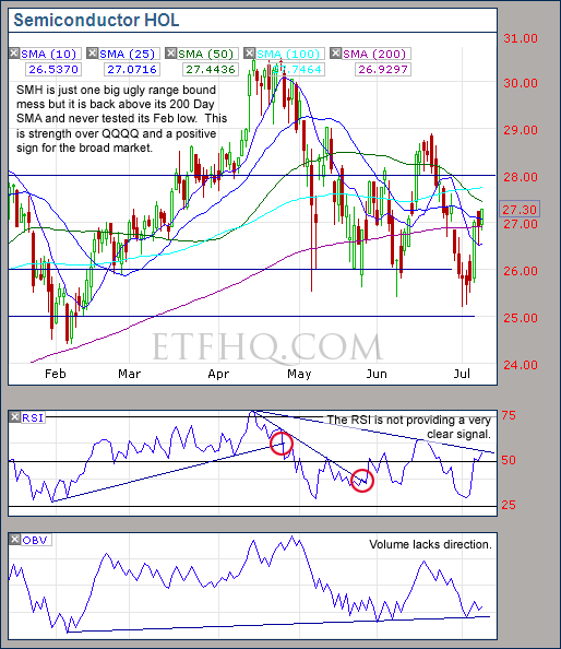
SMH is screaming new lows!  If that happens then the broad market is likely to follow.

.

IWM

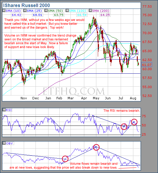
Yes is was worth the wait.  IWM saved us from being faked into turning bullish and now warns of new lows to come.

.

IYT

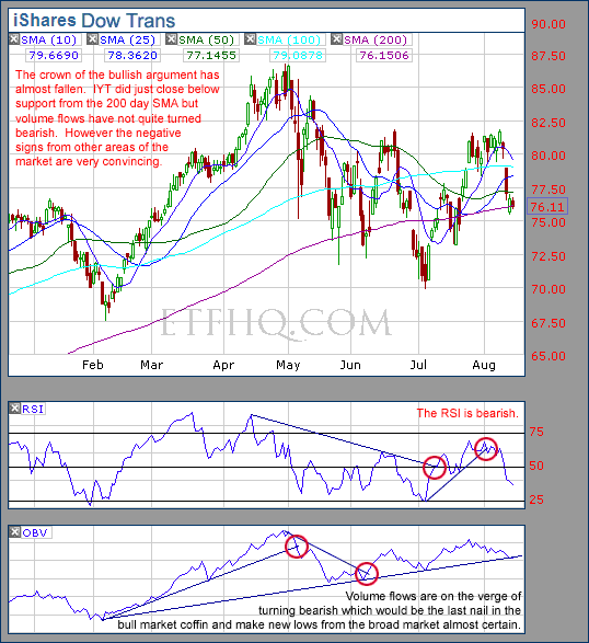
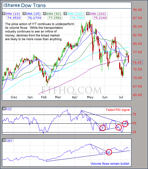
The strongest bullish argument has almost gone.  A trend change from OBV = goodbye crab market, hello bear market!

.

1

.

OM3 Weekly Indicator

.

OM3 Indicator

The bear alerts are not a surprise after such sharp declines and the strongest sell signal is coming from SMH; this is not a good sign.

Learn moreThe OM3 Indicator

.

1


TransDow & NasDow

.

TransDow & NasDow

Unfortunately the 2% profit on the Transports has turned into a 3.84% loss but it could have been much worse.  Now the Dow is dominant over both the Transports and the NASDAQ.  Historically the market has been very unproductive under these conditions and has seen most of its major declines.

.

What the TransDow Readings tell us:

The TransDow measures dominance between the DJ Transportation Index (DJTI) and the Dow Jones Industrial Average (DJIA). In a strong market the more economically sensitive Transportation Index should be dominant over the DJIA.

Historically the DJTI has been dominant over the Dow 45% of the time. The annualized rate of return from the DJTI during this period was 18.47% with the biggest loss for one trade sitting at -13.27%. The annualized return from the DJIA during the periods it was dominant over the DJTI was just 4.06% and the biggest loss for one trade was -16.13%. A 4% stop-loss is applied to all trades adjusting positions only at the end of the week.

What the NasDow Readings tell us:

The NasDow measures dominance between the NASDAQ and the DJIA. Using the same theory behind the Trans Dow; in a strong market the more economically sensitive NASDAQ should be dominant over the DJIA.

Historically the NASDAQ has been dominant over the DJIA 44% of the time. Taking only the trades when the NASDAQ is above its 40 week moving average the annualized rate of return was 25.47% with the biggest loss for one trade sitting at –8.59%. The annualized rate on the DJIA during the periods it was dominant over the NASDAQ is just 8.88% and the biggest loss for one trade was –12.28%. A 8% stop-loss is applied to all trades adjusting positions only at the end of the week.

.

1

.

LTMF 80 & Liquid Q

.

LTMF 80 & Liquid Q

Both LTMF 80 and Liquid Q remain in cash.

.

Historical Stats:

.

LTMF 80 & Liquid Q Stats

.

How The LTMF 80 Works

LTMF stands for Long Term Market Forecaster. It reads volume flows relative to price action and looks for out performance of volume measured on a percentage basis over the prior 12 months. During a sustained rally the readings will reach high levels (near 100%) making it imposable for the volume reading to always outperform price so any reading above 80% will maintain the buy signal. This system has outperformed the market over the last 10 years but performance has been damaged by some nasty losses. It only produces buy signals and only for QQQQ.

How Liquid Q Works

Liquid Q completely ignores price action and instead measures the relative flow of money between a selection of economically sensitive and comparatively stable ares of the market. It looks for times when the smart money is confident and and can be seen by through volume investing heavily is more risky areas due to an expectation of expansion. This system has outperformed the market over the last 10 years and remained in cash through most of the major declines. It only produces buy signals and only for QQQQ. We will provide more performance details on the web site for these systems soon.

.

1

.

Summary

Volume on SMH and IWM points to a failure of support and new lows to come while volume on QQQQ is not nearly as negative and IYT is on the verge of turning bearish.  The vast majority of the evidence points towards an end of the crab market and a continuation of the bearish trend.  However after such a sharp sell off I wouldn’t be surprised to see a mild bounce but any bounce will only delay the declines that are highly likely to be around the corner.

.

Any disputes, questions, queries, comments or theories are most welcome in the comments section below.

.

Cheers
Derry

And the Team @ ETF HQ

“Equipping you to win on Wall St so that you can reach your financial goals.”

.

P.S Like ETFHQ on Facebook – HERE

.

1

.

Quote of the Day:

“Start a business while you’re young. You’re able to sacrifice a lot more and put in the time necessary. It’s much harder and more time consuming that you ever would have thought.” – Rob Crespi founder of ‘Just Salad’

ETF HQ Report – It Doesn’t Look Good

August 09, 2010 – 07:20 am EDT

We have been waiting and waiting for this market to prove that it has the power to break through resistance and rally despite the many fundamental winds blowing in its face.  Unfortunately however the market has failed to do so and time has probably run out.  Things don’t look good and sadly it won’t take much to slip back into the bear market.

****Thanks to all those who referred people to this newsletter over the last week.  The more readers we have the more services we can provide you.

.

ETF % Change Comparison

.

ETF % Change Comparison

The hope was that the small caps (IWM) would finally step up and lead the market higher.  Instead they were the worst performers over the last week and have outperformed only SMH over the last four weeks.  This is not an encouraging sign at all.

Learn moreETF % Change Comparison

.

1

.

A Look at the Charts

.

SPY

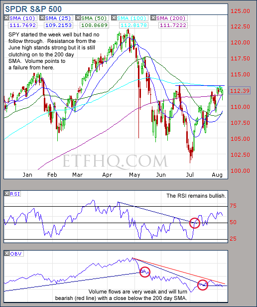
Volume flows suggest resistance will not be broken and that the trend change has failed.

.

QQQQ

There looks to be an easy ride from $45 to $42.50 if SMH closes below $27.

.

SMH

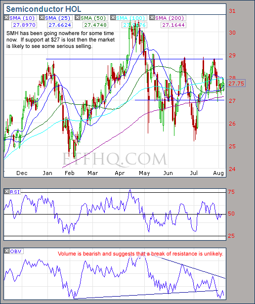
The action on SMH has been much ado about nothing but volume suggests weakness.  Lookout below $27!

.

IWM

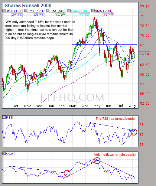
No trend change from volume to confirm the bull market but as long as IWM stays above its 200 day SMA there is hope.

.

IYT

It won’t take much selling to break IYTs volume trend but for now it remains bullish.

.

1

.

OM3 Weekly Indicator

.

OM3

The Bull Alerts over the last five weeks have brought with them some nice gains but the recent Buy signals are mostly Weak.

Learn moreThe OM3 Indicator

.

1


TransDow & NasDow

.

TransDow & NasDow

The Transportation Index remains dominant over the Dow which is positive and this trade is showing a small profit.  On a more negative note the Dow remains dominant over the NASDAQ.  Historically most of the big bullish moves have occurred when the NASDAQ has been dominant.

.

What the TransDow Readings tell us:

The TransDow measures dominance between the DJ Transportation Index (DJTI) and the Dow Jones Industrial Average (DJIA). In a strong market the more economically sensitive Transportation Index should be dominant over the DJIA.

Historically the DJTI has been dominant over the Dow 45% of the time. The annualized rate of return from the DJTI during this period was 18.47% with the biggest loss for one trade sitting at -13.27%. The annualized return from the DJIA during the periods it was dominant over the DJTI was just 4.06% and the biggest loss for one trade was -16.13%. A 4% stop-loss is applied to all trades adjusting positions only at the end of the week.

What the NasDow Readings tell us:

The NasDow measures dominance between the NASDAQ and the DJIA. Using the same theory behind the Trans Dow; in a strong market the more economically sensitive NASDAQ should be dominant over the DJIA.

Historically the NASDAQ has been dominant over the DJIA 44% of the time. Taking only the trades when the NASDAQ is above its 40 week moving average the annualized rate of return was 25.47% with the biggest loss for one trade sitting at –8.59%. The annualized rate on the DJIA during the periods it was dominant over the NASDAQ is just 8.88% and the biggest loss for one trade was –12.28%. A 8% stop-loss is applied to all trades adjusting positions only at the end of the week.

.

1

.

LTMF 80 & Liquid Q

.

LTMF 80 & Liquid Q

Both LTMF 80 and Liquid Q remain in cash.

.

Historical Stats:

.

LTMF 80 & Liquid Q Stats

.

How The LTMF 80 Works

LTMF stands for Long Term Market Forecaster. It reads volume flows relative to price action and looks for out performance of volume measured on a percentage basis over the prior 12 months. During a sustained rally the readings will reach high levels (near 100%) making it imposable for the volume reading to always outperform price so any reading above 80% will maintain the buy signal. This system has outperformed the market over the last 10 years but performance has been damaged by some nasty losses. It only produces buy signals and only for QQQQ.

How Liquid Q Works

Liquid Q completely ignores price action and instead measures the relative flow of money between a selection of economically sensitive and comparatively stable ares of the market. It looks for times when the smart money is confident and and can be seen by through volume investing heavily is more risky areas due to an expectation of expansion. This system has outperformed the market over the last 10 years and remained in cash through most of the major declines. It only produces buy signals and only for QQQQ. We will provide more performance details on the web site for these systems soon.

.

1

.

Summary

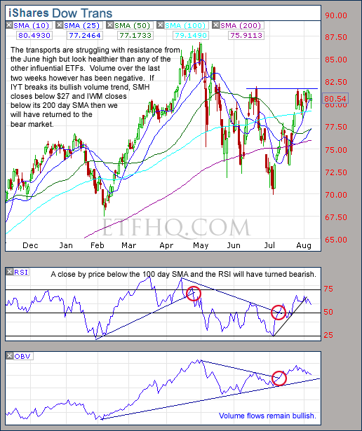
The biggest loss over the last week is the time that has passed.  Volume has been negative or uninspiring from most areas despite some advances in price.  The possibility for further advances does still remain as long as SMH holds above $27 and the 200 Day SMAs hold strong but the likely hood of a good rally has diminished almost entirely.  If however support fails, SMH closes below $27 and volume from IYT turns negative then we will have returned to the bear market.

.

Any disputes, questions, queries, comments or theories are most welcome in the comments section below.

.

Derry

And the Team @ ETF HQ

“Equipping you to win on Wall St so that you can reach your financial goals.”

.

P.S Like ETFHQ on Facebook – HERE

.

1

.

Quote of the Day:

The stock market is a no-called-strike game.  You don’t have to swing at everything, you can wait for your pitch.  The problem when you’re a money manager is that your fans keep yelling, ‘Swing, you bum!’ – Warren Buffett

The OM3 Indicator

The OM3 Indicator is one of the first indicators that I created and is featured in every edition of the ETF HQ report.  Over the medium term time frame trying to constantly hold a long or short position on any one stock or fund is a losing battle or at best a very difficult way to go about making money.

There will simply be periods when high probability trading opportunities are not available and these periods usually occur during crab markets.  For this reason I am a big advocate of systems that are highly opportunistic or involve fund rotation in order to identify areas where trends do exist.

Despite any individual security lacking favorable trading opportunities at times, the OM3 Indicator is designed to always provide a clear indication of direction based on historical probabilities.  This is useful becuase it is easy for ones analysis of market direction to be influenced by the positions that are being held at that time.  Using the OM3 Indicator helps one to maintain objectivity regardless of personal bias.

.

How It Works

.

Markets trend and cycle and there are indicators designed to perform in each environment.  The challenge comes in knowing when the market is trending and when it is cycling so that the appropriate indicator can be used.  The OM3 Indicator measures both so it is able to stay in the market during a prolonged trend, provides early warning when the trend is changing and survives during a crab market.

The indicator consists of two parts the ‘Signal’ and the ‘Alert’.  The ‘Signal’ can be a Strong or Weak, Buy or Sell – which is self explanatory.  ‘No Signal’ means that the component readings are in conflict and cancel each other out.

The alerts let you know if the cycle is speeding up or slowing down, so when there is a ‘Strong Buy, Bear Alert’ for instance; it simply means that the criteria for a Strong Buy is still in place but the cycle reading for this week is weaker (or more bearish) than last weeks reading (the same is true in reverse).

Example:

Example

Here you can see that the cycle has been turning up for three weeks but the criteria for a ‘Buy’ signal has only just been achieved.

The number of weeks that a signal has been present is displayed.  Historically a ‘Strong Buy’ signal has lasted for an average of 6 weeks and a maximum of 42 weeks, while a ‘Strong Sell’ has lasted for an average of 4 weeks and a maximum of 16.  These numbers give you an idea of the statistical life expectancy of each signal.

This is an indicator NOT a mechanical trading model.  It is useful to assist in the objective analysis of the market but for the best results should be combined with commonsense and support/resistance levels etc.

ETF % Change Comparison

Each week in the ETF HQ report we look at a percentage comparison on the performance of six ETFs.  This group we refer to as ‘The Influential ETFs’ because they are highly influential in dictating the markets true direction.  The group is made up of four ‘Economically Sensitive‘ (SMH, QQQQ, IWM and IYT) and two ‘Economically Stable‘ funds (SPY and DIA).

Example:

ETF % Change Comparison

The ‘Economically Sensitive’ ETFs amplify market movements rather like a Richter Scale amplifies the movements of the earth in order to warn of coming earth quakes and eruptions.  While the more ‘Economically Stable’ ETFs are important to get a gauge of relative performance; to provide a benchmark.

By comparing the performance of the economically sensitive and stable ETFs we can get an indication of the true market direction because the more sensitive areas are usually the first to initiate a trend change.  For example if DIA and SPY sell off heavily while SMH and IWM sell of mildly or continue moving to new highs then this would be very positive and vice versa.  By viewing the raw data in this ‘% Change Comparison’ we gain a useful additional perspective over just looking at the charts.

.

The Economically Sensitive:

.

SMH – Holds around 20 companies and is designed to provide exposure to the semiconductor industry.  Today, in the information age this is arguably the most economically sensitive industry of all because it stands at the front of the business cycle.  Semiconductors suffer periods of under and over supply that are uniquely linked to the speed of economic growth.

Because technology is advancing so quickly any inventory has a very short shelf life which results in painful loses for semiconductors before any other industry during a slowdown.  This is why SMH is such a fantastic leading indicator for the direction and health of the broad market.  Semiconductors play a similar role to that played by the rail roads during the industrial age and are useful as part of a modern Dow Theory.

QQQQ – Holds all the stocks in the NASDAQ 100 which is made up of the largest non-financial securities listed on the NASDAQ Stock Exchange.  It is often referred to as the technology index becuase it is heavily weighted in the technology sector which is particularly economically sensitive.  It is not possible for the economy to perform well without creating demand for services from the technology sector and technology stocks can’t perform well without their prosperity driving up demand for semiconductors.  For this reason QQQQ tends to lead the broad market and SMH tends to lead QQQQ.

IWM – Holds about 90% of the securities in the Russell 2000 index in an attempt to track its performance.  The Russell 2000 represents approximately 2000 of the smallest companies by market capitalization in the Russell 3000.  While the Russell 3000 represents about 98% of the investable US market the Russell 2000 represents under 10%.  These smaller companies have have the ability to grow much faster than their larger competitors when economic conditions are favorable but lack the stability of the large caps to weather storms as easily.

IYT – Tracks the Dow Jones Transportation Average and is comprised of companies involved in areas like air travel, trucking, railroads, air freight etc.  Despite living in the information age, people and goods must still be moved in order for the wheels of industry to keep turning.  If the Transports are performing well then it means that goods are being sold and this is a positive sign just as Dow observed in the his Dow Theory over 100 years ago.

.

The Economically Stable:

.
SPY – Emulates the S&P 500 which is designed to represent the 500 largest publicly traded US based companies by market capitalization.  Due to the size of the companies that make up the S&P 500 it has a comparatively economically stable.

DIA – Tracks the Dow Jones Industrial Average which is made up of 30 Mega Cap US companies.  These are ‘Blue Chip’ stocks that are considered some of the most stable and well established companies in the world making them about as economically stable as a public company can get.

.

Colors

.
The colors show the rank from 1-6 with 1 being the highest:

Color Rank.

ETF HQ Report – Time Is Running Out

August 02, 2010 – 02:40 am EDT

August, 2010?  Doesn’t that sound the opening dialogue of some sci-fi film set in the distant future where we all drive cars that float?  Anyway, over the last week there were some good bits and some bad bits but the declines were small and no real technical damage has been done… yet.  If we are going to see a trend change however, time is running out so the bulls must step up to the mark very soon.

****Thanks to all those who referred people to this newsletter over the last week, sharing is caring.

.

ETF % Change Comparison

.

ETF % Change Comparison

This market doesn’t like to make life easy does it?  It is exceptionally positive to see the Transports (IYT) bucking the trend and advancing a healthy 1.21% while it is concerning to see the Semiconductors (SMH) fall 3.69% for the week.  These conflicting internals are one of the reasons why a trend is finding it so difficult to develop.

.

What the % Comparison Table Tells Us:

By comparing the performance of the economically sensitive (SMH, QQQQ, IWM, IYT) and the comparatively stable ETFs (SPY and DIA) we can get an indication of the true market direction. The more sensitive areas of the market tend to be the first to initiate a trend change. For example if DIA and SPY sell off heavily while SMH and IWM (Russell 2000 small cap ETF) sell of mildly or continue moving to new highs then this would be very positive and vice versa.

The ‘Average Rank %’ is calculated by subtracting the % change for each ETF from the maximum % change and dividing it by the range for each period. 1-((MAX(% change all ETFs)-ETFs % Change)/(MAX(% change all ETFs)-MIN(% change all ETFs))) The readings for each period are then averaged. This reading is provided because if one ETF was significantly under/out performing the others then a plain high or low rank would not accurately reflect this.

.

1

.

A Look at the Charts

.

SPY

Heavy volume behind the declines on SPY last week are not a good look but the performance of QQQQ carries more weight.

.
QQQQ

QQQQ continues to outperform SPY which is positive but a close below $45 will cause problems.

.
SMH

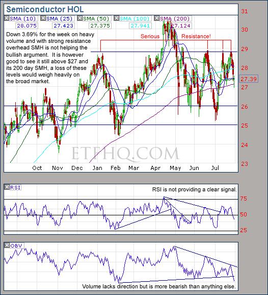
SMH is still holding onto $27 but the volume behind the declines over the last week was very heavy.

.
IWM

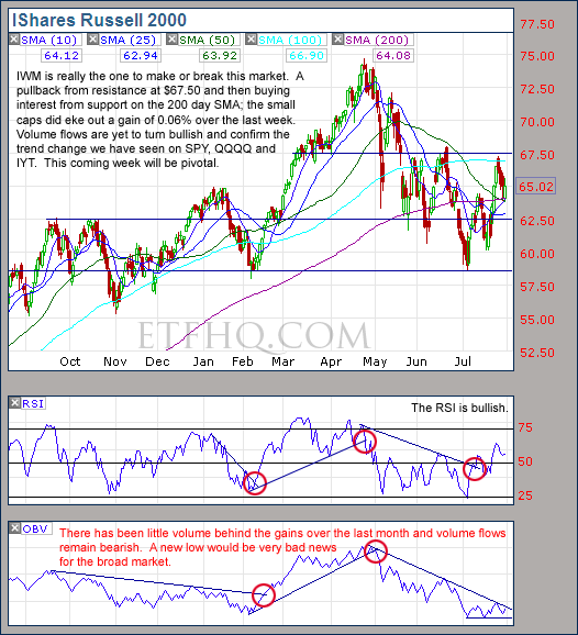
Will we see the Small Caps lead the market higher or not?  Keep an eye on that volume trend.

.
IYT

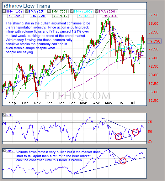
FedEx shares climbed 5.6% on Monday on good earnings which helps to explain why the volume into IYT has been so strong for the last two months.  Such performance requires the moving of goods and goods are only moved when goods are sold and this is a positive sign for the economy.  So if the market does start to fall apart and support levels begin to fail then a return to the bear market can’t be confirmed until volume flows on IYT turn negative.

.

1

.

OM3 Weekly Indicator

.

OM3

The OM3 indicator is not very enthusiastic and suggests that the weekly cycle is still moving up but within a bear market.

.

How to read the OM3 indicator

The OM3 indicator as with most of our models primarily reads price action and volume. The strong/weak buy/sell signals are self-explanatory. ‘No Signal’ means that the component readings are in conflict and cancel each other out.

The alerts let you know if the cycle is speeding up or slowing down, so when you get at ‘Strong Buy, Bear Alert’ for instance it simply means that the criteria for a strong buy is in place but this weeks cycle reading is weaker (or more bearish) than last weeks reading (the same is true in reverse).

The number of weeks that a signal has been repeated is displayed. Historically a ‘Strong Buy’ signal has lasted for an average of 6 weeks and a maximum of 42 weeks, while a ‘Strong Sell’ has lasted for an average of 4 weeks and a maximum of 16.

This is an indicator not a mechanical trading model. It is useful to assist in analyzing the market but for the best results should be combined with commonsense and support/resistance levels etc.

.

1

.

TransDow & NasDow

.

TransDow & NasDow

The Transports remain dominant over the Dow and are showing a small profit after one week.  The Dow has just emerged as the dominant index over the NASDAQ which is not a positive sign.

.

What the TransDow Readings tell us:

The TransDow measures dominance between the DJ Transportation Index (DJTI) and the Dow Jones Industrial Average (DJIA). In a strong market the more economically sensitive Transportation Index should be dominant over the DJIA.

Historically the DJTI has been dominant over the Dow 45% of the time. The annualized rate of return from the DJTI during this period was 18.47% with the biggest loss for one trade sitting at -13.27%. The annualized return from the DJIA during the periods it was dominant over the DJTI was just 4.06% and the biggest loss for one trade was -16.13%. A 4% stop-loss is applied to all trades adjusting positions only at the end of the week.

What the NasDow Readings tell us:

The NasDow measures dominance between the NASDAQ and the DJIA. Using the same theory behind the Trans Dow; in a strong market the more economically sensitive NASDAQ should be dominant over the DJIA.

Historically the NASDAQ has been dominant over the DJIA 44% of the time. Taking only the trades when the NASDAQ is above its 40 week moving average the annualized rate of return was 25.47% with the biggest loss for one trade sitting at –8.59%. The annualized rate on the DJIA during the periods it was dominant over the NASDAQ is just 8.88% and the biggest loss for one trade was –12.28%. A 8% stop-loss is applied to all trades adjusting positions only at the end of the week.

.

1

.

LTMF 80 & Liquid Q

.

LTMF 80 & Liquid Q

Both LTMF 80 and Liquid Q remain in cash.

.

Historical Stats:

.

LTMF 80 & Liquid Q Stats

.

How The LTMF 80 Works

LTMF stands for Long Term Market Forecaster. It reads volume flows relative to price action and looks for out performance of volume measured on a percentage basis over the prior 12 months. During a sustained rally the readings will reach high levels (near 100%) making it imposable for the volume reading to always outperform price so any reading above 80% will maintain the buy signal. This system has outperformed the market over the last 10 years but performance has been damaged by some nasty losses. It only produces buy signals and only for QQQQ.

How Liquid Q Works

Liquid Q completely ignores price action and instead measures the relative flow of money between a selection of economically sensitive and comparatively stable ares of the market. It looks for times when the smart money is confident and and can be seen by through volume investing heavily is more risky areas due to an expectation of expansion. This system has outperformed the market over the last 10 years and remained in cash through most of the major declines. It only produces buy signals and only for QQQQ. We will provide more performance details on the web site for these systems soon.

.

1

.

Summary

I said last week that “If the 200 Day SMAs start falling and SMH closes below $27 then prospects of a trend change are probably dead and burred for the time being.”  This is still the case but I would add that if volume flows on IYT turn bearish then we have returned to the bearish market.  I still have faith in the bullish prospects but a return to be bull market will need to to be confirmed by a trend change in volume flows on IWM while QQQQ and SMH continue to hold onto their 200 day SMAs.  In the interim the market remains in limbo and we would all be wise to remain patient.

.

Any disputes, questions, queries, comments or theories are most welcome in the comments section below.

.

Derry

And the Team @ ETF HQ

“Equipping you to win on Wall St so that you can reach your financial goals.”

.

P.S Like ETFHQ on Facebook – HERE

.

1

.

Poem of the Day:

Lose this day loitering – ’twill be the same story
To-morrow – and the next more dilatory;
Each indecision brings its own delays,
And days are lost lamenting o’er lost days,

Are you in earnest?  Sieze this very minute –
Boldness has genius, power and magic in it.
Only engage, and then the mind grows heated –
Begin it, and then the work will be completed!

Johann Wolfgang Von Goethe (1749 – 1832)
ETF HQ Report – Typical During A Trend Change

July 26, 2010 – 08:25 am EDT

The prospects of a trend change are alive and well and signs of strength were visible on Tuesday when we posted to our Facebook page “SMH is showing impressive resiliency by holding onto its 200 day SMA, several positive signs today”.  The week only improved from there and the best news is that the market was being lead higher by the small caps!

****Thanks to all those who referred people to this newsletter over the last week, sharing is caring.

.

ETF % Change Comparison

.
ETF % Change Comparison

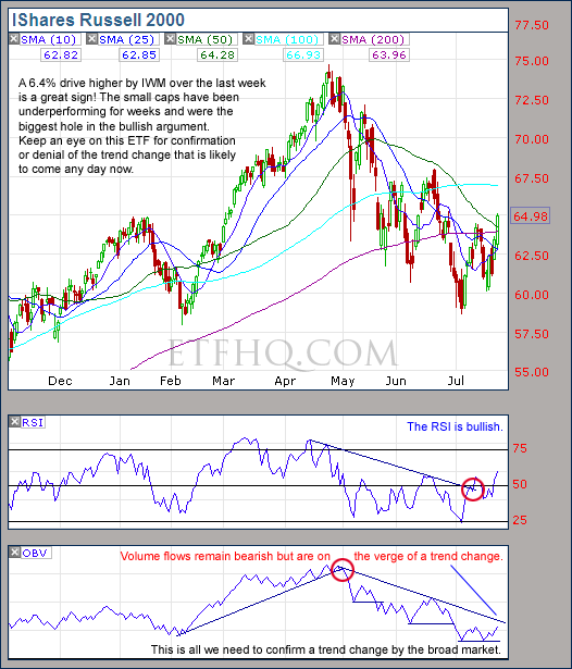
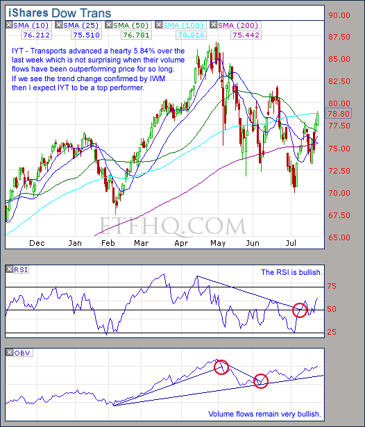
IWM is still down over 12% from its recent peak but was the top performer over the last week advancing 6.4% followed by IYT with 5.84%.  It is fantastic to see these highly economically sensitive areas of the market leading it higher.  Note how SMH was the first to peak 99 days ago but is now closer to that peak than any of the other ‘influential’ ETFs.  This is the type of behavior that is typical during a bullish trend change.
.

What the % Comparison Table Tells Us:

By comparing the performance of the economically sensitive (SMH, QQQQ, IWM, IYT) and the comparatively stable ETFs (SPY and DIA) we can get an indication of the true market direction. The more sensitive areas of the market tend to be the first to initiate a trend change. For example if DIA and SPY sell off heavily while SMH and IWM (Russell 2000 small cap ETF) sell of mildly or continue moving to new highs then this would be very positive and vice versa.

The ‘Average Rank %’ is calculated by subtracting the % change for each ETF from the maximum % change and dividing it by the range for each period. 1-((MAX(% change all ETFs)-ETFs % Change)/(MAX(% change all ETFs)-MIN(% change all ETFs))) The readings for each period are then averaged. This reading is provided because if one ETF was significantly under/out performing the others then a plain high or low rank would not accurately reflect this.

.

1

.

A Look at the Charts

.

SPY

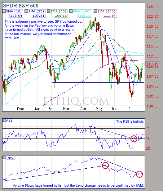
SPY says that the trend change has already occurred but we still need IWM to confirm.

.

QQQQ

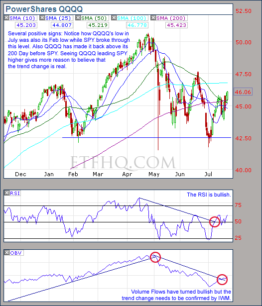
QQQQ is showing strength over SPY which is very positive.  Now we just need IWM to confirm the trend change.

.

SMH

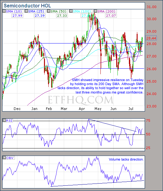
SMH lacks direction but continues to show strength which gives weight to the probability of a bullish trend change.

.

IWM

Waiting, waiting for confirmation from IWM.  Keep an eye on that volume trend.

.

IYT

If we return to the bull market then transportation stocks are likely to do particularly well.

.

1

.

OM3 Weekly Indicator

.

OM3 Indicator

The first buy signals (all be it ‘Weak Buy’ signals) in 10 weeks are a positive sign while the ‘Bull Alerts’ indicate that the weekly cycle moved up for the third week in a row.

.

How to read the OM3 indicator

The OM3 indicator as with most of our models primarily reads price action and volume. The strong/weak buy/sell signals are self-explanatory. ‘No Signal’ means that the component readings are in conflict and cancel each other out.

The alerts let you know if the cycle is speeding up or slowing down, so when you get at ‘Strong Buy, Bear Alert’ for instance it simply means that the criteria for a strong buy is in place but this weeks cycle reading is weaker (or more bearish) than last weeks reading (the same is true in reverse).

The number of weeks that a signal has been repeated is displayed. Historically a ‘Strong Buy’ signal has lasted for an average of 6 weeks and a maximum of 42 weeks, while a ‘Strong Sell’ has lasted for an average of 4 weeks and a maximum of 16.

This is an indicator not a mechanical trading model. It is useful to assist in analyzing the market but for the best results should be combined with commonsense and support/resistance levels etc.

.

1

.

TransDow & NasDow

.

TransDow & NasDow

There remains no signal on the NasDow while on a positive note the TransDow opened a new position in the Transportation Index on Friday.

.

What the TransDow Readings tell us:

The TransDow measures dominance between the DJ Transportation Index (DJTI) and the Dow Jones Industrial Average (DJIA). In a strong market the more economically sensitive Transportation Index should be dominant over the DJIA.

Historically the DJTI has been dominant over the Dow 45% of the time. The annualized rate of return from the DJTI during this period was 18.47% with the biggest loss for one trade sitting at -13.27%. The annualized return from the DJIA during the periods it was dominant over the DJTI was just 4.06% and the biggest loss for one trade was -16.13%. A 4% stop-loss is applied to all trades adjusting positions only at the end of the week.

What the NasDow Readings tell us:

The NasDow measures dominance between the NASDAQ and the DJIA. Using the same theory behind the Trans Dow; in a strong market the more economically sensitive NASDAQ should be dominant over the DJIA.

Historically the NASDAQ has been dominant over the DJIA 44% of the time. Taking only the trades when the NASDAQ is above its 40 week moving average the annualized rate of return was 25.47% with the biggest loss for one trade sitting at –8.59%. The annualized rate on the DJIA during the periods it was dominant over the NASDAQ is just 8.88% and the biggest loss for one trade was –12.28%. A 8% stop-loss is applied to all trades adjusting positions only at the end of the week.

.

1

.

LTMF 80 & Liquid Q

.

LTMF 80 & Liquid Q

Both LTMF 80 and Liquid Q remain in cash.

.

Historical Stats:

.

LTMF 80 & Liquid Q Stats

.

How The LTMF 80 Works

LTMF stands for Long Term Market Forecaster. It reads volume flows relative to price action and looks for out performance of volume measured on a percentage basis over the prior 12 months. During a sustained rally the readings will reach high levels (near 100%) making it imposable for the volume reading to always outperform price so any reading above 80% will maintain the buy signal. This system has outperformed the market over the last 10 years but performance has been damaged by some nasty losses. It only produces buy signals and only for QQQQ.

How Liquid Q Works

Liquid Q completely ignores price action and instead measures the relative flow of money between a selection of economically sensitive and comparatively stable ares of the market. It looks for times when the smart money is confident and and can be seen by through volume investing heavily is more risky areas due to an expectation of expansion. This system has outperformed the market over the last 10 years and remained in cash through most of the major declines. It only produces buy signals and only for QQQQ. We will provide more performance details on the web site for these systems soon.

.

1

.

Summary
Every sign but one now points to a bullish trend change and there is little negative that can be said about the market from a technical stand point.  All we are waiting for now is confirmation in the way of a trend change from OBV on IWM.  If it comes then there really is no excuse for holding short positions and the market should be full of medium term bullish opportunities.

If the 200 Day SMAs start falling and SMH closes below $27 then prospects of a trend change are probably dead and burred for the time being.

.

Any disputes, questions, queries, comments or theories are most welcome in the comments section below.

.

Derry

And the Team @ ETF HQ

“Equipping you to win on Wall St so that you can reach your financial goals.”

.

P.S Like ETFHQ on Facebook – HERE

.

1

.

Quote of the Day:

“A true master is not the one with the most students, but the one who creates the most Masters.  A true leader is not the one with the most followers, but the one who creates the most leaders.”

Neale Donald Walsch in Conversations With God

ETF HQ Report – And The Little One Said

July 18 , 2010 – 11:48 pm EDT

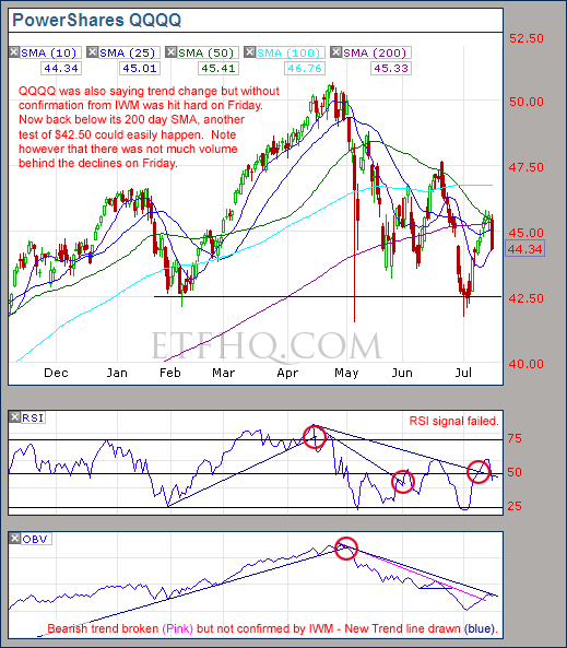
What an interesting week!  We were on the verge of a trend change but the small caps didn’t come to the party and the market sold off heavily on Friday.  I posted to our Facebook page on Thursday “QQQQ, IYT and SPY all say trend change but IWM says not yet!”  Unfortunately only a handful of you follow us on Facebook… are we no fun or do you just not use FB?  It is a great way to share mid week updates and discuss interesting topics – Find our page here.

****Thanks to all those who referred people to this newsletter over the last week, sharing is caring.

.

ETF % Change Comparison

.

ETF % Change Comparison

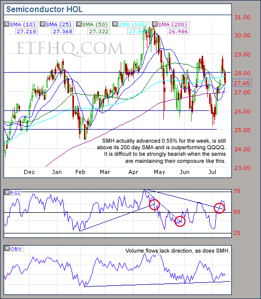
Now look at this… SMH managed to advance 0.55% for the week and is up almost 7% over the last two weeks.  If the market was really sick then I would expect to see SMH being slammed.  What is concerning though is how poorly the small caps in IWM are performing; they are down from their peak almost twice as much as SMH.  We are unlikely to see a strong trend while these conflicting internals continue.

.

What the % Comparison Table Tells Us:

By comparing the performance of the economically sensitive (SMH, QQQQ, IWM, IYT) and the comparatively stable ETFs (SPY and DIA) we can get an indication of the true market direction. The more sensitive areas of the market tend to be the first to initiate a trend change. For example if DIA and SPY sell off heavily while SMH and IWM (Russell 2000 small cap ETF) sell of mildly or continue moving to new highs then this would be very positive and vice versa.

The ‘Average Rank %’ is calculated by subtracting the % change for each ETF from the maximum % change and dividing it by the range for each period. 1-((MAX(% change all ETFs)-ETFs % Change)/(MAX(% change all ETFs)-MIN(% change all ETFs))) The readings for each period are then averaged. This reading is provided because if one ETF was significantly under/out performing the others then a plain high or low rank would not accurately reflect this.

.

1

.

A Look at the Charts

.

IWM

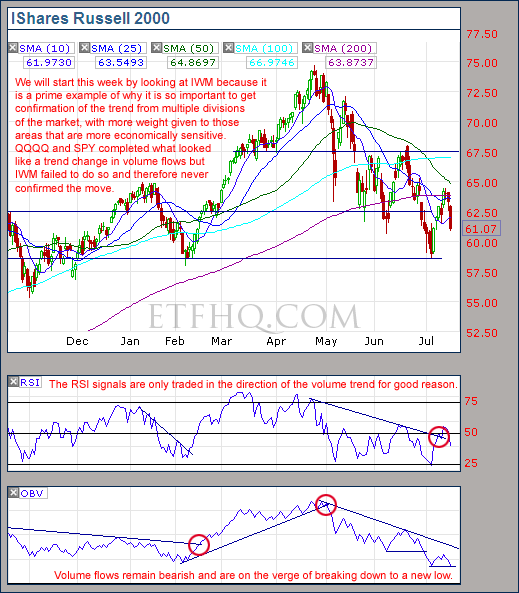
Here you can see the failure of IWM to confirm the trend change by QQQQ and SPY.  Money is leaving the small caps with real enthusiasm.

.

SPY

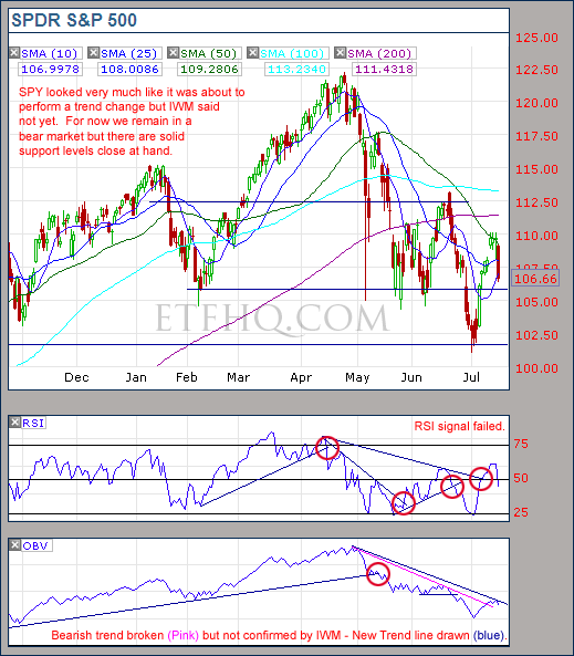
To look to only one area of the market is like seeing the world in only one color: A huge amount of detail is lost.

.

QQQQ

Volume behind the declines on Friday was nothing impressive and there is powerful support at $42.50.  IWM and SMH will need to sell off heavily if QQQQ is to fail at support.

.

SMH

Looking at SMH gives me confidence in the prospects for this market.  It would not be holding together so well if the bear market was really strong.

.

IYT

Volume flows for IYT continue to maintain their bullish trend – another reason to believe that the sky is not falling.

.

1

.

OM3 Weekly Indicator

.

OM3 Indicator

‘Stong Sell’ signals indicate that the trend is still down while the ‘Bull Alerts’ indicate that the weekly cycle continues to turn up.

.

How to read the OM3 indicator

The OM3 indicator as with most of our models primarily reads price action and volume. The strong/weak buy/sell signals are self-explanatory. ‘No Signal’ means that the component readings are in conflict and cancel each other out.

The alerts let you know if the cycle is speeding up or slowing down, so when you get at ‘Strong Buy, Bear Alert’ for instance it simply means that the criteria for a strong buy is in place but this weeks cycle reading is weaker (or more bearish) than last weeks reading (the same is true in reverse).

The number of weeks that a signal has been repeated is displayed. Historically a ‘Strong Buy’ signal has lasted for an average of 6 weeks and a maximum of 42 weeks, while a ‘Strong Sell’ has lasted for an average of 4 weeks and a maximum of 16.

This is an indicator not a mechanical trading model. It is useful to assist in analyzing the market but for the best results should be combined with commonsense and support/resistance levels etc.

.

1

.

TransDow & NasDow

.

TransDow and NasDow

For the NasDow there continues to be no clearly dominant index while for the TransDow the Dow remains dominant. Historically the market has been very unproductive under these conditions and has seen the majority of it’s major declines.

.

What the TransDow Readings tell us:

The TransDow measures dominance between the DJ Transportation Index (DJTI) and the Dow Jones Industrial Average (DJIA). In a strong market the more economically sensitive Transportation Index should be dominant over the DJIA.

Historically the DJTI has been dominant over the Dow 45% of the time. The annualized rate of return from the DJTI during this period was 18.47% with the biggest loss for one trade sitting at -13.27%. The annualized return from the DJIA during the periods it was dominant over the DJTI was just 4.06% and the biggest loss for one trade was -16.13%. A 4% stop-loss is applied to all trades adjusting positions only at the end of the week.

What the NasDow Readings tell us:

The NasDow measures dominance between the NASDAQ and the DJIA. Using the same theory behind the Trans Dow; in a strong market the more economically sensitive NASDAQ should be dominant over the DJIA.

Historically the NASDAQ has been dominant over the DJIA 44% of the time. Taking only the trades when the NASDAQ is above its 40 week moving average the annualized rate of return was 25.47% with the biggest loss for one trade sitting at –8.59%. The annualized rate on the DJIA during the periods it was dominant over the NASDAQ is just 8.88% and the biggest loss for one trade was –12.28%. A 8% stop-loss is applied to all trades adjusting positions only at the end of the week.

.

1

.

LTMF 80 & Liquid Q

.

LTMF 80 & Liquid Q

Both LTMF 80 and Liquid Q remain in cash.

.

Historical Stats:

.

LTMF 80 & Liquid Q Stats

.

How The LTMF 80 Works

LTMF stands for Long Term Market Forecaster. It reads volume flows relative to price action and looks for out performance of volume measured on a percentage basis over the prior 12 months. During a sustained rally the readings will reach high levels (near 100%) making it imposable for the volume reading to always outperform price so any reading above 80% will maintain the buy signal. This system has outperformed the market over the last 10 years but performance has been damaged by some nasty losses. It only produces buy signals and only for QQQQ.

How Liquid Q Works

Liquid Q completely ignores price action and instead measures the relative flow of money between a selection of economically sensitive and comparatively stable ares of the market. It looks for times when the smart money is confident and and can be seen by through volume investing heavily is more risky areas due to an expectation of expansion. This system has outperformed the market over the last 10 years and remained in cash through most of the major declines. It only produces buy signals and only for QQQQ. We will provide more performance details on the web site for these systems soon.

.

1

.

Summary

.

We remain in a bear market that is likely to have a weak trend while IYT continues to have bullish volume flows.  Expect continued volatility and indecisiveness from the market.  This is a challenging period that puts a traders patience to the test.  Remember: the stock market is a mechanism designed to transfer money from the active to the patient.

.

Any disputes, questions, queries, comments or theories are most welcome in the comments section below.

.

Derry

And the Team @ ETF HQ

“Equipping you to win on Wall St so that you can reach your financial goals.”

.

P.S Like ETFHQ on Facebook – HERE

.

1

.

Riddle of the Day:

Q – How many legs does a dog have if you call his tail a leg?

A – Four, because calling a tail a leg does not make it a leg.

ETF HQ Report – On The Verge Of A Trend Change

July 12 , 2010 – 07:58 am EDT

Congratulations to Spain on winning the World Cup!  They did well, there were some moments of brilliance (and 118 minutes of boredom) but the fireworks display was amazing.  As for the market, warning signs of an oversold bounce were there and over the last few days the majority of the losses from the previous week were recovered.  What does surprise me however, is that now with just a little more follow through, volume flows will turn positive and we will return to the bull market.  The question is; will there be any follow through?

****Get value from this newsletter?  If you do then please remember to invite others to subscribe, we grow by word of mouth (that means we need YOUR help).  Thanks in advance!

.

ETF % Change Comparison

.

ETF % Change Comparison

It is rather impressive to see that SMH is now up 0.81% over the last four weeks and down under 10% from its peak 85 days ago.  At turning points the Semiconductors tend to lead so this gives further backing to the bullish argument.

.

What the % Comparison Table Tells Us:

By comparing the performance of the economically sensitive (SMH, QQQQ, IWM, IYT) and the comparatively stable ETFs (SPY and DIA) we can get an indication of the true market direction. The more sensitive areas of the market tend to be the first to initiate a trend change. For example if DIA and SPY sell off heavily while SMH and IWM (Russell 2000 small cap ETF) sell of mildly or continue moving to new highs then this would be very positive and vice versa.

The ‘Average Rank %’ is calculated by subtracting the % change for each ETF from the maximum % change and dividing it by the range for each period. 1-((MAX(% change all ETFs)-ETFs % Change)/(MAX(% change all ETFs)-MIN(% change all ETFs))) The readings for each period are then averaged. This reading is provided because if one ETF was significantly under/out performing the others then a plain high or low rank would not accurately reflect this.

.

1

.

A Look at the Charts

.

SPY

SPY is on the verge of a trend change but it will need to be confirmed by QQQQ and IWM.

.

QQQQ

With volume flows suddenly within range of turning bullish and solid support underfoot the coming week will be interesting.

.

SMH

SMH may not have a clear direction but it is positive to see it outperforming QQQQ and SPY.

.

IWM

The small caps need to see much more positive volume before a trend change can be confirmed.

.IYT

We have been saying for a while now that it is strange for the Transports to have such strong volume flows if the market really is in a long term bear market.  This makes a bullish trend change by the broad market all the more of a possibility.

.

1

.

OM3 Weekly Indicator

.

OM3 Indicator

‘Sell Signals’ indicate that the trend is still down but the ‘Bull Alerts’ indicate that the weekly cycle has turned up.

.

How to read the OM3 indicator

The OM3 indicator as with most of our models primarily reads price action and volume. The strong/weak buy/sell signals are self-explanatory. ‘No Signal’ means that the component readings are in conflict and cancel each other out.

The alerts let you know if the cycle is speeding up or slowing down, so when you get at ‘Strong Buy, Bear Alert’ for instance it simply means that the criteria for a strong buy is in place but this weeks cycle reading is weaker (or more bearish) than last weeks reading (the same is true in reverse).

The number of weeks that a signal has been repeated is displayed. Historically a ‘Strong Buy’ signal has lasted for an average of 6 weeks and a maximum of 42 weeks, while a ‘Strong Sell’ has lasted for an average of 4 weeks and a maximum of 16.

This is an indicator not a mechanical trading model. It is useful to assist in analyzing the market but for the best results should be combined with commonsense and support/resistance levels etc.

.

1

.

TransDow & NasDow

.

TransDow & NasDow

For the NasDow there continues to be no clearly dominant index while for the TransDow the Dow remains dominant.  Historically the market has been very unproductive under these conditions and has seen the majority of it’s major declines.

.

What the TransDow Readings tell us:

The TransDow measures dominance between the DJ Transportation Index (DJTI) and the Dow Jones Industrial Average (DJIA). In a strong market the more economically sensitive Transportation Index should be dominant over the DJIA.

Historically the DJTI has been dominant over the Dow 45% of the time. The annualized rate of return from the DJTI during this period was 18.47% with the biggest loss for one trade sitting at -13.27%. The annualized return from the DJIA during the periods it was dominant over the DJTI was just 4.06% and the biggest loss for one trade was -16.13%. A 4% stop-loss is applied to all trades adjusting positions only at the end of the week.

What the NasDow Readings tell us:

The NasDow measures dominance between the NASDAQ and the DJIA. Using the same theory behind the Trans Dow; in a strong market the more economically sensitive NASDAQ should be dominant over the DJIA.

Historically the NASDAQ has been dominant over the DJIA 44% of the time. Taking only the trades when the NASDAQ is above its 40 week moving average the annualized rate of return was 25.47% with the biggest loss for one trade sitting at –8.59%. The annualized rate on the DJIA during the periods it was dominant over the NASDAQ is just 8.88% and the biggest loss for one trade was –12.28%. A 8% stop-loss is applied to all trades adjusting positions only at the end of the week.

.

1

.

LTMF 80 & Liquid Q

.

LTMF 80 & Liquid Q

Both LTMF 80 and Liquid Q remain in cash.

.

Historical Stats:

.

LTMF 80 & Liquid Q Stats

.

How The LTMF 80 Works

LTMF stands for Long Term Market Forecaster. It reads volume flows relative to price action and looks for out performance of volume measured on a percentage basis over the prior 12 months. During a sustained rally the readings will reach high levels (near 100%) making it imposable for the volume reading to always outperform price so any reading above 80% will maintain the buy signal. This system has outperformed the market over the last 10 years but performance has been damaged by some nasty losses. It only produces buy signals and only for QQQQ.

How Liquid Q Works

Liquid Q completely ignores price action and instead measures the relative flow of money between a selection of economically sensitive and comparatively stable ares of the market. It looks for times when the smart money is confident and and can be seen by through volume investing heavily is more risky areas due to an expectation of expansion. This system has outperformed the market over the last 10 years and remained in cash through most of the major declines. It only produces buy signals and only for QQQQ. We will provide more performance details on the web site for these systems soon.

.

1

.

Summary

.

The ‘Over Sold’ bounce that we were expecting may well turn out to be the start of a bullish trend change.  If volume flows on IYT remain bullish and we see a trend change from OBV on QQQQ and IWM then it will be time to establish long positions again.  Until then we remain in a bear market.

.

Any disputes, questions, queries, comments or theories are most welcome in the comments section below.

.

Derry

And the Team @ ETF HQ

“Equipping you to win on Wall St so that you can reach your financial goals.”

.

P.S Like ETFHQ on Facebook – HERE

.

1

.

Quote of the Day:

“You do things when the opportunities come along.  I’ve had periods in my life when I’ve had a bundle of ideas come along, and I’ve had long dry spells.  If I get an idea next week, I’ll do something.  If not, I won’t do a damn thing… You only have to do very few things right in your life so long as you don’t do too many things wrong.”  – Warren Buffett

ETF HQ Report – Volume Wins Again

July 05 , 2010 – 08:40 pm EDT

Well happy Independence Day America but the market sure knows how to rain on a parade.  Last week we warned that bearish volume flows indicated that support was soon to break and that a continuation of the bearish trend was highly likely.  Indeed, over the last few days the market has been a wash in red but things may not be as bad and they first appear…

.

ETF % Change Comparison

.

ETF % Change Comparison

Wow, IWM is now almost 19% from its peak 70 days ago while DIA is ‘only’ down 13%.  This is typical of a bear market where money retreats to the more economically stable areas like the mega cap stocks found in DIA.

.

What the % Comparison Table Tells Us:

By comparing the performance of the economically sensitive (SMH, QQQQ, IWM, IYT) and the comparatively stable ETFs (SPY and DIA) we can get an indication of the true market direction. The more sensitive areas of the market tend to be the first to initiate a trend change. For example if DIA and SPY sell off heavily while SMH and IWM (Russell 2000 small cap ETF) sell of mildly or continue moving to new highs then this would be very positive and vice versa.

The ‘Average Rank %’ is calculated by subtracting the % change for each ETF from the maximum % change and dividing it by the range for each period. 1-((MAX(% change all ETFs)-ETFs % Change)/(MAX(% change all ETFs)-MIN(% change all ETFs))) The readings for each period are then averaged. This reading is provided because if one ETF was significantly under/out performing the others then a plain high or low rank would not accurately reflect this.

.

1

.

A Look at the Charts

.

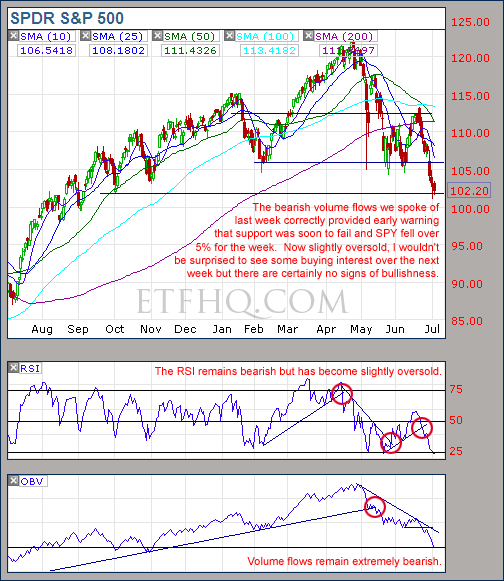
SPY

Volume flows on SPY correctly warned that support would fail and remain in a strong downward trend.

.

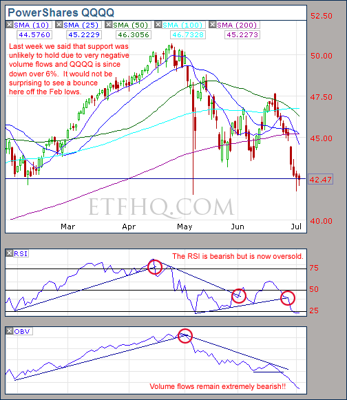
QQQQ

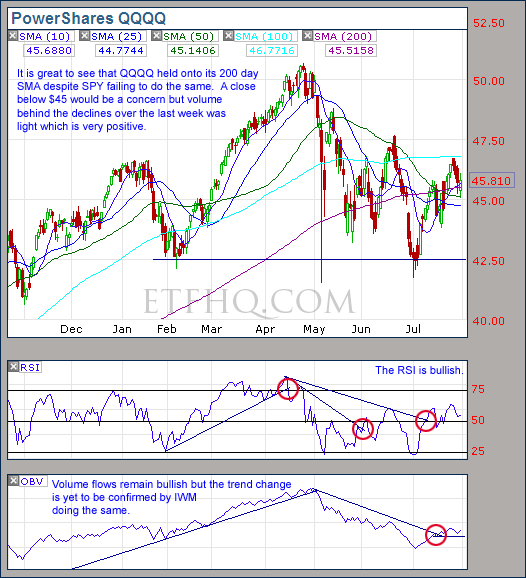
While all indications remain bearish on QQQQ an oversold bounce from support is quite possible.

.

SMH

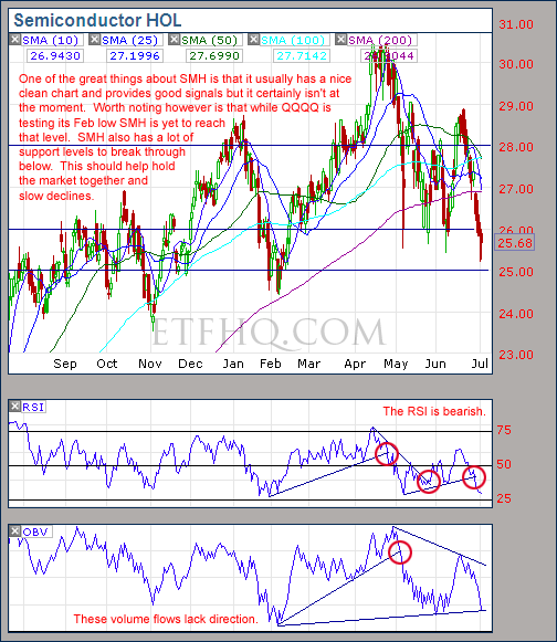
In a strongly trending bear market it is best to see SMH leading QQQQ and the broad market lower.  Instead SPY is testing its Oct low and QQQQ its Feb low while SMH is yet to reach either.  This would suggest that we are likely to have a bumpy ride lower rather than going straight down.

.

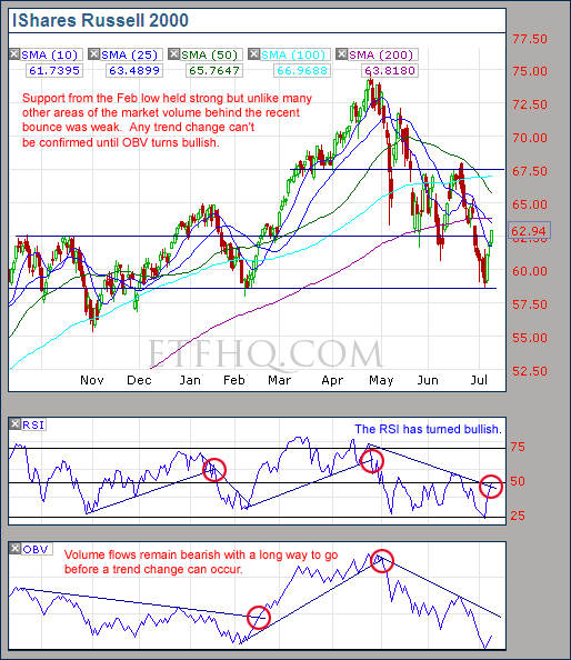
IWM

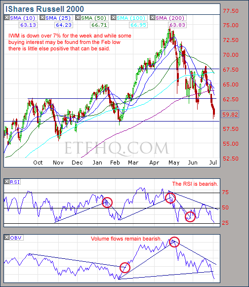
IWM like QQQQ is also coming up against support from the Feb low.  An oversold bounce from here is quite possible.

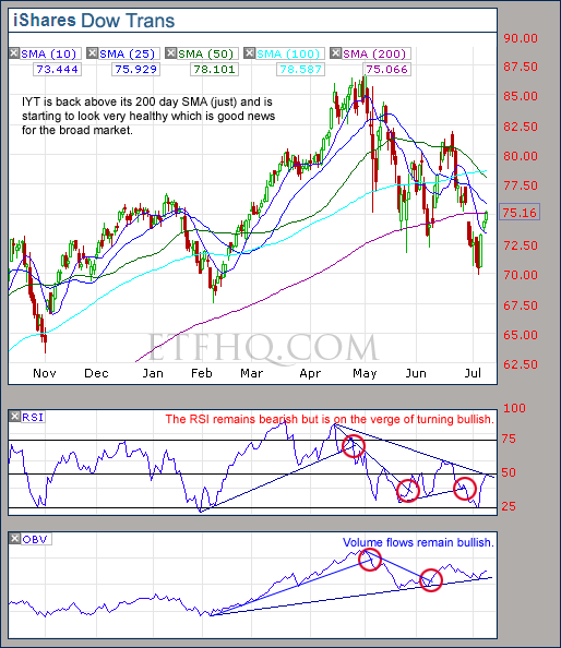
.IYT

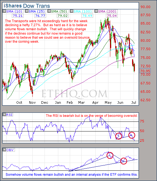
Despite a shocking week IYT still has bullish volume flows and after assessing the internal volume flows of its component stocks I can confirms this.  A break of this trend will confirm that we really are in a strong long term bear market.

.

1

.

OM3 Weekly Indicator

.

OM3 Indicator

Seven weeks of “Strong Sell” readings and fresh “Bear Alerts”; not positive to say the least.

.

How to read the OM3 indicator

The OM3 indicator as with most of our models primarily reads price action and volume. The strong/weak buy/sell signals are self-explanatory. ‘No Signal’ means that the component readings are in conflict and cancel each other out.

The alerts let you know if the cycle is speeding up or slowing down, so when you get at ‘Strong Buy, Bear Alert’ for instance it simply means that the criteria for a strong buy is in place but this weeks cycle reading is weaker (or more bearish) than last weeks reading (the same is true in reverse).

The number of weeks that a signal has been repeated is displayed. Historically a ‘Strong Buy’ signal has lasted for an average of 6 weeks and a maximum of 42 weeks, while a ‘Strong Sell’ has lasted for an average of 4 weeks and a maximum of 16.

This is an indicator not a mechanical trading model. It is useful to assist in analyzing the market but for the best results should be combined with commonsense and support/resistance levels etc.

.

1

.

TransDow & NasDow

.TransDow & NasDow

The shift to the Dow becoming dominant over the Transportation Index last week correctly identified a jump in market risk levels.  For the NasDow there continues to be no clearly dominant index.  Historically the market has been very unproductive under these conditions and has seen the majority of it’s major declines.

.

What the TransDow Readings tell us:

The TransDow measures dominance between the DJ Transportation Index (DJTI) and the Dow Jones Industrial Average (DJIA). In a strong market the more economically sensitive Transportation Index should be dominant over the DJIA.

Historically the DJTI has been dominant over the Dow 45% of the time. The annualized rate of return from the DJTI during this period was 18.47% with the biggest loss for one trade sitting at -13.27%. The annualized return from the DJIA during the periods it was dominant over the DJTI was just 4.06% and the biggest loss for one trade was -16.13%. A 4% stop-loss is applied to all trades adjusting positions only at the end of the week.

What the NasDow Readings tell us:

The NasDow measures dominance between the NASDAQ and the DJIA. Using the same theory behind the Trans Dow; in a strong market the more economically sensitive NASDAQ should be dominant over the DJIA.

Historically the NASDAQ has been dominant over the DJIA 44% of the time. Taking only the trades when the NASDAQ is above its 40 week moving average the annualized rate of return was 25.47% with the biggest loss for one trade sitting at –8.59%. The annualized rate on the DJIA during the periods it was dominant over the NASDAQ is just 8.88% and the biggest loss for one trade was –12.28%. A 8% stop-loss is applied to all trades adjusting positions only at the end of the week.

.

1

.

LTMF 80 & Liquid Q

.

LTMF 80 & Liquid Q

Both LTMF 80 and Liquid Q remain in cash.

.

Historical Stats:

.

LTMF 80 & Liquid Q Stats

.

How The LTMF 80 Works

LTMF stands for Long Term Market Forecaster. It reads volume flows relative to price action and looks for out performance of volume measured on a percentage basis over the prior 12 months. During a sustained rally the readings will reach high levels (near 100%) making it imposable for the volume reading to always outperform price so any reading above 80% will maintain the buy signal. This system has outperformed the market over the last 10 years but performance has been damaged by some nasty losses. It only produces buy signals and only for QQQQ.

How Liquid Q Works

Liquid Q completely ignores price action and instead measures the relative flow of money between a selection of economically sensitive and comparatively stable ares of the market. It looks for times when the smart money is confident and and can be seen by through volume investing heavily is more risky areas due to an expectation of expansion. This system has outperformed the market over the last 10 years and remained in cash through most of the major declines. It only produces buy signals and only for QQQQ. We will provide more performance details on the web site for these systems soon.

.

1

.

Summary

.

Yes, the market has broken down through several important support levels.  Yes, volume flows in SPY, QQQQ and IWM are strongly bearish.  But, it should not be ignored that volume on the Transports remains bullish.  Transportation stocks are highly economically sensitive and should see heavy outflows of money in a bear market.  Instead they have seen declines on light volume.  Add to this the fact that the market is slightly oversold near new support levels and there is good reason to believe that an oversold bounce is on the way.  Having said that, there will be no reason to initiate bullish positions while volume flows from other areas remain so clearly bearish.

.

Any disputes, questions, queries, comments or theories are most welcome in the comments section below.

.

Derry

And the Team @ ETF HQ

“Equipping you to win on Wall St so that you can reach your financial goals.”

.

P.S Like ETFHQ on Facebook – HERE

.

1

.

Quote of the Day:

“People are unreasonable, illogical, and self-centered.  Love them anyway.  If you do good, people may accuse you of selfish motives.  Do good anyway.  If you are successful, you may win false friends and true enemies.  Succeed anyway.  The good you do today may be forgotten tomorrow.  Do good anyway.  Honesty and transparency make you vulnerable.  Be honest and transparent anyway.  What you spend years building may be destroyed overnight.  Build anyway.  People who really want help may attack you if you help them.  Help them anyway.  Give the world the best you have and you may get hurt.  Give the world your best anyway.” – Mother Teresa