ETF HQ Report – High Risk of Declines

March 07, 2011 – 07:07 am EST

It was a volatile week but in the end we finished not far from where we started.  Support was tested again and held in most areas plus SMH had a fantastic week – all positive signs.  On a negative note volume flows have turned bearish in some areas which raises the risk levels dramatically, lets take a closer look…

Latest Research:

Standard Deviation Ratio Variable Moving Ave (SDR-VMA) – Test Results

Efficiency Ratio Variable Moving Average (ER-VMA) – Test Results

**** Welcome to all our new readers this week. We grow by word of mouth so thanks for spreading the word!

.

ETF % Change Comparison

.

ETF % Change Comparison

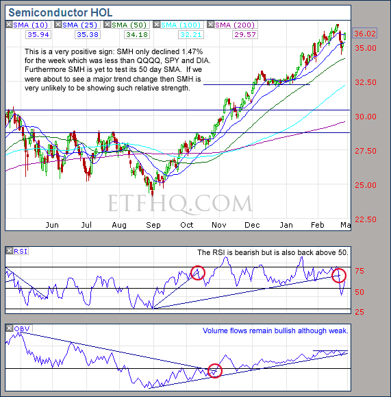
SMH was the shining leader for the week and even closed at a new high on Thursday.  It would be very unusual to reach a major market top when SMH is leading like this.  IYT continues to drag its feet however and any rally without the transports will ultimately be hollow..

Learn moreETF % Change Comparison

.

1

.

A Look at the Charts

.

SPY

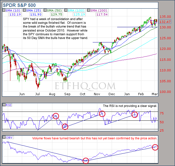
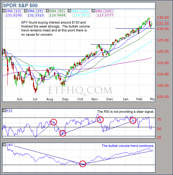
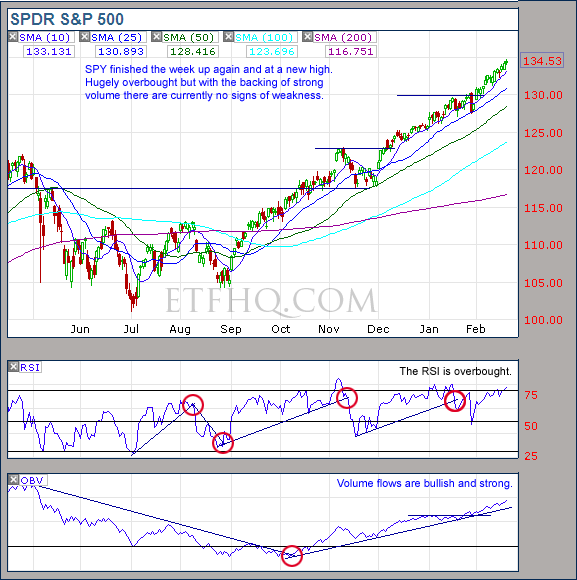
The new bearish volume trend from SPY is a concern however price is king and support still holds strong.

.
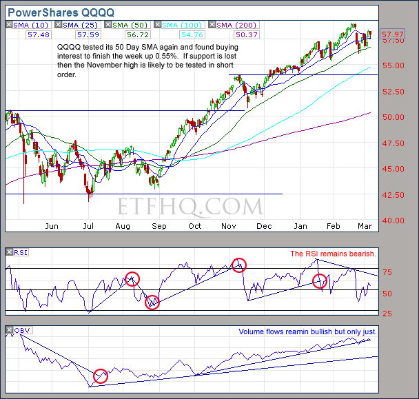
QQQQ

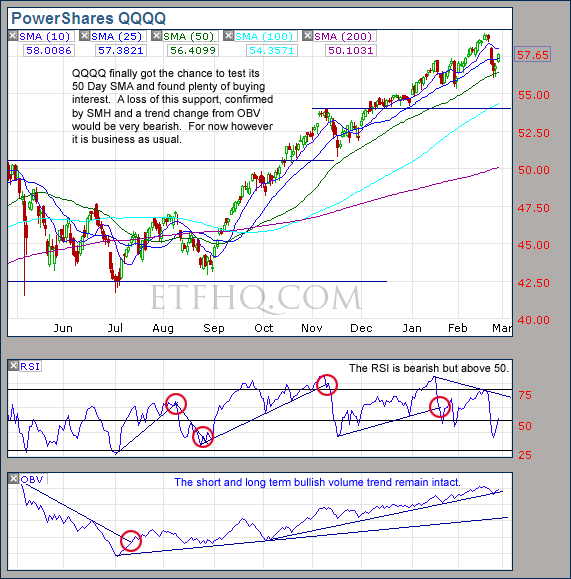
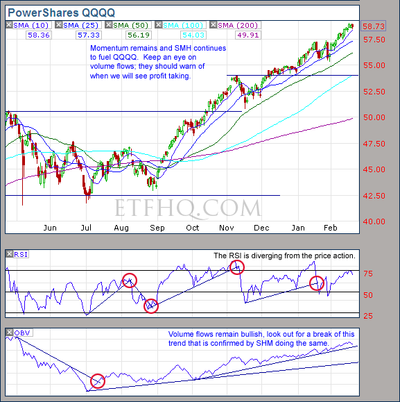
The 50 Day SMA is unusually important at the moment and QQQQ needs to maintain this support.

.
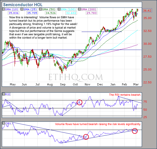
SMH

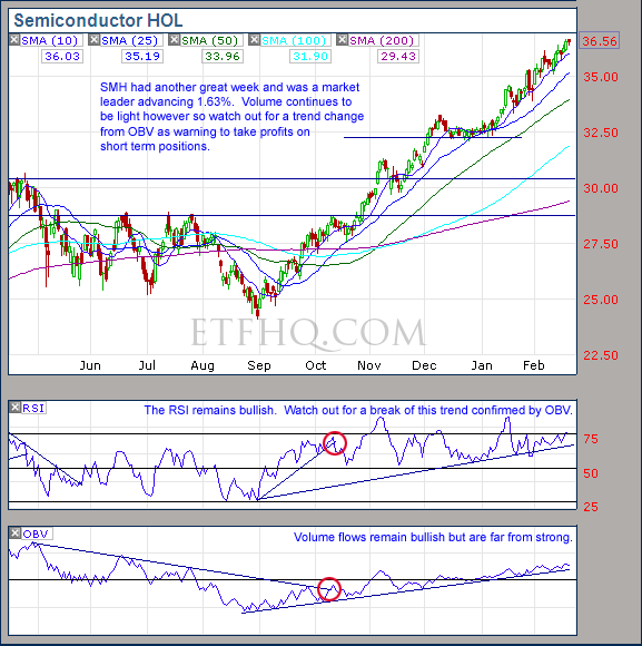
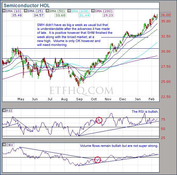
A price volume divergence after such a big run up is not a good look and suggests short term weakness.

.
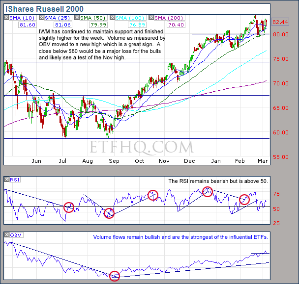
IWM

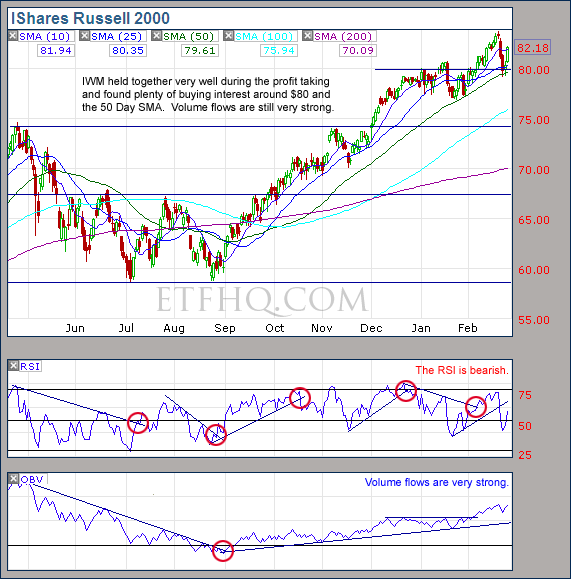
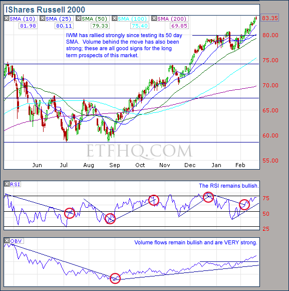
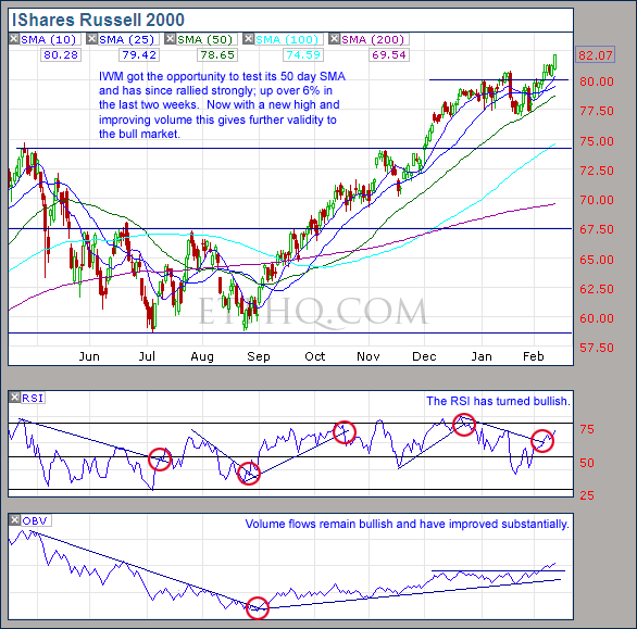
IWM has strong volume flows and good support.  A close below $80 would be dangerous however.

.
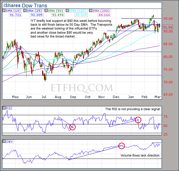
IYT

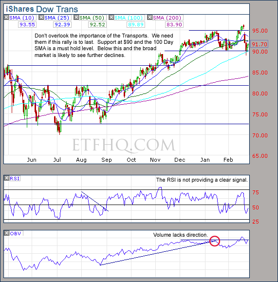
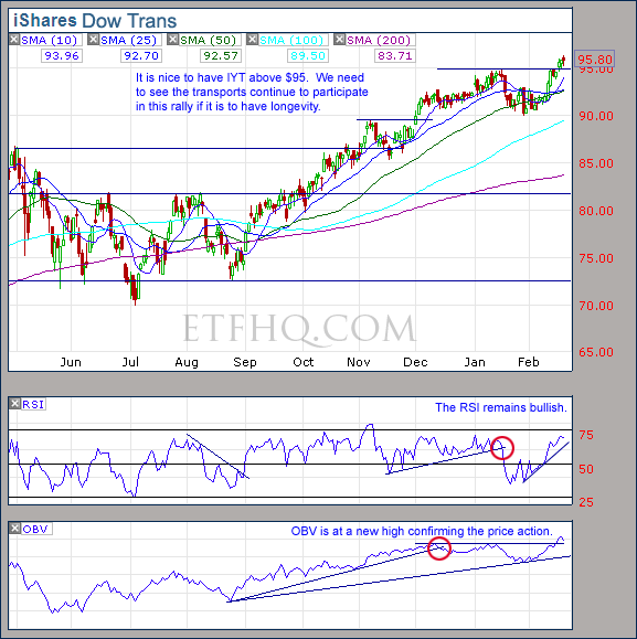
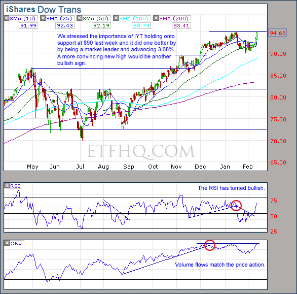
IYT is likely to foretell profit taking on the broad market with another close below $90.

.

1

.

OM3 Weekly Indicator

.

OM3 Indicator

Buy signals remain active for all but IYT while bear alerts warn that the weekly cycle is slowing down.

Learn moreThe OM3 Indicator

.

1

.

TransDow & NasDow

.

TransDow & NasDow

NasDow – The Dow remains dominant over the NASDAQ after 77 days during which time they have advanced 6.66% & 5.58% respectively.

TransDow – The Dow remains dominant over the Transports after 34 days during which time they have advanced 2.51% & 0.30% respectively.

Historically when the Dow has been the dominant index the market has been very unproductive.

.

What the TransDow Readings tell us:

The TransDow measures dominance between the DJ Transportation Index (DJTI) and the Dow Jones Industrial Average (DJIA). In a strong market the more economically sensitive Transportation Index should be dominant over the DJIA.

Historically the DJTI has been dominant over the Dow 45% of the time. The annualized rate of return from the DJTI during this period was 18.47% with the biggest loss for one trade sitting at -13.27%. The annualized return from the DJIA during the periods it was dominant over the DJTI was just 4.06% and the biggest loss for one trade was -16.13%. A 4% stop-loss is applied to all trades adjusting positions only at the end of the week.

What the NasDow Readings tell us:

The NasDow measures dominance between the NASDAQ and the DJIA. Using the same theory behind the Trans Dow; in a strong market the more economically sensitive NASDAQ should be dominant over the DJIA.

Historically the NASDAQ has been dominant over the DJIA 44% of the time. Taking only the trades when the NASDAQ is above its 40 week moving average the annualized rate of return was 25.47% with the biggest loss for one trade sitting at –8.59%. The annualized rate on the DJIA during the periods it was dominant over the NASDAQ is just 8.88% and the biggest loss for one trade was –12.28%. A 8% stop-loss is applied to all trades adjusting positions only at the end of the week.

.

1

.

LTMF 80 & Liquid Q

.

LTMF 80 and Liquid Q

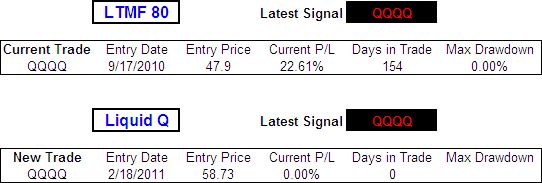
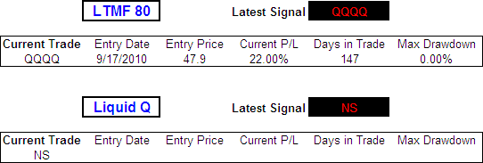
The LTMF 80 continues to hold a position in QQQQ that is currently showing a profit of 21.02% after 168 days.  Liquid Q also continues to hold a position in QQQQ that shows a loss of 1.30% after two weeks.

.

Historical Stats:

.

LTMF 80 & Liquid Q Stats

.

How The LTMF 80 Works

LTMF stands for Long Term Market Forecaster. It reads volume flows relative to price action and looks for out performance of volume measured on a percentage basis over the prior 12 months. During a sustained rally the readings will reach high levels (near 100%) making it imposable for the volume reading to always outperform price so any reading above 80% will maintain the buy signal. This system has outperformed the market over the last 10 years but performance has been damaged by some nasty losses. It only produces buy signals and only for QQQQ.

How Liquid Q Works

Liquid Q completely ignores price action and instead measures the relative flow of money between a selection of economically sensitive and comparatively stable ares of the market. It looks for times when the smart money is confident and and can be seen by through volume investing heavily is more risky areas due to an expectation of expansion. This system has outperformed the market over the last 10 years and remained in cash through most of the major declines. It only produces buy signals and only for QQQQ. We will provide more performance details on the web site for these systems soon.

.

1

.

Summary

Remember that price is king and this strongly trending market is very dangerous to bet against.  There are several signs of weakness and the risk of declines is currently very high but while support remains the bulls have the upper hand.  Keep an eye out for:

  • QQQQ below its 50 day SMA
  • IWM below $80
  • IYT below $90

If these occur then a test of the November highs it extremely likely.  While SMH continues to show such strong relative performance, any declines should be within the context of a longer term bull market.

Any disputes, questions, queries, comments or theories are most welcome in the comments section below.

.

Cheers

Derry

And the Team @ ETF HQ

“Equipping you to win on Wall St so that you can reach your financial goals.”

.

1

.

Quote of the Day:

(Someone should tell Charlie Sheen) ”There is one quality that one must possess to win, and that is definiteness of purpose, the knowledge of what one wants, and a burning desire to possess it.” – Napoleon Hill
Efficiency Ratio Variable Moving Average (ER-VMA) – Test Results

The Variable Moving Average (VMA) dynamically adjusts its own smoothing period to the changing market conditions based on a Volatility Index (VI).  While any VI can be used, in this article we will look at how the VMA performs using an Efficiency Ratio (ER).  This is identical to the modified CMO that Tushar S. Chande suggested be used in his October 1995 article in Technical Analysis of Stocks & Commodities – ‘Identifying Powerful Breakouts Early‘.

The ER-VMA requires two user selected inputs: An Efficiency Ratio Period and a VMA period.  We tested trades going Long and Short, using Daily data, taking End Of Day (EOD) and End Of Week (EOW) signals~ analyzing all combinations of:
ER = 10, 20, 40, 80, 126, 252

VMA = 1, 2, 3, 4, 5, 6, 7, 8, 9, 10

The ER lengths were selected due to the fact that they correspond with the approximate number of trading days in standard calendar periods: 10 days = 2 weeks, 20 days = 1 month, 40 days = 2 months, 80 days = ⅓ year, 126 days = ½ year and there are 252 trading days in an average year.

The VMA periods were selected after preliminary tests showed that when combined with the different ER lengths they resulted in median smoothing periods between 6 and 207 days; a range that should capture the best results based on what we know from previous research into moving averages.

A total of 240 different averages were tested and each one was run through 300 years of data across 16 different global indexes (details here).

Download A FREE Spreadsheet With Raw Data For

All 240 ER-VMA Long and Short Test Results

.

ER Variable Moving Average EOD vs EOW Returns:

.Efficiency Ratio Variable Moving Average - Average Annualized Return, Long

.

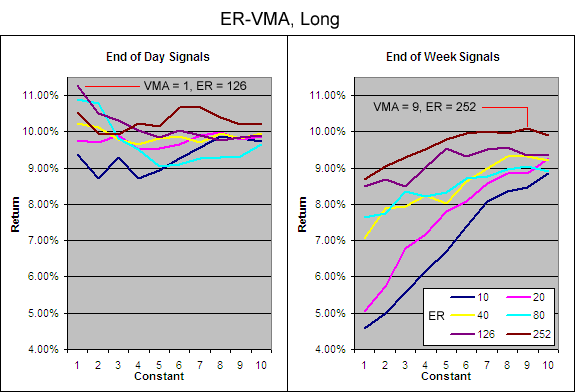
As with previous VMA test, every single ER-VMA using EOD signals managed to outperform the average buy and hold annualized return of 6.32%^ during the test period (before allowing for transaction costs and slippage).

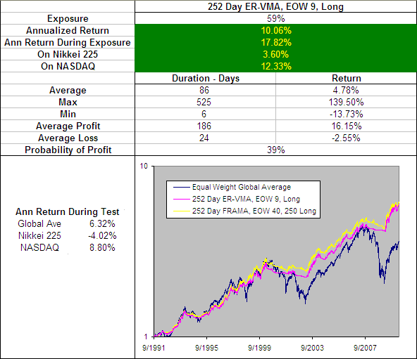
Clearly the ER periods of 126 and 252 produced the best results using both EOD and EOW signals.  This echoes previous results on other ‘intelligent’ moving averages.  The 126 Day ER-VMA with a constant of 1 stands out as the best performer with EOD signals while the 252 Day ER-VMA with a constant of 9 was the best when taking EOW signals.  (The results on the short side reiterate this).

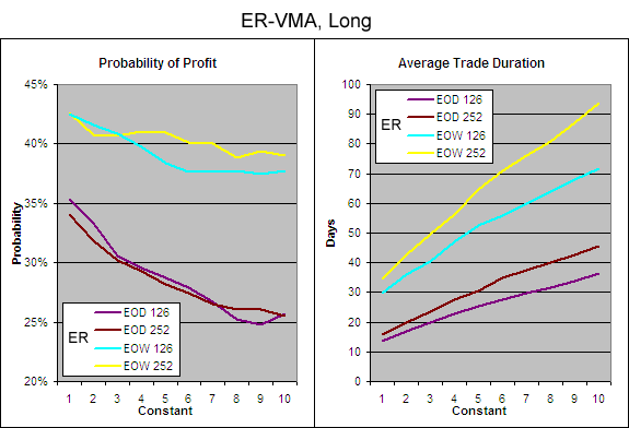
It is interesting to note that the returns hold up quite well when using EOW signals on a 252 ER so lets take a closer look at the how the probability of profit and trade duration compares for EOD and EOW signals:

.

Efficiency Ratio VMA - Probability of Profit and Average Trade Duration, Long

.

Clearly there is a large jump in the probability of profit and the average trade duration when using EOW signals; both are highly desirable characteristics especially if they can be achieved without sacrificing too much return.

.

Best EOD Efficiency Ratio Variable Moving Average

.

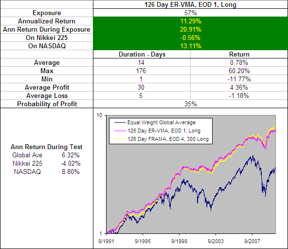
126 Day ER-VMA EOD, 1 Long.

I have included on the above chart the performance of the 126 Day FRAMA, EOD 4, 300 Long becuase so far this has been the best performing Moving Average.  The 126 Day ER-VMA, EOD 1, Long produced almost identical results to the best that the FRAMA could produce but still under performs slightly (The same is true on the short side).  Plus there are other little things that go against the 126 Day ER-VMA, EOD 1 like a slight increase in the biggest loss and not turning a profit on the Nikkei 225.

.

126 Day ER-VMA, EOD 1 – Smoothing Period Distribution

.

.

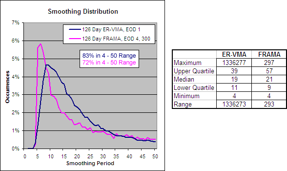
Looking at the smoothing distribution you can see it is quite similar to the FRAMA but with a lower median and a MASSIVE range.

.

126 Day ER-VMA, 1 – Alpha Comparison

.

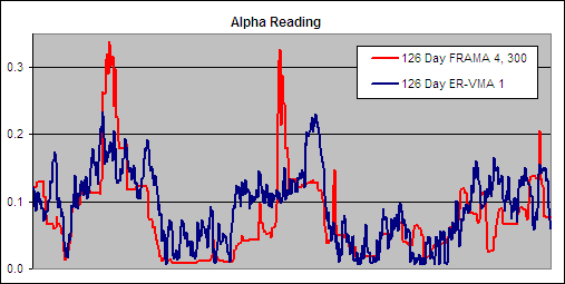
To get an idea of the readings that created these results we charted a section of the alpha for the 126 Day ER-VMA, 1 and compared it to the best performing FRAMA to see if there were any similarities that would reveal what makes a good volatility index:

.

126 Day ER-VMA, 1 - Alpha Comparison

.

The alpha does have a very similar pattern for both the 126 Day FRAMA 4, 300 and the 126 Day ER-VMA 1 and this further helps to explain why their performance is so similar.  Notice however that the FRAMA is far less volatile.  It is always preferable to work with indicators that generate clean readings with low levels of noise assuming they still produce good results.

.

Best EOW Efficiency Ratio Variable Moving Average

.

252 Day ER-VMA, EOW 9, Long

.

I have included on the above chart the performance of the 252 Day FRAMA, EOW 40, 250 Long becuase so far this has been the best performing ‘slower’ Moving Average.  The 252 Day ER-VMA, EOW 9, under performs by a small amount by almost every measure but it does offer a longer average trade duration of 86 days compared to 63 days for the FRAMA.  This makes the 252 Day ER-VMA, EOW 9 a very strong candidate as the best ‘slower’ moving average although its performance on the short side under performs by a slightly greater margin.

.

252 Day ER-VMA, EOW 9 – Smoothing Period Distribution

.

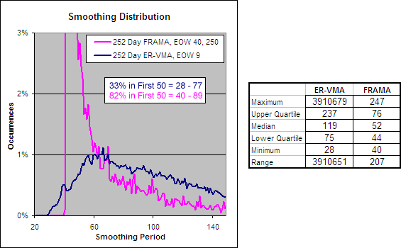
252 Day ER-VMA, 9 - Smoothing Period Distribution.

Looking at the smoothing distribution for the 252 Day ER-VMA, 9 you can see that it is far more spread out with just 33% of its the periods covered in the first 50 data points while the same range covers 82% for the FRAMA.  It also has a much higher median smoothing period of 119 compared to 52 for the FRAMA which explains why it has a longer average trade duration.

.

252 Day ER-VMA, 9 – Alpha Comparison

.

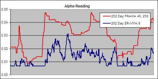
252 Day ER-VMA, 9 - Alpha Comparison.

This time we see that the alphas are very different but once again the FRAMA is far less volatile.  Remember the higher the reading the faster the resulting smoothing period; the ER-VMA stays much lower than the FRAMA which results in a slower average.

.

Conclusion

.

The ER-VMA produces some impressive returns and gives the FRAMA a good run for its money.  For a ‘fast’ moving average the 126 Day FRAMA, EOD 4, 300 is definitely superior to the 126 Day ER-VMA, 1 because it outperforms by almost every measure and is guided by readings (D) that are far less volatile.

For the ‘slower’ moving average it is more difficult to select the winner.  I like the fact that the 252 ER-VMA, 9 has a much more even distribution of smoothing and a longer average trade duration.  However it is unfortunate that there is so much more noise in the readings (ER) that guide it.  The ER-VMA certainly warrens mention and perhaps further research but based on our findings so far the FRAMA remains slightly superior in almost every way.

Want to use this indicator?  Get a free Excel spreadsheet at the flowing link under Downloads – Technical Indicators: Variable Moving Average (VMA).  It will automatically adjust to one of many different VIs that you can select including the Efficiency Ratio used in this article.

.

For more in this series see – Technical Indicator Fight for Supremacy

.

  • ~ An entry signal to go long (or exit signal to cover a short) for each average tested was generated with a close above that average and an exit signal (or entry signal to go short) was generated on each close below that moving average. No interest was earned while in cash and no allowance has been made for transaction costs or slippage. Trades were tested using End Of Day (EOD) and End Of Week (EOW) signals on Daily data. Eg. Daily data with an EOW signal would require the Week to finish above a Daily Moving Average to open a long or close a short while Daily data with EOD signals would require the Daily price to close above a Daily Moving Average to open a long or close a short and vice versa.
  • ^ This was the average annualized return of the 16 markets during the testing period. The data used for these tests is included in the results spreadsheet and more details about our methodology can be found here.

252 Day ER-AMA, 9 – Alpha Comparison

Standard Deviation Ratio Variable Moving Ave (SDR-VMA) – Test Results

The Variable Moving Average (VMA) dynamically adjusts its own smoothing period to the changing market conditions based on a Volatility Index (VI).  While any VI can be used, in this article we will look at how the VMA performs using a Standard Deviation Ratio (SDR).  This is the VI that Tushar S. Chande first suggested be used when he presented what he called a Volatility Index Dynamic Average (VIDYA) in the March 1992 edition of Technical Analysis of Stocks & Commodities – Adapting Moving Averages To Market Volatility.

The SDR-VMA requires three user selected inputs: A Short Standard Deviation (SD1), a Longer Standard Deviation (SD2) and a VMA period.  We tested trades going Long and Short, using Daily data, taking End Of Day (EOD) and End Of Week (EOW) signals~ analyzing all combinations of:

SD1 = 10, 20, 40, 80, 126

SD2 = 20, 40, 80, 126, 252

VMA = 5, 10, 15, 20, 25, 30, 35, 40, 45, 50

The SD lengths were selected due to the fact that they correspond with the approximate number of trading days in standard calendar periods: 10 days = 2 weeks, 20 days = 1 month, 40 days = 2 months, 80 days = ⅓ year, 126 days = ½ year and there are 252 trading days in an average year.

The VMA periods were selected after preliminary tests showed that when combined with the different SDR combinations, these settings resulted in a median smoothing period between 6 and 280 days; a range that should capture the best results based on what we know from previous research into moving averages.

A total of 390 different averages were tested and each one was run through 300 years of data across 16 different global indexes (details here).

Download A FREE Spreadsheet With Raw Data For

All 390 SDR-VMA Long and Short Test Results

.

SDR Variable Moving Average Test Results, Daily EOD, Long:

.

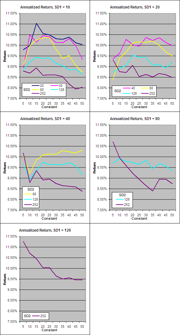
The data collected from our tests has been split by SD1 length with return plotted on the “y” axis, the VMA constant on the “x” axis and a separate series displayed for each SD2 length.

.

VIDYA Annualized Return.

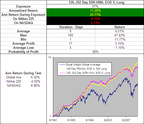
First up it must be noted that every single SDR-VMA Long using EOD signals on Daily data outperformed the average buy and hold annualized return of 6.32%^ during the test period (before allowing for transaction costs and slippage).  This is a vote of confidence for the concept especially seeing as each average was typically sitting in cash 37% of the time.

Perhaps the most interesting information from the data however is the fact that the best performer from each set had a SD2 that was twice the length of SD1.  This formula of SD2 = 2*SD1 should therefore be used whenever utilizing the Standard Deviation Ratio.

.

The Best SDR-VMA Parameters

.

The best performing average was found where SD1 = 126, SD2 = 252 and the VMA constant = 5.  In the FRAMA tests we also saw that the periods of 126 (half a year) and 252 (a full trading year) produced the best results so this appears to be a reoccurring theme:

.

126, 252 Day SDR-VMA, EOD 5, Long.

I have included on the above chart the performance of the 126 Day FRAMA, EOD 4, 300 Long becuase so far this has been the best performing Moving Average and as you can see the SDR-VMA under performs.  To make matters worse it has an typical trade duration of just 9 days compared to the FRAMA’s 14, and underperformed the buy and hold returns of both the Nikkei 225 and the NASDAQ.  Therefore we can conclude that the SDR-VMA, despite being effective is not as good as the FRAMA.

.

A look at the Smoothing Period:

.

126, 252 Day SDR-VMA, EOD 5 - Smoothing Period Distribution.

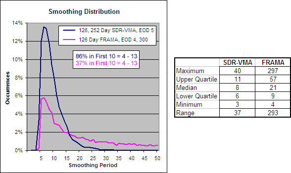
By looking at the smoothing distribution you can see why the SDR-VMA is so much faster than the FRAMA.  While the FRAMA has a range of 293 days and a median of 21, the SDR-VMA has a range of just 37 days and a median of 8.

.

126, 252 Day SDR-VMA, 5 – Alpha Comparison

.

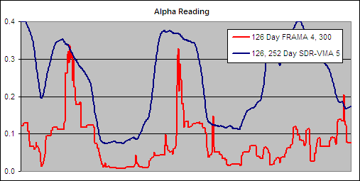
To get an idea of the readings that created these results we charted a section of the alpha for the 126, 252 Day SDR-VMA, 5 and compared it to the best performing FRAMA to see if there were any similarities that would reveal what makes a good volatility index:

.

126, 252 Day SDR-VMA, 5 - Alpha Comparison.

The alpha patterns are similar for both the 126 Day FRAMA 4, 300 and the 126, 252 Day SDR-VMA 5 but the readings are still very different.  The SDR-VMA’s indicator is nearly always higher than the FRAMA’s which is why the resulting VMA is much faster.

It is desirable to see however that the SDR-VMA’s alpha is so clean and noise free in its movements.  This leads me to believe that the 126, 252 SDR would be a good VI if it were adjusted to produce a slower average.  Also due to the lack of noise from the SDR it may offer value in other applications such a way of ranking a universe of stocks by their trend strength, but that is the topic of another set of tests.

.

For more in this series see – Technical Indicator Fight for Supremacy

.

  • ~ An entry signal to go long (or exit signal to cover a short) for each average tested was generated with a close above that average and an exit signal (or entry signal to go short) was generated on each close below that moving average. No interest was earned while in cash and no allowance has been made for transaction costs or slippage.  Trades were tested using End Of Day (EOD) and End Of Week (EOW) signals on Daily data.  Eg. Daily data with an EOW signal would require the Week to finish above a Daily Moving Average to open a long or close a short while Daily data with EOD signals would require the Daily price to close above a Daily Moving Average to open a long or close a short and vice versa.
  • ^ This was the average annualized return of the 16 markets during the testing period. The data used for these tests is included in the results spreadsheet and more details about our methodology can be found here.

ETF HQ – Little Cause For Concern So Far

February 28, 2011 – 08:35 am EST

Another week comes to an end and it was an exciting one for all the wrong reasons.  The stock market saw some sharp declines but even more alarmingly the New Zealand Town of Christchurch suffered a devastating earthquake.  Thanks to everyone who emailed to ask if we were OK – Luckily for us the quake was down the other end of the country.

The death toll currently sits at 148 but is expected to rise significantly as more bodies are found.  Even these amazing photos just don’t do justice to the scale of the devastation.  Please take the time to read this article to get a true understanding of what it was like – The Day The Earth Roared, and then go here to help us Kiwis out – http://www.redcross.org.nz/donate.  Thank you so much!

To the markets – On Tuesday we saw sharp declines that apparently come out of nowhere, however this is typical behavior from a mature rally.  Thankfully support was quickly found and Friday saw many buyers return.  The skill at times like this is in being able to separate the whipsaws from the reversals, lets take a closer look…

** New Post – The Variable Moving Average (VMA) aka Volatility Index Dynamic Ave (VIDYA)

**** Welcome to all our new readers this week.  We grow by word of mouth so thanks for spreading the word!

.

ETF % Change Comparison

.

ETF % Change Comparison

Closest to their highs and also the best performers over the last week were IWM and SMH.  These are two highly economically sensitive ETFs – If we had just seen a major market reversal then it is most unlikely that these two would be showing such strong relative strength.  However the under performance of the Transports (IYT) is not good and it will be important that they don’t get left behind.

.

Learn moreETF % Change Comparison

.

1

.

A Look at the Charts

.

SPY

A bit of selling is healthy and for now there are no warning signs from SPY.

.

QQQQ

QQQQs 50 Day SMA support held strong, keep an eye on this level.

.

SMH

Volume from the Semis is lacking but the price action still looks strong.

.

IWM

Great volume from the Small Caps (IWM) – we remain in a bull market while that trend is intact.

.

IYT

IYT must hold together if the rally on the broad market is to continue.  Look out below $90.

.

1

.

OM3 Weekly Indicator

.

OM3 Indicator

The transports have achieved the first sell signal in almost 6 months.  Bear alerts across the board warn that the weekly cycle is slowing.

Learn moreThe OM3 Indicator

.

1

.

TransDow & NasDow

.

TransDow & NasDow

NasDow – The Dow has been dominant over the NASDAQ for 77 days now.  During this time the Dow has advanced 6.31% and the NASDAQ has advanced 5.44%.

TransDow – The Dow has been dominant over the Transports for 34 days.  During this time the Dow has advanced 2.18% and the Transports have advanced 0.29%.

Historically when the Dow has been the dominant index the market has been very unproductive.

.

What the TransDow Readings tell us:

The TransDow measures dominance between the DJ Transportation Index (DJTI) and the Dow Jones Industrial Average (DJIA). In a strong market the more economically sensitive Transportation Index should be dominant over the DJIA.

Historically the DJTI has been dominant over the Dow 45% of the time. The annualized rate of return from the DJTI during this period was 18.47% with the biggest loss for one trade sitting at -13.27%. The annualized return from the DJIA during the periods it was dominant over the DJTI was just 4.06% and the biggest loss for one trade was -16.13%. A 4% stop-loss is applied to all trades adjusting positions only at the end of the week.

What the NasDow Readings tell us:

The NasDow measures dominance between the NASDAQ and the DJIA. Using the same theory behind the Trans Dow; in a strong market the more economically sensitive NASDAQ should be dominant over the DJIA.

Historically the NASDAQ has been dominant over the DJIA 44% of the time. Taking only the trades when the NASDAQ is above its 40 week moving average the annualized rate of return was 25.47% with the biggest loss for one trade sitting at –8.59%. The annualized rate on the DJIA during the periods it was dominant over the NASDAQ is just 8.88% and the biggest loss for one trade was –12.28%. A 8% stop-loss is applied to all trades adjusting positions only at the end of the week.

.

1

.

LTMF 80 & Liquid Q

.

LTMF 80 & Liquid Q

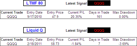
LTMF 80 continues to hold a position in QQQQ after 161 days and currently shows a profit of 20.35%.

The Liquid Q trade has gotten off to a bad start and currently shows a loss of 1.84% after 7 days.

.

Historical Stats:

.

LTMF 80 & Liquid Q Stats

.

How The LTMF 80 Works

LTMF stands for Long Term Market Forecaster. It reads volume flows relative to price action and looks for out performance of volume measured on a percentage basis over the prior 12 months. During a sustained rally the readings will reach high levels (near 100%) making it imposable for the volume reading to always outperform price so any reading above 80% will maintain the buy signal. This system has outperformed the market over the last 10 years but performance has been damaged by some nasty losses. It only produces buy signals and only for QQQQ.

How Liquid Q Works

Liquid Q completely ignores price action and instead measures the relative flow of money between a selection of economically sensitive and comparatively stable ares of the market. It looks for times when the smart money is confident and and can be seen by through volume investing heavily is more risky areas due to an expectation of expansion. This system has outperformed the market over the last 10 years and remained in cash through most of the major declines. It only produces buy signals and only for QQQQ. We will provide more performance details on the web site for these systems soon.

.

1

.

Summary

We have seen a little bit of light selling and a number of support levels have been tested but there is little cause for concern so far.  The strongest bearish arguments comes from the lack luster performance of IYT and the lack of volume behind SMH.  However IWM and SMH continue to show relative strength and their volume trends do remain bullish.

If IYT closes below $90 and its 100 Day SMA then expect more selling from the broad market.  Keep an eye on the 50 Day SMAs – they have generated buying interest so far and will hopefully continue to do so.

Any disputes, questions, queries, comments or theories are most welcome in the comments section below.

.

Cheers

Derry

And the Team @ ETF HQ

“Equipping you to win on Wall St so that you can reach your financial goals.”

.

1

.

Quote of the Day:

“Do not regret growing older.  It is a privilege denied to many.”  – Author Unknown

Variable Moving Average (VMA) aka Volatility Index Dynamic Ave (VIDYA)

The Variable Moving Average (VMA) aka Volatility Index Dynamic Average (VIDYA) was developed by Tushar S. Chande and first presented in the March 1992 edition of Technical Analysis of Stocks & Commodities – Adapting Moving Averages To Market Volatility

Chande’s theory was that the performance of an exponential moving average could be improved by using a Volatility Index (VI) to adjust the smoothing period as market conditions change.  The idea being that when prices are congested an average should slow down to avoid whipsaws but when prices are trending strongly an average should speed up to capture the major price moves.

He was not the first person to think along these lines; George R. Arrington, Ph.D introduced a variable Simple Moving Average based on Standard Deviation in the June 1991 edition of Technical Analysis of Stocks & Commodities – Building a Variable-Length Moving Average (VLMA).  The YIDYA however represented a massive step forward from the VLMA because it allowed a much larger spread of smoothing periods.

.

How To Calculate a Variable Moving Average

.

VMA = (α * VI * Close) + ((1 – ( α * VI )) * VMA[1])

Where:

α = 2 / (N + 1)

VI = Users choice of a measure of volatility or trend strength.

N = User selected constant smoothing period.

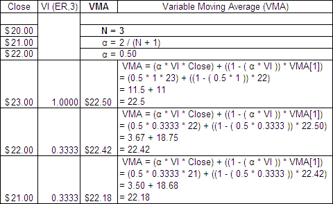
Here is an example of a 3 period VMA with a 3 period Efficiency Ratio (ER) as the VI:

.

Variable Moving Average Formula.

How the VIDYA Smoothing is changed by the Volatility Index

.

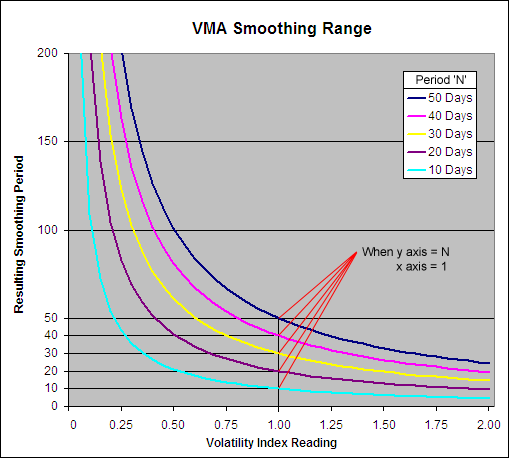
The Variable Moving Average is unique in that it has no upper or lower limit to its smoothing period:

.

How the VMA smoothing period works

.

The VMA smoothing period can go infinitely high until the Volatility Index equals zero at which point the resulting average will stop moving and be equal to the previous VMA.  When the Volatility Index equals 1 the smoothing period will be equal to the user selected constant ‘N’; notice how when the Y axis = N, the X axis = 1.

However if the Volatility Index being used can rise above 1 (such as the Standard Deviation Ratio) then the smoothing period can drop below the user selected constant.  When the VI = (N/2) + 0.5 then the smoothing period will be 1, which is equal to the price itself.  Therefore the VI that is used must not rise above (N/2) + 0.5 and if it does upon occasion then this cap must be written into the formula.

.

A Look at the Actual Alpha

.

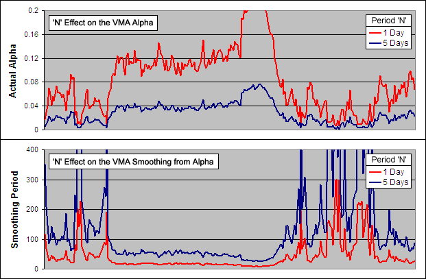
Because the VMA is as the name suggests, variable, the ‘Actual Alpha’ is not static but is influenced by the VI.  By changing the constant ‘N’ however the interpretation of the VI changes greatly:

.

VMA - The effect that N has on Alpha and Smoothing.

Above you can see an example of the ‘Actual Alpha’ and the resulting smoothing period for a VMA with an ‘N’ of 1 and an ‘N’ of 5.  We know that when the VI = 1 (indicating that the stock is trending perfectly) the smoothing period = ‘N’.  So the fastest possible smoothing periods in these examples would be 1 and 5 respectively; not a big difference.  But it is surprising to see what a huge impact changing ‘N’ just a few points has overall.  In fact as ‘N’ increases the resulting VMA moves exponentially slower.  This affect is rather like the squaring used by Kaufman in his Adaptive Moving Average.

.

What Volatility Index to use?

.

Chande originally used the Standard Deviation Ratio as his VI and this is the one typically used when people talk about a VIDYA.  But later on, in the October 1995 article from Technical Analysis of Stocks & Commodities – ‘Identifying Powerful Breakouts Early‘ he suggested the use of his own Chande Momentum Oscillator (CMO).

Because the CMO ranges between 100 and -100, to use it in this application we must take the absolute value divided by 100.  The result is identical to the Efficiency Ratio (ER) and is the VI used most often when people refer to a VMA.  Any measure of volatility or trend strength can be used however as long as it fits between a zero to (N/2) + 0.5 range where higher readings indicate a stronger trend.

.

Volatility Indexes Used for Testing

.

As part of the ‘Technical Indicator Fight for Supremacy‘ we have tested/will test the following indicators as the Volatility Index in a Variable Moving Average:

Are there any others that you think are worth testing?  Please let us know in the comments section at the bottom.

.

Variable Moving Average Excel File

.

I have put together an Excel Spreadsheet containing the Variable Moving Average and made it available for FREE download.  It contains a ‘basic’ version that shows all the working and a ‘fancy’ one that will automatically adjust to the length as well as the Volatility Index you specify.  Find it at the following link near the bottom of the page under Downloads – Technical Indicators: Variable Moving Average (VMA)

.

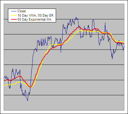
10 Day Variable Moving Average Example, VI = 50 Day Efficiency Ratio

.

Variable Moving Average vs EMA - Example

ETF HQ – Same Old Bull

February 21, 2011 – 04:03 am EST

It was more of the same from this relentless bull over the last week.  Volume flows into most areas confirmed the price action and the Transports have now spent a few days above resistance at $95; all positive signs.  There are a few areas that will need to be monitored for warnings of profit taking though, lets take a closer look…

** If you have a moment, please vote for Whitney in the Demon Bikini Model Search 2011.

**** The LTMF 80 system that comes free with this newsletter is showing a profit of 22.61% on its current trade.  The two previous trades produced a return of -1.26% and 12.55%.  We grow by word of mouth… please and thank you for continuing to tell your friends.

.

ETF % Change Comparison

.

ETF % Change Comparison

The Semis (SMH), Small Caps (IWM) and Transports (IYT) were the market leaders over the last week.  These are all highly economically sensitive so this shows confidence in the bull.

.

Learn moreETF % Change Comparison

.

1

.

A Look at the Charts

.

SPY

SPY is at a new highs on strong volume, it is difficult to pick holes in that.

.

QQQQ

All looking good from QQQQ, just keep an eye on the volume trend for signs of weakness.

.

SMH

If SMH sees a trend change in volume and QQQQ does the same then expect profit taking to follow.

.

IWM

Wow great volume into IWM, awesome to see.

.

IYT

It would be good to see IYT at least hold onto $95 and have OBV stay above its previous high.

.

1

.

OM3 Weekly Indicator

.

OM3 Indicator

The buy signals remain active across the board and the bull alerts offer no warnings at this time.

Learn moreThe OM3 Indicator

.

1

.

TransDow & NasDow

.

TransDow and NasDow

The Dow remains dominant over both the Transports and the NASDAQ.  Historically the market has been very unproductive under these conditions.

.

What the TransDow Readings tell us:

The TransDow measures dominance between the DJ Transportation Index (DJTI) and the Dow Jones Industrial Average (DJIA). In a strong market the more economically sensitive Transportation Index should be dominant over the DJIA.

Historically the DJTI has been dominant over the Dow 45% of the time. The annualized rate of return from the DJTI during this period was 18.47% with the biggest loss for one trade sitting at -13.27%. The annualized return from the DJIA during the periods it was dominant over the DJTI was just 4.06% and the biggest loss for one trade was -16.13%. A 4% stop-loss is applied to all trades adjusting positions only at the end of the week.

What the NasDow Readings tell us:

The NasDow measures dominance between the NASDAQ and the DJIA. Using the same theory behind the Trans Dow; in a strong market the more economically sensitive NASDAQ should be dominant over the DJIA.

Historically the NASDAQ has been dominant over the DJIA 44% of the time. Taking only the trades when the NASDAQ is above its 40 week moving average the annualized rate of return was 25.47% with the biggest loss for one trade sitting at –8.59%. The annualized rate on the DJIA during the periods it was dominant over the NASDAQ is just 8.88% and the biggest loss for one trade was –12.28%. A 8% stop-loss is applied to all trades adjusting positions only at the end of the week.

.

1

.

LTMF 80 & Liquid Q

.

LTMF 80 & Liquid Q

The LTMF 80 continues to hold a position in QQQQ that is now showing a profit of 22.61%.

Liquid Q has just opened a new position in QQQQ.  This new trade has a 66% probability of being profitable with an average profit of 7.36%

.

Historical Stats:

.

LTMF 80 & Liquid Q Stats

.

How The LTMF 80 Works

LTMF stands for Long Term Market Forecaster. It reads volume flows relative to price action and looks for out performance of volume measured on a percentage basis over the prior 12 months. During a sustained rally the readings will reach high levels (near 100%) making it imposable for the volume reading to always outperform price so any reading above 80% will maintain the buy signal. This system has outperformed the market over the last 10 years but performance has been damaged by some nasty losses. It only produces buy signals and only for QQQQ.

How Liquid Q Works

Liquid Q completely ignores price action and instead measures the relative flow of money between a selection of economically sensitive and comparatively stable ares of the market. It looks for times when the smart money is confident and and can be seen by through volume investing heavily is more risky areas due to an expectation of expansion. This system has outperformed the market over the last 10 years and remained in cash through most of the major declines. It only produces buy signals and only for QQQQ. We will provide more performance details on the web site for these systems soon.

.

1

.

Summary

While there are not currently any signs of weakness, keep a close eye on the volume flows of QQQQ and SMH.  It is positive that Liquid Q has just opened a new long position in QQQQ; this has a 2/3 chance of being profitable.  If IYT closes back below $95 then the market is unlikely to make much headway so lets hope the Transports keep trucking.  Make it a great week!

Any disputes, questions, queries, comments or theories are most welcome in the comments section below.

.

Cheers

Derry

And the Team @ ETF HQ

“Equipping you to win on Wall St so that you can reach your financial goals.”

.

1

.

Quote of the Day:

“Hope is not a strategy.  Luck is not a factor.  Fear is not an option.” – James Cameron

Relative Volatility Index (RVI)

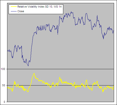
The Relative Volatility Index was created by Donald Dorsey and first presented in the June 1993 issue of Technical Analysis of Stocks and Commodities – The Relative Volatility Index.  He noticed that most technical analysts look for confirmation from several indicators before initiating a trade in order to reduce the occurrence of false signals.  This is a logical approach however many indicators are simply variations on the same calculation.  Dorsey described this as “not unlike taking two wind direction readings rather than reading the wind direction and barometric pressure to predict tomorrow’s weather”.

Because most indicators measure price change, Dorsey developed the RVI as a confirming indicator that measures the direction of volatility.  It is almost identical to the Relative Strength Index (RSI) but uses the standard deviation of high and low prices.

“There is no reason to expect the RVI to perform any better or worse than the RSI as an indicator in its own right.  The RVI’s advantage is as a confirming indicator because it provides a level of diversification missing in the RSI.”

How To Calculate the Relative Volatility Index

RVI = 100 * U / (U + D)

Where:

U = Wilder’s Smoothing,N of USD

D = Wilder’s Smoothing,N of DSD

USD = If close > close(1) then SD,S else 0

DSD = If close < close(1) then SD,S else 0

S = User selected period for the Standard Deviation of the close (Dorsey suggested 10).

N = User selected smoothing period (Dorsey suggested 14)

(Instead of using Wilder’s Smoothing we use an EMA with a period of (N*2)-1 which produces the same result but is faster to calculate.)

Here is an example of a RVI with an “S” and “N” of 3:

RVI Formula

Relative Volatility Index Excel File

I have put together an Excel Spreadsheet containing the Relative Volatility Index and made it available for FREE download.  It contains a ‘basic’ version displaying the example above and a ‘fancy’ one that will automatically adjust to the length you specify.  Find it at the following link near the bottom of the page under Downloads – Technical Indicators: Relative Volatility Index (RVI)


Relative Volatility Index Example

RVI Example

How to use the Relative Volatility Index

The Relative Volatility Index measures the direction and magnitude of volatility.  High readings indicate the market is moving up strongly, low readings indicate a strong bearish move and readings round 50 indicate a lack of direction.  In this way the RVI can be used to measure the strength or lack of a trend.  However like the RSI, extreme readings often warn of a reversal.

Here are the buy and sell rules that Dorsey developed for the RVI.  Keep in mind that he intended this as a confirming indicator not a stand alone system:

  • Buy only  if RVI > 50
  • Sell short only if RVI < 50
  • If you miss the first RVI buy signal buy when RVI > 60
  • If you miss the first RVI Sell signal sell when RVI < 40
  • Close a long position when the RVI falls below 40
  • Close a short position when the RVI rises above 60

In the September 1995 issue of Technical Analysis of Stocks and Commodities, Dorsey wrote a follow up article – Refining the Relative Volatility Index.  Here he presented the idea of using the average of two RVIs; one of high prices and one of low prices and then smoothing the result with a 20 day Linear Regression Indicator.  He called the new version “Inertia”.

“A trend is simply the outward result of inertia.  Once a market starts to move, it takes significantly more energy for it to change direction than for it to continue along the same path.”


In Physics Inertia is described as the amount of resistance that an object requires for a change in velocity.  To get a reading of Inertia requires a measure of mass and direction.  In the stock market there are many different ways (each of varying effectiveness) to measure direction but what about mass?

Because volatility reveals the markets propensity to make various sized movements regardless of direction, Dorsey saw it as a possible measure for mass.  If his theory is correct then the RVI should be a particularly useful trend indicator.

His modified version of the Relative Volatility Index or “Inertia” can be used as a long term trend indicator where readings above 50 indicate positive Inertia and readings below 50 indicate negative Inertia or a bearish trend.


Test Results

As part of the ‘Technical Indicator Fight for Supremacy‘ We have tested/will test the Relative Volatility Index as a component in several technical indicators:

We will also be testing its stand alone buy and sell signals and if they are good then we see how it performs as a confirming indicator.

ETF HQ Report – Momentum

February 14, 2011 – 08:26 am EST

Happy Valentines day to you!  We very much appreciate all those who read this newsletter.  Also valentines day has a significant impact on many areas so here is an in-depth report – Valentines Day by the Numbers.

On a more serious note; much respect to the courageous people of Egypt!  We have just witnessed true power of the people in action!  Lets hope that it brings lasting change, peace and prosperity to their nation.

Inside the bat cave at headquarters, we are currently chest deep drowning in numbers from tests as part of the Technical Indicator Fight for Supremacy.  The next round of results will be posted soon but in the mean time here is one of the indicators that we are currently putting through its paces – Fractal Dimension.

To the markets…

Last week we spoke of the importance of continued momentum, that we needed to see a new high from IWM and that ITY must hold onto support at $90.  Well this market certainly knows how to deliver and even produced some big gains from IYT.  Lets take a closer look…

****There is currently a 22% profit on the open trade from the LTMF 80 system that comes free with this newsletter.  We grow by word of mouth so thanks for continuing to spread the word.

.

ETF % Change Comparison

.

ETF % Change Comparison

It is not often that you see new highs across the board like this and it is a very positive sign.  IYT and IWM have been lagging behind recently but over the last week lead the market higher.  SMH on the other hand was at the back of the pack, but after several weeks of big gains this is not surprising.

.

Learn moreETF % Change Comparison

.

1

.

A Look at the Charts

.

SPY

Volume on SPY is the best part of this picture.

.

QQQQ

QQQQ will not behave like this forever and we are privileged to be part of this epic rally.

.

SMH

Volume flows on SMH are not super strong and will need close monitoring for warnings of weakness.

.

IWM

IWM has produced the new high we were looking for and it has been confirmed by OBV.

.

IYT

It would be great to see IYT close at a more convincing new high backed by volume.

.

1

.

OM3 Weekly Indicator

.

OM3 Indicator

The buy signals remain active across the board and have been active for almost 6 months now.  Bull alerts have returned to IWM and IYT.

Learn moreThe OM3 Indicator

.

1

.

TransDow & NasDow

.

TransDow & NasDow

The NasDow has indicated that the Dow has been dominant over the NASDAQ and likely to outperform for the last 63 days.  During this time the Dow and NASDAQ have advanced 7.56% and 6.52% respectively.

The TransDow has indicated that the Dow has been dominant over the Transports and likely to outperform for the last 20 days.  During this time the Dow and the Transports have advanced 3.38% and 3.76% respectively.

Historically when the Dow has been dominant the market has been highly unproductive.

.

What the TransDow Readings tell us:

The TransDow measures dominance between the DJ Transportation Index (DJTI) and the Dow Jones Industrial Average (DJIA). In a strong market the more economically sensitive Transportation Index should be dominant over the DJIA.

Historically the DJTI has been dominant over the Dow 45% of the time. The annualized rate of return from the DJTI during this period was 18.47% with the biggest loss for one trade sitting at -13.27%. The annualized return from the DJIA during the periods it was dominant over the DJTI was just 4.06% and the biggest loss for one trade was -16.13%. A 4% stop-loss is applied to all trades adjusting positions only at the end of the week.

What the NasDow Readings tell us:

The NasDow measures dominance between the NASDAQ and the DJIA. Using the same theory behind the Trans Dow; in a strong market the more economically sensitive NASDAQ should be dominant over the DJIA.

Historically the NASDAQ has been dominant over the DJIA 44% of the time. Taking only the trades when the NASDAQ is above its 40 week moving average the annualized rate of return was 25.47% with the biggest loss for one trade sitting at –8.59%. The annualized rate on the DJIA during the periods it was dominant over the NASDAQ is just 8.88% and the biggest loss for one trade was –12.28%. A 8% stop-loss is applied to all trades adjusting positions only at the end of the week.

.

1

.

LTMF 80 & Liquid Q

.

LTMF 80 & Liquid Q

The LTMF 80 continues to hold a position in QQQQ and is now showing a profit of 22% after 147 days.  Liquid Q remains in cash.

.

Historical Stats:

.

LTMF 80 & Liquid Q Stats

.

How The LTMF 80 Works

LTMF stands for Long Term Market Forecaster. It reads volume flows relative to price action and looks for out performance of volume measured on a percentage basis over the prior 12 months. During a sustained rally the readings will reach high levels (near 100%) making it imposable for the volume reading to always outperform price so any reading above 80% will maintain the buy signal. This system has outperformed the market over the last 10 years but performance has been damaged by some nasty losses. It only produces buy signals and only for QQQQ.

How Liquid Q Works

Liquid Q completely ignores price action and instead measures the relative flow of money between a selection of economically sensitive and comparatively stable ares of the market. It looks for times when the smart money is confident and and can be seen by through volume investing heavily is more risky areas due to an expectation of expansion. This system has outperformed the market over the last 10 years and remained in cash through most of the major declines. It only produces buy signals and only for QQQQ. We will provide more performance details on the web site for these systems soon.

.

1

.

Summary

No markets don’t only go up and yes we are likely to get caught out by sudden and sharp profit taking at some point.  At the moment however there are very few signs of weakness and there are always warning signs before things turn really bad.  SMH has far weaker volume than is ideal so its behavior should be watched closely.  Hopefully we will soon see a more convincing close at a new high from IYT as this would be a further sign of bullishness.

Any disputes, questions, queries, comments or theories are most welcome in the comments section below.

.

Cheers

Derry

And the Team @ ETF HQ

“Equipping you to win on Wall St so that you can reach your financial goals.”

.

1

.

Quote of the Day:

“I will not leave the square.  Over my dead body.  I trust the army, but I don’t trust those controlling the army behind the scenes.  Down with corruption and repression.  This is a new day of freedom.  I have tasted freedom and I will not turn back.” – Mohamed Salah 27, Agriculture Graduate

Fractal Dimension “D”

The Fractal Dimension “D” is a measure of how completely a Fractal appears to fill space as one zooms down to finer and finer scales.  So what is a fractal?  It is a rough or fragmented shape that can be split into parts, each of which is at least similar to a reduced size copy of the original.  The following video illustrates the beauty of fractals in 3D and is well worth watching in full screen:

.

AMAZING – 3D Evolving Fractal Landscape

.

.

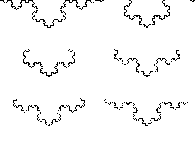
Below is an example of a fractal called the Koch Curve:

.

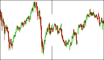
Example of a Fractal - Koch CurveNotice how no matter what scale you view the Koch Curve in it looks very similar?  This characteristic is called self similarity and defines a fractal shape.  Can you see anything strange about the chart below?
.

The Markets are Fractal.

Without being told would you have known that the left half of the chart above was 5 years of monthly bars and the right half was 15 days on 30 minute bars?  Probably not, because price movements look similar no matter what time frame we are viewing them in, this is self similarity and why the financial markets are considered fractals.

The Wiener process is also a fractal and looks very much like stock price movements.  It is a continuous time stochastic process that charts Brownian Motion and is used in the mathematical theory of finance as well as the Black-Scholes option pricing model.  It is clearly self similar and the average features of the function do not change while zooming in.  Image by Cyp:

.

Fractal - Wiener Process
Wiener Process

.

Usually we think of things in whole, rather than partial dimensions and at first I found this a foreign concept, but try thinking of it this way:  A shape like a stock chart is too big to be one dimensional but too thin to be two dimensional, so its Fractal Dimension results in a reading between 1 and 2.

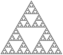
It is easy to understand the number of dimensions in a line, square or cube.  A line has 1 dimension – length, a square has 2 – length and width and a cube has 3 – length, width and depth.  However if we use this very simplistic thought process to try and reveal the Dimension of a fractal like the Sierpinski triangle then we run into problems.

Fractal - Sierpinski Triangle
Sierpinski Triangle

It is clear that we need a more intelligent approach for identifying the dimension of self similar shapes so lets look at it in another way: If we break a line segment into 4 self similar parts of the same length, a magnification factor of 4 is needed to reveal the original shape.  If we break a line segment into 7 self similar parts, a magnification factor of 7 will yield the original shape… 20 parts, magnification of 20 etc.  Therefore we can break a line segment into “N” self similar parts and a magnification factor of “N” will reveal the original shape.

If we break a square into four self similar sub squares then a magnification factor of 2 is needed to reveal the original shape.  9 self similar parts will require a magnification factor of 3 and 25 self similar parts will require a magnification factor of 5.  As a result we can conclude that a square can be broken into N^2 self similar copies and to reveal the original shape a magnification factor of “N” must be used.  A cube can be broken into N^3 self similar pieces and once again the original shape is found using a magnification factor of “N”.

So a more accurate way of thinking about the Dimension of a object is to say that “D” is the exponent of the number of self similar pieces with a magnification factor of “N” which a shape can be broken into.

Using this thought process, lets look again at the dimension of the Sierpinski triangle.   How do we find the exponent in this case?  Now we are going to need logarithms (log).

What is Log?

Log reveals the power that a number needs to be raised to in order to produce a given result.  Unless otherwise stated the base number is 10, therefore:

Log(1000) = 3

Because

10^3 = 10 * 10 * 10

10^3 = 1000

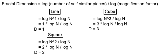
Returning to our previous conclusions – we know that for a square we have N^2 self-similar pieces, each with a magnification factor of N etc… So:

Fractal Dimension Formula - log

The Sierpinski triangle is made up of 3 self similar pieces that require a magnification factor of 2 to reveal the original shape.  Therefore:

D = log (number of self similar pieces) / log (magnification factor)

= log 3 / log 2

= 1.58

The Sierpinski triangle also contains 27 self similar pieces that require a magnification factor of 8 to reveal the original shape so:

D = log (number of self similar pieces) / log (magnification factor)

= log 27 / log 8

= 1.58

In addition to this we know that the Sierpinski triangle breaks into 3^N self similar parts requiring a magnification factor of 2^N to reveal the original shape.  Therefore:

D = log (number of self similar pieces) / log (magnification factor)

= log 3^N / log 2^N

= N * log 3 / N * log 2

= 1.58

So the Fractal Dimension is really a measure of how complicated a self similar shape is.  A line is smaller and more basic than that a square, while the Sierpinski triangle sits somewhere between the two.  However all three have the same number of self similar parts; they can all be divided to infinity.

****The beauty of the Fractal Dimension lies in its ability to somehow capture the notion of how large a set is.

.

Finding The Fractal Dimension of a Stock

.

John F Ehlers created a method for identifying the “D” for stocks by averaging the measured Fractal Dimension over different scales.  He used this method as a component of his Fractal Adaptive Moving Average (FRAMA) and presented it again as a standalone indicator in the June 2010 edition of Technical Analysis of Stocks and Commodities – Fractal Dimension As A Market Mode Sensor.

The standard method of discovering the “D” of a shape is to cover it with a number of small objects that are various sizes and compare how many of each fit across the surface.  Covering a price curve with a series of small boxes however is far too cumbersome.  But because price samples are uniformly spaced (each bar is 1 day, 1 week, 10 min etc) Ehlers decided that the average slope of the curve could be used as an estimation of the box count.

This is far less complicated than it sounds as the slope is found by simply taking the highest price over a period minus the lowest price during that period and dividing the result by the number of periods.  We will call this measure “HL”.  We need to find the “HL” measure (slope) over the first half, second half and full length of “N” to help us find “D”.

D = (Log(HL1 + HL2) – Log(HL)) / Log(2)

Note: Log(2) = Log(N / (½N))

HL1 = (Max(High,½N..N) – Min(Low,½N..N)) / ½N

HL2 = (Max(High,½N) – Min(Low,½N)) / ½N

HL = (Max(High,N) – Min(Low,N)) / N

N = Periods

If D < 1  then D = 1

If D > 2  then D = 2

.

Finding The Fractal Dimension, Examples

.

Lets have a look at some theoretical stock prices and the resulting Fractal Dimension:

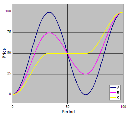
.

"D" - Example

.

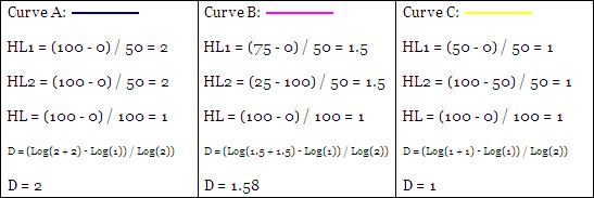
Above are three price curves, now lets calculate the “D” for each where “N” = 100.

D = (Log(HL1 + HL2) – Log(HL)) / Log(2)

So:

Calculating "D"

.

For ‘Curve A’ the full range is repeated in both halves of the chart so it exists fully in two Dimensions and D = 2.  For ‘Curve B’ only half of the range is repeated in each half of the chart so it exists in between one and two Dimensions or specifically D = 1.58.  The range for ‘Curve C’ is not repeated at all between the two halves of the chart so it exists in only one Dimension; D = 1.

.

Fractal Dimension Excel File

.

I have put together an Excel Spreadsheet that calculates the Fractal Dimension and made it available for FREE download.  It contains a ‘basic’ version displaying the working and a ‘fancy’ one that will automatically adjust to the length you specify.  Find it at the following link near the bottom of the page under Downloads – Technical Indicators: Fractal Dimension (D)

.

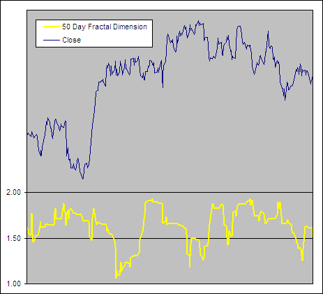
Fractal Dimension Example

.

Fractal Dimension

.

Uses for the Fractal Dimension

.

The lower the Fractal Dimension the closer a stock chart is to a straight line and therefore the stronger the trend.  High readings on the other hand reveal a complex fractal; the shape of a range bound market.  These two different market types require very different strategies in order to maximize profits and minimize losses.

Ehlers uses this measure in the FRAMA to dynamically adjust the alpha of an exponential moving average so that it reacts quickly in a trending market and slowly when prices are congested.  Accurately being able to identify the strength of a trend has endless uses and therefore is worthy of much research.

.

Test Results

.
As part of the ‘Technical Indicator Fight for Supremacy‘ We have tested/will test the Fractal Dimension as a component in several technical indicators:

We will also test “D” as a filter taking trades only when it indicates a strong trend.

.

Further Information on Fractals

.

Woodshedder wrote thought provoking article On Fractals and Market Crashes.  Here is an interesting open source platform called Fragmentarium that allows to create Fractals yourself like this:

.

Quaternion Mandelbrot 4D with Reflection

.

Also here is a great documentary on Fractals:

.

Fractals – Hunting The Hidden Dimension

.

Vertical Horizontal Filter (VHF)

The Vertical Horizontal Filter (VHF) was first presented by Adam White in an article published in the August, 1991 issue of Futures Magazine – Tuning into trendiness with VHF indicator.  Trend following indicators work best in a trending market while in a range bound market, mean reversion strategies tend to excel.  The Vertical Horizontal Filter is designed to determine if prices are in a trending or congestion phase so that the most appropriate trading strategy can be applied.

The Vertical Horizontal Filter can be interpreted in several different ways:

  1. Values can be used to indicate the strength of the trend; higher values equal a stronger trend.
  2. The VHF direction can be used to identify if a trending or congestion phase is developing.
  3. It can also be used as a contrarian indicator where extreme readings foretell of an impending change in the market phase.

.

How To Calculate the Vertical Horizontal Filter:

.

VHF = Numerator / Denominator

Where:

Denominator = n ∑ (ABS(Close – Close[1]))

Numerator = ABS (Max Close[n] – Min Close[n])

n = Number of Periods

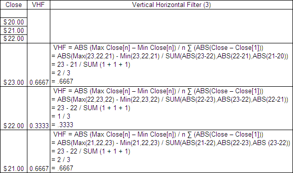
Here is an example of a 3 period VHF:

.

Vertical Horizontal Filter Formula.

Vertical Horizontal Filter Excel File

.

I have put together an Excel Spreadsheet containing the Vertical Horizontal Filter and made it available for FREE download.  It contains a ‘basic’ version displaying the example above and a ‘fancy’ one that will automatically adjust to the length you specify.  Find it at the following link near the bottom of the page under Downloads – Technical Indicators: Vertical Horizontal Filter (VHF)

.

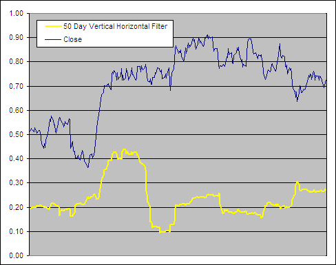
Vertical Horizontal Filter Example

.

Vertical Horizontal Filter
.

Test Results

.
As part of the ‘Technical Indicator Fight for Supremacy‘ We have tested/will test the Vertical Horizontal Filter as a component in several technical indicators:

We will also be testing it for buy and sell signals in conjunction with trending and mean revision indicators.

.