FRAMA – Is It Effective?

The Fractal Adaptive Moving Average aka FRAMA is a particularly clever indicator.  It uses the Fractal Dimension of stock prices to dynamically adjust its smoothing period.  In this post we will reveal how the FRAMA performs and if it is worthy of being included in your trading arsenal.

To fully understand how the FRAMA works please read this post before continuing.  You can also download a FREE spreadsheet containing a working FRAMA that will automatically adjust to the settings you specify.  Find it at the following link near the bottom of the page under Downloads – Technical Indicators: Fractal Adaptive Moving Average (FRAMA).  Please leave a comment and share this post if you find it useful.

The ‘Modified FRAMA’ that we tested consists of more than one variable.  So before we can put it up against other Adaptive Moving Averages to compare their performance, we must first understand how the FRAMA behaves as its parameters are changed.  From this information we can identify the best settings and use those settings when performing the comparison with other Moving Average Types.

Each FRAMA requires a setting be specified for the Fast Moving Average (FC), Slow Moving Average (SC) and the FRAMA period itself.  We tested trades going Long and Short, using Daily and Weekly data, taking End Of Day (EOD) and End Of Week (EOW) signals~ analyzing all combinations of:

FC = 1, 4, 10, 20, 40, 60

SC = 100, 150, 200, 250, 300

FRAMA = 10, 20, 40, 80, 126, 252

Part of the FRAMA calculation involves finding the slope of prices for the first half, second half and the entire length of the FRAMA period.  For this reason the FRAMA periods we tested were selected due to being even numbers and the fact that they correspond with the approximate number of trading days in standard calendar periods: 10 days = 2 weeks, 20 days = 1 month, 40 days = 2 months, 80 days = ⅓ year, 126 days = ½ year and there are 252 trading days in an average year.  A total of 920 different averages were tested and each one was run through 300 years of data across 16 different global indexes (details here).

Download A FREE Spreadsheet With Raw Data For

All 920 FRAMA Long and Short Test Results

.

FRAMA – Test Results:

.

Best FRAMA Parameters

A Slower FRAMA

FRAMA Testing – Conclusion

.

Daily vs Weekly Data – EOD vs EOW Signals

.

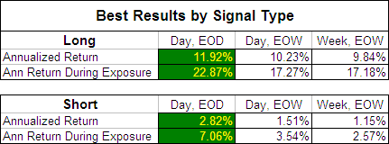
In our original MA test; Moving Averages – Simple vs. Exponential we revealed that once an EMA length was above 45 days, by using EOW signals instead of EOD signals you didn’t sacrifice returns but did benefit from a 50% jump in the probability of profit and double the average trade duration.  To see if this was also the case with the FRAMA we compared the best returns produced by each signal type:

.
FRAMA - Best Returns by Signal Type

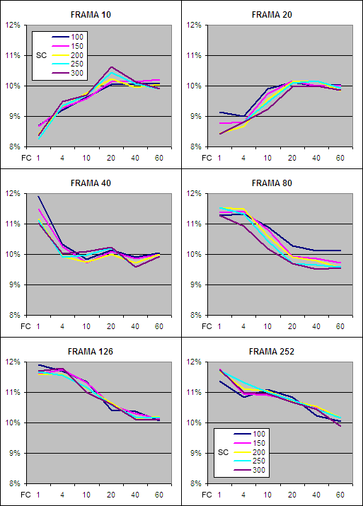
As you can see, for the FRAMA, Daily data with EOD signals produced by far the most profitable results and we will therefore focus on this data initially.  It is presented below on charts split by FRAMA period with the test results on the “y” axis, the Fast MA (FC) on the “x” axis and a separate series displayed for each Slow MA (SC).

Return to Top

.

FRAMA Annualized Return – Day EOD Long

.
FRAMA - Annualized Return, Long

.

The first impressive thing about the results above is that every single Daily EOD Long average tested outperformed the buy and hold annualized return of 6.32%^ during the test period (before allowing for transaction costs and slippage).  This is a strong vote of confidence for the FRAMA as an indicator.

You will also notice that the data series on each chart are all bunched together revealing that similar results are achieved despite the “SC” period ranging from 100 to 300 days.  Changing the other parameters however makes a big difference and returns increase significantly once the FRAMA period is above 80 days.  This indicates that the Fractal Dimension is not as useful if measured over short periods.

When the FRAMA period is short, returns increase as the “FC” period is extended.  This is due to the Fractal Dimension being very volatile if measured over short periods and a longer “FC” dampening that volatility.  Once the FRAMA period is 40 days or more the Fractal Dimension becomes less volatile and as a result, increasing the “FC” then causes returns to decline.

Overall the best annualized returns on the Long side of the market came from a FRAMA period of 126 days which is equivalent to about six months in the market, while a “FC” of just 1 to 4 days proved to be most effective.  Assessing the results from the Short side of the market comes to the same conclusion although the returns were far lower: FRAMA Annualized Return – Short.

Return to Top

.

FRAMA Annualized Return During Exposure – Day EOD Long

.
FRAMA, Annualized Return During Exposure - Long.

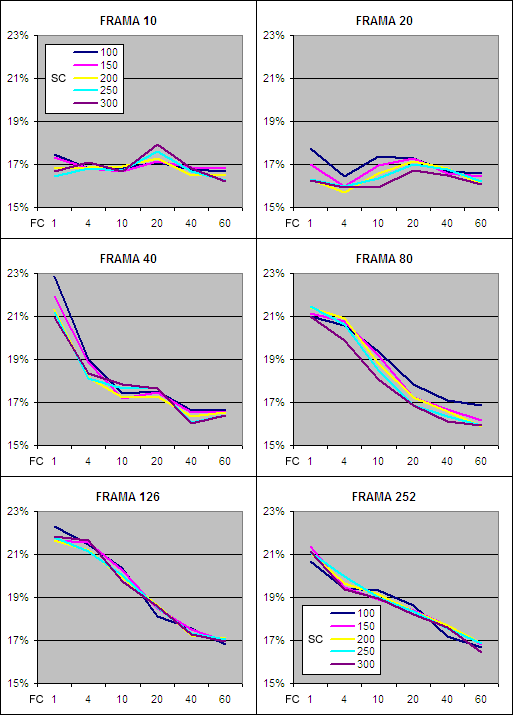
The above charts show how productive each different Daily FRAMA EOD Long was while exposed to the market.  Clearly the shorter FRAMA periods are far less productive and anything below 40 days is not worth bothering with.  The 126 day FRAMA again produced the best returns with the optimal “FC” being 1 – 4 days.  Returns for going short followed a similar pattern but as you would expect were far lower; FRAMA Annualized Return During Exposure – Short.

Moving forward we will focus in on the characteristics of the 126 Day FRAMA because it consistently produced superior returns.

Return to Top

.

FRAMA, EOD – Time in Market

.

FRAMA, Market Exposure - Long and Short.

Because the 16 markets used advanced at an average annualized rate of 6.32%^ during the test period it doesn’t come as a surprise that the majority of the market exposure was to the long side.  By extending the “FC” it further increased the time exposed to the long side and reduced exposure on the short side.  If the test period had consisted of a prolonged bear market the exposure results would probably be reversed.

Return to Top

.

FRAMA, EOD – Trade Duration

.

126 Day FRAMA, Average Trade Duration - Long & Short

.

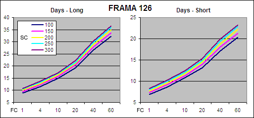
By increasing the “FC” period it also extends the average trade duration.  Changing the “SC” makes little difference but as the “SC” is raised from 100 to 300 days the average trade duration does increase ever so slightly.

Return to Top

.

FRAMA, EOD – Probability of Profit

.
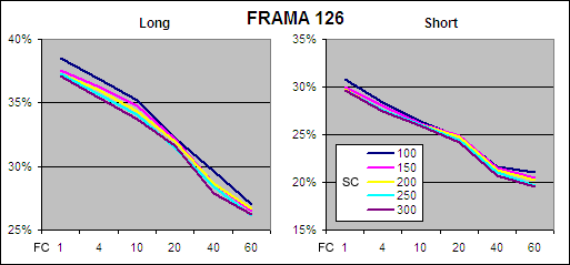
126 Day FRAMA, Probability of Profit - Long & Short

.

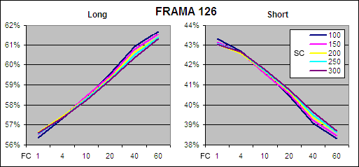
As you would expect, the probability of profit is higher on the long side which again is mostly a function of the global markets rising during the test period.  However the key information revealed by the charts above is that the probability of profit decreases significantly as the “FC” is extended.  This is another indication that the optimal FRAMA requires a short “FC” period.

Return to Top

.

The Best Daily EOD FRAMA Parameters

.

Our tests clearly show that a FRAMA period of 126 days will produce near optimal results.  While for the “SC” we have shown that any setting between 100 and 300 days will produce a similar outcome.  The “FC” period on the other hand must be short; 4 days or less.  John Ehlers’ original FRAMA had a “FC” of 1 and a “SC” of 198; this will produce fantastic results without the need for any modification.

Because we prefer to trade as infrequently as possible we have selected a “FC” of 4 and a “SC” of 300 as the best parameters because these settings results in a longer average trade duration while still producing great returns on both the Long and Short side of the market:

.

FRAMA, EOD – Long

.
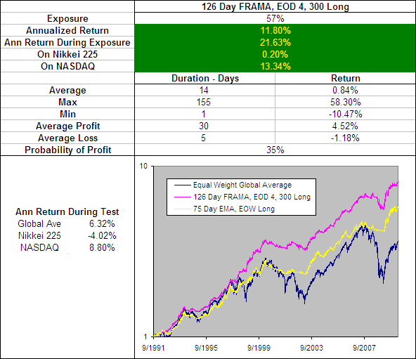
126 Day FRAMA, EOD 4, 300 Long

.

Above you can see how the 126 Day FRAMA with a “FC” of 4 and a “SC” of 300 has performed since 1991 compared to an equally weighted global average of the tested markets.  I have included the performance of the 75 Day EMA, EOW becuase it was the best performing exponential moving average from our original tests.

This clearly illustrates that the Fractal Adaptive Moving Average is superior to a standard Exponential Moving Average.  The FRAMA is far more active however producing over 5 times as many trades and did suffer greater declines during the 2008 bear market.

.

FRAMA, EOD – Short

.
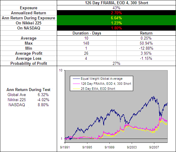
126 Day FRAMA, EOD 4, 300 Short

.

On the Short side of the market the FRAMA further proves its effectiveness.  Without needing to change any parameters the 126 Day FRAMA, EOD 4, 300 remains a top performer.  When we ran our original tests on the EMA we found a faster average worked best for going short and that the 25 Day EMA was particularly effective.  But as you can see on the chart above the FRAMA outperforms again.

What is particularly note worthy is that the annualized return during the 27% of the time that this FRAMA was short the market was 6.64% which is greater than the global average annualized return of 6.32%.

.
126 Day FRAMA, EOD 4, 300 - Long and Short on Tested MarketsSee the results for the 126 Day FRAMA, EOD 4, 300
Long and Short on each of the 16 markets tested.

Return to Top

.

126 Day FRAMA, EOD 4, 300 – Smoothing Period Distribution

.

With a standard EMA the smoothing period is constant; if you have a 75 day EMA then the smoothing period is 75 days no matter what.  The FRAMA on the other hand is adaptive so the smoothing period is constantly changing.  But how is the smoothing distributed?  Does it follow a bell curve between the “FC” and “SC”, is it random or is it localized around a few values.  To reveal the answer we charted the percentage that each smoothing period occurred across the 300 years of test data:

.
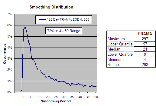
126 Day FRAMA, EOD 4, 300 - Smoothing Period Distribution.

The chart above came as quite a surprise.  It reveals that despite a “FC” to “SC” range of 4 to 300 days, 72% of the smoothing was within a 4 to 50 day range and the majority of it was only 5 to 8 days.  This explains why changing the “SC” has little impact and why changing the “FC” makes all the difference.  It also explains why the FRAMA does not perform well when using EOW signals, as an EMA must be over 45 days in duration before EOW signals can be used without sacrificing returns.

Return to Top

.

A Slower FRAMA

.
We have identified that the FRAMA is a very effective indicator but the best parameters (126 Day FRAMA, EOD 4, 300 Long) result in a very quick average that in your tests had an typical trade duration of just 14 days.  We also know that the 75 Day EMA, EOW Long is an effective yet slower moving average and in our tests had a typical trade duration of 74 days.

A good slow moving average can be a useful component in any trading system because it can be used to confirm the signals from other more active indicators.  So we looked through the FRAMA test results again in search a less active average that is a better alternative to the 75 Day EMA and this is what we found:

.
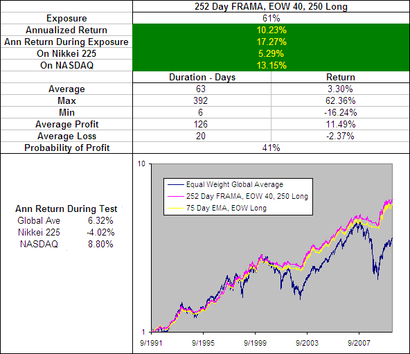
252 Day FRAMA, EOW 40, 250 Long.

The 252 Day FRAMA, EOW 40, 250 Long produces some impressive results and does out perform the 75 Day EMA, EOW Long by a fraction.  However this fractional improvement is in almost every measure including the performance on the short side.  The only draw back is a slight decrease in the average trade duration from 74 days to 63 when long.  As a result the 252 Day FRAMA, EOW 40, 250 has knocked the 75 Day EMA, EOW out of the Technical Indicator Fight for Supremacy.

.
252 Day FRAMA, EOW 40, 250 - Long and Short on Tested Markets
See the results for the 252 Day FRAMA, EOW 40, 250
Long and Short on each of the 16 markets tested.

Return to Top

.

252 Day FRAMA, EOW 40, 250 – Smoothing Period Distribution

.
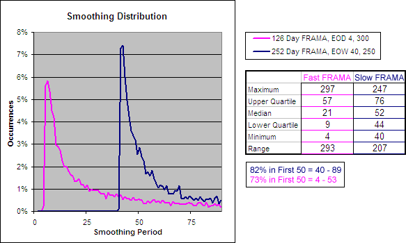
252 Day FRAMA, EOW 40, 250 - Smoothing Period Distribution.

Return to Top

.

FRAMA Testing – Conclusion

.

The FRAMA is astoundingly effective as both a fast and a slow moving average and will outperform any SMA or EMA.  We selected a modified FRAMA with a “FC” of 4, a “SC” of 300 and a “FRAMA” period of 126 as being the most effective fast FRAMA although the settings for a standard FRAMA will also produce excellent results.  For a slower or longer term average the best results are likely to come from a “FC” of 40, a “SC” of 250 and a “FRAMA” period of 252.

Robert Colby in his book ‘The Encyclopedia of Technical Market Indicators’ concluded, “Although the adaptive moving average is an interesting newer idea with considerable intellectual appeal, our preliminary tests fail to show any real practical advantage to this more complex trend smoothing method.”  Well Mr Colby, our research into the FRAMA is in direct contrast to your findings.

It will be interesting to see if any of the other Adaptive Moving Averages can produce better returns.  We will post the results HERE as they become available.

Well done John Ehlers you have created another exceptional indicator!

.

More in this series:

We have conducted and continue to conduct extensive tests on a variety of technical indicators.  See how they perform and which reveal themselves as the best in the Technical Indicator Fight for Supremacy.


Return to Top

.


  • ~ An entry signal to go long (or exit signal to cover a short) for each average tested was generated with a close above that average and an exit signal (or entry signal to go short) was generated on each close below that moving average.  No interest was earned while in cash and no allowance has been made for transaction costs or slippage.  Trades were tested using End Of Day (EOD) and End Of Week (EOW) signals for Daily data and EOW signals for Weekly data. Eg. Daily data with an EOW signal would require the Week to finish above a Daily Moving Average to open a long or close a short while Daily data with EOD signals would require the Daily price to close above a Daily Moving Average to open a long or close a short and vice versa.
  • ^ This was the average annualized return of the 16 markets during the testing period. The data used for these tests is included in the results spreadsheet and more details about our methodology can be found here.

ETF HQ Report – Significant Volume Divergence

October 04, 2010 – 02:40 pm EDT

Sorry for the delay with this weeks newsletter, I was out at the beach all day Monday (NZ Time) and when I had almost finished writing the newsletter the internet went down.  Since then the new week has gotten off to a rocky start.  Here is the report as written about 10 hours ago:

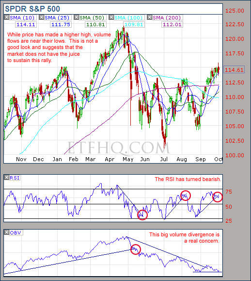
The market didn’t achieve much over the last week but on a positive note it didn’t do any damage either.  There is however a significant volume divergence that has become obvious and in a fledgling bullish reversal volume flows should be healthy across the board.  The fact that they are not is a real cause for concern.

****Thanks to all those who referred people to this newsletter over the last week. The more readers we have the more services we can provide you.

.

ETF % Change Comparison

.

ETF % Change Comparison

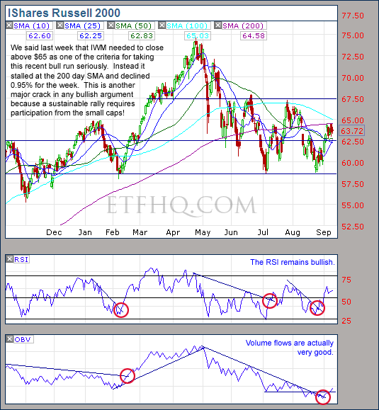
This is positive – IWM up 1.30% and SMH up 0.62% while QQQQ is down 1.31%.  Also SMH and IWM are now the furthest from their recent lows. This pattern must continue if the bull is to manage a second leg to this rally.

Learn moreETF % Change Comparison

.

1

.

A Look at the Charts

.

SPY

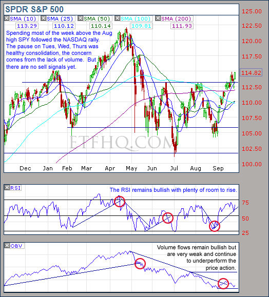
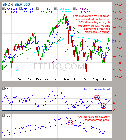
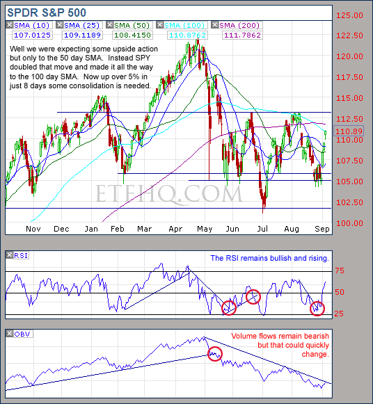
The volume divergence is clear and must not be ignored. While SPY is making a higher high OBV is near to a lower low.

.

QQQQ

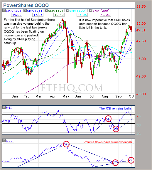
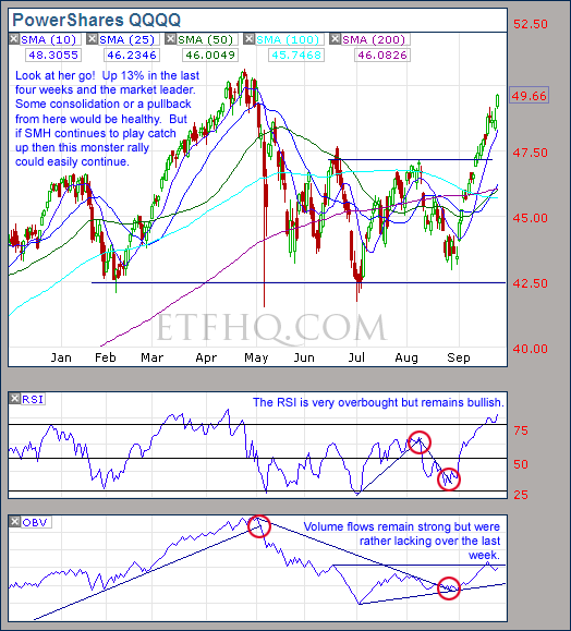
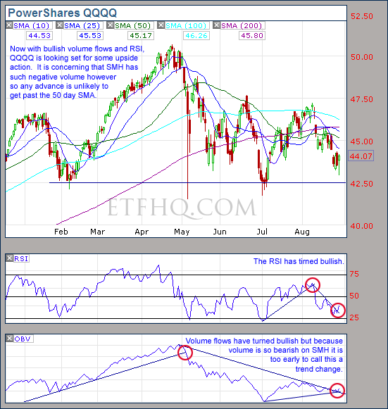
QQQQ also has a bearish volume divergence and will need continued support from SMH to hold together.

.

SMH

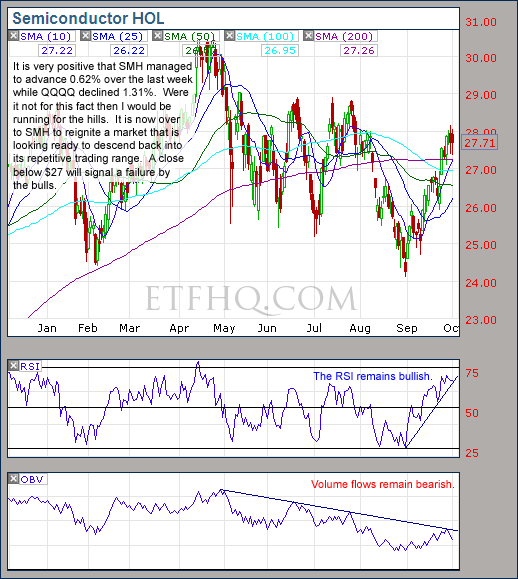
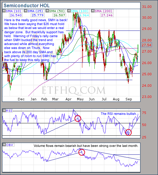
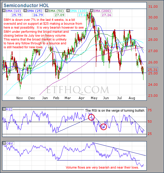
It would be exceedingly bad news if SMH closes below $27, and will most likely mark the return to the crab market.

.

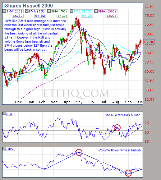
IWM

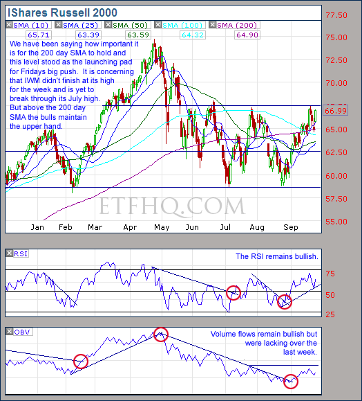
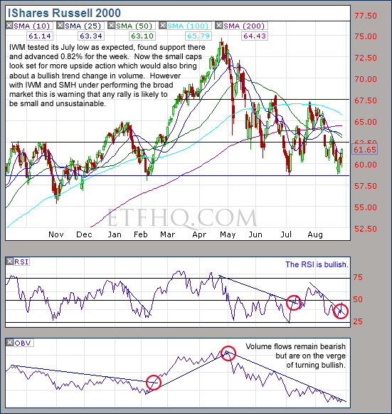
IWM is actually looking the best of the bunch and hopefully it can continue to lead the market higher. It must maintain that bullish volume trend.

.

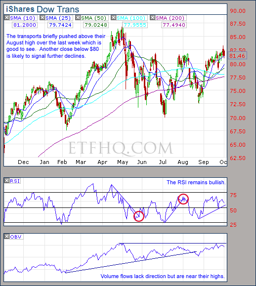
IYT

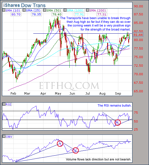
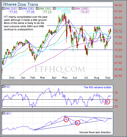
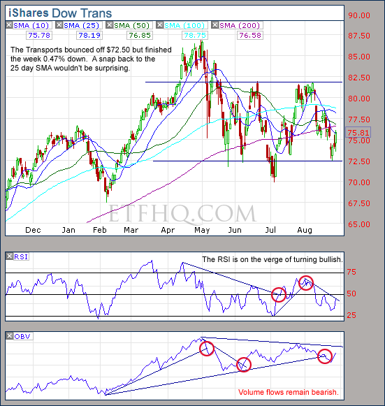
A rally from IYT would do wonders to support this market and the volume flows of its component stocks are very strong. A close below $80 would be bad news.

.

1

.

OM3 Weekly Indicator

.

OM3 Indicator

‘Strong Buy’ signals with ‘Bull Alerts’ persist across the board.

Learn moreThe OM3 Indicator

.

1

TransDow & NasDow

.

TransDow & NasDow

The NasDow remains on No Signal while the TransDow indicates that the Dow is dominant over the Transports. Historically the market has been very unproductive under these conditions.

.

What the TransDow Readings tell us:

The TransDow measures dominance between the DJ Transportation Index (DJTI) and the Dow Jones Industrial Average (DJIA). In a strong market the more economically sensitive Transportation Index should be dominant over the DJIA.

Historically the DJTI has been dominant over the Dow 45% of the time. The annualized rate of return from the DJTI during this period was 18.47% with the biggest loss for one trade sitting at -13.27%. The annualized return from the DJIA during the periods it was dominant over the DJTI was just 4.06% and the biggest loss for one trade was -16.13%. A 4% stop-loss is applied to all trades adjusting positions only at the end of the week.

What the NasDow Readings tell us:

The NasDow measures dominance between the NASDAQ and the DJIA. Using the same theory behind the Trans Dow; in a strong market the more economically sensitive NASDAQ should be dominant over the DJIA.

Historically the NASDAQ has been dominant over the DJIA 44% of the time. Taking only the trades when the NASDAQ is above its 40 week moving average the annualized rate of return was 25.47% with the biggest loss for one trade sitting at –8.59%. The annualized rate on the DJIA during the periods it was dominant over the NASDAQ is just 8.88% and the biggest loss for one trade was –12.28%. A 8% stop-loss is applied to all trades adjusting positions only at the end of the week.

.

1

.

LTMF 80 & Liquid Q

.

LTMF 80  & Liquid Q

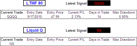
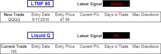
Liquid Q remains in cash while the LTMF 80 continues to hold a position in QQQQ that is showing a minor profit.

.

Historical Stats:

.

LTMF 80 & Liquid Q Stats

.

How The LTMF 80 Works

LTMF stands for Long Term Market Forecaster. It reads volume flows relative to price action and looks for out performance of volume measured on a percentage basis over the prior 12 months. During a sustained rally the readings will reach high levels (near 100%) making it imposable for the volume reading to always outperform price so any reading above 80% will maintain the buy signal. This system has outperformed the market over the last 10 years but performance has been damaged by some nasty losses. It only produces buy signals and only for QQQQ.

How Liquid Q Works

Liquid Q completely ignores price action and instead measures the relative flow of money between a selection of economically sensitive and comparatively stable ares of the market. It looks for times when the smart money is confident and and can be seen by through volume investing heavily is more risky areas due to an expectation of expansion. This system has outperformed the market over the last 10 years and remained in cash through most of the major declines. It only produces buy signals and only for QQQQ. We will provide more performance details on the web site for these systems soon.

.

1

.

Summary

On a positive note SMH and IWM continued to advance over the last week while the broad market consolidated. This is exactly what we want to see in a strong market. The problem is that there is a major volume divergence on SPY and QQQQ suggesting that the market is weak and soon to experience some profit taking.

If SMH closed below $27, volume flows turn bearish on IWM and the RSIs turn down then the profit taking is likely to become a return to the crab/bear market.  It is too early to go short just yet and I would love to see a short squeeze defibrillate some volume behind the bulls but that appears unlikely.

.

Any disputes, questions, queries, comments or theories are most welcome in the comments section below.

.

Cheers

Derry

And the Team @ ETF HQ

“Equipping you to win on Wall St so that you can reach your financial goals.”

.

P.S Like ETFHQ on Facebook – HERE

.

1

.

Quote of the Day:

“The challenge of leadership is to be strong, but not rude; be kind, but not weak; be bold, but not a bully; be thoughtful, but not lazy; be humble, but not timid; be proud, but not arrogant; have humor, but without folly.” – Jim Rohn

Fractal Adaptive Moving Average (FRAMA)

FRAMA stands for Fractal Adaptive Moving Average and we have classed it as a Log-Normal Adaptive Moving Average (LAMA).  Created by John F Ehlers (See his original paper or the article from the 2005 edition from Technical Analysis of Stocks and Commodities – Fractal Adaptive Moving Averages), it utilizes Fractal Geometry in an attempt to dynamically adjust its smoothing period to suit the changing price action over time.  The FRAMA theory is extremely clever, but clever theories don’t guarantee good results so we are putting the concept into the ring for the ‘Technical Indicator – Fight for Supremacy‘.

But before we go any further it is important that we understand what we are testing.  So I will explain how the FRAMA works although I must admit it is a bit above the the maths education that I didn’t pay attention to in school.  Also we have put together a free excel spreadsheet containing the Fractional Adaptive Moving Average so you can test it for yourself.

(If you would rather skip the maths then jump to the completed test results here – Is the FRAMA Effective?)

.

FRAMA Topics

.

Test Results – Is the FRAMA Effective?

.

How The FRAMA Works

.

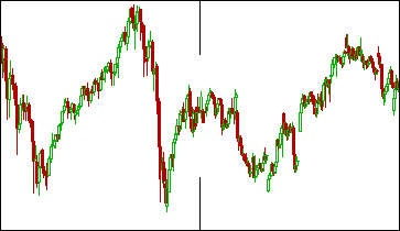
First of all the FRAMA takes advantage of the fact that financial markets are fractal.  A fractal shape is said to be rough or fragmented and can be split into parts, each of which is at least similar to a reduced size copy of the original.  Example: Can you see anything strange about the chart below?

.

The Markets are Fractal.

Without being told would you have known that the left half of the chart above was 5 years of monthly bars and the right half was 15 days on 30 minute bars?  Probably not, because price movements look similar no matter what time frame we are viewing them in.  This characteristic is called self-similarity and defines a fractal shape.

By finding the Fractal Dimension or “D” we get an indication as to how completely a Fractal appears to fill space as one zooms down to finer and finer scales.  Think of it this way: A stock chart is too big to be one dimensional but too thin to be two dimensional so its Fractal Dimension is a reading between one and two.

(For a more in depth look into Fractals and “D” please read this post – The Fractal Dimension)

The FRAMA identifies the Fractal Dimension of prices over a specific period and then uses the result to dynamically adapt the smoothing period of an exponential moving average.

Return to Top

.

Finding The Fractal Dimension of a Shape

.

To find the Fractal Dimension “D” of a shape we cover it with a number “F” of small objects that are various sizes “S”:

D = Log(F2 / F1) / Log(S1 / S2)

What is Log?

For those of you like me who didn’t pay attention in maths class ‘Log’ is short for Logarithm and is the power that a number needs to be raised to in order to produce a given result.  Unless otherwise stated the base number is 10, therefore:

Log(1000) = 3

Because

10^3 = 10 * 10 * 10

10^3 = 1000

After that quick maths lesson lets calculate the Fractal Dimension for a line segment that is 10 meters long.  First select two small dimensions such as S1 = 1 meter and S2 = 0.1 meters.  By placing boxes of these sizes on the line segment we can fit 10 of the one meter size and 100 of the 0.1 meter size.  So F1 = 10 and F2 = 100.  Therefore:

D = Log(F2 / F1) / Log(S1 / S2)

D = Log(100 / 10) / Log(1 / 0.1)

D = Log(10) / Log(10)

D = 1 / 1

D = 1

Because D = 1 we have revealed that the Fractal exists fully in one Dimension which makes sense because the measured shape was just a flat line.

For a second example instead of a flat line lets use a square that is 10 x 10 meters.  Keeping S1 and S2 the same we now get F1 = 100 and F2 = 10,000 therefore:

D = Log(F2 / F1) / Log(S1 / S2)

D = Log(10,000 / 100) / Log(1 / 0.1)

D = Log(100) / Log(10)

D = 2 / 1

D = 2

Because D = 2 we have revealed that the Fractal has completely filled two dimensions which makes sense as the measured shape was a square and a square requires two dimensions to exist.

Unfortunately stock prices lack this regularity but are still self similar.  So, in order to discover the “D” of stock prices we must average the measured Fractal Dimension over different scales.

Covering a price curve with a series of small boxes is far too cumbersome but because price samples are uniformly spaced (each bar is 1 day, 1 week, 10 min etc) Ehlers decided that the average slope of the curve could be used as an estimation of the box count.  This is far less complicated than it sounds as the slope is found by simply taking the highest price over a period minus the lowest price during that period and dividing the result by the number of periods.  We will call this measure “HL”, therefore:

HL = (Max(High,N) – Min(Low,N)) / N

N = Periods

We will need to find the “HL” measure (slope) over the first half, second half and full length of “N” to help us find “D”, clear as mud?

Return to Top

.

How to Calculate a Fractal Adaptive Moving Average

.

It starts with the Close price.

FRAMA(N-1) = Close

After that FRAMA is calculated according to the following formula:

FRAMA = FRAMA(1) + α * (Close – FRAMA(1))

You will notice that this is the same as the formula for an Exponential Moving Average (EMA):

EMA = EMA(1) + α * (Close – EMA(1))

But Alpha in an EMA is α = 2 / (N + 1) so it remains constant while for the FRAMA α = EXP(W*(D – 1)) making it adapt as the Fractal Dimension changes.

What is EXP?

EXP is known as the Exponential Function, it is like Log but instead of an assumed base of 10 it has a base of “e”.  So x = Log(10^x) and x = EXP(e^x) where “e” is approximately 2.718281828.  Confused yet?  “e” is a unique number because the slope of its curve is 1 when x = 0 and it solves the compound interest problem.

Didn’t know there was a problem with compound interest?  Neither did I.

You see if you invest $1 at an interest rate of 100% calculated annually, at the end of the first year you will have $2; simple.  But if you compound the interest during the year it gets a bit more complicated.  When interest is compounded every 6 months you can find the result for the year by multiplying $1 by 1.5 twice, so $1.00 × 1.5^2 = $2.25.  If the interest is compounded quarterly then the result is $1.00 × 1.25^4 = $2.44, and monthly it is $1.00 × 1.0833…^12 = $2.613035….

Notice how each time you increase the frequency of compounding you get a larger result?  This is the ‘compound interest problem’.  However if you invest $1 with a return of 100% each year and the interest is compound constantly then the result is ‘e’.

So why did Ehlers use EXP?

If a number “Y” has a random variable with a Normal Distribution then EXP(Y) has a Log-Normal Distribution.  Stock prices are said to be Log-Normal so EXP is used to relate the Fractal Dimension to Alpha.  Keep reading this will make more sense soon…

What is Log-Normal and why does it describe stock prices?

(In theory) the percentage change to achieve possible future stock prices at the end of a period is Normally Distributed.  That is; the change will result in a positive or negative return and 95% of the outcomes should fall within two standard deviations of the mean.  (In reality price changes aren’t normally distributed – Michael Stokes explains Fat Tails)

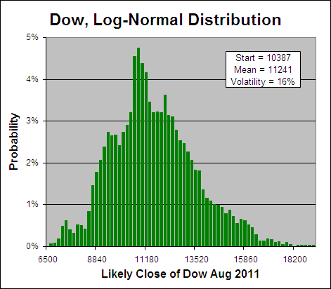
The possible prices that will result from those changes can range from zero and infinity.  This is because a stock can’t drop more than 100% as that would result in a negative price but a it can more than double.  Therefore prices are said to be Log-Normal.  This concept really confused me at first but a picture is worth a 1000 words so:

.

Stock Prices are Log-Normal.

To show that stock prices are roughly Log-Normal I calculated the price change over the prior year for the last 10,000 market days on the Dow.  In theory these results are Normally Distributed so by finding their EXP and plotting the frequency each result occurs, the above chart reveals the most probable closing prices for the Dow in one years time.

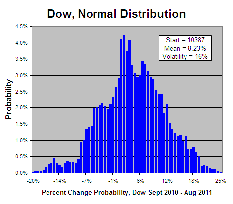
Now if a number “Y” is Log-Normal, then Log(Y) will be Normally Distributed.  So if stock prices are indeed Log-Normal then by taking the Log of the price changes on the above chart we should get something that looks like a bell curve:

.

Price Changes are Normally Distributed

.

Above you can see a bell curve (all be it an ugly one) that displays the probability of any percent chance on the Dow over the next year between -20% and 25%.  So hopefully that explains what Log-Normal is and why it is a characteristic of stock prices… Here ends the maths lesson.

Return to Top

.

How to Calculate a Fractal Adaptive Moving Average – Continued

.

FRAMA = FRAMA(1) + α * (Close – FRAMA(1))

Where:

α = EXP(W * (D – 1))

D = (Log(HL1 + HL2) – Log(HL)) / Log(2)

Note: Log(2) = Log(N / (½N))

HL1 = (Max(High,½N..N) – Min(Low,½N..N)) / ½N

HL2 = (Max(High,½N) – Min(Low,½N)) / ½N

HL = (Max(High,N) – Min(Low,N)) / N

N = FRAMA Period, must be an even number.

W = -4.6 (Set by Ehlers but can be changed.  See: Modified FRAMA)

If Alpha < 0.01  then Alpha = 0.01

If Alpha > 1 then Alpha = 1

Return to Top

.

Finding The Fractal Dimension, Examples

.

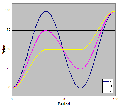
Lets have a look at some theoretical stock prices and the resulting Fractal Dimension:

.

FRAMA, "D" - Example

.

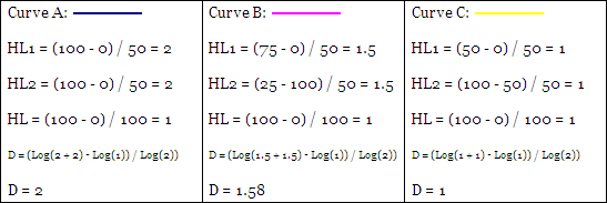
Above are three price curves, now lets calculate the “D” for each where “N” = 100.

D = (Log(HL1 + HL2) – Log(HL)) / Log(2)

So:

FRAMA Calculating "D"

.

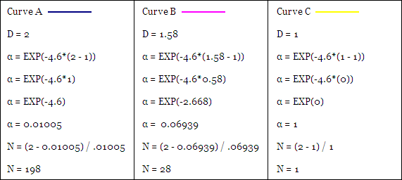
For ‘Curve A’ the full range is repeated in both halves of the chart so it exists fully in two Dimensions and D = 2.  For ‘Curve B’ only half of the range is repeated in each half of the chart so it exists in between one and two Dimensions or specifically D = 1.58.  The range for ‘Curve C’ is not repeated at all between the two halves of the chart so it exists in only one Dimension and D = 1.

Return to Top

.

How does the Fractal Dimension “D” affect the Smoothing Period “N”?

.

The FRAMA adapts between being a Fast or Slow EMA based in the Fractal Dimension of stock prices.  Ehlers designed the slowest possible EMA to be approximately 200 periods in duration and the fastest to have a period of one or in other words be equal to the price itself.  So for the three curves from our previous example, lets see how “D” changes “α” and how that affects “N” or the smoothing period of the resulting EMA:

α = EXP(W*(D – 1))

N (EMA) = (2 – α) / α

(Ehlers set “W” as -4.6, but it can be changed. See: Modified FRAMA)

.

How "D" Affects "α" and Resulting "N".

When D = 2 as with ‘Curve A’ the result is an Slow EMA of 198 periods while when D = 1 as with ‘Curve C’ the result is a Fast EMA of one period (the close price itself).

.

“This adaptive structure rapidly follows major changes in price and slowly changes when the prices are in a congestion zone.” – John Ehlers

Return to Top

.

Modified FRAMA

.

Ehlers rigidly set the FRAMA to shift between a Fast EMA of 1 period (lets call it FC) and a Slow EMA of 198 days (lets call it SC).  But because we are going to be entering the FRAMA in the ‘Technical Indicator – Fight for Supremacy‘ I wanted to be able to specifically define the “FC” and “SC” of my choice.

Special thanks to Prospectus – “Real Rocket Scientist, Wanna-be Trader” for his help on this section, be sure to subscribe to his blog and follow him on twitter.

So instead of setting “W” as -4.6 as Ehlers did, lets make W = LN(2 / (SC + 1)).  This results in a FRAMA that shifts between a “FC” of 1 and a “SC” of your choice.  For example where SC = 200, W = -4.61015.  Ehlers obviously rounded this off hence his setting of -4.6.

What is LN and why do we use it to find “W”?

LN is an abbreviation for ‘Natural Logarithm’ and is the inverse of EXP; so if EXP(1) = x then LN(x) = 1.  Because EXP is used to relate the Fractal Dimension to Alpha, LN is used to find “W”.

Now in order to set the Fast MA or “FC” of your choice simply take the resulting EMA period “N” and adjust it to fit the new range.  For example if SC = 100 and the resulting N = 50 but instead of the standard SC = 1 we want to change it to SC = 20, the following formula will reveal the “New N”:

New N = ((SC – FC) * ((Origional N – 1) / (SC – 1))) + FC

New N = ((100-20) * ((50 – 1) / (100 – 1))) + 20

New N = (80 * (49 / 99)) + 20

New N = 60

This is then easily converted back into Alpha:  New α = 2 / (New N + 1)

Modified FRAMA additional rules:

SC = Your choice of a Slow moving average > FC

FC = Your choice of a Fast moving average < SC

If Alpha < 2 / (SC + 1)  then Alpha = 2 / (SC + 1)

If Alpha > 1 then Alpha = 1

FRAMA(N-1) = SUM(CLOSE, H)/H

H = EVEN( ((SC – FC) / 2) ) + FC

If N-1 < EVEN( ((SC – FC) / 2) ) + FC then H = N-1

Return to Top

.

FRAMA Excel File

.

We have put together an Excel Spreadsheet containing the FRAMA and made it available for FREE download.  It contains a ‘basic’ version of John Ehlers FRAMA and our Modified version along with a ‘fancy’ one that will automatically adjust to the settings that you specify.  Find it at the following link near the bottom of the page under Downloads – Technical Indicators: Fractal Adaptive Moving Average (FRAMA).  Please let me know if you find it useful.

.

FRAMA and a Simple Moving Average

.

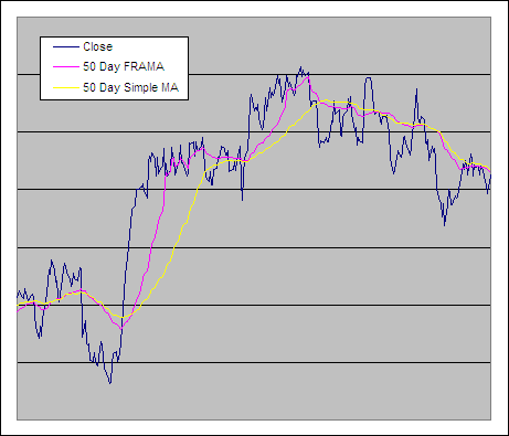
FRAMA and a Simple Moving Average

Return to Top

.

Fractal Adaptive Moving Average Test Results

.
We tested the FRAMA through 300 years of data across 16 global markets, see the results now – Is the FRAMA Effective?
.
.
.

Michael Stokes explains why – Fat Tails

ETF HQ Report – The Semis Are Back

September 27, 2010 – 05:07 am EDT

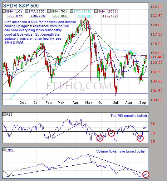
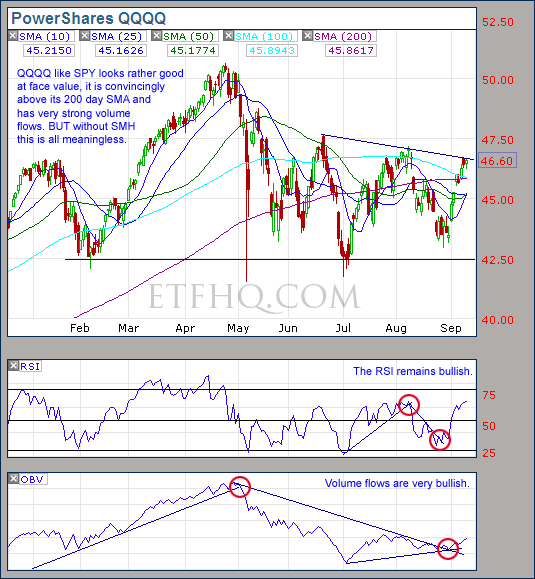
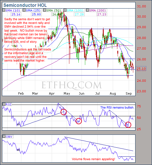
It was another great week for the market.  Previously we said that the bulls had the upper hand as long as SMH held onto $26 and IWM its 200 day SMA.  These levels were tested on Thursday and acted as the launching pad for a monster jump on Friday that was lead by SMH.  Yes the Semis have been playing catch up and on Thursday they showed great strength by advancing while the majority of the market was down.  Seeing SMH showing leadership to the upside like this gives real validity to the recent rally.

But it wasn’t all good, volume in many areas was lacking and several of the influential ETFs are yet to break above their July highs.  Lets lake a closer look:

****Thanks to all those who referred people to this newsletter over the last week. The more readers we have the more services we can provide you.

.

ETF % Change Comparison

.

ETF % Change Comparison

The transports have been rather sluggish which hasn’t helped the position we held in IYT but QQQQ and SMH lead the way higher over the last week which is just fantastic news.  When you look at the “% From Bottom” you can see that the leaders are almost in order from left to right.  This is exactly what we want to see off market bottoms: the economically sensitive leading the economically stable.

Learn moreETF % Change Comparison

.

1

.

A Look at the Charts

.

SPY

The lack of volume is a concern but the higher high is great news.  If QQQQ keeps going then SPY will follow.

.

QQQQ

QQQQ didn’t have much volume behind the big move over the last week but SMH has the fuel to sustain this rally.

.

SMH

It was make or break for SMH but $26 held strong and with it now above the 200 day SMA; $29 is a real possibility.  If that occurs then it will provide the fuel that the broad market needs to make some major technical victories.

.

IWM

It will be important for IWM to break past the July high this week if the rally is to continue.

.

IYT

It’s unfortunate that the Transports remain so sluggish but keep an eye on IYT.  If the market continues higher and the transports get left behind then a major sell off will not be far away.

.

1

.

OM3 Weekly Indicator

.

OM3 Indicator

Finally all of the ETFs including SMH have moved to a ‘Strong Buy’ signal.  With most of the signals having been active for four weeks this rally is getting statistically mature.
Learn moreThe OM3 Indicator

.

1


TransDow & NasDow

.

TransDow & NasDow

The Dow has become dominant over the Transports and the position we held has been closed for a small 2.19% profit, the TransDow is now in cash.  The NasDow also remains in cash as there is no clearly dominant index between the Dow and the NASDAQ.

.

What the TransDow Readings tell us:

The TransDow measures dominance between the DJ Transportation Index (DJTI) and the Dow Jones Industrial Average (DJIA). In a strong market the more economically sensitive Transportation Index should be dominant over the DJIA.

Historically the DJTI has been dominant over the Dow 45% of the time. The annualized rate of return from the DJTI during this period was 18.47% with the biggest loss for one trade sitting at -13.27%. The annualized return from the DJIA during the periods it was dominant over the DJTI was just 4.06% and the biggest loss for one trade was -16.13%. A 4% stop-loss is applied to all trades adjusting positions only at the end of the week.
What the NasDow Readings tell us:

The NasDow measures dominance between the NASDAQ and the DJIA. Using the same theory behind the Trans Dow; in a strong market the more economically sensitive NASDAQ should be dominant over the DJIA.

Historically the NASDAQ has been dominant over the DJIA 44% of the time. Taking only the trades when the NASDAQ is above its 40 week moving average the annualized rate of return was 25.47% with the biggest loss for one trade sitting at –8.59%. The annualized rate on the DJIA during the periods it was dominant over the NASDAQ is just 8.88% and the biggest loss for one trade was –12.28%. A 8% stop-loss is applied to all trades adjusting positions only at the end of the week.

.

1

.

LTMF 80 & Liquid Q

.

LTMF 80 & Liquid Q

After 7 days the LTMF 80 position in QQQQ is showing a profit of 3.27% and remains open while Liquid Q remains in cash.

.

Historical Stats:

.

LTMF 80 & Liquid Q Stats

.

How The LTMF 80 Works

LTMF stands for Long Term Market Forecaster. It reads volume flows relative to price action and looks for out performance of volume measured on a percentage basis over the prior 12 months. During a sustained rally the readings will reach high levels (near 100%) making it imposable for the volume reading to always outperform price so any reading above 80% will maintain the buy signal. This system has outperformed the market over the last 10 years but performance has been damaged by some nasty losses. It only produces buy signals and only for QQQQ.

How Liquid Q Works

Liquid Q completely ignores price action and instead measures the relative flow of money between a selection of economically sensitive and comparatively stable ares of the market. It looks for times when the smart money is confident and and can be seen by through volume investing heavily is more risky areas due to an expectation of expansion. This system has outperformed the market over the last 10 years and remained in cash through most of the major declines. It only produces buy signals and only for QQQQ. We will provide more performance details on the web site for these systems soon.

.

1

.

Summary

We identified this rally a month ago as just short term strength; underestimating it due to the fact that it was not backed by participation from SMH.  Now for the second week we are seeing SMH lead the market higher and because the semis are so far behind the broad market they have a lot of catching up to do.   With many other areas of the market running out of steam hopefully SMH will provide the fuel that is needed to sustain this rally a little longer.  That will help IWM and IYT to make a higher high before the inevitable pull back that is on the way.

If we see a pull back this week then the previously identified support levels of $26 on SMH and the 200 day SMA on IWM must hold or this entire rally will have been nothing more that a giant fake.  As always stay alert!

.

Any disputes, questions, queries, comments or theories are most welcome in the comments section below.

.

Cheers
Derry

And the Team @ ETF HQ

“Equipping you to win on Wall St so that you can reach your financial goals.”

.

P.S Like ETFHQ on Facebook – HERE

.

1

.

Quote of the Day:

“If you’re a chartist but don’t understand psychology, then those charts won’t do much for you” – John C. Lee AKA The Chart Addict

ETF HQ Report – Conflicting Internals Continue

September 20, 2010 – 01:45 am EDT

Well I have no problem in admitting when we are wrong and at this point it certainly looks as though we may have been wrong about the market heading for new lows.  Last week we said that if SMH can close above $26 and IWM above $65 then things would need to be reassessed.  These two milestones were achieved early on in the week so it is time to start taking the bulls seriously.

****Thanks to all those who referred people to this newsletter over the last week. The more readers we have the more services we can provide you.

.

ETF % Change Comparison

.

ETF % Change Comparison

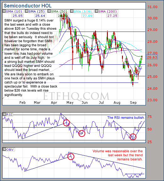
It was very positive to see SMH advance a huge 6.14% over the last week, it is basically playing catch up.  If we see a pull back over the coming week and SMH is hit more lightly than the broad market then this should be used as a buying opportunity and vice versa.

Learn moreETF % Change Comparison

.

1

.

A Look at the Charts

.

SPY

SPY is saying that the market is very unlikely to break through resistance.

.

QQQQ

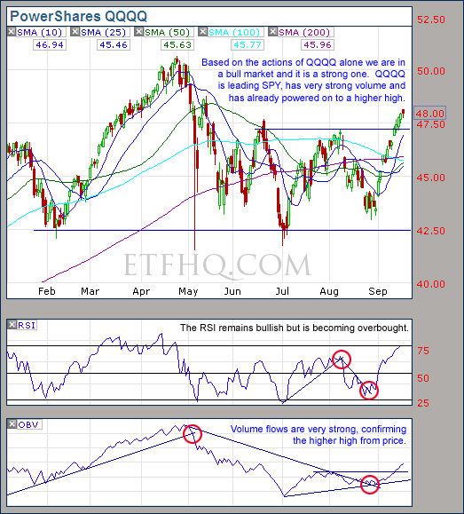
QQQQ says that we are in the grips of a healthy bull market and QQQQ holds more weight than SPY.

.

SMH

As long as SMH holds above $26 or declines less than the broad market moving forward then the bulls must be taken seriously.

.

IWM

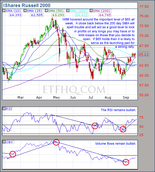
While IWM holds above its 200 day SMA the bulls have the upper hand.  Below this level declines are likely to accelerate.

.

IYT

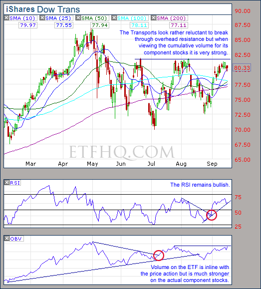
If the Transports can break through to a higher high it will be a very positive sign for the broad market.

.

1

.

OM3 Weekly Indicator

.

OM3 Indicator

All the ETFs are on their third week of ‘Strong Buy’ signals apart from SMH which remains on a ‘Strong Sell’ but has recieved a ‘Bull Alert’.  Historically the average ‘Strong Buy’ signal has lasted for 6 weeks.

Learn moreThe OM3 Indicator

.

1


TransDow & NasDow

.

TransDow & NasDow

The Transports remain dominant over the the Dow and the TransDow is showing a small profit after two weeks in the Transportation Index.  The NasDow remains in cash.

.

What the TransDow Readings tell us:

The TransDow measures dominance between the DJ Transportation Index (DJTI) and the Dow Jones Industrial Average (DJIA). In a strong market the more economically sensitive Transportation Index should be dominant over the DJIA.

Historically the DJTI has been dominant over the Dow 45% of the time. The annualized rate of return from the DJTI during this period was 18.47% with the biggest loss for one trade sitting at -13.27%. The annualized return from the DJIA during the periods it was dominant over the DJTI was just 4.06% and the biggest loss for one trade was -16.13%. A 4% stop-loss is applied to all trades adjusting positions only at the end of the week.

What the NasDow Readings tell us:

The NasDow measures dominance between the NASDAQ and the DJIA. Using the same theory behind the Trans Dow; in a strong market the more economically sensitive NASDAQ should be dominant over the DJIA.

Historically the NASDAQ has been dominant over the DJIA 44% of the time. Taking only the trades when the NASDAQ is above its 40 week moving average the annualized rate of return was 25.47% with the biggest loss for one trade sitting at –8.59%. The annualized rate on the DJIA during the periods it was dominant over the NASDAQ is just 8.88% and the biggest loss for one trade was –12.28%. A 8% stop-loss is applied to all trades adjusting positions only at the end of the week.

.

1

.

LTMF 80 & Liquid Q

.

LTMF 80 & Liquid Q

The LTMF 80 opened a new position in QQQQ at Fridays close.  This trade has a 50% probability of being profitable but the average profit is 12.5% and the average loss is 3%.  Liquid Q remains in cash.

.

Historical Stats:

.

LTMF 80 & Liquid Q Stats

.

How The LTMF 80 Works

LTMF stands for Long Term Market Forecaster. It reads volume flows relative to price action and looks for out performance of volume measured on a percentage basis over the prior 12 months. During a sustained rally the readings will reach high levels (near 100%) making it imposable for the volume reading to always outperform price so any reading above 80% will maintain the buy signal. This system has outperformed the market over the last 10 years but performance has been damaged by some nasty losses. It only produces buy signals and only for QQQQ.

How Liquid Q Works

Liquid Q completely ignores price action and instead measures the relative flow of money between a selection of economically sensitive and comparatively stable ares of the market. It looks for times when the smart money is confident and and can be seen by through volume investing heavily is more risky areas due to an expectation of expansion. This system has outperformed the market over the last 10 years and remained in cash through most of the major declines. It only produces buy signals and only for QQQQ. We will provide more performance details on the web site for these systems soon.

.

1

.

Summary

The conflicting market internals that have characterized the crab market of the last 4 months continue.  It has been a very challenging time and our main portfolio is only up 25% YTD on margin.  But with the S&P 500 up only 0.94% over the same time; it could be worse.

Over the last week the bulls have proved that they need to be taken seriously despite continued uncertainly.  The fact that SMH has been so late to enter the recent rally is real cause for concern but the positives can’t be ignored.  The market is due for a pull back although it can’t really afford to suffer much of a retrace at this point.  It is important that IWM holds above its 200 day SMA and SMH above $26.  Below these levels there is a high risk of a major market failure.

.

Any disputes, questions, queries, comments or theories are most welcome in the comments section below.

.

Cheers
Derry

And the Team @ ETF HQ

“Equipping you to win on Wall St so that you can reach your financial goals.”

.

P.S Like ETFHQ on Facebook – HERE

.

1

.

Quote of the Day:

“Bad ideas is good.  Good ideas is better.  No ideas is terrible.” – Lenny Baum

ETF HQ Report – Where’s The Beef?

September 13, 2010 – 01:35 am EDT

It is not often that you see a market that looks like more of a bull trap than this one.  At first glance the major indices appear to be recovering nicely, on healthy volume and working their way through resistance.  But…..

Where’s The Beef

.

This recent rally lacks substance and there are warning signs of almost imminent failure.  Why?  Lets take a closer look:

****Thanks to all those who referred people to this newsletter over the last week. The more readers we have the more services we can provide you.

.

ETF % Change Comparison

.

ETF % Change Comparison

Over the last week, two of the most economically sensitive areas of the market; the Semiconductors (SMH) and the Small Caps (IWM) bucked the trend and declined 2.95% and 0.95% respectively.  Furthermore, SMH was the first to peak 148 days ago, was late to bottom 10 days ago, is the furthest from its high and closets to its low.

Semiconductors lead the business cycle and constantly undergo periods of under and over supply based on the growth of the economy.  All expansion in this age requires technological info-structure, semiconductors are the building block of that info-structure and have a very short shelf life.  This is why it is so concerning to see SMH getting left behind in the recent rally.

Learn moreETF % Change Comparison

.

1

.

A Look at the Charts

.

SPY

The trend change in volume from SPY looks great BUT means little while SMH and IWM continue to underperform.

.

QQQQ

Great volume on QQQQ – yes, working its way through resistance – tick… But, without SMH to confirm, this is a hollow victory.  If QQQQ closes back below its 200 day SMA then declines are likely to accelerate.

.

SMH

The challenges with SMH are clear; terrible volume flows, falling prices, near lows etc.  Above $26 there is hope, below there is little.

.

IWM

IWM actually has good volume flows which is very positive but the 200 Day SMA resistance is strong and a close above $65 is necessary before taking the bulls seriously.  Below $62.50 we enter the danger zone.

.

IYT

The transports are not offering much insight at the moment

.

1

.

OM3 Weekly Indicator

.

OM3 Indicator

The OM3 indicator is on its second week of buy signals now but it’s concerning that SMH remains on a ‘Strong Sell’.

Learn moreThe OM3 Indicator

.

1


TransDow & NasDow

.

TransDow & NasDow

The TransDow continues to indicate that the Transports are dominant over the Dow which is a positive sign and the position in IYT is basically flat at this point.  The NasDow is showing no clearly dominant index between the Dow and the NASDAQ.

.

What the TransDow Readings tell us:

The TransDow measures dominance between the DJ Transportation Index (DJTI) and the Dow Jones Industrial Average (DJIA). In a strong market the more economically sensitive Transportation Index should be dominant over the DJIA.

Historically the DJTI has been dominant over the Dow 45% of the time. The annualized rate of return from the DJTI during this period was 18.47% with the biggest loss for one trade sitting at -13.27%. The annualized return from the DJIA during the periods it was dominant over the DJTI was just 4.06% and the biggest loss for one trade was -16.13%. A 4% stop-loss is applied to all trades adjusting positions only at the end of the week.

What the NasDow Readings tell us:

The NasDow measures dominance between the NASDAQ and the DJIA. Using the same theory behind the Trans Dow; in a strong market the more economically sensitive NASDAQ should be dominant over the DJIA.

Historically the NASDAQ has been dominant over the DJIA 44% of the time. Taking only the trades when the NASDAQ is above its 40 week moving average the annualized rate of return was 25.47% with the biggest loss for one trade sitting at –8.59%. The annualized rate on the DJIA during the periods it was dominant over the NASDAQ is just 8.88% and the biggest loss for one trade was –12.28%. A 8% stop-loss is applied to all trades adjusting positions only at the end of the week.

.

1

.

LTMF 80 & Liquid Q

.

LTMF 80 & Liquid Q

Both LTMF 80 and Liquid Q remain in cash.

.

Historical Stats:

.

LTMF 80 & Liquid Q Stats

.

How The LTMF 80 Works

LTMF stands for Long Term Market Forecaster. It reads volume flows relative to price action and looks for out performance of volume measured on a percentage basis over the prior 12 months. During a sustained rally the readings will reach high levels (near 100%) making it imposable for the volume reading to always outperform price so any reading above 80% will maintain the buy signal. This system has outperformed the market over the last 10 years but performance has been damaged by some nasty losses. It only produces buy signals and only for QQQQ.

How Liquid Q Works

Liquid Q completely ignores price action and instead measures the relative flow of money between a selection of economically sensitive and comparatively stable ares of the market. It looks for times when the smart money is confident and and can be seen by through volume investing heavily is more risky areas due to an expectation of expansion. This system has outperformed the market over the last 10 years and remained in cash through most of the major declines. It only produces buy signals and only for QQQQ. We will provide more performance details on the web site for these systems soon.

.

1

.

Summary

What were subtle warnings that the market was soon to fail are now quite blatant.  No lasting gains can occur while IWM and SMH continue to underperform the broad market and if QQQQ closes back below its 200 day SMA along with IWM below $62.50 then the declines to follow could be quite sharp.

However we must always be open to the possibility that we are wrong so if SMH can close above $26 and IWM above $65 then the situation will need to be reassessed.  Please exercise extreme caution at the moment as new lows are highly probable in the near future.

On a side note here is a fantastic – Visual Guide To Deflation – Enjoy.

.

Any disputes, questions, queries, comments or theories are most welcome in the comments section below.

.

Cheers
Derry

And the Team @ ETF HQ

“Equipping you to win on Wall St so that you can reach your financial goals.”

.

P.S Like ETFHQ on Facebook – HERE

.

1

.

Quote of the Day:

“America will never be destroyed from the outside.  If we falter and lose our freedoms, it will be because we destroyed ourselves. – Abraham Lincoln

ETF HQ Report – Welcome September

September 07, 2010 – 07:00 am EDT

What a week, and what a way to kick off September.  Now a quick rant for those if you who say that September is a bad month for stocks… You are completely missing the point!  It is very dangerous to base trading decisions on a calendar pattern becuase there is no law that states one month with be better than another.

Where there is no law there is nothing to measure, so any pattern is most likely due to coincidence or has simply become a self-fulfilling prophecy.  Such patterns can disappear without warning.  If there is a genuine reason behind a calender pattern such as fund flows due to tax time etc. then design your system to measure that reason… not the calendar!  End rant.

In our last newsletter we warned that there were several bullish signs and to expect short term strength.  Well over the last week we have certainly seen strength and far more than expected.  All the levels set as targets were reached and convincingly exceeded.  The speed of the advance was probably fueled by short covering but was so impressive that it brings into question my theory that we are headed for new lows.  So lets take a closer look…

****Thanks to all those who referred people to this newsletter over the last week. The more readers we have the more services we can provide you.

.

ETF % Change Comparison

.

ETF % Change Comparison

This week I have added a measure of how far each of the influential ETFs are from their recent lows.  Leading the advance was IWM and IYT who were also the first to bounce off their lows 10 days ago.  This is impressive as the small caps and the transports are highly economically sensitive.  On a not so impressive note; SMH and QQQQ are only 3 days off their lows.  In a strong market it would be rare for them to getting left behind like this.  These conflicting internals help to explain why the market remains stuck in a range.

Learn moreETF % Change Comparison

.

1

.

A Look at the Charts

.

SPY

SPY exceeded expectations to the upside but volume flows remain bearish and the 100 day SMA stands as resistance.

.

QQQQ

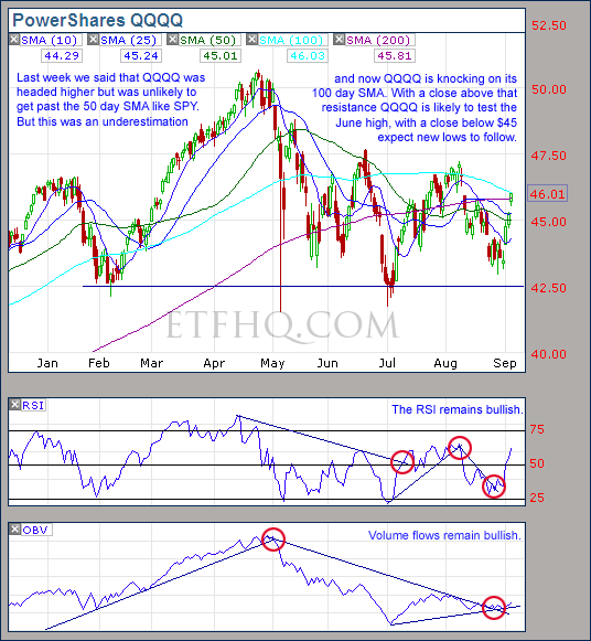
QQQQ remains one of the strongest bullish arguments; volume is healthy and OBV never made a new low like it did on SPY, SMH and IWM.  The 100 day SMA stands as resistance and a close below $45 will put us back on track for new lows.

.

SMH

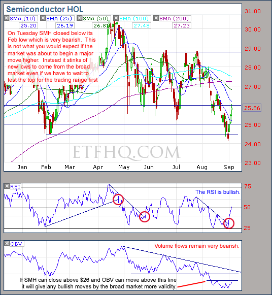
SMH provides the strongest bearish argument; very negative volume flows and a close on Tuesday below its Feb low.  This action highlights internal cracks in this market that should not be ignored.

.

IWM

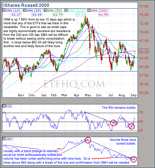
A trend change from volume, strong support and market leadership; this is very bullish.  With a close above $65 and a bit more volume this move will be believable.

.

IYT

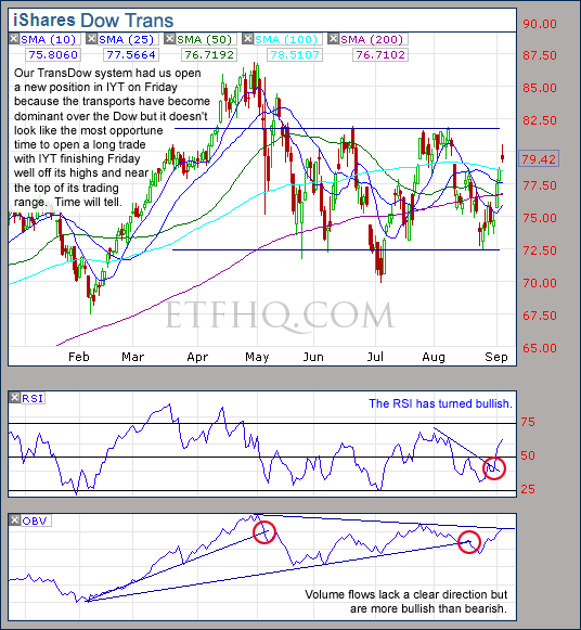
IYT had a poor finish on Friday despite a very strong week.  Looks desperate for some consolidation.

.

1

.

OM3 Weekly Indicator

.

OM3 Indicator

The only ETF still on a sell signal is SMH while everything else has switched to strong buy.  It would be much better to see SMH being the first to gain a buy signal rather than the last.  The bull alerts indicate that the weekly cycle has begun to turn up.

Learn moreThe OM3 Indicator

.

1


TransDow & NasDow

.

TransDow & NasDow

The TransDow system indicates that the Transports have become dominant over the Dow which is a bullish sign and a new position was opened in IYT on Friday.  The NasDow remains on ‘No Signal’ indicating that there is no clearly dominant index between the Dow and the NASDAQ.

.

What the TransDow Readings tell us:

The TransDow measures dominance between the DJ Transportation Index (DJTI) and the Dow Jones Industrial Average (DJIA). In a strong market the more economically sensitive Transportation Index should be dominant over the DJIA.

Historically the DJTI has been dominant over the Dow 45% of the time. The annualized rate of return from the DJTI during this period was 18.47% with the biggest loss for one trade sitting at -13.27%. The annualized return from the DJIA during the periods it was dominant over the DJTI was just 4.06% and the biggest loss for one trade was -16.13%. A 4% stop-loss is applied to all trades adjusting positions only at the end of the week.

What the NasDow Readings tell us:

The NasDow measures dominance between the NASDAQ and the DJIA. Using the same theory behind the Trans Dow; in a strong market the more economically sensitive NASDAQ should be dominant over the DJIA.

Historically the NASDAQ has been dominant over the DJIA 44% of the time. Taking only the trades when the NASDAQ is above its 40 week moving average the annualized rate of return was 25.47% with the biggest loss for one trade sitting at –8.59%. The annualized rate on the DJIA during the periods it was dominant over the NASDAQ is just 8.88% and the biggest loss for one trade was –12.28%. A 8% stop-loss is applied to all trades adjusting positions only at the end of the week.

.

1

.

LTMF 80 & Liquid Q

.

LTMF 80 & Liquid Q

Both LTMF 80 and Liquid Q remain in cash.

.

Historical Stats:

.

LTMF 80 & Liquid Q Stats

.

How The LTMF 80 Works

LTMF stands for Long Term Market Forecaster. It reads volume flows relative to price action and looks for out performance of volume measured on a percentage basis over the prior 12 months. During a sustained rally the readings will reach high levels (near 100%) making it imposable for the volume reading to always outperform price so any reading above 80% will maintain the buy signal. This system has outperformed the market over the last 10 years but performance has been damaged by some nasty losses. It only produces buy signals and only for QQQQ.

How Liquid Q Works

Liquid Q completely ignores price action and instead measures the relative flow of money between a selection of economically sensitive and comparatively stable ares of the market. It looks for times when the smart money is confident and and can be seen by through volume investing heavily is more risky areas due to an expectation of expansion. This system has outperformed the market over the last 10 years and remained in cash through most of the major declines. It only produces buy signals and only for QQQQ. We will provide more performance details on the web site for these systems soon.

.

1

.

Summary

The advances over the last week were certainly impressive but the speed of advance is totally unsustainable.  Now many of the Indices are simultaneously against resistance so consolidation is likely to be the best outcome for now.  If SMH can close above $26, IWM above $65 and QQQQ above its 200 day SMA then a solid attempt at new highs will be on the cards.  On the other hand if QQQQ closes below $45 and IWM below $62.50 then I will expect a test and likely failure of the lows.

On a side note here is a fantastic – Visual Guide To Inflation – Enjoy.

.

Any disputes, questions, queries, comments or theories are most welcome in the comments section below.

.

Cheers
Derry

And the Team @ ETF HQ

“Equipping you to win on Wall St so that you can reach your financial goals.”

.

P.S Like ETFHQ on Facebook – HERE

.

1

.

Quote of the Day:

“If you have trouble imaging a 20% loss in the stock market, you shouldn’t be in stocks.” – John (Jack) Bogle

Weighted Moving Average (W-MA)

The Weighted Moving Average is going up against several other MAs in the ‘Technical Indicator – Fight for Supremacy‘ so lets briefly cover how it is calculated and to make things easy I have put together an Excel Spreadsheet for free download.

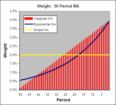
In an attempt to be more reactive to price changes a Weighted Moving Average applies the most weight to the latest data rather like an EMA does.  But instead of the weighting being exponential it is linear like a SMA.  Below you can see how the weighting is applied to a 50 period W-MA, EMA and SMA:

.

Weight - WMA vs EMA vs SMA.

How To Calculate a Weighted Moving Average

.

The Formula is:

W-MA = (PRICE*n + PRICE(1)*n-1 + … PRICE(n-1)*1) / (n * (n+1) / 2)

Where:

n = The smoothing period.

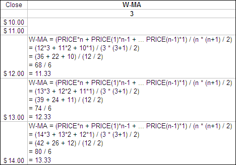
Here is an example of a 3 period Weighted Moving Average:

.

Calculating a Weighted Moving Average.

Weighted Moving Average Excel File

.

I have put together an Excel Spreadsheet containing a Weighted Moving Average and made it available for FREE download.  It contains a ‘basic’ version displaying the example above and a ‘fancy’ one that will automatically adjust to the length you specify.  Find it at the following link near the bottom of the page under Downloads – Technical Indicators: Weighted Moving Average (W-MA).  Please let me know if you find it useful.

.

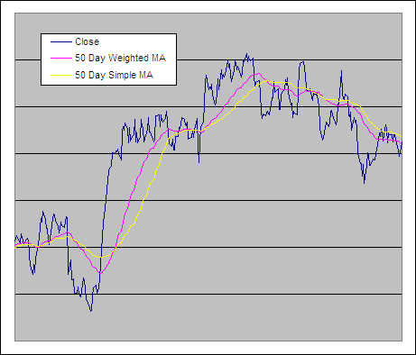
Weighted Moving Average and a Simple Moving Average

.

Weighted Moving Average and a Simple MA

.

Test Results

.

We tested several different types of Weighted Moving Averages including the W-MA through 300 years of data across 16 global markets to reveal which is the best and if any of them are worthy of use as a trading tool.  See the results – Weighted Moving Averages Put To The Test

.

.

Wilder’s Smoothing was developed buy J. Welles Wilder, Jr. and he used it as a component in several of his other indicators including the RSI which is one of the most popular technical indicators of all time.

ETF HQ Report – Short Term Strength

August 30, 2010 – 05:35 am EDT

Despite the week getting off to a bad start the market finished strongly on Friday which is impressive as traders often like to take money off the table before the weekend.  We are yet to see the new lows that we have been expecting and there are now several bullish signs over the short term.

****Thanks to all those who referred people to this newsletter over the last week.  The more readers we have the more services we can provide you.

.

ETF % Change Comparison

.

ETF % Change Comparison

If we were about to see a major market reversal off support then I would expect to see SMH and QQQQ being the first to see the buying pressure.  Instead they lead the declines over the last week and SMH has been one of the worst performers over all the measured time frames.

Learn moreETF % Change Comparison

.

1

.

A Look at the Charts

.

SPY

Volume remains heavily bearish but support has been found and signs of short term strength are evident.

.

QQQQ

The comparatively strong volume on QQQQ is the strongest bullish sign in the market at the moment but SMH suggests otherwise.

.

SMH

At bullish turning points SMH should outperform the broad market.  Instead it has been suffering greater declines, more bearish volume and lower lows.  This indicates that a bounce from here will not have the strength to get far.

.

IWM

IWM looks good bouncing off support and advancing for the week while SPY declined but the broad market has not yet tested the July low.  This is not the behavior of a strong market.

.

IYT

IYT finished the week particularly strongly and a retrace to the 25 day SMA is a real possibility.

.

1

.

OM3 Weekly Indicator

.

OM3 Indicator

The OM3 indicator suggests a meekly bearish market.

Learn moreThe OM3 Indicator

.

1


TransDow & NasDow

.

TransDow & NasDow

There continues to be no clearly dominant Index between the NASDAQ and the Dow while the Dow remains dominant over the Transports.  Historically the market has been very unproductive in these conditions.

.

What the TransDow Readings tell us:

The TransDow measures dominance between the DJ Transportation Index (DJTI) and the Dow Jones Industrial Average (DJIA). In a strong market the more economically sensitive Transportation Index should be dominant over the DJIA.

Historically the DJTI has been dominant over the Dow 45% of the time. The annualized rate of return from the DJTI during this period was 18.47% with the biggest loss for one trade sitting at -13.27%. The annualized return from the DJIA during the periods it was dominant over the DJTI was just 4.06% and the biggest loss for one trade was -16.13%. A 4% stop-loss is applied to all trades adjusting positions only at the end of the week.

What the NasDow Readings tell us:

The NasDow measures dominance between the NASDAQ and the DJIA. Using the same theory behind the Trans Dow; in a strong market the more economically sensitive NASDAQ should be dominant over the DJIA.

Historically the NASDAQ has been dominant over the DJIA 44% of the time. Taking only the trades when the NASDAQ is above its 40 week moving average the annualized rate of return was 25.47% with the biggest loss for one trade sitting at –8.59%. The annualized rate on the DJIA during the periods it was dominant over the NASDAQ is just 8.88% and the biggest loss for one trade was –12.28%. A 8% stop-loss is applied to all trades adjusting positions only at the end of the week.

.

1

.

LTMF 80 & Liquid Q

.

LTMF 80 & Liquid Q

Both LTMF 80 and Liquid Q remain in cash.

.

Historical Stats:

.

LTMF 80 & Liquid Q Stats

.

How The LTMF 80 Works

LTMF stands for Long Term Market Forecaster. It reads volume flows relative to price action and looks for out performance of volume measured on a percentage basis over the prior 12 months. During a sustained rally the readings will reach high levels (near 100%) making it imposable for the volume reading to always outperform price so any reading above 80% will maintain the buy signal. This system has outperformed the market over the last 10 years but performance has been damaged by some nasty losses. It only produces buy signals and only for QQQQ.

How Liquid Q Works

Liquid Q completely ignores price action and instead measures the relative flow of money between a selection of economically sensitive and comparatively stable ares of the market. It looks for times when the smart money is confident and and can be seen by through volume investing heavily is more risky areas due to an expectation of expansion. This system has outperformed the market over the last 10 years and remained in cash through most of the major declines. It only produces buy signals and only for QQQQ. We will provide more performance details on the web site for these systems soon.

.

1

.

Summary

With the market oversold and support underfoot the possibility of a rally from here is good but there are several subtle reasons the think that any rally will not last long, including:

  • Strongly negative volume on SMH and OBV near lows.
  • Under performance of SMH compared to the broad market and breach of July low.
  • Under performance of IWM compared to broad market.
  • Volume flows (OBV) making new lows on IWM.
  • QQQQ under performing SPY.
  • Volume flows (OBV) making new lows on SPY.

If volume flows on SPY and IYT turn bullish however then things will need to be reassessed.  In such case I will probably have been wrong about a return to the bear market.

.

Any disputes, questions, queries, comments or theories are most welcome in the comments section below.

.

Cheers
Derry

And the Team @ ETF HQ

“Equipping you to win on Wall St so that you can reach your financial goals.”

.

P.S Like ETFHQ on Facebook – HERE

.

1

.

Quote of the Day:

[The majority of traders in the experiment lost money because] They lacked what I call emotional discipline-the ability to keep their emotions removed from trading decisions.  Dieting provides an apt analogy for trading.  Most people have the necessary knowledge to lose weight-that is, they know that in order to lose weight you have to exercise and cut your intake of fats.  However, despite this widespread knowledge, the vast majority of people who attempt to lose weight are unsuccessful.  Why?  Because they lack the emotional discipline. – Victor Sperandeo

ETF HQ Report – New Lows

August 23, 2010 – 12:58 am EDT

We saw a mild bounce over the last week which wasn’t surprising after such a strong sell off.  But the market encountered resistance and ended the week poorly.  The question now is; will we see new lows?

****A big welcome to all our new subscribers over the last week and thanks to everyone for spreading the word.  The more readers we have the more resources we can put into this service.  Please direct people to http://etfhq.com to subscribe.

.

ETF % Change Comparison

.

ETF % Change Comparison

Those hardest hit in the recent declines saw the most upside over the last week but SMH and IWM still lead the declines over the last fortnight and since the last major peak.

Learn moreETF % Change Comparison

.

1

.

A Look at the Charts

.

SPY

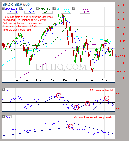
Volume on SPY is comparatively bearish but if we are too see new lows and continue lower then SMH and QQQQ should lead the way first.  SPY is currently 5.22% above its lowest close in July.

.

QQQQ

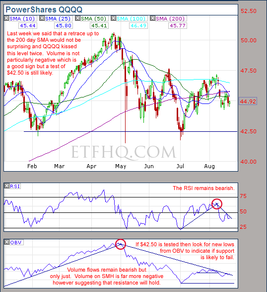
Volume flows on QQQQ have been much better than those seen on SMH and SPY but there are multiple levels of strong overhead resistance.

.

SMH

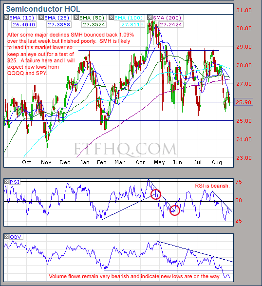
SMH is only 1.44% off its closing low in July and volume flows are very negative.  If SMH breaks down to new lows then expect the broad market to follow.

.

IWM

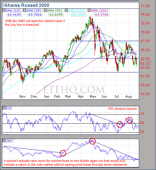
IWM is 3.57% off its closing low in July and is likely to test that level this coming week.

.

IYT

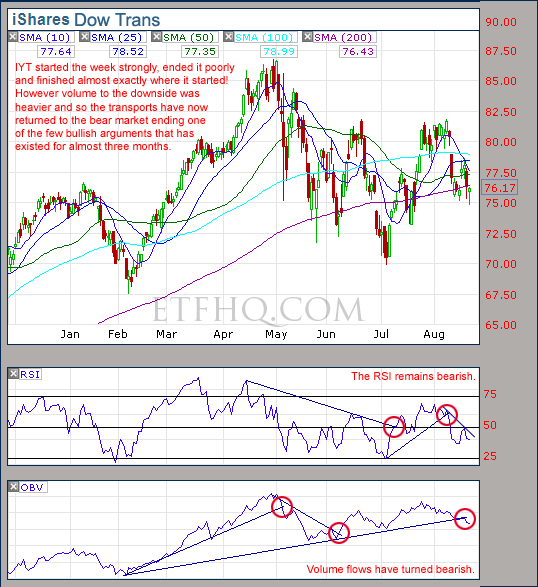
Volume flows on IYT have turned bearish again indicating that we are no longer range bound but have returned to the bear market.

.

1

.

OM3 Weekly Indicator

.

OM3 Indicator

No strong trend from the OM3 indicator but the second week of ‘Bear Alerts’ tells that the weekly cycle continues to turn down.

Learn moreThe OM3 Indicator

.

1


TransDow & NasDow

.

TransDow & NasDow

There is no clearly dominant index between the NASDAQ and the Dow while the Dow remains dominant over the Transports.  Historically the market has been very unproductive under these conditions.

.

What the TransDow Readings tell us:

The TransDow measures dominance between the DJ Transportation Index (DJTI) and the Dow Jones Industrial Average (DJIA). In a strong market the more economically sensitive Transportation Index should be dominant over the DJIA.

Historically the DJTI has been dominant over the Dow 45% of the time. The annualized rate of return from the DJTI during this period was 18.47% with the biggest loss for one trade sitting at -13.27%. The annualized return from the DJIA during the periods it was dominant over the DJTI was just 4.06% and the biggest loss for one trade was -16.13%. A 4% stop-loss is applied to all trades adjusting positions only at the end of the week.

What the NasDow Readings tell us:

The NasDow measures dominance between the NASDAQ and the DJIA. Using the same theory behind the Trans Dow; in a strong market the more economically sensitive NASDAQ should be dominant over the DJIA.

Historically the NASDAQ has been dominant over the DJIA 44% of the time. Taking only the trades when the NASDAQ is above its 40 week moving average the annualized rate of return was 25.47% with the biggest loss for one trade sitting at –8.59%. The annualized rate on the DJIA during the periods it was dominant over the NASDAQ is just 8.88% and the biggest loss for one trade was –12.28%. A 8% stop-loss is applied to all trades adjusting positions only at the end of the week.

.

1

.

LTMF 80 & Liquid Q

.

LTMF 80 & Liquid Q

Both LTMF 80 and Liquid Q remain in cash.

.

Historical Stats:

.

LTMF 80 & Liquid Q Stats

.

How The LTMF 80 Works

LTMF stands for Long Term Market Forecaster. It reads volume flows relative to price action and looks for out performance of volume measured on a percentage basis over the prior 12 months. During a sustained rally the readings will reach high levels (near 100%) making it imposable for the volume reading to always outperform price so any reading above 80% will maintain the buy signal. This system has outperformed the market over the last 10 years but performance has been damaged by some nasty losses. It only produces buy signals and only for QQQQ.

How Liquid Q Works

Liquid Q completely ignores price action and instead measures the relative flow of money between a selection of economically sensitive and comparatively stable ares of the market. It looks for times when the smart money is confident and and can be seen by through volume investing heavily is more risky areas due to an expectation of expansion. This system has outperformed the market over the last 10 years and remained in cash through most of the major declines. It only produces buy signals and only for QQQQ. We will provide more performance details on the web site for these systems soon.

.

1

.

Summary

For the bullish argument; volume on QQQQ has been comparatively good and it wouldn’t take much for volume flows on QQQQ and IWM to turn bullish.  However even if this occurs then decent advances are unlikely due to strong resistance overhead.

For the bearish argument; the market is no longer oversold, OBV on the Transports has turned bearish and volume in most areas has been under performing price.  Tests of the June lows are highly likely and there is plenty of evidence to suggest that new lows are on the way.  Keep an eye on SMH and IWM because they should be the first ones to test the lows and if support fails then it will most likely fail on the broad market as well.

.

Any disputes, questions, queries, comments or theories are most welcome in the comments section below.

.

Cheers
Derry

And the Team @ ETF HQ

“Equipping you to win on Wall St so that you can reach your financial goals.”

.

P.S Like ETFHQ on Facebook – HERE

.

1

.

Quote of the Day:

“The market does reflect the available information, as the professors tell us.  But just as the funhouse mirrors don’t always accurately reflect your weight, the markets don’t always accurately reflect that information.  Usually they are too pessimistic when it’s bad, and too optimistic when it’s good.” – Bill Miller